The Swing Text Components All the Swing text components are derived from JTextComponent, which is a subclass of JComponent. Swing provides five fully functional text controls, three of which provide replacement functionality for the AWT TextField and TextArea components and two that are entirely new. The class hierarchy of the Swing text components is shown in Figure 1-1. Although Figure 1-1 shows all the text components in the Swing package, it doesn't show the complex set of model and view classes that are used to implement them. Much of the power of these components, especially the new JEditorPane and JTextPane controls, comes from the generalized and flexible architecture that underlies them. Later in this chapter, you'll see how to exploit this architecture to create customized text components that are suited to particular tasks. For example, you'll see several examples of text fields that validate the user's keystrokes as they are typed. Before looking at how to create custom components, let's look at what the basic controls are capable of. Figure 1-1. Swing text component class hierarchy. The JTextField and JPasswordField Components JTextField and JPasswordField are the simplest of all the text components. They both contain a single line of text, which may be supplied by the application program or typed by the user. The main difference between these two controls is that JPasswordField doesn't directly display its content instead, it uses a single character (usually an asterisk) to represent each character that it contains, so that it is possible to see how many characters have been typed, but not what they are. As its name suggests, JPasswordField is intended to be used as a simple way to accept a user's password. Because it is derived from JTextField, everything that applies to JTextField is also true of JPasswordField. For brevity, the rest of this section will refer only to JTextField. However, everything that follows is true also of JPasswordField. Creating a Text Field When you create a JTextField, you can specify some or all of the following attributes: The Document in which it will hold its text. The initial content of the text field. The number of columns to be displayed. As you'll see later, all the text components hold their content in an object that implements an interface called Document. Different text components use different Documents tailored to their specific needs; JTextField uses an instance of the PlainDocument class to store text. This class, and the other Document classes, will be covered later in "Storing Document Content". If you supply a text string to initialize the control, the text will be stored in the Document and displayed when the component appears on the screen. If you don't supply any text, the control starts out empty. The setText method can be used to change the text. When the user presses RETURN in a text or password field, an ActionEvent is generated. Application programs can register an ActionListener to receive this event and use the getText method to retrieve whatever the user typed in the control. Text Field Size When you create a text field, you can specify its width in columns as an argument to the JTextField constructor; you can also set the width using the setColumns method. Note, however, that setting the number of columns does not constrain the amount of text that the control can hold restricting the number of characters that the user can type into a text field requires you to create a custom Document class, as you'll see in "A Text Field with Limited Input Capacity". The only effect that setting the column count has is to control the text field's preferred width, which is determined as follows: If the column count has been set, the preferred width of the control is the number of columns multiplied by the width of the letter m in the font selected into the text field. If the column count has not been set, the preferred width is the size of the text in the text field in the currently selected font. Sometimes, of course, the text field won't be given its preferred width. This is often the case in form layouts where input fields are allowed to stretch across their host container. In general, then, setting the column count only acts as a hint to the text field that might help it select a suitable field width; the text itself could be wider or narrower than the horizontal space occupied by the text field. Content Alignment Because the width of the text field is not necessarily the same as that of the text it contains, there is the matter of text alignment to consider. There are three natural ways to align the text within a text field: The beginning of the text aligned to the left of the text field. The end of the text aligned to the right of the text field. The center of the text aligned in the center of the text field. You can specify the alignment of the text using the setHorizontalAlignment method, which takes a single argument with one of the following values: JTextField.LEFT JTextField.RIGHT JTextField.CENTER By default, left alignment is used. When the text is right-aligned, the text field's insertion cursor appears at the right side of the control, after the text. Any new text typed by the user is added there, moving the existing content to the left. In a text field with center alignment, the cursor again appears at the right of any existing text and new characters are added at its right end, but in this case the text is moved in such a way as to keep its center aligned with the middle of the control. Figure 1-2 shows five text fields configured in slightly different ways. The code for this example is shown in Listing 1-1. Figure 1-2. JTextField examples.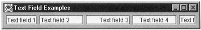 Listing 1-1 Configuring Text Fields package AdvancedSwing.Chapterl; import javax.swing.*; import javax.swing.text.*; import java.awt.*; public class TextFieldExample { public static void main(String[] args) { JFrame f = new JFrame("Text Field Examples"); f.getContentPane().setLayout(new FlowLayout()); f.getContentPane().add(new JTextField ("Text field 1")); f.getContentPane().add(new JTextField ("Text field 2", 8)); JTextField t = new JTextField("Text field 3", 8); t.setHorizontalAlignment(JTextField.RIGHT); f.getContentPane().add(t); t = new JTextField("Text field 4", 8); t.setHorizontalAlignment(JTextField.CENTER); f.getContentPane().add(t); f.getContentPane().add(new JTextField ("Text field 5", 3)); f.pack(); f.setVisible(true); } } To try this example, use the command: java AdvancedSwing.Chapter1.TextFieldExample Let's look at each of the text fields in turn, working from the left. The first field (with content "Text Field 1") is created using default alignment and size. As a result, it makes itself wide enough to hold its content and aligns the text on the left. Because the control is at the optimal size for its content, it is difficult to see that the text is left-aligned. The second field, however, has an explicitly specified column width of 8 and you can clearly see in this case that the text is aligned to the left. It may surprise you that the text field is actually larger than its content, given that it is supposed to be eight columns wide and that the text string it contains has 12 characters. The reason for this, of course, is that the width of the control is calculated as the width of eight letter m's in the text field's assigned font. In this case, the 12-character content happens to take up less room than eight m's in the same font. Core Note If you were to use a constant-width font, the number of columns would correspond to the number of characters that the text field could display.
The third and fourth text fields differ from the second only in their alignment: they are initialized with right- and center-alignment, respectively. The effect of the alignment is clearly visible in Figure 1-2. If you click in the first text field and then use the TAB key to get to the third field, you'll see that the insertion point is initially placed to the left of the text and that anything that you type moves automatically to the left as you type it. Move the focus to the fourth field using the TAB key and type a few more characters and you'll see that the text in this control always arranges to be centered in the visible area. The fifth text area is created with a column width of 3, which turns out to be too small to display its content. Nothing is actually lost however all the text is still in the control. Indeed, if you use the TAB key to get to this control, and then use the arrow keys on your keyboard to move the cursor to the right, you'll find that the text will scroll left as the cursor reaches the right side of the text field, bringing into view the text that was initially out of the visible area. This scrolling capability is provided automatically by JTextField. As you'll see, however, the other text controls do not scroll by default. Scroll Offset If you want, you can control the text fields scrolling capability from within your application using the following three methods: public int getScrollOffset(); public void setScrollOffset(int offset); public void scrollRectToVisible(Rectangle r); The getScrollOffset method returns the text field's current scroll offset, which is the number of pixels of the text string that are out of view to the left of the control's visible area. This value is, therefore, zero when a text field with left alignment is initially displayed. If you were to scroll the text to the left so that the first few characters went out of view, the scroll offset would increase by the number of pixels of the rendered string lost from view. The setScrollOffset method allows you to explicitly set a new scroll offset, which has the effect of changing the text positioning within the view. Setting the scroll offset to zero moves the left side of the text in a left-aligned control to the left of the control. As you might expect, setting a positive value causes some of the text to move out of view to the left. However, a negative scroll offset does not result in leading space between the left side of the control and the text that it contains instead, it is treated as zero. The scrollRectToVisible method is an alternative way to move the text within the viewing area. The only member of the Rectangle argument that this method uses is the x value, which is taken as a signed offset from the current scroll position. Thus, a positive value causes the scroll offset to increase, moving the text to the left, while a negative value causes the text to move to the right. Again, you can't use this method to set a negative scroll offset attempting to do so results in the scroll offset being set to zero. There are, therefore, two equivalent ways to ensure that the start of the text is visible in a text field: JTextField t = new JTextField("Text Field", 3); t.setScrollOffset(0); // Directly sets scroll offset to zero t.scrollRectToVisible(new Rectangle(-t.getScrollOffset(), 0, 0, 0)); The JTextArea Control JTextArea is a two-dimensional control that allows you to display more than one line of text. To this end, you can create a text area by initializing it with a string in which the separate lines are delimited by newline characters, so that each line of the string appears on a different line of the control. You can also explicitly specify the number of rows and columns that the JTextArea should occupy. As with JTextField, of course, specifying these values only influences the text area's preferred size and does not necessarily determine its actual width or height. Text Area Size, Scrolling, and Wrapping The actual size of a text area depends on the number of rows and columns that you specify either in the constructor or with the setRows and/or setColumns methods and on two other factors: The easiest way to see how these attributes interact is to look at an example. The code in Listing 1-2 creates six text areas containing the same four lines of text, but initialized in slightly different ways. If you run this example using the command: java AdvancedSwing.Chapter 1. TextAreaExample you get the result shown in Figure 1-3. Figure 1-3. JTextAreas with various scrolling and wrap settings.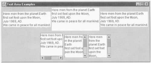 Let's first consider the text areas on the top row of Figure 1-3. All these areas contain the same text, which is four lines long because it has three embedded newline characters. The control at top left is created without specifying the number of rows and columns to be used and, as a result, the text area is as wide and as tall as it needs to be to exactly fit the text. The other two text areas on the top row are configured with six rows and ten columns and three rows and eight columns respectively. However, you can see that, despite the fact that they specify different column counts, they are the same width. Furthermore, the rightmost text area has four rows even though three were specified in the constructor. This demonstrates that a text area expands to occupy as much space as it needs, assuming that the layout manager allows it to, even if an attempt is made to constrain it by configuring specific row and column counts. Listing 1-2 Configuring Text Areas package AdvancedSwing.Chapter1; import javax.swing.*; import javax.swing.text.*; import java.awt.*; public class TextAreaExample { public static void main(String[] args) { JFrame f = new JFrame("Text Area Examples"); JPanel upperPanel = new JPanel(); JPanel lowerPanel = new JPanel(); f.getContentPane().add(upperPanel, "North"); f.getContentPane().add(lowerPanel, "South"); upperPanel.add(new JTextArea(content)); upperPanel.add(new JTextArea(content, 6, 10)); upperPanel.add(new JTextArea(content, 3, 8)); lowerPanel.add(new JScrollPane( new JTextArea(content, 6, 8))); JTextArea ta = new JTextArea(content, 6, 8); ta.setLineWrap(true); lowerPanel.add(new JScrollPane(ta)); ta = new JTextArea(content, 6, 8); ta.setLineWrap(true); ta.setWrapStyleWord(true); lowerPanel.add(new JScrollPane(ta)); f.pack(); f.setvisible(true); } static String content = "Here men from the planet Earth\n" + "first set foot upon the Moon,\n" + "July 1969, AD.\n" + "We came in peace for all mankind."; } The second row of Figure 1-3, however, shows that the situation is different when a text area is wrapped in a JScrollPane. The text areas in the bottom row are all created with six rows and eight columns and you can see that the visible area of the scroll pane is six rows high. The width of the visible area is, in fact, the same as eight letter m's in the font used by the text area, although it is difficult to see this because the font is not constant-width. When a text area is wrapped in a scroll pane, then the scroll pane's view port is sized to match the number of rows and columns specified for the text area itself, again assuming that the layout manager does not apply other constraints. Because we know that it is not possible to fit all the text into an eight-character-wide display area, it is clear that some of the lines will either be too wide and need to be scrolled into view, or they will need to wrap onto the following line. By default, the text area does not wrap text; the text area on the left of the bottom row is set up in this way and, as you can see, three lines of text overflow the display area to the right. As a result of this, the scroll panes horizontal scroll bar appears. However, because there are only four lines of text and the text area has six rows, there is no need for a vertical scroll bar. There are two JTextArea methods that control text wrapping and a complementary pair that allow you to retrieve the current settings: public void setLineWrap(boolean wrap); public boolean getLineWrap(); public void setWrapStyleWord(boolean word); public boolean getWrapStyleWord(); As noted earlier, by default, no wrapping is performed and getLineWrap returns false. If you invoke setLineWrap with argument true, the text area will fill each line of the scroll pane's visible area and wrap at its right boundary, splitting words without regard to word breaks therefore, words can be divided over line boundaries. This effect can be seen in the lower middle text area. When line wrapping is enabled, the text always ends at the right edge of the control so there is no need for a horizontal scroll bar, but a vertical scroll bar is required because the resulting text can no longer be displayed in six lines. The scroll pane works out for itself which scroll bars it needs to display based on the text area's preferred size and the size of its viewport. When line wrapping is enabled, you can also force breaks to occur at word boundaries by invoking the setWrapStyleWord method with argument true, as has been done with the rightmost text area. Here you can see that the text is not broken indiscriminately, giving a much better effect. Again, a vertical scroll bar is needed to allow all the text to be seen. Line and word wrapping can also be used when the text area is not enclosed in a scroll pane, but they only have any effect when the layout manager of the container surrounding the control does not allocate it the horizontal space that it needs to display its longest line of text. When this happens, the text is broken in the same way as shown in the preceding example and the vertical space requirement will increase to account for the overflow lines. Of course, if the layout manager also constrains the height of the text area, it may not be possible to display all the text, and some number of lines will be lost at the bottom of the control. JEditorPane and JTextPane JEditorPane and JTextPane are deluxe text components that have no AWT equivalents. These two controls can be used to render simple text in the same way as JTextArea, and can also be used to display more complex text with multiple fonts and colors. JEditorPane is, in effect, a window onto a pluggable document editor. It can be configured to display text held externally in arbitrary formats by connecting it to an editor kit that knows how to interpret a particular document encoding format and render the corresponding content on the screen. Swing comes with two complete editor kits that can be used to display documents encoded in HTML (Hypertext Markup Language) and RTF (Rich Text Format). Plugging an HTML editor kit into a JEditorPane, for example, turns it into a simple Web browser, with the capability of loading pages over the network and following hypertext links. You can also switch the JEditorPane into edit mode, in which case you can edit the HTML page content on the screen and then save the resulting document, which will result in the corresponding HTML being written out. In other words, you can use JEditorPane as a rough-and-ready HTML editor. This facility is also available for RTF documents. JTextPane is a subclass of JEditorPane that allows you to create your own documents with arbitrary combinations of font, color, and any other attribute you care to associate with text or with any other active content that you might embed in the document. Using JTextPane you can, for example, mix text with images or with Swing components that bring some active element to the document. The programming interfaces that allow you to do this are relatively straightforward, although the data model that underlies both JTextPane and JEditorPane is rather complex. You'll see some of the complexity of these components in the first few chapters of this book. Common Text Component Features All the text components are derived, directly or indirectly, from JTextComponent and inherit several common features from this class. This section provides an overview of the most important of these features. Editable and Enabled States By default, when you create a text component, the user will be able to change its content by typing or by selecting new text from the clipboard. Sometimes it is useful to create a read-only text component, or to be able to determine at runtime whether the control's content should be editable. For example, consider an application that provides an input form that allows a user to change field values and update the corresponding data source (such as a database). Usually, the form might use text controls with editing enabled. However, it might be necessary to display the same form in read-only mode, perhaps because the user does not have permission to change the underlying data, or simply as part of a separate "view" function that does not allow update. To make this possible, JTextComponent provides the following methods: Invoking setEditable(false) stops the user from typing into the component or selecting data into it from the clipboard (see "Selection and Data Transfer"). It is still possible, however, to select text from a read-only control and place it onto the clipboard. Figure 1-4 shows a selection of text components, some of which are read-only. You can run this example using the command: Figure 1-4. Editable and read-only text components.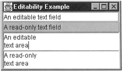 java AdvancedSwing.Chapter1.EditabilityExample The two components at the top of this figure are text fields. Of these, the first is editable, while the second has been made read-only. If you try to type into the second text field, you'll find that you can't. Notice that, in this case, the fact that this component is read-only is obvious to the user because its background color is different from that of the editable text field directly above it. This change in background color is carried out automatically by the text fields look-and-feel class. However, you can't rely on this visual cue while it works with the Metal look-and-feel, both the Windows and Motif text fields don't change color when they become read-only. By contrast, the text areas at the bottom of the figure look identical even in the Metal look-and-feel, but the bottom one is read-only while the one above it is not. As well as making a text component read-only by using setEditable (false), you can also enable or disable it using the following methods inherited from Component: A disabled text component acts as if it were read-only and changes its visual appearance to reflect the fact that it cannot be modified. The Metal implementation, for example, does this by shading the text, as shown in Figure 1-5. Figure 1-5. A disabled text field.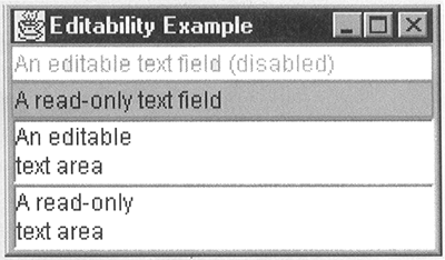 The example shown in Figure 1-5 can be run with the following command: java AdvancedSwing.Chapter 1.EditabilityExample disable When this example is running, the text field at the top is initially enabled, as it is in Figure 1-4. After 10 seconds, it will be disabled and the text content will change to indicate that this has happened. The text field is enabled again 10 seconds later, and so on. The distinction between a read-only text component and a disabled component is an important one. Usually, you choose to make a field read-only because the field that it represents should not be editable in the context of the form that it is part of, perhaps because the field is computed from other fields or should never be editable by the user for other reasons. By contrast, you would disable a text component to make it read-only for a short time. For example, you might choose to disable a text component after the user has filled in a form and pressed the OK button, to show that no further input is possible until the current operation is complete. When the operation finishes, you would enable the text components for further input. Whichever choice you make, any characters that the user attempts to type into the text field are ignored. Focus Accelerator Keys As an aid to keyboard navigation, JTextComponent allows an accelerator key to be associated with each text component. When this key is pressed at the same time as the ALT key, the text field will receive the keyboard input focus. This facility is useful when you are creating a form with many input fields that could be filled in any order or when you want the user to be able to jump immediately to any particular field without needing to use the mouse. Because a text component with a focus accelerator key has no way to indicate to the user that there is a focus accelerator or which key to use, it is common to use the accelerator key as the mnemonic key for a JLabel associated with the text component, as shown in Figure 1-6. Figure 1-6. Text components and focus accelerators. Here, each text field has an associated label, one letter of which is underlined to indicate that a focus accelerator for the corresponding text field is available. To see how this works, type the command: Java AdvancedSwing.Chapter1.TextAcceleratorExample When the form appears on the screen, press ALT+c, being sure that the "c" is lowercase. When you do this, you'll find that the cursor moves to the input field labeled City. Similarly, pressing ALT+h moves the input focus to the House/Street field, and so on. Core Alert Some versions of Swing have a bug that causes the accelerator key to appear in the text field. For example, if you use ALT+c to move the focus to the field labeled City followed by pressing ALT+h to move the focus elsewhere, the "h" will appear in the City field. This bug was fixed in Swing 1.1.1.
Creating a text field with an associated label is a three-step process, an example of which might look like this: JTextField t = new JTextField(35); t.setFocusAccelerator('c'); JLabel l = new JLabel("City:", SwingConstants.RIGHT); l.setDisplayedMnemonic('c'); The JTextComponent setFocusAccelerator method is used to define the accelerator key; you can also retrieve the current accelerator key using getFocusAccelerator, which returns "\0" if there is none. These methods are defined as follows: The key supplied to setFocusAccelerator may be either upper- or lowercase (assuming it is alphabetic); either way, the user must press the corresponding key together with ALT but without SHIFT, whether the programmer specifies "c" or "C" in the code. The following line ensures that a text component has no associated accelerator: t.setFocusAccelerator('\0'); // \0 clears any registered // accelerator The JLabel setDisplayedMnemonic method results in the supplied character being underlined when the label displays its text. It is your responsibility to arrange for the characters used as the accelerator for the text field and as the label mnemonic match. Selection and Data Transfer JTextComponent supports cut-and-paste operations via the system clipboard using the underlying AWT data transfer mechanism, a full description of which you'll find in Core Java 2, Volume 2: Advanced Features (Sun Microsystems Press/Prentice Hall). Let's look at how this works as seen by both the user and programmer. The User's View of Text Component Cut-and-Paste Operations From the user's point of view, copying, deleting, and pasting text from a Swing text field is the same as it would be in a native application. The first step is to create a selection, which is done by clicking where the selection is to begin and then dragging it left or right to the other end of the selection. As the mouse is dragged, the text that will be part of the selection is highlighted. Core Note The Swing text components implement selection using two pluggable subcomponents the Caret, which is responsible for drawing the cursor and keeping track of where the mouse is as it is dragged over the content of the text component, and the Highlighter which, as its name suggests, is responsible for highlighting the selected text. Both of these elements can be customized to produce different effects if desired. You'll see an example of a customized Caret later in this chapter and of a customized Highlighter in Chapter 3.
Having created the selection, the user can copy or delete it onto the clipboard using a gesture that is look-and-feel dependent. Text that has been copied to the clipboard can then be pasted into another text field using another look-and-feel dependent gesture. The key bindings for these operations in the Metal, Motif, and Microsoft Windows look-and-feels are shown in Table 1-1. Table 1-1. Text Component Key Bindings Cut and Paste | Operation | Java and Windows | Motif | | Copy | CTRL+c | CTRL+ INSERT | | Cut | CTRL+X | SHIFT+DELETE | | Paste | CTRL+v | SHIFT+INSERT | Note that data transfer doesn't operate simply within a single Java application, or even just between two Java applications. It is also possible to transfer data into and out of platform native applications. For example, start the text field example shown in Figure 1-5 using the command java AdvancedSwing.Chapter1.EditabilityExample disable and select some text from the bottom text area. With the selected text highlighted (as shown in Figure 1-7, in which the text "read-only" has been selected), copy it onto the clipboard using the correct key sequence for your active look-and-feel from Table 1-1. Figure 1-7. Selecting text onto the clipboard from a text component. With the text copied onto the clipboard, click somewhere in the editable text area so that the insertion cursor appears and then press the keys that perform a paste action (for example, CTRL+v). This will cause the text "read-only" to be inserted after the mouse insertion point. Now start a native text editor (for example, Notepad on Windows or vi under UNIX), open a new document, and paste the clipboard content into it. Again, you'll find that the text "read-only" is inserted. To complete this example, type some more text into the native editor, select it and copy it onto the clipboard, and then paste it into the editable text area of the Java application. By experimenting with the Java example and the native application, you should be able to verify that you can copy text from a text field whether or not it is editable. You can't copy data from a disabled text component and, of course, you can't cut data from a text component that is either read-only or disabled and the text that you attempted to delete will not even be copied to the clipboard. Similarly, you cannot paste data into a text component unless it is both editable and enabled. The Programmer's View JTextComponent provides an API for implementing delete, copy, and paste operations should you wish to do so. The methods you can use are as follows: public int getSelectionStart(); public int getSelectionEnd(); public void setSelectionStart(int start); public void setSelectionEnd(int end); public void select(int start, int end); public void selectAll(); public void setCaretPosition(int pos); public void moveCaretPosition(int pos); public void copy(); public void cut(); public void paste(); Assuming the user has made a selection, the first two methods return the start and end position of the selection as offsets from the start of the text in the text field, counting the first character as offset 0. If there is no selection, these methods return identical values that correspond to the location of the input cursor (or caret). You can create a selection programmatically by using setSelectionStart and setSelectionEnd to individually set the start and end offsets, or in a single call using select or selectAll, the latter of which selects everything in the text component. These four methods are provided for compatibility with the AWT text components. New code should instead use setCaretPosition to mark the start of the selection and moveCaretPosition to indicate the end. This pair of calls creates a selection consisting of the range of characters between offset given to setCaretPosition and the one passed to moveCaretPosition. Note that however you create a selection, the end offset must be equal to or greater than the start offset. The job of moving data to or from the clipboard is done by the copy, cut, and paste methods. These convenience functions extract the selected text and move it to the clipboard or copy data in from the clipboard by using the AWT data transfer facility, which is discussed further in Chapter 8. In the case of a paste operation, the data overwrites whatever is currently selected in the text component, or is inserted straight after the caret position if there is no selection. You can position the caret before the paste operation occurs by using the setCaretPosition method (which creates an empty selection at the offset specified), or select the text to be overwritten with the content of the clipboard by using setCaretPosition followed by moveCaretPosition. Text Components, Text Wrapping, and Scrolling As you saw earlier, unless you are dealing with a JTextField or a JPasswordField, you usually need to place text components inside a JScrollPane to ensure that all their content will be accessible to the user. You also saw, in Listing 1-2, that JTextArea has methods that allow you to control whether text that is too long to be displayed in the space allocated to it should wrap to the next line or should continue past the end of the visible area, necessitating the use of a horizontal scroll bar. Those methods are, however, specific to JTextArea. In this section, you'll see how the more complex JEditorPane and JTextPane controls handle scrolling and word wrapping. Controlling Line and Word Wrapping As you've already seen in this chapter, JTextArea does not wrap text by default, but has additional methods that allow you to change this behavior if you want, whereas JTextField, for which line wrapping makes no sense, incorporates its own scrolling mechanism that allows text that does not fit in the component's visible area to be brought into view by moving the cursor. The other standard text components, JEditorPane and JTextPane, always wrap text. However, you can suppress word wrapping for these two components if you want. When a component is mounted in a JScrollPane, it can elect to be treated in one of two ways: If you want to avoid line wrapping because you want to force each line of text to occupy one line on the screen, you need to make your text component retain its preferred width so that if the text is wider than the viewport, it is formatted on one line and a horizontal scroll bar is created. The key to this is the Scrollable interface, which contains the following method (among others): public boolean getScrollableTracksViewportWidth(); When the component mounted in its viewport implements the Scrollable interface, the JScrollPane calls the components implementation of this method when determining how to set the component's horizontal size. If this method returns true, the component's horizontal size will be made to match that of the viewport. If it returns false, the component will be given its preferred horizontal size. There is a similar method that independently controls the component's height. JTextComponent's implementation of getScrollableTracksViewportwidth returns true if the preferred width of the text component is smaller than the width of the JScrollPane's viewport and false otherwise. This means that the text component will be stretched to match the width of the visible area if it would otherwise be too narrow to fit. On the other hand, if the text component requires more horizontal space than is available, it is not reduced in size to fit the viewport. Either way, the text in the control would not wrap with this policy. JTextArea has a slightly different implementation that behaves in the same way as JTextComponent unless line wrapping is enabled, in which case it returns true, so that the components width will be forced to match the width of the viewport when wrapping is required. JEditorPane, which is also derived from JTextComponent, has a slightly more complex implementation that returns true most of the time, except when the viewport size is smaller than the minimum width or larger than the maximum of its content, when it returns false to maintain the minimum or maximum size. JTextPane, a subclass of JEditorPane, always returns true from getScrollableTracksViewportWidth. In other words, both JTextPane and JEditorPane will wrap text. To change the wrapping behavior of, say JTextPane, you need to subclass it and override its getScrollableTracksViewportwidth method to return false when appropriate. The simplest solution would be to always return false from this method and this would work, in the sense that the text would never wrap. However, this approach has a flaw. What would happen if the viewport were wider than the space required by the longest line of text? In this case, because the JTextPane would only be as wide as its longest line of text requires, the extra space to its right would be unoccupied the background of the viewport would show through. In the Metal look-and-feel with default colors installed, this results in the viewport containing a JTextPane with a white background on the left and a gray empty space to the right, followed by the vertical scroll bar if one is necessary. A better solution is shown in Listing 1-3. Listing 1-3 A Text Pane Without Line Wrapping package AdvancedSwing.Chapter1; import javax.swing.*; import javax.swing.text.*; import javax.swing.plaf.*; import java.awt.*; public class NonWrappingTextPane extends JTextPane { public NonWrappingTextPane() { super(); } public NonWrappingTextPane(StyledDocument doc) { super(doc); } // Override getScrollableTracksViewportWidth // to preserve the full width of the text public boolean getScrollableTracksViewportWidth() { Component parent = getParent(); ComponentUI ui = getUI(); return parent != null ? (ui.getPreferredSize(this).width <= parent.getSize().width): true; } // Test method public static void main(String[] args) { String content = "The plaque on the Apollo 11 Lunar Module\n" + "\"Eagle\" reads:\n\n" + "\"Here men from the planet Earth first\n" + "set foot upon the Moon, July, 1969 AD\n" + "We came in peace for all mankind.\"\n\n" + "It is signed by the astronauts and the\n" + "President of the United States."; JFrame f = new JFrame("Non-wrapping Text Pane Example"); JTextPane tp = new JTextPane(); tp.setText(content); NonWrappingTextPane nwtp = new NonWrappingTextPane(); nwtp.setText(content); f.getContentPane().setLayout (new GridLayout(2, 1)); f.getContentPane().add(new JScrollPane(tp)); f.getContentPane().add(new JScrollPane(nwtp)); f.setSize(300, 200); f.setVisible(true); } } In this example, the NonWrappingTextPane is a subclass of JTextPane in which the getScrollableTracksViewportwidth method has been overridden to produce the desired effect. If you type the command java AdvancedSwing.Chapter1.NonWrappingTextPane you'll see a frame with two panes containing the same text mounted one above the other, as shown in Figure 1-8. Figure 1-8. Text panes with and without line wrap.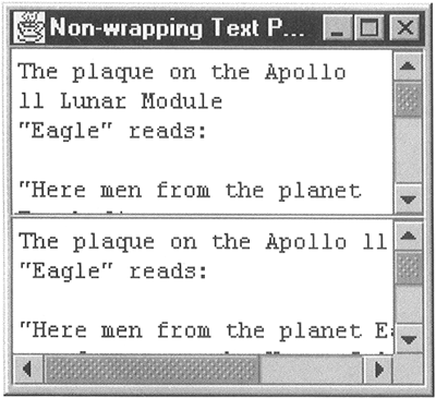 The pane at the top is a standard JTextPane. If you adjust the width of the frame so that it is too narrow to show all the text, you'll find that the text in the top pane wraps as necessary. No horizontal scroll bar will appear, but the number of lines of text will grow, as evidenced by the vertical scroll bar. By contrast, the text in the lower control doesn't wrap instead, a horizontal scroll bar appears when you make the viewport too small. If you make the frame wider than the longest line of text, you'll see that both text panes grow to fill the horizontal space available. In particular, the lower text pane does not suffer from the flaw described earlier. To make this work, the getScrollableTracksViewportWidth method is implemented as follows: When the viewport width is smaller than the desired width of the text pane, return false. This makes the JScrollPane size the text pane at its full width, avoiding the wrapping and resulting in a horizontal scroll bar. When the viewport is wider than the text, return true. Now, the text pane will be stretched horizontally to occupy all the space in the viewport. You can see the details in Listing 1-3. When the text pane is mounted in a JScrollPane, its parent is the viewport itself and the width of that component is the width of the viewport as it appears on the screen. The point to note here is how the text pane's preferred size is determined. The most obvious way to get this would be to call getPreferredsize and extract the width from the returned Dimension object. However, this would result in a stack overflow, because getPreferredSize for JTextPane is inherited from JEditorPane. However, the JEditorPane implementation of this method calls getScrollableTracksViewportwidth, which we are reimplementing here by calling getPreferredSize! Instead, our getScrollableTracksViewportwidth method needs the real preferred size of the text component, without taking into account whether it is mounted in a JScrollPane. This information is available from the getPreferredSize method of the text pane's user interface (UI) component, which can be obtained by calling the getUI method of JComponent. Program-Controlled Scrolling of Text Components Another common requirement of text components mounted in scroll panes is to programmatically scroll to a known location. For example, you might want to scroll the text component when conducting a text search to highlight an instance of the search string that is not currently visible. You can provide this behavior by using the JComponent scrollRectTovisible method, which works equally well for text components. The only problem is working out where the text that you want to scroll to is located within the scroll pane's viewport. Listing 1-4 shows a subclass of JTextPane (AppendingTextPane) that has a new method called appendText. This method takes a String as its only argument and adds it to the end of the text pane's current content. Then, it arranges for the scroll pane that the text pane is mounted in to scroll so that the new text is visible. This feature is useful for implementing a debugging console, where it is useful to be able to keep track of output as it appears, without having to continually click the scroll bar to bring it into view. Listing 1-4 A Text Pane with Automatic Scrolling package AdvancedSwing.Chapter1; import javax.swing.*; import javax.swing.text.*; import java.awt.*; import java.awt.event.*; import java.text.*; import java.util.*; public class AppendingTextPane extends JTextPane { public AppendingTextPane() { super(); } public AppendingTextPane(StyledDocument doc) { super(doc); } // Appends text to the document and ensure that // it is visible public void appendText(String text) { try { Document doc = getDocument(); // Move the insertion point to the end setCaretPosition(doc.getLength()); // Insert the text replaceSelection(text); // Convert the new end location // to view co-ordinates Rectangle r = modelToView(doc.getLength()); // Finally, scroll so that the new text is visible if (r != null) { scrollRectToVisible(r); } } catch (BadLocationException e) { System.out.println("Failed to append text: " + e) ; } } // Testing method public static void main(String[] args) { JFrame f = new JFrame("Text Pane with Scrolling Append"); final AppendingTextPane atp = new AppendingTextPane(); f.getContentPane().add(new JScrollPane(atp)); f.setSize(200, 200); f.setVisible(true); // Add some text every second Timer t = new Timer(1000, new ActionListener() { public void actionPerformed(ActionEvent evt) { String timeString = fmt. format (new Date()); atp.appendText(timeString + "\n"); } SimpleDateFormat fmt = new SimpleDateFormat("HH:mm:ss"); }); t.start(); } } You can try out this new text component by typing the command: java AdvancedSwing.Chapterl.AppendingTextPane This program creates an empty text pane and starts a timer. Every second, a String containing the current time is appended to the text pane. If you let this example run for a few seconds, the text pane will fill up. However, the latest time will always be displayed because the text pane scrolls automatically to bring it into view, as shown in Figure 1-9. Figure 1-9. Automatic scrolling of text components.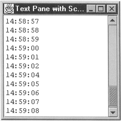 The appendText method contains the code that arranges for the scrolling. The first problem is to actually append the text to the existing content. This is done by using the replaceSelection method, which replaces whatever is currently selected by the String passed as its argument. Immediately before this method is called, setCaretPosition is called to place the insertion point at the end of the current content. As noted earlier, calling setcaretPosition (without a subsequently call of moveCaretPosition) creates an empty selection, so the following replaceSelection is effectively an insertion at the end of the text pane. To scroll the new text into view, scrollRectToVisible is called. This method needs a Rectangle that describes the section of the viewport that should be made visible. At this stage, all we have is the offset within the text pane at which the new text was inserted, which was obtained from the getLength method of the Document underlying the text pane. Fortunately, JTextComponent has a method called modelToView that takes a model offset and returns a Rectangle describing the location of that offset within the document view. This Rectangle can be passed directly to scrollRectTovisible to obtain the desired effect. Note that we first check that the Rectangle returned by modelToView is not null: This is necessary because this method returns null if the text component has not yet been painted. | 