SMALL INTERFACE PIECES, LOOSELY JOINED
| As an interface designer trying to make sense of all the technology changes in the last few years, I see two big effects on the craft of interface design. One is the proliferation of interface idioms: recognizable types or styles of interfaces, each with its own vocabulary of objects, actions, and visuals. You probably recognize all the ones shown in the figure on the next page, and more are being invented all the time. Figure I-1. A sampler of interface idioms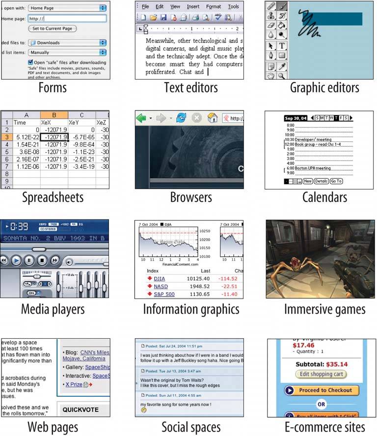 The second effect is a loosening of the rules for putting together interfaces from these idioms. It no longer surprises anyone to see several of these idioms mixed up in one interface, for instance, or to see parts of some controls mixed up with parts of other controls. Online help pages, which have long been formatted in hypertext anyway, might now have interactive applets in them, animations, or links to a web-based bulletin board. Interfaces themselves might have help texts on them, interleaved with forms or editors; this used to be rare. Combo boxes' dropdown menus might have funky layouts, like color grids or sliders, instead of the standard column of text items. You might see web applications that look like document-centered paint programs, but have no menu bars, and save the finished work only to a database somewhere. The freeform-ness of web pages seems to have taught users to relax their expectations with respect to graphics and interactivity. It's okay now to break the old Windows styleguide strictures, as long as users can figure out what you're doing. And that's the hard part. Some applications, devices, and web applications are easy to use. Many aren't. Following style guides never guaranteed usability anyhow, but now designers have even more choices than before (which, paradoxically, can make design a lot harder). What characterizes interfaces that are easy to use? One could say, "The applications that are easy to use are designed to be intuitive." Well, yes. That's almost a tautology. Except that the word "intuitive" is a little bit deceptive. Jef Raskin once pointed out that when we say "intuitive" in the context of software, we really mean "familiar." Computer mice aren't intuitive to someone who's never seen one (though a growling grizzly bear would be). There's nothing innate or instinctive in the human brain to account for it. But once you've taken 10 seconds to learn to use a mouse, it's familiar, and you'll never forget it. Same for blue underlined text, play/pause buttons, and so on. Rephrased: "The applications that are easy to use are designed to be familiar." Now we're getting somewhere. "Familiar" doesn't necessarily mean that everything about a given application is identical to some genre-defining product (e.g., Word, Photoshop, Mac OS, or a Walkman). People are smarter than that. As long as the parts are recognizable enough, and the relationships among the parts are clear, then people can apply their previous knowledge to a novel interface and figure it out. That's where patterns come in. This book catalogs many of those familiar parts, in ways you can reuse in many different contexts. Patterns capture a common structureusually a very "local" one, like funky layouts on a combo boxwithout being too concrete on the details, which gives you flexibility to be creative. If you know what users expect of your application, and if you choose carefully from your toolbox of idioms (large-scale), controls (small-scale), and patterns (covering the range), then you can put together something which "feels familiar" while remaining original. And that gets you the best of both worlds. |
EAN: 2147483647
Pages: 75