| Forms are an easy way for you to get information back from site visitors. However, many Web developers think that it's enough just to throw a few form fields into a table, and let them fall where they may in the Web page. They then expect the visitor to be willing to sift through this mess of roughly aligned text and 3D-beveled boxes to figure out what information is needed. However, with only a little extra effort you can control the appearance of forms (text fields, select boxes, buttons, labels, etc.) using CSS, as well as greatly enhance their functionality with interactive styles, all without ever having to break out HTML tables. In this example, I took a standard form for collecting personal information (Figure 21.10) and cleaned it up, making it easier to use (Figure 21.11). Figure 21.10. Would you want to fill out this form? 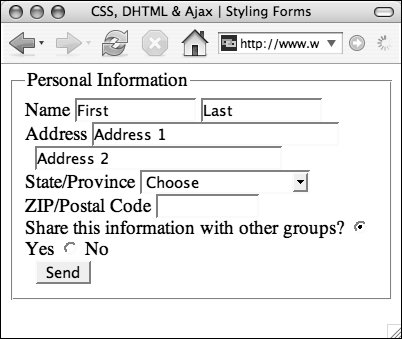
Figure 21.11. CSS can be used to completely change the appearance of form elements from their standard look. But beware: Some users may get confused if you stray too far from the norm. 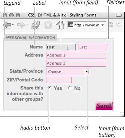
To style form elements: | | 1. | fieldset {…}
The fieldset is an optional border around a form that can be used in conjunction with a form legend to set the form or parts of the form off from the rest of the page (Code 21.9). With CSS, you can define the border and background that will go behind the form, as well as the general foreground colors and fonts to be used for the form text.
Code 21.9. Add styles directly to form tags, or use classes for the input tag (which can take many forms). | | | 2. | legend {…}
The legend is a label for the form that, by default, sits over the top-left corner of the border of the fieldset. The legend is a great way to add a description of the form that will stand out.
| 3. | label {…}
The <label> tag is designed for use with form fields to identify which label goes with which form element. The advantage of the label tag is that you can directly associate a particular label with a particular form field element so that clicking the label is the same as clicking the form element itself. For example, when a label is associated with a checkbox field, you can click the associated label and the checkbox toggles states.
We need to style labels as block elements with a specific width and float them to the left. The width of the label will then cause the form fields associated with them to align flush on the right side, creating a very neat appearance that is easy to readand with no tables in sight.
| 4. | label.fieldLabel {…}
Add a class, associated with the label element, called something like label.fieldLabel. This will be used to override the general label style when we need a label that sits directly next to the form element with which it is associated (such as radio buttons).
| | | 5. | input.formInputText {…}
The default appearance of text input fields is determined by the operating system, but generally they have a clunky 3D-beveled border that can be very unattractive. However, you can control the border, background, foreground color, and font for input fields. Generally, you will still want these to appear as boxes that contrast other content on the page. One thing to keep in mind, though, is that some browsers (most notably Apple Safari) do not allow you to change the border of form elements.
| 6. | input.formInputText:hover {…}
In addition to the default static state for the text field, add :hover and :focus pseudo-classes for the formInputField class. This will trigger a change of styles whenever the visitor's mouse curses over or tabs into a text field. In our example, the box turns blue.
| 7. | select.formSelect {…}
This code is used to add styles to drop-down or multiselect form elements. Although I have set the border for this class, many browsers will ignore this or place it only around the existing border.
Again, we can add both :hover and :focus pseudo-classes to the selected element to increase its interaction with the user.
| 8. | input.formInputButton {…}
Add a formInputButton class and :hover state so that you can set a style for what happens when the visitor hovers over the button.
In this example, I simply created a new background graphic by removing the gloss in the existing graphic, so it looks as if the button is pressed. You can then also set an :active state for the button so that the button reverts back to its normal state before the form is sent.
| | | 9. | <form action="#" method="get" name="myForm"> …</form>
Once you have set up your CSS rules, it's time to set up your form. Don't worry about making it look pretty in the HTML code (that's what CSS is for), but do use the for attribute with labels to associate them with a form field.
| 10. | function clearField(obj) {…}
I'm also using a simple JavaScript function that erases any initial value in the form field when the user clicks in it. This allows me to pre-populate input fields with additional instructions or sample text that disappears when the form field receives focus.
|
 Tips Tips
In theory, you could create styles based on element attribute values (see "Defining Selectors Based on Tag Attributes" in Chapter 2) to style the different versions of the <input> element, rather than using classes. But because this method works inconsistently across browsers, it cannot be relied upon to produce consistent results. The Mac OS X browsers, Safari and Camino, will only apply font style changes made to input, textarea, or select form elements. All other styles, including background and border changes, are ignored. Notice that in the example code I also included a version of the input form button using :hover. This will actually change the appearance of the form button when the user rolls over it. Unfortunately the rollover trick won't work in Internet Explorer for Windows, which only supports :hover with hypertext links. Although styles will affect radio buttons and checkboxes, the result is generally not what the designer intended. Most browsers will simply apply the styles to the rectangular box around the button or box, leaving the central element unchanged. Generally, these types of input fields are best left alone. There are actually several kinds of input elements that can be created with the <input> tag, each defined by a different type of attribute, and each with its own idiosyncrasies. It's generally not a good idea to set a universal style for the <input> tag, since these styles are applied to all the various kinds of inputs, including text, checkboxes, and radio buttons. Instead, create a class for each input type and apply the class directly to the input tags as needed.
|
 xhtml1-strict.dtd"> <html xmlns="http://www.w3.org/1999/xhtml"> <head> <meta http-equiv="Content-Type" content="text/html; charset=utf-8" /> <title>CSS, DHTML & Ajax | Styling Forms</title> <script type="text/javascript"> function clearField(obj) { if (obj.defaultValue==obj.value) obj.value = ''; } </script> <style type="text/css"> fieldset { font: 0.8em "Helvetica Neue", helvetica, arial, sans-serif; color: #666; background-color: #efefef; padding: 2px; border: solid 1px #d3d3d3; width: 350px; } legend { color: #666; font-weight: bold; font-variant: small-caps; background-color: #d3d3d3; padding: 2px 6px; margin-bottom: 8px; } label { font-weight: bold; line-height: normal; text-align: right; margin-right: 10px; position: relative; display: block; float: left; width: 125px; } label.fieldLabel{ display: inline; float: none; } input.formInputText { font-size: .8em; color: #666; background-color:#fee; padding: 2px; border: solid 1px #f66; margin-right: 5px; margin-bottom: 5px; height: 15px; } input.formInputText:hover { background-color: #ccffff; border: solid 1px #006600; color: #000; } input.formInputText:focus { color: #000; background-color: #ffffff; border: solid 1px #006600; } select.formSelect { font-size: .8em; color: #666; background-color: #fee; padding: 2px; border: solid 1px #f66; margin-right: 5px; margin-bottom: 5px; cursor: pointer; } select.formSelect:hover { color: #333; background-color: #ccffff; border: solid 1px #006600; } select.formSelect:focus { color: #000; background-color: #ffffff; border: solid 1px #006600; } input.formInputButton { font-size: 1.2em; vertical-align: middle; font-weight: bolder; text-align: center; color: #300; background: #f99 url(bg_button.png) repeat-x; padding: 1px; border: solid 1px #f66; cursor: pointer; float: right; } input.formInputButton:hover { background-image: url(bg_button_hover.png); } input.formInputButton:active { background-image: url(bg_button.png); } </style> </head> <body> <form action="#" method="get" > <fieldset> <legend>Personal Information</legend> <label for="firstName">Name</label> <input type="text" name="firstName"