| The ViewStack class has no built-in mechanism to control which child container is displayed or made active. A number of tools are supplied by Flex to control thisone of them is the TabNavigator. This class, which extends the ViewStack, builds tabs for each child container and uses the label property of the container to determine what should be displayed on each tab. When you click a tab, the content in the corresponding container will be displayed or made active. You simply replace the <mx:ViewStack> tags with <mx:TabNavigator> tags to use this navigator container, as shown here: <mx:TabNavigator height="200" width="450"> <mx:HBox label="Child 0"> <mx:Label text="Zeroth child label 1" fontSize="20"/> <mx:Label text="Zeroth child label 2" fontSize="20"/> </mx:HBox> <mx:VBox label="Child 1"> <mx:Label text="First child label 1" fontSize="20"/> <mx:Label text="First child label 2" fontSize="20"/> </mx:VBox> <mx:HBox label="Child 2"> <mx:Label text="Second child label 1" fontSize="20"/> <mx:Label text="Second child label 2" fontSize="20"/> </mx:HBox> </mx:TabNavigator>
This code generates the following when run (with the last tab clicked): 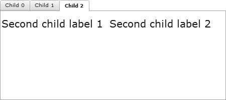
You will now use a TabNavigator component to place the two pieces of functionality in the data-entry application, updating/deleting products and adding products, onto different tabs. 1. | Open DataEntry.mxml.
In this file you instantiate two custom components: one to update/delete products and one to add products. Remember that UpdateDeleteProd.mxml subclasses the HBox class, and that AddProduct.mxml subclasses the VBox class. This is important because to use the TabNavigator with these custom components, they must be containers.
| 2. | Locate the instantiation of the two custom components near the bottom of the file.
<v:UpdateDeleteProd units="{units}" foodColl="{foodColl}" productUpdate="showPopUp(event.product,'Product Updated')" productDelete="showPopUp(event.product,'Product Deleted')"/> <v:AddProduct cats="{categories}" units="{units}" productAdded="showPopUp(event.product,'Product Added')"/>
The two implementations of functionality currently appear on the same page.
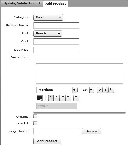
| | | 3. | Surround both component instantiations with a <mx:TabNavigator> tag set. Set the width to 700 and the height to 600.
<mx:TabNavigator width="700" height="600"> <v:UpdateDeleteProd units="{units}" foodColl="{foodColl}" productUpdate="showPopUp(event.product,'Product Updated')" productDelete="showPopUp(event.product,'Product Deleted')"/> <v:AddProduct cats="{categories}" units="{units}" productAdded="showPopUp(event.product,'Product Added')"/> </mx:TabNavigator>
| 4. | Run DataEntry.mxml.
You now see two tabs of the TabNavigator appear; you can click each tab to see the application functionality separated. Also note that because no label properties are set on the custom components, the tabs have no text on them.
| 5. | Add a label property to the UpdateDeleteProd custom component with a value of Update/Delete Product. Add a label property to the AddProd custom component with a value of Add Product. Run the DataEntry.mxml application again; the label text is now displayed on the tabs.
|
|