Recipe 6.15. Designing a Dynamic Visual Menu
ProblemYou want to build a curved tab navigation menu that works even when text is resized; Figure 6-26 shows the default. Figure 6-26. The dynamic folder tab navigation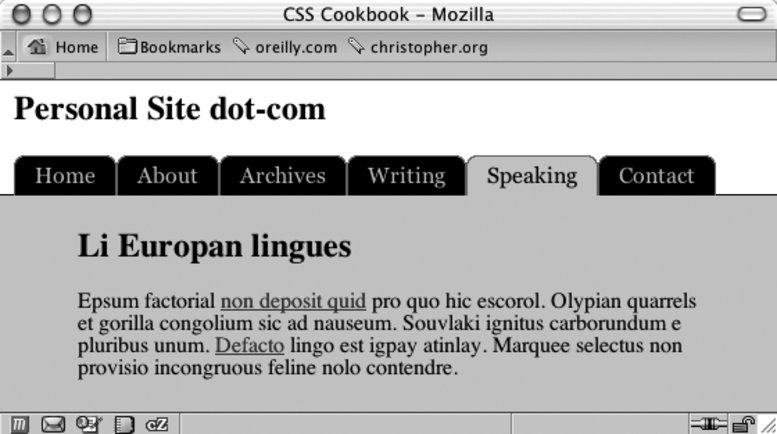 SolutionFirst write the markup for the navigation menu: <div > <h2>Personal Site dot-com</h2> <h5>Site navigation:</h5> <ul> <li><a href="/">Home</a></li> <li><a href="/about/">About</a></li> <li><a href="/archives/">Archives</a></li> <li><a href="/writing/">Writing</a></li> <li ><a href="/speaking/">Speaking</a></li> <li><a href="/contact/">Contact</a></li> </ul> </div> Then create two folder tab images: one tab for anchor links and another tab to represent the current page viewed by the user. Split the folder tab image into two images (see Figure 6-27). Figure 6-27. The folder tab image split in two; note the curves in the upper corners of the images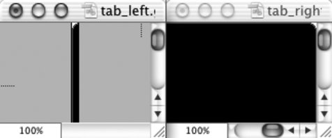 Then place the right side of the folder tab in the background of the list item: #header li { float: left; background-image: url(tab_right.gif); background-repeat: no-repeat; background-position: right top; margin:0; padding: 0; }Place the left side of the folder tab in the background of the anchor element: #header a { display: block; background-image: url(tab_left.gif); background-repeat: no-repeat; background-position: left top; padding: 5px 15px; color: #ccc; text-decoration: none; font-family: Georgia, Times, "Times New Roman", serif; }Assign a custom folder tab to represent the current web document being viewed: #header #current { background-image:url(tab_right_current.gif); } #header #current a { background-image:url(tab_left_current.gif); color: black; }Place the image with a line measuring one-pixel high at the bottom of the grouping. DiscussionKeeping the text in the navigation links aids in three areas of web development:
For example, users with poor eyesight can adjust the size of the text and that tabs without breaking the design (see Figure 6-28). Figure 6-28. The text resized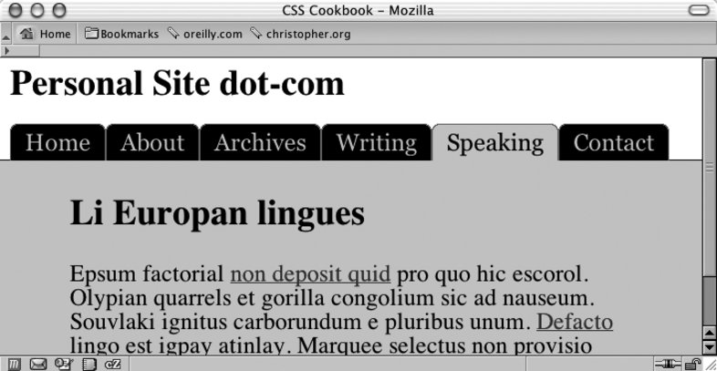 Because users can resize the text to very large settings, the background images that comprise the folder tabs need to be large as well; otherwise, the folder tabs will break (check out Figure 6-29). In this solution, the folder tab images have a width of 450 pixels. Figure 6-29. Note the breaking of the tab in the Archives link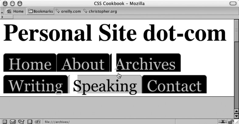 Web developers prefer this method because it lets them easily maintain the list of links. To change a navigation label or correct a typo, developers can simply edit the HTML text without having to return to a digital imaging program to create folder tab images. Another benefit of this method is that the folder tabs can be designed in a more aesthetically pleasing way. Recipe 6.8 demonstrates how to create a navigation setup with folder tabs using the border property. This look creates a boxy or squared edge to the folder tabs. With this current recipe, however, web developers can curve the tabs and introduce color blending for improved aesthetics. See AlsoRecipe 2.16 that uses a similar rubber-band technique to create pull quotes with images; "Sliding Doors of CSS, Part II" at http://www.alistapart.com/articles/slidingdoors2/, which expands on this folder tab navigation concept. |
EAN: 2147483647
Pages: 235