Status Summary
| < Day Day Up > |
| The Status Summary screen is a very common view used when you want to get a quick high-level assessment of the health of your agent architecture. As shown in Figure 8-2, the Status Summary page presents a great amount of information, which is viewable in a single compact screen. This page is divided into three sections:
Figure 8-2. Status Summary Screen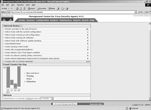 NOTE Events are only added to the event log if the rule that triggered on the remote host was set to log. There could be far more actions occurring on the remote agents than seen at the CSA MC if many of the events have logging disabled. Network StatusThe Network Status section is minimized, by default, to display only a few of the important rows. By clicking the plus sign (+), you can expand the section to list several other rows. All numbers are clickable links to either events or hosts that are filtered to show only the information pertaining to the description. The full list of information displayed on this screen is as follows:
Event Counts per DayThe Event Counts per Day portion of the Status Summary screen shows you a graphical representation of the number and type of events your architecture has had over the past few days. With this view, you can see whether your daily event count is spiking and in need of further investigation. You can also see within this representation the relationship between the event severities. The first piece you need to understand when interpreting graphical data is the legend. The legend is to the right of the daily bars in the bar chart. The four colors used are mapped to event severity as follows:
When interpreting the graphical view, you also need to understand the axis labels. The x-axis across the bottom of the graphic represents days. Each bar represents a 24-hour period starting and ending at midnight on the date listed below the bar. The month is also listed just below the days. These dates are clickable links that take you to a filtered view of the event log containing only those particular days events. The y-axis has only one number listed at the top of the axis. This number is the maximum number of events received on any of the displayed days. The number is listed here to give you an understanding of the scale related to the bar charts. If the y-axis is labeled at 15,000 events and you have 2 days represented where 1 of the days is half the size of the other day, you might want to look at the events much closer to understand why you had 7,500 more events on that day. However, if the number listed as the scale is 30, you might not be as worried because the difference between the 2 days is only 15 events. NOTE Placing your cursor over the date below the bar chart without clicking causes a small text message to pop up displaying the number of events on that particular day, which might not easily be discernable from the chart itself. The final piece of the graphic to understand is the information related to the bars themselves. The entire bar for a given day displays the number of events logged over that particular 24-hour period in relation to the other days displayed and the day displayed with the most events logged. Within a particular bar, the types of events are colored as per the legend and stacked to form the bar with the lower-severity events at the bottom and the higher-severity events at the top of the bar. This view enables you to get quick security health-check information about the deployment. Another great feature of this graphical view is that the bars themselves are also clickable links that redirect you to a filtered view of only the events from that day matching that particular severity group. This function can make your administration of the product more efficient by saving you the time it would normally take to create the filter necessary to view this information. For example, Figure 8-4 shows a filtered view of a single day in the event log as would display after clicking the link associated with the date below any particular bar in the summary window. Figure 8-4. Single Day Filtered View of the Event Log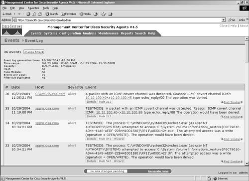 RefreshThe Refresh portion of the Status Summary screen is located at the bottom of the page. From here, you can set the automatic refresh rate of the Status Summary screen. By default, it is set to refresh the information every minute. You can view the countdown to when the next refresh will occur, refresh immediately by clicking the Refresh link, or change the refresh interval to 30 seconds, 1 minute, or 5 minutes. The auto-refresh of this screen makes the data available close to real-time values, and therefore this has become a popular screen displayed around the clock in many NOCs and SOCs. |
| < Day Day Up > |