WPF in the IDE
The Visual Studio IDE includes editors for manipulating WPF Window classes and controls. Although many of the details are different, the basic operation of the IDE is the same whether you are building a Windows Forms application or a WPF application.
The following section explains how to get started using WPF. The section after that one provides more detail about how to use the IDE to build WPF applications.
Getting Started
To use WPF, you must install the latest Windows Software Development Kit (SDK). Go to the Microsoft Download Center (www.microsoft.com/downloads) and search for the Windows SDK. Currently the most recent version is the Microsoft Windows SDK for Windows Vista at www.microsoft.com/downloads/details.aspx?FamilyID=. This version can be as large as roughly 1GB, so you may have trouble downloading it unless you have a fast Inter.NET connection.
The Windows SDK adds a new .NET Framework 3.0 entry to the project types listed by the New Project dialog box shown in Figure 26-2. Select the .NET Framework 3.0 project type and pick Windows Application (WPF) to start a new WPF application. Enter a descriptive project name and click OK as usual.
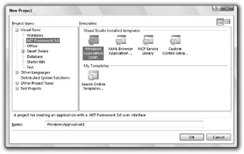
Figure 26-2: The Windows SDK adds .NET Framework 3.0 projects to the New Project dialog box.
Editing XAML
Figure 26-3 shows the IDE displaying a new WPF project. Most of the areas should look familiar from Windows Forms development. The Toolbox on the left contains tools that you can place on the window in the middle area. Solution Explorer on the right shows the files used by the application. The Properties window shows property values for the currently selected control in the middle. The selected object in Figure 26-3 is the main Window, so the top of the Properties window shows its type: System.Windows .Window.
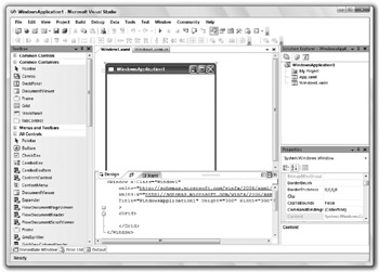
Figure 26-3: The IDE looks almost the same for Windows Forms and WPF applications.
One large difference between the IDE’s appearance when building a WPF application versus a Windows Forms application is the central editor. In a Windows Forms application, you edit a form with the Windows Form Designer. In a WPF application, you use the graphical XAML editor shown in Figure 26-3 to edit a Window object’s XAML code. The upper half of this area shows a graphical editor where you can drag controls from the Toolbox much as you design a Windows Form. The lower part of the editor shows the resulting XAML code.
If you look closely at Figure 26-3, you can see the Window element that includes the rest of the file. When you first build an application, the Window object’s element contains a single Grid control.
Usually, it is easiest to build WPF Window objects by using the graphical editor and the Toolbox. When you select a control in the graphical editor, you can view and modify many of its properties in the Properties window. Unfortunately, the Properties window does not give you access to all of the controls’ features. Some properties are read-only in the Properties window. Others are editable, but do not provide custom editors.
| Tip | Microsoft will probably fix at least some of these problems before the final release, or in a Service Pack shortly thereafter. It’s also possible that Microsoft intends some of these features may only be available in the Expression Design product. |
For example, a control’s Background property determines how the control draws its background. In the Properties window, you can set this to a single color’s name, such as Red or a numeric color value such as #FF0000FF (blue). However, this property can also be set to the brush the control should use to draw its background. For example, the brush can be a LinearGradientBrush, RadialGradientBrush, or PathGradientBrush object. You can set these kinds of values in the XAML code, or by using Visual Basic code, but the Properties window does not provide an editor that can do this, at least in the current beta release.
Figure 26-4 shows a Window containing a Grid that has a linear gradient background. Notice that the Background property in the Properties window is blank. The XAML code in the bottom center defines the Grid control’s background.
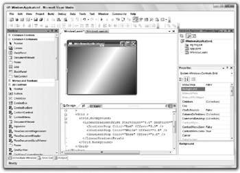
Figure 26-4: XAML code can make a gradient background while the Properties window cannot.
The following code shows the XAML that gives the grid its background:
<Window x: xmlns="http://schemas.microsoft.com/winfx/2006/xaml/presentation" xmlns:x="http://schemas.microsoft.com/winfx/2006/xaml" Title="WindowsApplication1" Height="235" Width="300" > <Grid > <Grid.Background> <LinearGradientBrush StartPoint="0,0" EndPoint="1,1"> <GradientStop Color="Red" Offset="0.0" /> <GradientStop Color="White" Offset="0.5" /> <GradientStop Color="Blue" Offset="1.0" /> </LinearGradientBrush> </Grid.Background> </Grid> </Window> The Window element contains the single Grid element. That element contains a Grid.Background element that in turn contains a LinearGradientBrush element. The StartPoint and EndPoint attributes give the points across which the gradient should vary its colors. The scale for these points ranges from (0, 0) in the control’s upper-left corner to (1, 1) in its lower-right corner.
The GradientStop elements inside the LinearGradientBrush element indicate desired colors at points between the starting point and the ending point. The values shown here indicate that the background should start red at the StartPoint, shade to white halfway to the EndPoint, and shade from white to blue at the EndPoint.
| Tip | Changes to the XAML code are not immediately reflected in the graphical designer. Click the Design tab to make the designer reload the XAML code. |
Expression Design provides additional tools for editing XAML. For example, it includes editors that let you define gradient backgrounds and Bezier curves interactively. Although the Visual Studio IDE doesn’t provide similar tools, you can build these non-interactively with XAML code.
Similarly, the Properties window doesn’t give you an easy way to set a non-container control’s Content property to another control, but you can do this easily with XAML code. The following XAML code builds a Window similar to the one shown in Figure 26-1:
<Window x: xmlns="http://schemas.microsoft.com/winfx/2006/xaml/presentation" xmlns:x="http://schemas.microsoft.com/winfx/2006/xaml" Title="XamlGridButton" Height="193" Width="219" > <Grid> <Button Name="btnGrid" Height="100" Width="150"> <Grid Height="90" Width="140"> <Grid.RowDefinitions> <RowDefinition Height="33*" /> <RowDefinition Height="33*" /> <RowDefinition Height="34*" /> </Grid.RowDefinitions> <Grid.ColumnDefinitions> <ColumnDefinition Width="33*" /> <ColumnDefinition Width="33*" /> <ColumnDefinition Width="34*" /> </Grid.ColumnDefinitions> <Label Content="UL" Grid.Row="0" Grid.Column="0" /> <Label Content="In The Middle" Grid.Row="1" Grid.Column="0" Grid.ColumnSpan="3" VerticalAlignment="Center" HorizontalAlignment="Center" /> <Label Content="LR" Grid.Row="2" Grid.Column="2" VerticalAlignment="Bottom" HorizontalAlignment="Right" /> </Grid> </Button> </Grid> </Window> The top-level Window element contains a Grid control that holds a single Button. The Button contains a second Grid control. Grid.Row and Grid.Column elements define the grid’s row and column sizes.
The inner Grid contains three Label controls. The first displays the text UL, is aligned to the upper left (by default), and is contained in the grid’s upper-left cell (row 0, column 0).
The second Label displays the text In the Middle, is aligned in the center, and is contained in grid’s second row (row 1), first column (column 0). Its ColumnSpan property is 3, so it spans all three cells in the second row.
The final Label displays the text LR, is aligned to the lower right, and is in the grid’s lower-right cell (row 2, column 2).
The graphical editor and the Properties window don’t give you access to all of XAML’s features, but they do let you build a basic user interface for WPF applications. Once you have defined the window’s basic structure, you can use XAML to fine-tune the result (for example, by adding gradient backgrounds).
Editing Visual Basic Code
Each XAML file is associated with a Visual Basic code file. When you first create a WPF project, that file is opened by default. If you look closely at the central designer in Figure 26-4, you’ll see that the XAML file Window1.xaml is open and visible in the designer. Another tab contains the corresponding Visual Basic file Window1.xaml.vb. Click on that tab to view the Visual Basic source code.
Unfortunately, as Figure 26-5 shows, the Visual Basic file isn’t listed in the project Explorer by default, so if you close that file, you cannot easily reopen it.
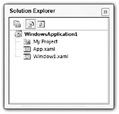
Figure 26-5: Solution Explorer does not list Visual Basic source files by default.
To find the Visual Basic source file again, click the Solution Explorer Show All Files button (the one that’s highlighted in Figure 26-5), and then expand the XAML file as shown in Figure 26-6. Double-click the file to open it in the Visual Basic code editor.
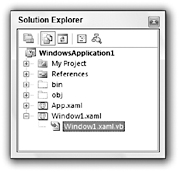
Figure 26-6: Use the Solution Explorer Show All Files button to find Visual Basic files.
The following text shows the Visual Basic source code initially created for a XAML file. This file merely creates a constructor for the corresponding Window class that calls InitializeComponent.
' Interaction logic for Window1.xaml Partial Public Class Window1 Inherits System.Windows.Window Public Sub New() InitializeComponent() End Sub End Class You can add event handlers to this file just as you can add event handlers to Windows Forms code. Use the left drop-down to select a control or Window1 Events. Then, use the right drop-down list to select an event for that object.
| Tip | Note that you cannot double-click the graphical XAML editor to open a control’s default event handler as you can in a Windows Forms project. Instead, you must open the Visual Basic code file and then use the drop-down lists to select the event handler that you want. Also note that the left drop-down may not list every control as soon as you create them in the XAML editor. To make the code editor aware of new controls, use the Build menu to rebuild the Window. |
You can also add non-event handler subroutines and functions as you can in any other Visual Basic code file.
Inside the Visual Basic code file, you can get and set control properties, and call control methods, just as you can in a Windows Forms project. The only differences are in the features the WPF controls provide. Those differences generally correspond to the XAML commands that define controls.
For example, the following Visual Basic code builds the same Button containing a Grid holding three Labels shown in Figure 26-1. The previous section, “Editing XAML,” shows XAML code that builds this button.
' Interaction logic for Window1.xaml Partial Public Class Window1 Inherits System.Windows.Window Public Sub New() InitializeComponent() End Sub Private Sub Window1_Loaded(ByVal sender As Object, _ ByVal e As System.Windows.RoutedEventArgs) Handles Me.Loaded ' Make a grid. Dim grd As New Grid() grd.Width = btnGrid.Width - 10 grd.Height = btnGrid.Height - 10 ' Add rows and columns. AddRow(grd, New GridLength(33, GridUnitType.Star)) AddRow(grd, New GridLength(33, GridUnitType.Star)) AddRow(grd, New GridLength(34, GridUnitType.Star)) AddCol(grd, New GridLength(33, GridUnitType.Star)) AddCol(grd, New GridLength(33, GridUnitType.Star)) AddCol(grd, New GridLength(34, GridUnitType.Star)) ' Put things inside the grid. Dim lbl1 As New Label() lbl1.Content = "UL" lbl1.HorizontalAlignment = Windows.HorizontalAlignment.Left lbl1.VerticalAlignment = Windows.VerticalAlignment.Top lbl1.SetValue(Grid.RowProperty, 0) lbl1.SetValue(Grid.ColumnProperty, 0) grd.Children.Add(lbl1) Dim lbl2 As New Label() lbl2.Content = "In the Middle" lbl2.HorizontalAlignment = Windows.HorizontalAlignment.Center lbl2.VerticalAlignment = Windows.VerticalAlignment.Center lbl2.SetValue(Grid.RowProperty, 1) lbl2.SetValue(Grid.ColumnProperty, 0) lbl2.SetValue(Grid.ColumnSpanProperty, 3) grd.Children.Add(lbl2) Dim lbl3 As New Label() lbl3.Content = "LR" lbl3.HorizontalAlignment = Windows.HorizontalAlignment.Right lbl3.VerticalAlignment = Windows.VerticalAlignment.Bottom lbl3.SetValue(Grid.RowProperty, 2) lbl3.SetValue(Grid.ColumnProperty, 2) grd.Children.Add(lbl3) ' Put the grid inside the button. btnGrid.Content = grd End Sub ' Add a row of the indicated height to the grid. Private Sub AddRow(ByVal my_grid As System.Windows.Controls.Grid, _ ByVal height As GridLength) Dim row_def As New RowDefinition() row_def.Height = height my_grid.RowDefinitions.Add(row_def) End Sub ' Add a column of the indicated width to the grid. Private Sub AddCol(ByVal my_grid As System.Windows.Controls.Grid, _ ByVal width As GridLength) Dim col_def As New ColumnDefinition() col_def.Width = width my_grid.ColumnDefinitions.Add(col_def) End Sub Private Sub btnGrid_Click(ByVal sender As Object, _ ByVal e As System.Windows.RoutedEventArgs) Handles btnGrid.Click MessageBox.Show("Clicked!", "Clicked", _ MessageBoxButton.OK, _ MessageBoxImage.Information) End Sub End Class The main Window class’s Loaded event handler fires when the form is loaded. The code starts by creating a Grid control and setting its width and height.
Next, the code calls subroutines AddRow and AddCol to make three rows and columns. These routines make building rows and columns easier, and are described shortly.
The code then creates three Label controls and sets their properties. Some properties, such as HorizontalAlignment and Content, are fairly straightforward. Other properties, such as Grid.RowProperty, Grid.ColumnProperty, and Grid.ColumnSpan are a little trickier. Those properties only make sense when the Label controls are contained in a Grid, so they are not really properties of the Label controls. Instead they are properties added by the Grid, much as an ExtenderProvider adds properties to a control. If you place a Button inside a StackPanel, the Properties window doesn’t show these properties.
After it initializes each Label, the code uses the Grid control’s Children.Add method to put the Label inside the Grid.
After it finishes creating all of the controls, the code sets the Button control’s Content property to the new grid.
Subroutine AddRow creates a new RowDefinition object to represent a Grid’s row. It sets the object’s Height and adds the object to the Grid control’s RowDefinitions collection. Subroutine AddCol uses similar methods to make a new Grid row.
The last piece of code in this example is a Click event handler for the btnGrid button. When you click the button, this code displays a message box.
Anything you can do declaratively with XAML you can also do procedurally with Visual Basic. The following section, “XAML Features,” describes some of the things that you can do with XAML and shows examples. The section “Procedural WPF” later in this chapter explains how you can implement some of the same features with Visual Basic code instead of XAML.
EAN: N/A
Pages: 417