Custom Controls in General
Building a custom control requires five basic steps:
-
Create the control’s project.
-
Make a Toolbox bitmap icon for the control.
-
Test the control in the UserControl Test Container.
-
Give the control properties, methods, and events.
-
Make a test project to debug the control more thoroughly.
-
Test the control at design time and runtime to make sure it works.
The following sections describe these steps.
Creating the Control Project
To make a new control library in Visual Basic, select the File menu’s New Project command, select the Windows Control Library template, enter the project’s name, and click OK. The library can contain several controls, so it may not always make sense to name the library after a single control. This example assumes that you are building a control that displays a smiley face. In that case, you might name the library FaceControls in case you want to add bored, sad, and other faces later.
Initially, Visual Basic gives the control library a single UserControl object named UserControl1. Change this file’s name to something more descriptive such as SmileyFace. If you look at the file in the code editor, you should find that Visual Basic has automatically changed the control’s class name to match.
Add code to the control to make it do whatever you want it to do. For a SmileyFace control, you might add properties such as FaceColor, NodeColor, and EyeColor. The control’s Paint event handler will draw the smiley face.
Next use the Build menu to compile the control library. The project’s bin directory contains the library’s compiled .dll file.
Setting the Toolbox Icon
If you add the control to the form designer’s Toolbox now, you’ll see a default image that looks like a gear. To make your control display something more meaningful, you must set its Toolbox icon.
You can set the control’s Toolbox icon by adding a ToolboxBitmap attribute to the control’s class. The constructor for the ToolboxBitmap attribute can take as parameters the name of the bitmap file, a class that contains the bitmap resource to use, or a class and the name of a bitmap resource to use (if the class contains more than one bitmap resource). This section assumes that you will use the last method. See the online help for more information. The web page http://msdn.microsoft.com/library/en-us/cpref/html/frlrfSystemDrawingToolboxBitmapAttributeClassTopic.asp describes the ToolboxBitmapAttribute class and its constructors.
Open Solution Explorer and double-click the My Project entry to view the project’s property pages. Click the Resources tab and open the Add Resource drop-down list. Select the Add Existing File command, and select the bitmap file to create a new bitmap resource. Double-click the new bitmap to open it in the integrated Bitmap Editor and modify it if necessary. Use the Properties window to make the bitmap 16 × 16 pixels in size.
Set the pixel in the lower-left corner to the color that you want to use as the Toolbox bitmap’s transparent color. Visual Basic will replace the pixels having this color with the Toolbox’s background color. Draw and save the bitmap, and then close it.
Click the bitmap file in Solution Explorer, and open the Properties window. Select the file’s Build Action property, click the drop-down arrow on the right, and select Embedded Resource. Now when you compile the control library, this bitmap will be embedded as a resource inside the .dll file.
Next, open the control’s module in the code editor, and insert a ToolboxBitmap attribute in front of the control’s class declaration, as shown in the following code. This example tells Visual Basic that the control’s Toolbox icon should come from the SmileyFaceTool.bmp resource embedded in the SmileyFace class. Note the line continuation character at the end of the first line so that the ToolboxBitmap statement is on the same code line as the class declaration.
<ToolboxBitmap(GetType(SmileyFace), "SmileyFaceTool.bmp")> _ Public Class SmileyFace ... End Class Now when you build the control library, the SmileyFace control includes the information it needs to display its Toolbox bitmap.
Testing in the UserControl Test Container
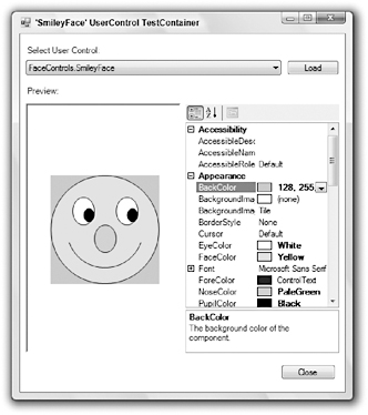
If you use the Debug menu’s Start command to execute a control library project, Visual Studio displays a sample control in the UserControl Test Container shown in Figure 12-1. The drop-down list at the top lets you select different controls in the project. You can use the property grid on the right to experiment with different property values to see how the control behaves.

Figure 12-1: Visual Basic lets you preview controls in the UserControl Test Container.
As its name hints, the UserControl Test Container only displays UserControls. If you create a control that inherits from the Control class or from some other control, then the UserControl Test Container does not list it and will not display it. In that case, you must skip this step and move on to the next one, making a test project.
Making a Test Project
The UserControl Test Container only lets you test UserControls, not those that inherit from the Control class or some other control. It also only lets you test a control’s properties. You can see the control’s design time behavior, but not how its methods and events work at runtime.
To test controls that are not UserControls and to test the control’s runtime behavior, you must build a test project. You can either build a completely separate project, or you can add a new Windows application to the control’s project.
To add an application to the control’s project, open the File menu’s Add submenu and select New Project. Select the Windows Application template, give the project a meaningful name (such as FaceControlsTest), and click OK. This adds the test project to the same solution that already contains the control library.
To make Visual Basic start execution with the test project, open the Solution Explorer, right-click the new project, and select Set as StartUp Project.
When you open the new project’s form, the Toolbox will contain a FaceControls Components section (assuming that the control project is named FaceControls) that holds icons representing the controls defined by the control library. You can use these tools just as you would use any other control tools.
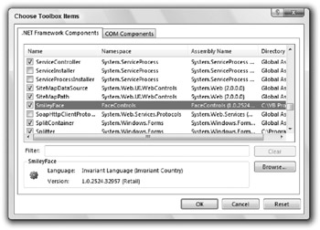
When you create separate applications that are not part of the control library’s solution, you must add the controls to the Toolbox manually. To add the controls, open a form in the form designer. Right-click the Toolbox, and select Choose Items. On the Choose Toolbox Items dialog box shown in Figure 12-2, click the Browse button. Select the .dll file in the control library’s bin folder, and click Open to make the controls appear in the dialog’s .NET Framework Components tab. Select the check boxes next to the controls (they should be checked by default), and click OK.

Figure 12-2: Use the Customize Toolbox dialog box to add your control to the Toolbox.
If you change the control’s Toolbox icon, you must rebuild the control library’s .dll file. Then open the test project’s form, right-click the Toolbox, select Add/Remove Items again, click the Browse button, and reselect the control library’s .dll file.
Test the Control
After you add it to the Toolbox, you can use the control on the test project’s form just as you can use any other control. Click on the Toolbox icon to select the control, and click and drag to place an instance of the control on the form. Double-click on the control to place an instance of the control in a default location with a default size. Initially, Visual Basic sets the controls’ names to their class’s name followed by a number, as in SmileyFace1, SmileyFace2, and so forth.
Use the Properties window to set the controls’ properties at design time. Use code to examine and modify the controls’ properties, methods, and events at runtime.
Implement Properties, Methods, and Events
At this point, you can test the control, but if you haven’t given it any properties, methods, and events, you can only work with the default behavior that it inherits from its parent class. If the control is to do something useful, you must give it new properties, methods, and events.
Controls implemented from scratch often use Paint event handlers to draw the control. Composite controls often respond to events raised by their constituent controls and take actions, which may include raising new events for the form containing the control.
When a developer places the control on a form, the Properties window automatically displays any public properties that are not read-only. This feature is remarkably intelligent. If a property has the Integer data type, the Properties window will only allow the developer to enter an integer. If a property has an enumerated type, the Properties window automatically displays a drop-down list containing the types of allowed values.
If a property has the Font data type, the Properties window automatically provides an ellipsis to the right of the property’s value and displays a font selection dialog box if the user clicks it. Similarly, if the property is a Color, Image, or Date, the Properties window provides an appropriate dialog box or drop-down list to let the user select the property’s value.
If a property’s data type is OleDbDataConnection, DataSet, TextBox, Label, or some other control or component type, then the Properties window provides a drop-down list that lets the developer select from any appropriate item on the form. If the data type is TextBox, then the drop-down will list all of the form’s TextBoxes.
In fact, the Properties window can even handle custom controls and components that you build yourself. For example, suppose that you create a control named EmployeeRegister. You can then create another control that has a property of type EmployeeRegister. If the developer selects the control, opens the Properties window, clicks on that property, and clicks the drop-down arrow on the right, Visual Basic will display a list of any EmployeeRegister controls on the form.
Even more miraculously, the Properties window can handle collections of objects that you define. For example, the following code defines a WorkItem class. It then defines a UserControl class named
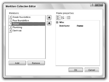
Imports System.Collections.Generic ' Represents a piece of work. <Serializable()> _ Public Class WorkItem ' The ItemName property. Private m_ItemName As String Public Property ItemName() As String Get Return m_ItemName End Get Set(ByVal value As String) m_ItemName = value End Set End Property Public Overrides Function ToString() As String Return ItemName End Function End Class ' UserControl that has the property. Public Class WorkItemLister ' The WorkItems property. Private m_WorkItems As New List(Of WorkItem) Public Property WorkItems() As List(Of WorkItem) Get Return m_WorkItems End Get Set(ByVal value As List(Of WorkItem)) ' Copy the new items into the ' m_WorkItems List. For Each work_item As WorkItem In value m_WorkItems.Add(work_item) Next work_item End Set End Property End Class If you add a WorkItemLister object to a form and select it, the Properties window lists the WorkItems property’s value as (Collection) and displays a drop-down arrow to the right. If you click the arrow, Visual Basic displays the collection editor shown in Figure 12-3.

Figure 12-3: Visual Basic automatically provides collection editors for collection properties.
| Tip | The WorkItem class’s ToString function lets objects know what to display for an instance of the class. The collection editor uses this function to display Grade foundation, Pour foundation, and the other work item names, instead of the class name WorkItemsControls.WorkItem. |
Assign Attributes
You can modify a control’s behavior by adding attributes to its properties, methods, and events, and to its class declaration. The following code demonstrates some of the most useful control (or component) and property attributes for a UserControl named EmployeeRegister.
The ToolboxBitmap attribute tells Visual Basic that it can find a Toolbox bitmap for the class in the assembly containing the EmployeeRegister type, and that the bitmap resource’s name is EmployeeRegisterTool.bmp.
The DefaultProperty attribute sets the component’s default property. If you click an EmployeeRegister control in the form designer, the property named TextValue is initially selected in the Properties window.
Note that the DefaultProperty doesn’t always work as advertised because the Properties window tries to display the same property when you select different controls. For example, suppose that you click on a TextBox control and select its Name property in the Properties window. If you then click an EmployeeRegister control, the Properties window shows its Name property because EmployeeRegister has a Name property. On the other hand, if you select a TextBox’s MultiLine property and then click an EmployeeRegister control, the Properties window selects the TextValue property because EmployeeRegister doesn’t have a MultiLine property.
The DefaultEvent attribute indicates the component’s default event. If you double-click on an EmployeeRegister control in the form designer, Visual Basic opens the code editor and displays the control’s default event handler.
The DesignTimeVisible attribute determines whether the component is visible in the form designer at design time. If you set this to False, the control or component does not appear in the Toolbox. If a form already contains an instance of the object, a component is hidden in the component tray, although a control remains visible. You can use this attribute to build a control that the program can create and manipulate at runtime but that the developer cannot create at design time.
The TextValue property’s Description attribute gives the text displayed at the bottom of the Properties window when you select the property.
The Category attribute determines the category that contains the property when you select the Property window’s Categorized button. This attribute’s value can be any string. The Property window will make a new category with this name if it doesn’t name an existing category.
The Browsable attribute determines whether the Property window displays the property. If you set this value to False, you cannot set the property’s value at design time.
Finally the DefaultValue property determines the default value for the property. If you set a control’s property to this value, Visual Basic does not store the property’s value with the form. Later, when it reloads the form, Visual Basic does not load any value for the property. This code shows one way to initialize a property’s value when it declares Private m_TextValue As String = “Default Value”. To avoid confusion, you should generally initialize the private variable representing a property to the same value you set with faultValue attribute.
When you right-click a property in the Properties window and select the Reset command, Visual Basic sets the property to the value defined by the DefaultValue attribute. This is particularly useful for images and other objects where you might want to make the default value Nothing.
Imports System.ComponentModel <ToolboxBitmap(GetType(EmployeeRegister), "EmployeeRegisterTool.bmp"), _ DefaultProperty("TextValue"), _ DefaultEvent("TheEvent"), _ DesignTimeVisible(True)> _ Public Class EmployeeRegister ' Declare a public event. Public Event TheEvent() ' The TextValue property. Private m_TextValue As String = "Default Value" <Description("The object's text value. Category("String Values"), _ Browsable(True), _ DefaultValue("Default Value")> _ Public Property TextValue() As String Get Return m_TextValue End Get Set(ByVal value As String) m_TextValue = value End Set End Property End Class You can learn more about the ToolboxBitmap attribute at http://msdn2.microsoft.com/en-us/library/system.drawing.toolboxbitmapattribute.aspx. You can learn more about other attribute classes at msdn2.microsoft.com/library/2e39z096.aspx.
Manage Design Time and Runtime
A control or component can use its predefined DesignMode property to determine whether it is running at design time or runtime and take different actions if that is appropriate. For example, a control might allow the developer to manipulate its data directly at design time but prevent the user from changing the data at runtime.
The following code shows how the control can check whether it is running at design or runtime:
If Me.DesignMode Then ' Let the developer manipulate the data at design time. ... Else ' Don't let the user change the data at run time. ... End If EAN: N/A
Pages: 417