Site-Design Tips
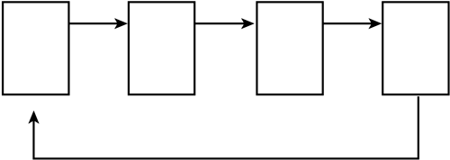
| The skills outlined in the preceding examples are all you need to stitch multiple pages into a coordinated site. All you need now is a little guidance about ways you can organize information into a Web site. The remainder of this chapter offers tips for choosing a site design. Building a Multipage Linear SiteIn a multipage linear site, the pages and links are set up in a way that encourages the reader to read a group of pages in a particular order, from start to finish (see Figure 24.6). Figure 24.6. The structure of a multipage linear site. This design makes sense when the content your site delivers is made up mostly of medium-size blocks of text (around one screen) that should be read in a particular sequential order, from beginning to end. (Some people call it a slide show structure because the visitor steps through the pages in order, as in a slide show.) Suppose that this book were converted into a Web site. Its chapters serve the reader best when they're read in order, because each chapter builds on material from the ones before it. To encourage readers to proceed in order, the site would be designed so that the natural flow from page to page (or from chapter to chapter) follows the proper order. Other content that fits this design includes a story that's too long to fit on one page or lengthy step-by-step instructions. Each page in a multipage linear site features a prominent link, often labeled Next or Continue, that leads only to the next page in order. Other links can be offered as well, but be careful about offering too many links in these types of pages ”the links enable the reader to stray from the order, defeating the purpose of the design.
Tips for Multipage Linear Site DesignWhen developing a multipage linear Web site, keep in mind the following tips for good design:
Working with One-Page Linear PagesWhen the following conditions are true, a one-page linear design is a terrific (and often overlooked) approach (see Figure 24.7):
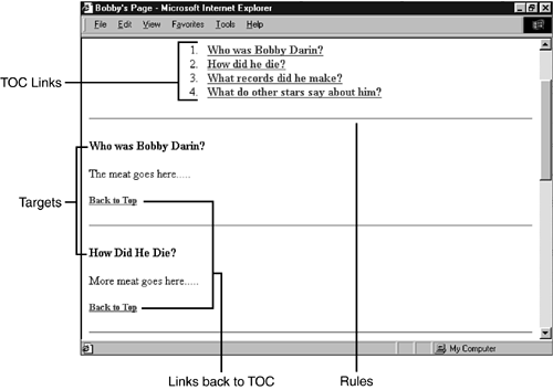
Figure 24.7. A sample one-page linear design. This structure is often applied to lengthy reference material provided as one part of a larger, multipage site, but a well-designed one-pager can actually serve as your whole site. Although readers can always scroll through the entire page, the top of the page typically shows a list of links ”a table of contents or index of sorts. Each link points to a target (see Chapter 23) somewhere down in the page. The links help readers quickly find particular information without having to scroll for it.
Tips for One-Page Linear DesignWhen developing a one-page linear design, keep in mind the following tips for good design:
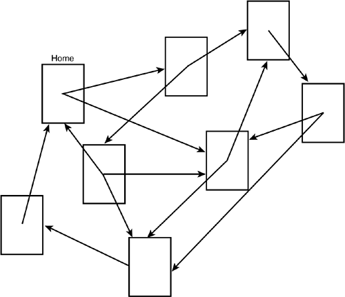
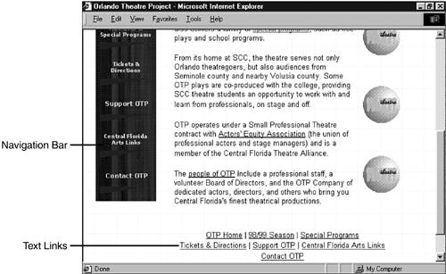
Making a Web-Style SiteIn a Web structure, anything goes (see Figure 24.8). Any page can link to any other page, or to all other pages. This structure makes sense when the various pages contain information that is related to information on other pages, but there's no logical order or sequence to that information. Figure 24.8. A Web-style structure. In a Web-style site, a "top" page might be provided as a starting point (as in a hierarchical site, as described later in this chapter), but from there, readers can wander around the site in no particular path . Web structures are best suited to fun, recreational subjects or to subjects that defy any kind of sequential or hierarchical breakdown. Typically, each page of a Web-style site contains a block of links ”often in a column along one side of the page or in a block at the bottom ”that lead to every other page in the site (see Figure 24.9). Figure 24.9. Each page in a Web-style site typically contains a block of text links (or a navigation bar) to all other pages in the site, if there aren't too many. Tips for Web-Style DesignWhen developing a Web-style site, keep in mind the following tips for good design:
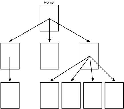
Making a Hierarchical SiteThe most well-organized design (see Figure 24.10), a hierarchical Web site starts out with a general, "top" page that leads to several second-level pages containing more specific information. Each of these second-level pages leads to third-level pages containing more specific info about the second-level page to which they are linked, and so on. Figure 24.10. A hierarchical structure. The careful organization of a hierarchical site is not for the mere sake of neatness. The structure of the page actually helps the visitor find what he or she wants, especially when the site carries lots of detailed information. Suppose that the site sells clothes, and I want a dress shirt. The top page might show links to women's clothes and men's clothes. I choose the Men's link and arrive at a second-level page offering links to shirts, pants, and shoes. I choose Shirts, and I see a third-level page offering Dress and Casual. I choose Dress, and I'm there. The structure of the page makes my search easy, even though the site offers hundreds of items. Tips for Hierarchical DesignWhen developing a hierarchical site, keep in mind the following tips for good design:
|
EAN: 2147483647
Pages: 350