| Let's take another look at the AIR judging form we developed in Chapter 10. Now, however, we'll focus on the visual presentation of the form. Instead of using structural elements to achieve presentation effects or using presentation elements to create the appearance of structure, we'll use CSS to bring out the structure of the form. This is what we meant when we said earlier that there isn't a real contradiction between the WCAG 1.0's recommendation to use style sheets to control presentation and layout and the Section 508 requirement to organize documents in such a way that they can be read without style sheets. Reviewing the AIR Judging Form We discussed the AIR judging form in detail in Chapter 10. Here we'll just remind you that the form contains a number of different sections, with a different number of items in each one and a different scoring system. We used <fieldset> and <legend> elements to define the various sections, and we decided to use pull-down menus (<select> and <option> elements) so that judges wouldn't have to remember how many points to assign in a given instance. In other words, we used HTML markup to indicate the logical structure of the judging form. We paid little or no attention to presentation and layout issues such as fonts, highlighting, and so on. Not surprisingly, the resulting form wasn't much to look at but it might be too much for some prospective judges. Determining the Design Goals and Strategy for the New Form The overall task for users of the judging form is to participate in judging the Accessibility Internet Rally. This requires successfully completing a judging form for each assigned site. Specifically, judges must be able to Locate scoring items quickly and easily. Recognize the salient points in each item, such as item name, criteria, scoring options, and comment areas. Select the appropriate scoring option for each item judged. Enter required and optional information.
We want to make it easier for judges with low vision and/or cognitive disabilities to locate the various parts of the form as well as the individual items and to make it easier for all judges to find what they need. Defining what users need to be able to do makes it easier to list our design goals below. Make it easy for people, including people with low vision and people with cognitive disabilities, to identify the separate sections of the long, complex judging form. Help people using the form to identify and locate individual items within the sections of the form. Help users recognize and locate the form controls used for scoring. Make the form visually attractive.
In short, we want to use CSS to bring out the structural elements of the AIR judging form so all the judges can more easily identify them. The style sheet will make the form easier to scan for: We also want to make individual items more readable. Using Font Selection and Spacing to Improve Legibility We can accomplish many of the goals listed above by choosing a readable font and using spacing to improve legibility. Font Selection According to Dr. Aries Arditi [1997b] of Lighthouse International, people with low vision find open, sans-serif fonts such as Arial more readable than closed, serif fonts like Times New Roman. A combination of upper- and lowercase lettering is also more readable than ALL CAPS. We'll use the font-family property to indicate a range of acceptable fonts. The line of code below gives an example of how to use this property. font-family:arial,verdana,sans-serif; This statement takes into account the wide range of fonts installed on computers that access the Internet. Instead of insisting on a single font, this code tells the browser to use the Arial font if it's available on the user's system. If Arial isn't installed, the browser will look for another sans-serif font called Verdana. If that's also not available, the browser will use whatever sans-serif font it can find. Arditi writes that people designing print documents should choose 16- or even 18-point fonts to ensure that their work is legible to people with limited vision. Those readers might find the same font sizes useful on the Web as well. But here's one of many places where Web design techniques differ from the techniques that work for print. Instead of specifying the font-size property in terms of points or pixels, Web designers should use the relative units of measure supported by CSS, such as em, percent (%), or the verbal descriptors largest, larger, medium, smaller, or smallest. These are called relative measures because the font size shown on the screen is relative to each individual user's default font settings. For example, if the default font is 16-point Arial, then each of the following three lines of CSS code would display text in that font. font-size:1em; font-size:100%; font-size:medium; All three of the statements above do the same thing: set the size of the display font to match the user's default settings. One advantage of doing it this way is that it allows individual users to change their font sizes as they choose. For example, they can use the View  Text option in Internet Explorer to adjust the font size, as shown in Figure 15-4. Text option in Internet Explorer to adjust the font size, as shown in Figure 15-4. Figure 15-4. Screen shot of the Text submenu of Internet Explorer 5.5, showing five options ranging from Largest to Smallest. The current selection, Medium, is identified by a small bullet to the left of the selection. 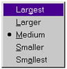 If you've used a relative measure to set the font-size property, your design won't "break" when a user decides to enlarge or shrink the font size to suit his or her needs or taste. In fact, your design will be preserved since all the font sizes will change relative to the user's newly declared base size. By contrast, if you use an absolute measure (font-size:12pt; for example) there's no telling what might happen! For the improved AIR form whose style sheet is listed at the beginning of this chapter, we used relative measures to set font sizes for text in the <body> and <legend> elements. We also defined a .item selector so we can associate a style with the name of each item to be scored. For the <body> element, we set the size to 1 em, matching the user's default font size. Text assigned to the .item class is slightly larger (1.2 em), and the <legend> element is larger still, at 1.4 em. Spacing Spacing is another important tool for improving legibility. Readers with limited vision often have difficulty locating the beginning of new lines as they read down the page. Arditi [1997b] of Lighthouse International explains that setting what typographers call leading (which essentially determines the vertical space between lines) to 25-30 percent above the font size helps these readers track the text more effectively. (In this book, for example, the leading has been set to approximately 28.5 percent above the font size.) With this in mind, we set the line-height property for text in the AIR form's <body> element to 1.25 em, thus adding an additional 25 percent to the space between lines. body{ font-family:arial,verdana,sans-serif; font-size:1em; font-weight:normal; font-style:normal; line-height:1.25em; color:black; background-color:white } In addition to opening up the space between lines of text, the style sheet we showed you at the beginning of this chapter also pads the space around <fieldset> elements to make them stand out more clearly as well. fieldset{ padding-top:1em; padding-left:1em; padding-right:1em; border:groove } We also defined the border of each <fieldset> element, using the groove style included as part of CSS. Finally, we needed to make sure that judges using the navigation links to jump from item to item on the form would be able to distinguish items that wrapped around to the next line. For this purpose, our style sheet defined a .menu selector that uses both the text-indent and margin-left properties as well as margin-top and margin-bottom. This way the menu items that wrap to the next line are indented on the second line. We adjusted the margin properties to limit the space between each line so that the menu length is manageable. .menu{ font-family:arial,verdana,sans-serif; font-size:1em; font-weight:normal; font-style:normal; color:black; background-color:white; text-indent:-5%; margin-left:5%; margin-top:0em; margin-bottom:0em } This code coordinates the text-indent and margin-left properties to create hanging indents in the AIR form's navigation menu. Using Color and Contrast to Enhance Legibility To supplement our use of font selection, font sizes, and spacing, we've also used color and contrast to make it easier for judges to locate different elements on the AIR form. Like our use of fonts and spacing, our use of color is designed to bring out the structural elements we defined through HTML markup. Overview of Color and Contrast Issues Color is an incredibly important design tool. It's used for so many things: indicating the status of a visited link, defining blocks of related material, highlighting important information, guiding users to an appropriate action, and so forth. But here, too, it's important to avoid creating unintended accessibility barriers. The Section 508 standards and WCAG 1.0 agree that it's important to ensure that information presented with color is also available in the absence of color and that color contrasts are strong enough for users to distinguish between foreground and background. Here's an example of how inadvertent barriers can be created when color is the only indicator of important information. In the multiple-choice test shown below, high school-aged students preparing for England's national A-Level examinations are instructed to select a red button to mark the correct answer (Figure 15-5). Figure 15-5. Screen shot of a multiple-choice test that requires students to see and differentiate the colors red and green to mark their answers. Accessed December 8, 2001, at http://www.hinchbk.cambs.sch.uk/ocr/langtest1.html. Used with permission. 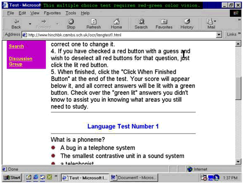 Approximately 10 percent of males are unable to perceive red or green. It's quite possible, therefore, that some students would have serious difficulty with this practice test. It could be argued that there's no real problem in this case, since there's only one button next to each choice. But step 5 of the instructions says that when students receive feedback on the test, incorrect answers will be identified by a "green lit" button. In other words, students will need to be able to tell the difference between red and green in order to see which questions they answered correctly precisely the colors that 10 percent of male students can't distinguish! If the red buttons were form elements such as an <input> element of type="image" or type="radio" they could be associated with <label> elements using the techniques described in Chapter 10. However, these buttons are actually graphical links; they have no ALT text, and all of them have the same name, which JAWS reports as "ocr/mctest." So a student with red-green color deficiency would find this practice test extremely frustrating, if not downright impossible to work with. There's nothing wrong with using color. But when you do, make sure that color isn't the only way your users will be able to identify important information. For example, feedback to students taking the practice test shown above could simply group correct and incorrect responses under headings marked up as <h2> or <h3> elements (depending on the logical structure of the page). The designers could still display a green button beside each incorrect response if they choose. In fact that might be a good idea, since the heading text and the presence of the buttons would reinforce each other. Most people with limited vision whatever the cause have difficulty with at least some color distinctions. According to Arditi [1997a], people with partial sight and inherited or acquired color deficiencies are likely to experience diminished perceptual capability across all three dimensions of color: hue, lightness, and saturation. Arditi notes that lightness is the most important perceptual attribute in terms of making color contrast effective but adds that the most effective page designs are those where colors "differ dramatically" across all three dimensions. An Experiment in Yellow and Black Personal experience suggests, and Arditi's research confirms, that many people with low vision find yellow text on a black background readable and relatively easy on the eyes. So we started by trying to apply this principle to the presentation of the entire AIR form (Figure 15-6). Figure 15-6. Screen shot of the AIR judging form with yellow text on a black background. The navigation links on the lower-left side of the screen are black on a yellow background. 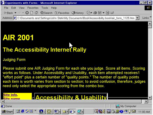 The result was disastrous. While this presentation might work for judges with low vision, it had a startling effect when we showed it to someone with TBI. The reaction was instantaneous and sharply negative. The subject told us a few days later that she had continued to experience "aftereffects" for some three hours after she viewed this screen even though she had only looked at it briefly. Even after we changed the style sheet to display white text on a blue background, this informant explained that for her the multiple colors used to differentiate various sections of the form were simply additional information that she had to take into account. She reported that the "background" colors never receded into the background but remained in her consciousness and demanded attention each time she looked at the screen. The effect was to siphon off energy that she would rather have used to read the items on the form and to make the decisions that judging requires. Back to the Drawing Board Next we tried a more selective approach, one that would highlight specific features of the page instead of the entire form. This was more successful: the same individual indicated that the presentation of the form as shown in Figures 15-7 and 15-8 would work for her, provided that we change the yellow-on-black of the <legend> elements to a less shocking color combination. Figure 15-7. Screen shot of the AIR judging form, which shows the <legend> elements set off in yellow text on a black background. The <fieldset> elements are padded so that their nesting is visible. 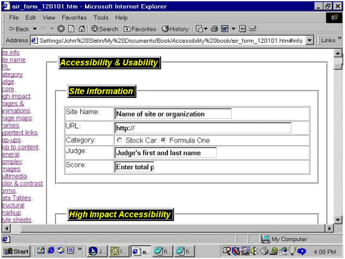 Figure 15-8. Screen shot showing the first two items in the High Impact Accessibility section of the AIR judging form. The terms Images and animations and Image Maps are highlighted to indicate where each item begins. 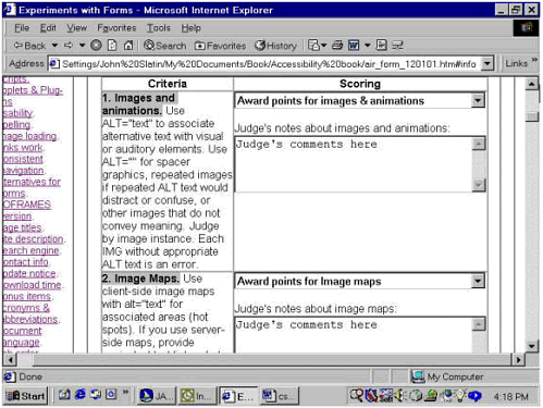 To ease identification of the major sections of the AIR judging form, we used our style sheet to add text and background colors to the <legend> elements. Together with the enlarged font size (1.4 em) and an outset border, this makes the <legend> elements stand out from the page. But since yellow text on black still caused problems for our subject, we used a different high-contrast combination to reduce the interference. You may be wondering why we didn't use graphics instead of styled text another technique that's often used in cases like this. There's a three-part answer to this. The page would have been more complicated because we would have then needed to size and position the image and assign ALT text to say exactly the same thing as the word(s) represented in the graphic. The page would "break" if a user changed the font sizes: the text would change but the graphic wouldn't, and the results might be pretty ugly. Finally, with CSS it's far easier to experiment with different color combinations: we can change the color and back-ground-color properties in the style sheet, then refresh the page and test the results much faster than if we had to edit the image.
After we made the color change discussed above, the CSS code for the <legend> elements looked like this. legend{ font-family:arial,verdana,sans-serif; font-size:1.4em; font-weight:bold; font-style:italic; color:white; background-color:blue; border:outset} It's worth noting that a very similar technique can also be used to simulate buttons for navigation or interaction; unlike images used as buttons, the style of these "text-buttons" can even be modified or overridden by users who prefer to apply their own style sheets. We also used text and background colors to help judges locate where each scoring item begins. To do this, we added a .item selector to our style sheet, as shown in the listing earlier in this chapter. This allows us to treat a piece of text (a <span> element) as if it were a true HTML element, so we can associate a style with it. Here's the CSS code we used for the .item selector. .item{ font-family:arial,verdana,sans-serif; font-size:1.2em; font-weight:bold; font-style:normal; color:black; background-color:silver} The phrases we wanted to highlight are part of the <label> element for the pull-down menus from which judges will select the scoring option they need. We didn't want to apply the style to the entire label that would defeat the purpose of highlighting the beginning of each scoring item! So we used the <span> element, which was introduced into HTML specifically to allow designers to mark off a portion of a larger element that is, to define a span of material that will be styled differently from the material that surrounds it. Then we used the class attribute to assign the .item style to the <span> element, as shown in the listings below and in Figure 15-8. <label for="hi1_pts"><span >Images and animations </span> . . . </label> Throughout this discussion of the AIR judging form, we've used CSS to highlight the structure of the document, thereby making it easier for users to identify and navigate the components of the judging form. In our next example, a Web site for a class at the University of Texas, we'll take a different tack: we'll exploit the separation of content and structure from presentation and layout to create a design that's effective for users who are blind as well as those who are sighted. | 

 Making Your Web Site More Usable for Everyone")