| Visual Basic .NET includes a number of controls that perform specific functions. Some of these controls are discussed in the following sections. The LinkLabel Control The LinkLabel control is a welcome enhancement to the standard Label control. As you may have gathered from its name, the LinkLabel control is much like a normal Label control, but it allows the user to click one or more Web-like hyperlinks to perform some action, such as opening a new form or visiting a Web page. The hyperlink analogy will be familiar to Web-savvy users. As you will see, you can designate all or part of the text that makes up a LinkLabel control's Text property to be a hyperlink. When the user clicks the hyperlink text in the control, the LinkClicked event is fired, and code that you have placed in the control's LinkClicked event handler initiates the desired action. Specifying a Single Hyperlink If you want a LinkLabel control to contain a single hyperlink, you simply set the control's LinkArea property to a LinkArea object, which at its most basic specifies the first character of the text that is to be a hyperlink, along with the number of characters that make up the length of the hyperlink. As with most properties, this can be done at design time in the Properties window or by using code at runtime. Setting the LinkArea Property at Design Time After setting the Text property of a LinkLabel control to the desired caption, you can designate the part of the text that you want to act as a hyperlink by setting the LinkArea property in the Properties window. If you click the plus sign next to the LinkArea property, it will expand to reveal the property's two subcomponents Start and Length. Start specifies the first character of the control's Text property that is to act as a hyperlink. Character counting is zero-based; that is, the first character is position 0, the second character is position 1, and so on. Length specifies how many characters are to be used as the hyperlink. You can type individual values for the Start and Length components in their respective boxes in the Properties window, or you can type both values separated by a comma (12, 4, for example) next to the LinkArea property itself. Figure 12.9 illustrates a LinkLabel control whose LinkArea property is set to 4, 17. Notice that the mouse pointer has changed to the pointing-hand icon that is typically displayed when hovering over a hyperlink. Figure 12.9. You can use the LinkArea property to designate all or part of a LinkLabel control's caption as a hyperlink. 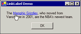 Note By default, the LinkArea property includes all characters in the current Text property and continues to do so even when the Text property changes until you specifically change it.
Tip If you click the ellipsis (…) next to the LinkArea property in the Properties window, the LinkArea Editor dialog box displays the current contents of the control's Text property; you can easily select the desired link text here, and the LinkArea property will be set for you. You can even change the control's Text property from this dialog box.
Setting the LinkArea Property at Runtime You can set the value of a LinkLabel control's LinkArea property dynamically at runtime as well. You do so by setting the property's value to a LinkArea object that you can create on-the-fly, using code like the following: LinkLabel1.LinkArea = New LinkArea(12, 9) Specifying Multiple Hyperlinks in a Single LinkLabel Control It is not at all unusual for a single LinkLabel control to contain more than one hyperlink. For example, consider the label shown in Figure 12.9. Its Text property contains The Memphis Grizzlies, who moved from Vancouver in 2001, are the NBA's newest team. You may want the words "Memphis Grizzlies" to link to that team's Web site, while the word "NBA" links to the National Basketball Association's Web site. To create multiple links within a single LinkLabel control, you utilize the control's Links property, which exposes the control's LinkCollection class, using code at runtime. When a LinkLabel control will have multiple links, it makes sense to use the Links property to add all desired links to the LinkCollection at runtime. Keep in mind, however, that by default a LinkLabel control's full text is treated as a hyperlink. You will need to clear this default full-text hyperlink before adding new hyperlinks; otherwise, you will have overlapping hyperlinks, which will lead to a runtime error. When using the Links property to add a new link to the control's LinkCollection, you must specify the link's starting position, its length, and (optionally) a value for the Link object's LinkData property. The LinkData property contains information that will be useful when the link is clicked to help identify which of a control's links was clicked because all the control's links share the same event handler. In this case, we will use the LinkData property to specify the URL that applies to each of the control's links. The following initialization code, placed in the New procedure of the form containing the LinkLabel control, will use the Clear method of the Links property to clear all hyperlinks from the control, and then add two hyperlinks as suggested previously: LinkLabel1.Links.Clear() LinkLabel1.Links.Add(4, 17, "http://www.grizzlies.com") LinkLabel1.Links.Add(65, 3, "http://www.nba.com") The resultingLinkLabel control is shown in Figure 12.10. Figure 12.10. A LinkLabel control can contain multiple hyperlinks. 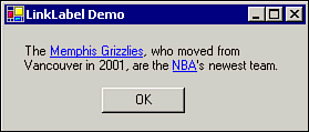 Reacting to the Selection of a Hyperlink Of course, the whole point of a LinkLabel control is for some action to occur when the user clicks the hyperlink. When the user clicks one of a LinkLabel control's hyperlinks, the control's LinkClicked event handler is invoked. If the LinkLabel control contains only one hyperlink, writing code for the LinkClicked event handler to initiate the appropriate action is a simple matter. Typically, you will want to open another form or use a browser to open a Web page. The following code will cause an instance of frmDestination to be loaded when LinkLabel1's link is clicked: Dim f as New frmDestination() f.Show() Reacting to the user having clicked a link in a LinkLabel control that contains more than one link is a little trickier. Fortunately, the LinkData property of the Link object allows us to specify information related to that specific link. The LinkData property of the active link is provided to the LinkClicked event handler via the argument e, which is of type LinkLabelLinkClickedEventArgs. In the example demonstrated in the previous section, each new member added to the LinkCollection (via the Links property) was assigned a URL for its LinkData property. Making use of this information, the following LinkClicked event handler for LinkLabel1 will cause the user's default Web browser to open and display the appropriate URL when any of LinkLabel1's links are clicked: Private Sub LinkLabel1_LinkClicked(ByVal sender As System.Object, _ ByVal e As System.Windows.Forms.LinkLabelLinkClickedEventArgs) _ Handles LinkLabel1.LinkClicked System.Diagnostics.Process.Start(e.Link.LinkData) End Sub Tip When writing code to react to the user having clicked a link in a LinkLabel control, be sure to put the code in the control's LinkClicked event handler, not the Click event handler. The Click event occurs when the user clicks any part of the label, even if the part he clicks is not a hyperlink.
Changing the Appearance of Links The LinkLabel control supports several properties that govern how the links appear and behave. These properties are discussed in the following sections. The LinkBehavior Property The LinkBehavior property specifies how and when the link(s) contained in a LinkLabel control is underlined to indicate that it is a link. The possible values for the LinkBehavior property, supplied via the LinkBehavior enumeration, are summarized in Table 12.4. Table 12.4. Values for the LinkBehavior Property| LinkBehavior Member | Description |
|---|
| AlwaysUnderline | The link is always underlined to indicate that it is a link. | | HoverUnderline | The link is underlined only when the mouse pointer passes over the link. | | NeverUnderline | The link is never underlined. | | SystemDefault | The link is displayed using the system's default link behavior, specified by the user. This is the default value of the LinkBehavior property. |
The LinkColor Property The LinkColor property is used to specify the color that is initially displayed for the link(s) contained in a LinkLabel control. You use a Color object to specify the value of this property. The default value of the LinkColor property is Color.Blue, causing links to initially appear in blue text. You can change the LinkColor property in the Properties window at design time or at runtime by using code like LinkLabel1.LinkColor = Color.Aquamarine. The ActiveLinkColor Property The ActiveLinkColor propert is used to specify the color in which a link is displayed while it is being clicked. The default value of the ActiveLinkColor property is Color.Red. The VisitedLinkColor Property After the user has clicked a link, you may want the link to appear in a different color from unvisited links (which is typical Web hyperlink behavior). The VisitedLinkColor property allows you to specify the color to be used for links that have been visited (as determined by the LinkVisited property described in the next section). The default value of the VisitedLinkColor property is Color.Purple. The LinkVisited and Visited Properties Even though you can specify a color in which visited links are to be displayed, the fact that a link has been visited is not maintained automatically. For a link to be displayed in the color designated by its VisitedLinkColor property, you must set the LinkLabel control's LinkVisited property to True. However, the LinkVisited property only applies to the first link contained in a LinkLabel control. If a LinkLabel control contains multiple links, you must set the Visited property of the appropriate Link object in the LinkLabel control's LinkClicked event handler, as illustrated here: Private Sub LinkLabel1_LinkClicked(ByVal sender As System.Object, _ ByVal e As System.Windows.Forms.LinkLabelLinkClickedEventArgs) _ Handles LinkLabel1.LinkClicked e.Link.Visited = True System.Diagnostics.Process.Start(e.Link.LinkData) End Sub The Timer Component Sometimes you will want to write code that runs at specific time intervals or after a certain amount of time has elapsed. The Timer component provides this functionality by executing code at set time increments. Some possible uses for the Timer component include the following: The Timer component works by firing the Tick event (and, in turn, invoking the Tick event handler) at specific time intervals. You control the length of time between Tick events by setting the timer's Interval property to the number of milliseconds that should elapse between Tick events. (A millisecond is a thousandth of a second; therefore, 1,000 milliseconds equal one second.) Once the timer has been activated (either by invoking its Start method or by setting its Enabled property to True), code that you place in the Tick event handler is executed each time the number of milliseconds specified by the Interval property elapses. Let's demonstrate how to use the Timer component by creating a simple stopwatch program. This program will use the Timer component to continually update a Label control containing the elapsed time since the stopwatch's Start button is clicked. Setting Up the Stopwatch Application Follow these steps to set up the stopwatch application: -
Start a new Windows Application project. Name it Stopwatch. -
Set the Text property of the application's single form (Form1) to Stopwatch Demo. -
Add a Label control named lblElapsedTime to Form1. Enter 00:00:00, representing no elapsed time, as its Text property. Set its Font property to Courier New, 36 point. Set its TextAlign property to TopCenter. Size and position the label so that its entire contents are visible. -
Drag a Button control to Form1; give it the name cmdStart. Set its Text property to Start. -
Add a second Button control to Form1; give it the name cmdStop. Set its Text property to Stop. Also, set its Enabled property to False; the user should not be able to click the Stop button until the stopwatch has been started. -
Drag a Timer from the Toolbox to Form1. Note that the new Timer (Timer1) does not appear on the form itself, but in the tray area below the form. The Timer component is not visible to the user at runtime. -
To calculate the stopwatch's elapsed time, the application will need a form-level variable to remember when the user clicked the Start button. Open the Code window for Form1 and type Dim dStart As DateTime just above the End Class line.
An example of the completed form is shown in Figure 12.11. Figure 12.11. The stopwatch application has a simple user interface. 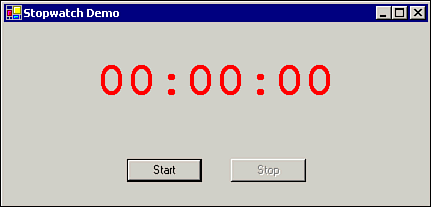 Coding the Start Button When the user clicks the Start button, the following things need to happen: The dStart variable should be set to remember when the user started the stopwatch. The Timer component should be activated. The Start button should be disabled because the user should not be able to click it after the stopwatch has already started. The Stop button should be enabled.
Enter the Click event handler in Listing 12.1 for cmdStart, which will accomplish the desired tasks. Listing 12.1 Starting the Timer Component Private Sub cmdStart_Click(ByVal sender As System.Object, _ ByVal e As System.EventArgs) Handles cmdStart.Click dStart = Now Timer1.Start() cmdStart.Enabled = False cmdStop.Enabled = True End Sub Coding the Stop Button The Stop button should accomplish the following: The Timer component should be deactivated. The Start button should be enabled. The Stop button should be disabled.
To handle these actions, enter the following Click event handler for cmdStop: Private Sub cmdStop_Click(ByVal sender As System.Object, _ ByVal e As System.EventArgs) Handles cmdStop.Click Timer1.Stop() cmdStart.Enabled = True cmdStop.Enabled = False End Sub Coding the Timer Component Of course, the mostimportant job in this application belongs to the Timer component. Once the timer's Start method is invoked, the default value of its Interval property, 100 milliseconds, will cause the timer's Tick event to fire every tenth of a second, which is fine for this application. The timer's Tick event handler, which is executed with each Tick event, needs to calculate the elapsed time (in seconds) between the start time (which has been stored in the dStart variable) and the current time (represented by the Now method of the System.DateTime structure). The difference is converted to a string representing hours, minutes, and seconds and then displayed in the lblElapsedTime label. To enter the Tick event handler for Timer1, perform these steps: -
Make sure you are in the Code window for Form1. -
Click the Code window's Class Name drop-down box and select Timer1. -
After Timer1 is selected in the Class Name drop-down box, select Tick from the Method Name box. -
Enter the following code as the Tick event handler for Timer1:
Private Sub Timer1_Tick(ByVal sender As Object, _ ByVal e As System.EventArgs) Handles Timer1.Tick Dim lHrs As Long, lMins As Long, lSecs As Long lSecs = DateDiff(DateInterval.Second, dStart, DateTime.Now) lHrs = Int(lSecs / 3600) lSecs -= (lHrs * 3600) lMins = Int(lSecs / 60) lSecs -= (lMins * 60) lblElapsedTime.Text = Format(lHrs, "00") & ":" & _ Format(lMins, "00") & ":" & Format(lSecs, "00") End Sub Listing 12.2 shows the complete code for the Stopwatch application to this point. Later in this section, you will see how to add more functionality to the application. Listing 12.2 Coding the Stopwatch Application Dim dStart As DateTime Private Sub cmdStart_Click(ByVal sender As System.Object, _ ByVal e As System.EventArgs) Handles cmdStart.Click dStart = DateTime.Now Timer1.Start() cmdStart.Enabled = False cmdStop.Enabled = True End Sub Private Sub Timer1_Tick(ByVal sender As Object, _ ByVal e As System.EventArgs) Handles Timer1.Tick Dim lHrs As Long, lMins As Long, lSecs As Long lSecs = DateDiff(DateInterval.Second, dStart, DateTime.Now) lHrs = Int(lSecs / 3600) lSecs -= (lHrs * 3600) lMins = Int(lSecs / 60) lSecs -= (lMins * 60) lblElapsedTime.Text = Format(lHrs, "00") & ":" & _ Format(lMins, "00") & ":" & Format(lSecs, "00") End Sub Private Sub cmdStop_Click(ByVal sender As System.Object, _ ByVal e As System.EventArgs) Handles cmdStop.Click Timer1.Stop() cmdStart.Enabled = True cmdStop.Enabled = False End Sub Testing the Stopwatch Application Save and run the application. When you click the Start button, the Timer's Start method is invoked, enabling the timer. The Label control is continually updated with the number of hours, minutes, and seconds since the Start button was clicked. The Stop button causes the stopwatch to stop. A running version of the Stopwatch application is pictured in Figure 12.12. Figure 12.12. The Stopwatch application uses the Timer component to update a Label control with elapsed time information. 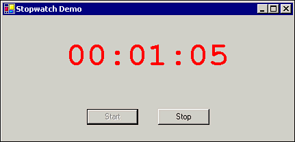 The NotifyIcon Control The NotifyIcon control provides some nice functionality for which Visual Basic developers have been clamoring for some time; namely, the ability to place a "live" icon in the system tray. Four important properties of the NotifyIcon control define its appearance and behavior: The Icon property specifies the icon that is to appear in the system tray. The Visible property determines whether the control is visible in the system tray. The Text property defines the ToolTip text that is displayed when the user hovers the mouse pointer over the tray icon. The ContextMenu property specifies a ContextMenu control that is popped up when the user right-clicks the NotifyIcon control.
In addition, the Click, DoubleClick, and MouseMove events give you the opportunity to write code to react to your users' interaction with a NotifyIcon control. To illustrate the NotifyIcon control, we will enhance the Stopwatch application that was created in the preceding section. This time, we will add a tray icon indicating that the Stopwatch application is running, even if the user minimizes the form. We will write code to cause the form to become hidden if the user minimizes it. A context menu will allow the user to restore the main form or exit the application from the tray icon. Furthermore, if the user hovers over the tray icon, a ToolTip will display the current value of the stopwatch. Modifying the Stopwatch Application The following steps will take you through the process of enhancing the Stopwatch application to utilize a NotifyIcon control in the system tray: -
Begin with the Stopwatch application that we created in the preceding section. -
Drag a ContextMenu control to Form1. Add the following menu items to the ContextMenu control: | Menu Item Name | TextProperty |
|---|
| mnuRestore | &Restore | | mnuExit | E&xit |
-
Drag a NotifyIcon control to Form1. -
Set the NotifyIcon control's Icon property to an appropriate icon. I used the icon timer01.ico, which by default is installed with Visual Studio .NET in the C:\Program Files\Microsoft Visual Studio.NET\Common7\Graphics\icons\Misc folder. -
Set the NotifyIcon control's ContextMenu property to ContextMenu1, which you created in step 2. When you select the ContextMenu property in the Properties window, notice that you are presented with a drop-down list box listing any ContextMenu controls that exist on Form1. -
Set the NotifyIcon's Text property to Stopwatch is Stopped, which will be the initial value of the icon's ToolTip until the stopwatch is started. -
To cause the form to be hidden if the user minimizes it, enter the following as the form's Resize event handler (which is executed whenever the user resizes the form, including minimizing it). The code checks to see if the current value of the form's WindowState property indicates that it is minimized; if so, the form is hidden: Private Sub Form1_Resize(ByVal sender As Object, _ ByVal e As System.EventArgs) Handles MyBase.Resize If Me.WindowState = FormWindowState.Minimized Then Me.Visible = False End If End Sub -
Add the following code as the Click event handler for the mnuRestore menu item. This code causes the form to return to visibility and un-minimize itself: Private Sub mnuRestore_Click(ByVal sender As Object, _ ByVal e As System.EventArgs) Handles mnuRestore.Click Me.Visible = True Me.WindowState = FormWindowState.Normal End Sub -
Add the following code as the Click event handler for the mnuExit menu item: Private Sub mnuExit_Click(ByVal sender As Object, _ ByVal e As System.EventArgs) Handles mnuExit.Click Me.Close() End Sub -
Add the code NotifyIcon1.Text = "Elapsed Time: " & lblElapsedTime.Text to the end of the existing Timer1_Tick event handler. This code sets the value of the NotifyIcon control's Text property, which updates its ToolTip each time the Tick event fires. The complete Timer1_Tick event handler is as follows: Private Sub Timer1_Tick(ByVal sender As Object, _ ByVal e As System.EventArgs) Handles Timer1.Tick Dim lHrs As Long, lMins As Long, lSecs As Long lSecs = DateDiff(DateInterval.Second, dStart, DateTime.Now) lHrs = Int(lSecs / 3600) lSecs -= (lHrs * 3600) lMins = Int(lSecs / 60) lSecs -= (lMins * 60) lblElapsedTime.Text = Format(lHrs, "00") & ":" & _ Format(lMins, "00") & ":" & Format(lSecs, "00") NotifyIcon1.Text = "Elapsed Time: " & lblElapsedTime.Text End Sub
Listing 12.3 shows the newly enhanced Stopwatch application. Listing 12.3 Enhancing the Stopwatch Application Dim dStart As DateTime Private Sub cmdStart_Click(ByVal sender As System.Object, _ ByVal e As System.EventArgs) Handles cmdStart.Click dStart = DateTime.Now Timer1.Start() cmdStart.Enabled = False cmdStop.Enabled = True End Sub Private Sub Timer1_Tick(ByVal sender As Object, _ ByVal e As System.EventArgs) Handles Timer1.Tick Dim lHrs As Long, lMins As Long, lSecs As Long lSecs = DateDiff(DateInterval.Second, dStart, DateTime.Now) lHrs = Int(lSecs / 3600) lSecs -= (lHrs * 3600) lMins = Int(lSecs / 60) lSecs -= (lMins * 60) lblElapsedTime.Text = Format(lHrs, "00") & ":" & _ Format(lMins, "00") & ":" & Format(lSecs, "00") NotifyIcon1.Text = "Elapsed Time: " & lblElapsedTime.Text End Sub Private Sub cmdStop_Click(ByVal sender As System.Object, _ ByVal e As System.EventArgs) Handles cmdStop.Click Timer1.Stop() cmdStart.Enabled = True cmdStop.Enabled = False End Sub Private Sub mnuRestore_Click(ByVal sender As System.Object, _ ByVal e As System.EventArgs) Handles mnuRestore.Click Me.Visible = True Me.WindowState = FormWindowState.Normal End Sub Private Sub mnuExit_Click(ByVal sender As System.Object, _ ByVal e As System.EventArgs) Handles mnuExit.Click Me.Close() End Sub Private Sub Form1_Resize(ByVal sender As Object, _ ByVal e As System.EventArgs) Handles MyBase.Resize If Me.WindowState = FormWindowState.Minimized Then Me.Visible = False End If End Sub Testing the Modified Stopwatch Application You have now enhanced the Stopwatch application to include a system tray icon. Save and run the modified application. Notice that a tray icon appears. Start the stopwatch and hover the mouse pointer over the tray icon, noticing that the ToolTip contains the current value displayed by the stopwatch. Minimize the stopwatch form; notice that the form disappears, but the tray icon is still visible and still displays the stopwatch value when hovered over. Right-click the tray icon to see the context menu. Click Restore to make the form reappear. The ProgressBar Control A progress bar, shown in Figure 12.13, is commonly used to give the user a visual indication of how long an operation has taken and how much of the operation is remaining. Typically, a progress bar is used to display how much of a file remains to be downloaded, how many records of a database have been processed, and so on. The progress bar starts with an empty panel, which a bar expands to fill as the operation progresses. Visual Basic .NET provides the ProgressBar control to let you add this capability to your programs. Figure 12.13. The ProgressBar control is used to show the user how much of an operation is remaining. 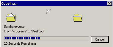 To use the ProgressBar control, draw one on a form and set its properties appropriately. The main properties that control the progress bar are Minimum, Maximum, and Value. The Minimum and Maximum properties define the range that the bar will cover, and the Value property dictates the current position of the bar. In other words, if Minimum is set to 0 and Maximum is set to 100, a Value property setting of 50 would cause the bar to fill about half of the control's available area. A typical use of the ProgressBar control is to display the status of a database operation while it is in progress. You can set the Maximum property to the number of records being processed; each time a record is processed, you can increment the Value property by one. As is normal, it's easier to learn about a control by using it. Follow these steps to see a ProgressBar control in action: -
Start a new Windows Application project. -
Drag a ProgressBar control to the application's main form (Form1). Set its Minimum property to 0 and its Maximum property to 10. -
Drag a Button control to Form1. -
Enter the code from Listing 12.2 as the Click event handler for the Button control: Private Sub Button1_Click(ByVal sender As System.Object, _ ByVal e As System.EventArgs) Handles Button1.Click Dim lThen As Long ProgressBar1.Value = 0 Do While ProgressBar1.Value < ProgressBar1.Maximum ProgressBar1.Value += 1 lThen = Timer Do While Timer < (lThen + 1) '(Wait for 1 second) Loop Loop End Sub
This code begins by setting the ProgressBar control's Value property to 0; therefore, it will start off with an empty bar. The first Do loop increments the progress bar's Value property by one until it reaches its maximum value (10). So that the progress bar doesn't move so fast that you can't see it, the internal Do loop causes the program to pause for one second each time through the external loop. When you save and run the application, click the Button control. You will see the ProgressBar control's bar expand to fill the control's area over the course of about 10 seconds. Scrollbars Windows users are familiar with the concept of scrollbars, which provide a graphical way to perform tasks such as controlling the current position within a document or making adjustments to the volume of a media clip. Scrollbars work just like the real-world volume control on your stereo system, which can be set to any point between certain maximum and minimum values. From the programmer's point of view, the Visual Basic scrollbar controls return a numeric value; it is the programmer's responsibility to use this value appropriately in an application. Visual Basic .NET provides two types of scrollbars for entering numerical data: the HScrollBar (horizontal scrollbar) control and the VScrollBar (vertical scrollbar) control. These two controls are shown in Figure 12.14. Figure 12.14. The HScrollBar and VScrollBar controls can be used to enter and display a numeric value graphically. 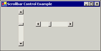 The only difference between the two controls is the orientation of the bar on the form. The following section examines the HScrollBar control, but it applies equally to the VScrollBar control. Setting Up the Scrollbar To use a scrollbar, you simply use properties to set and retrieve the range of acceptable values that the user may enter, as well as the actual current value. The three most important properties, available at both design time and runtime, are as follow: Value Retrieves or sets the current numeric value Minimum Controls the minimum value of the Value property Maximum Controls the maximum value of the Value property
To use these properties, set the Minimum and Maximum properties to values representing the range you want and then access the Value property to find the result. One typical range is from 0 to 100, where the users would enter a number as a percentage. Note The scrollbars can accept Int32 type numbers (32-bit integers), which can be anywhere in the range of -2,147,483,647 to 2,147,483,647. However, valid values for the Value property depend on the values of the Minimum and Maximum properties. Remember this point when you are setting a scrollbar value from code because a value outside the current range causes an error.
The Scroll event of the scrollbar fires whenever the bar is scrolled; the Scroll event handler is a good place to put code that utilizes the control's Value property. To test a scrollbar, start a new Windows Application project. Place a horizontal scrollbar and a TextBox control on the form. Then enter the following code in the initialization area of the form's New procedure: HScroll1.Minimum = 0 HScroll1.Maximum = Me.Width TextBox1.Left = 0 Private Sub HScroll1_Change() TextBox1.Left = HScroll1.Value End Sub Run the program and set the scrollbar to different values by dragging; clicking; and using the arrow, Home, and End keys. The text box should change positions on the form to match the current setting of the scrollbar. Controlling the Size of the Value Changes If you have used ascrollbar in a word processor or other program, you know that clicking the arrow at either end of the bar moves you a short distance, and clicking between an arrow and the position button moves you a larger distance. The scrollbar controls work the same way, and you get to set how much the numbers change with each kind of move. The scrollbar's Value property changes every time you click the scrollbar or drag the position button, as indicated in Figure 12.15. Figure 12.15. Clicking various parts of the scrollbar changes its value by different amounts. 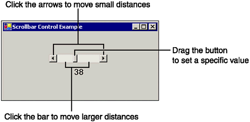 The amount that the Value property increases or decreases when an arrow is clicked is controlled by the SmallChange property (unless such a change would exceed the bounds of the Minimum and Maximum properties). This property gives you very fine control over the numbers being entered. Its default value is 1, which is probably a good number to use for most purposes. When you click between the arrow and the position button, the Value property can change by a larger amount than if you click an arrow. The amount of this change is set by the LargeChange property. The default setting of the LargeChange property is 10. The setting you use depends on your application. Tip A good rule of thumb is to set the LargeChange property to a number about 5% 10% of the total range (for example, a value of 50 for a 0 1000 range).
Displaying the Scrollbar's Position Numerically Although the visual representation provided by a scrollbar is nice, users cannot tell what the range is or the exact numeric value. Sometimes you may need to write code to provide more detailed feedback. For example, suppose you are using a scrollbar to select a fiscal year for a report. The scrollbar's Maximum property can be set to the current fiscal year, and its Minimum property can be set to the earliest year for which data exists. As users move the scrollbar, you can display the value they are scrolling through and then, when they release the mouse, invoke the code that actually generates the report. Code such as the following, placed in a scrollbar's Scroll event handler, will display the current contents of the Value property in a Label control's Text property: Label1.Text = HScrollBar1.Value Tip Be sure to display an initial value in the Label control, either by setting its Text property at design time or by using code in the form's New procedure at runtime.
| 
