| When you add a new form to your project, you are presented with a plain gray square box. As you add controls to your form, you change its appearance. However, there are a lot of changes you can make to the form itself to make it more interesting and useable. To understand some of these changes, let's quickly review the different parts of a form, as indicated in Figure 10.1. Figure 10.1. To give your application a more professional appearance, change the form caption by setting the Text property. 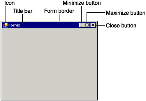 Setting form properties can control each of the elements pictured in Figure 10.1. You may have already learned some of the basic properties of a form, such as the Text property, which controls the text that is displayed in the title bar, or the Icon property, which controls the image that is displayed both in the title bar and in the task bar when the form is minimized. In this section, we will discuss properties of a form that can be used to control how the form looks and behaves when the user interacts with it. Changing the Border Style of a Form If you work with a lot of Windows applications, you know that forms take on different styles depending on their use in an application. For example, Microsoft Word allows you to resize a document to fit the entire screen if necessary. On the other hand, the settings for your screen saver appear in a fixed window that cannot be resized or minimized. The FormBorderStyle property of a Windows form determines what title bar elements are displayed on the form, and whether the user can control the form's size and position. By default, the FormBorderStyle property of a form is set to Sizable, which means the user has total freedom over resizing the form at runtime. The seven possible settings that control the FormBorderStyle property are listed in Table 10.1 . Several examples of different FormBorderStyle settings are shown in Figure 10.2. Figure 10.2. Changing the FormBorderStyle property can give a form many different appearances. 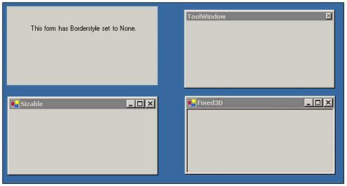 Table 10.1. FormBorderStyle Property Settings| Setting | Effect |
|---|
| None | No border, title bar, or control buttons are displayed for the form. The user cannot move or resize the form. | | FixedSingle | The title bar and control buttons are displayed for the form. The user cannot resize the form. | | Sizable | The title bar and control buttons are displayed. The user can resize the form by clicking and dragging the border. This setting is the default. | | Fixed3D | The title bar and control buttons are displayed. A three-dimensional border is displayed, which makes the form look inset. The user cannot resize the form. | | FixedDialog | Visually similar to the FixedSingle form. | | FixedToolWindow | The form has a single-line border and displays only the title bar and Close button. They are shown in a reduced font size. | | SizableToolWindow | This is the same as the Fixed ToolWindow, except that the form has a sizable border. |
Note Setting the FormBorderStyle property to prevent resizing does not affect the form's appearance in the design environment; it does so only at runtime.
Understanding Title Bar Buttons In Table 10.1, several of the FormBorderStyle definitions indicate that a control box and the Close, Minimize, and Maximize buttons would be displayed in the title bar of the form. This behavior is the default. But even with these border styles, you can individually control whether these elements are enabled on the form. Hiding the Minimize and Maximize Buttons The MaximizeBox and MinimizeBox properties each have a True or False setting that determines whether the particular element is clickable by the end user. The default setting for each of these properties on a sizable form is True. (Tool window forms do not have these buttons.) If you set a property to False, the corresponding element is displayed in a grayed-out mode to indicate it is disabled on the form, as pictured in Figure 10.3. If you set both the MinimizeBox and MaximizeBox properties to False, the buttons will disappear from the title bar. Figure 10.3. The control box of a Windows form is the icon in the upper-left corner, which will display a menu containing resize options when clicked. The shortcut key for this menu is Alt+Space. 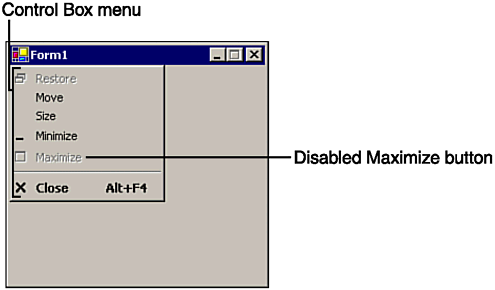 The Control Box menu pictured in Figure 10.3 automatically displays the menu options in the state that corresponds to the state of the associated title bar button. If you set a form's ControlBox property to False, all of the title bar buttons will disappear completely. Note You can use the WindowState property to minimize or maximize a form with code, regardless of the state of the title bar buttons.
Displaying a Help Button Another button available for use in the title bar is the help button. A help button allows the user to ask your program for help on a particular section of the form. A help button works differently from most buttons, in that using it is a two-step process. First, the user clicks the help button, which changes the mouse cursor to a question mark. Next, the user clicks a control on your form, such as the text box with which she needs assistance. Clicking a control after clicking the form's help button causes its HelpRequested event to fire. In this event, you can write code to display relevant information. However, enabling this button is a little tricky. Not only do you have to set the HelpButton property to True, but you also have to set the MinimizeButton and MaximizeButton properties to False. Although this may seem like a strange restriction at first, it makes sense when you consider the help box is designed for use with dialog boxes; as you will see in an upcoming section, for other types of forms, it is common to provide a Help menu for program documentation.  For more on dialog boxes, p.335 For more on dialog boxes, p.335
Working with Size and Position Forms and controls have a size, which is represented by the Size property, and a position, which is represented by the Location property. Because a computer screen is a two-dimensional object, each of these properties is itself an object with properties for each dimension. A form's size is made up of a height and a width component; its location is made up of x and y coordinates in relation to the screen. These components and their relationships are shown in Figure 10.4. Figure 10.4. The location and size properties of a text box are measured relative to the form; the form is measured relative to the screen. 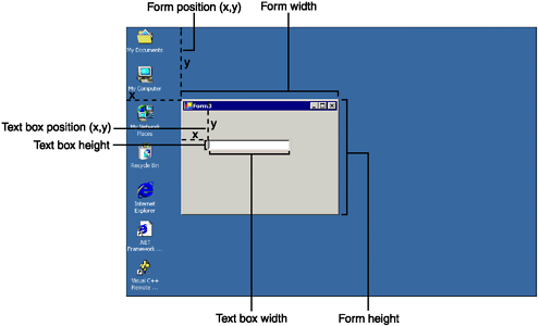 Form Sizing Properties As you've seen, you can modify an object's size by selecting it and dragging a sizing handle at design time. You also can change the values of its Height, Width, or Size properties at runtime. The following lines of code double a form's size when executed: Me.Height *= 2 Me.Width *= 2 Notice the use of the keyword Me, which refers to the current instance of an object. Using Me allows you to specify the current form object from within the form class, without naming it explicitly. Notice in the previous lines of code that Height and Width are separate, top-level properties. The Size class allows you to specify the height and width of a form at the same time: Dim ExtraLarge As New Size(123,456) Me.Size = ExtraLarge The Size class is used to represent a rectangular area of pixels. If you resize an object at design time or runtime with the mouse, you will see a corresponding change in the Height, Width, and Size properties. Understanding the Location Property In addition to controlling an object's size, you can also control its position on the screen with the Left, Top, and Location properties. As with the size properties, you can set each coordinate of the location individually using the Left or Top properties, or all at once by declaring an object of type Position. The Left property specifies the distance of the left side of an object from the left side of the object's container. The Top property specifies the distance of the top edge of an object from the top edge of its container. In the case of a standard form, the container is the entire screen. If you draw a control on a form, such as a text box, the form is the control's container, as shown in Figure 10.4. The text box's Height and Width properties relate to the form that contains it. Note The ToString method of the Size and Position objects formats their values in coordinate style format, with parentheses.
Setting Boundary Sizes Even if your FormBorderStyle property is set to allow the user to resize the form, you can control the range of sizes allowed by setting minimum and maximum sizes. You can do this at design time or runtime by setting the MaximiumSize and MinimumSize properties. As an example, the following lines of code set a form's minimum and maximum size: Me.MinimumSize = New Size(100,100) Dim NewSize AS Size NewSize = Screen.GetWorkingArea(Me).Size NewSize.Height \= 2 NewSize.Width \= 2 Me.MaximumSize = NewSize The first line of code sets the minimum size of the form to 100 x 100 pixels. The next few lines of code determine the screen's size and set the maximum form size to half of that area. In other words, if your screen is 1,024 x 768, then the code statements would make the maximum form size 512 x 384 pixels. Notice that we use the GetWorkingArea method of the Screen class to determine the size of the working area of the current form. To test this code, place it in a button's Click event. Experiment with resizing the form, then click the button and notice that resizing becomes restricted. Note The MinimumSize and MaximumSize properties affect both code statements and user-initiated resizing. For example, if you set a form's size to a size larger than the allowed maximum size, the form size will change to the maximum size.
If you set size restrictions but then later want to remove them, set the MinimumSize and MaximumSize properties to (0,0). Adding Automatic Scrollbars Visual Basic .NET forms include an interesting new feature called AutoScroll, which automatically creates scrollbars for your form, as shown in Figure 10.5. Figure 10.5. AutoScroll creates scrollbars when the form dimensions are too small to display all the controls. Background images are not affected. 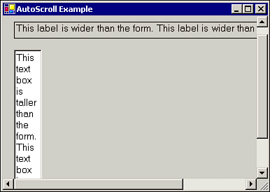 To use AutoScroll, just set a form's AutoScroll property to True, either at design time or runtime. Setting the AutoScroll property to True provides a visual indication to the user that controls exist outside the viewable area. A summary of the AutoScroll-related form properties is next: AutoScroll Controls automatic scrollbars. If you allow the user to manually resize a form, the scrollbars will appear and disappear as needed. AutoScrollMargin Allows you to pad the controls with a margin so that the scrollbars appear when the form's borders fall within the margin. By default, this property is set to a Size of (0,0). AutoScrollMinSize The minimum size that will make the scrollbars appear, regardless of whether there are controls outside the form's visible area. AutoScrollPosition Gets or sets a Position containing the scrollbar settings. For example, if the scrollbars are at their topmost and leftmost positions, this property will contain the position (0,0).
Setting Form Startup Options Your form position can change while your program is running, either when the user moves it or you set a new value for the Position property. However, you can set the StartPosition property to tell Visual Basic where you want the form to be initially displayed. You can pick one of the following options for the StartPosition property: CenterParent The form appears centered within the border of its parent form. For example, if Form1calls the ShowDialog method of Form2 and the StartPosition property of Form2 is set to CenterParent, then Form2 will be centered in relation to Form1. CenterScreen Centers the form in relation to the entire screen. Manual The form will appear at the coordinates specified in the Location property, which defaults to (0,0) the upper-left corner screen. WindowsDefaultLocation Allows Windows to determine the starting position, based on the other open windows. WindowsDefaultBounds Allows Windows to determine the starting position and size of the form.
Visual Effects As we will see in a future chapter, you can use classes from the System.Drawing namespace to draw objects and print text directly on a form or control. However, there are a few properties of a form that can be used to create some interesting visual effects. For more on Drawing and Graphics, p.357 Changing Form Colors The BackColor property can be used to set the color of the background area of the form, which appears behind the controls. Instead of a plain gray form, you can set the background to the color of your choice: Me.BackColor = Color.Honeydew Me.BackColor = Color.FromKnownColor(KnownColor.Desktop) Me.ForeColor = Color.FromName("Yellow") Note For a list of system-defined colors available in Visual Basic, see the help topic "Color Members."
The first line of the previous code sets the background color to one of the built-in color constants, Color.Honeydew (yes, Honeydew!). The next line of code uses a system color, which means the actual color of the form will be affected by the user's color scheme in the Windows control panel. In the example, the form background is set to the same color as the Windows desktop. The final line of code uses the FromName method to specify a color by name. You also can set color values to custom colors, such as those returned by a ColorDialog control. For more on the Color dialog box, p.309 The ForeColor and BackColor properties of a form affect controls that are placed on the form, such as labels and buttons. For example, if you add a label control to a form, the label's ForeColor and BackColor colors will match the form. If you do not explicitly set the label's colors, they will remain linked to those of the form and change when the form colors are changed. This is true both at runtime and in design mode. Adding a Background Image Another nice effect you can add to a form is a background image. Controls can be placed on top of the image, as shown in Figure 10.6. Figure 10.6. A background image can be used to create a custom login screen or About box. 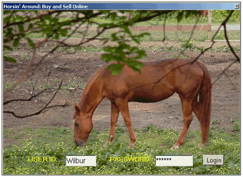 The easiest way to set the background image for a form is to use the Properties window at design time. However, if you need to load images from disk after your program is running, you can set the property to any valid Image object, as in the following example: Dim imgTemp As Image imgTemp = Image.FromFile(Application.StartupPath & "Horse.jpg") Me.BackgroundImage = imgTemp For more on graphics formats, p.357 The preceding lines of code create an instance of the Image class using an image file, horse.jpg, and assign it to the BackgroundImage property of the form. The code assumes the image file is located in the same folder as the application executable, which is the bin directory when you are debugging in Visual Studio. If the image dimensions are less than the form size, the image is tiled repeatedly on the form background. Note Set the background color of a control to Color.Transparent to allow the user to view the form's background image through the control.
Creating Transparent Forms Two new properties, TransparencyKey and Opacity, allow you to create transparent forms, meaning you can see other forms or the Windows desktop behind your application. To use the Opacity property, assign a double value between 0 1 to represent the desired percentage of opaqueness. For example, the following line of code sets a form's Opacity to 50%: Form1.Opacity = 0.5 To see the Opacity property in action, using a scrollbar perform the following steps: -
Add a Horizontal scrollbar control to your form. Set its Name property to scrOpacity. -
The Min and Max properties of the scrollbar should already be set to 0 and 100, respectively. Set the Value property of the scrollbar to 100. -
Add a Label control to your form. Set the Name property to lblOpacity. -
Add the following two lines of code to the scrollbar's Scroll event: Me.Opacity = scrOpacity.Value / 100 lblOpacity.Text = Me.Opacity.ToString
Now run the sample program. As you move the scrollbar, the form should appear to fade in and out, as shown in Figure 10.7. Figure 10.7. The Opacity property can use to create fade-ins and other ghostly form effects. 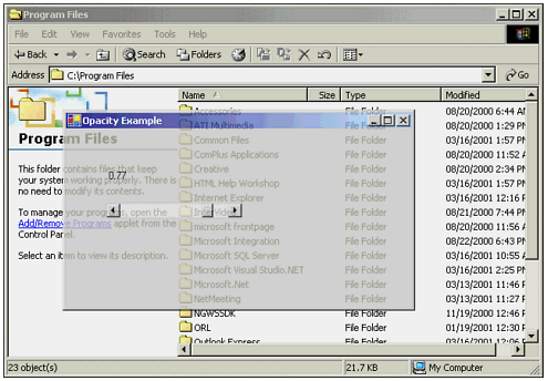 The TransparencyKey property is similar to the Opacity property in that it allows you to see through the form, but with two important differences: The transparent parts of the form do not accept events such as the mouse click; in other words you can still access the controls on an opaque form even if you can't see it, but a transparent area of a form allows you to click through it. Form transparency is either total or not based on a color; opacity is a percent value that applies to all colors.
To demonstrate a transparent form, add a Label control to your form and set the BackgroundColor property of the label to blue. Set the TransparencyKey property of the form to the same color as the label background. When you run the program, your form will appear to have a hole in it clicking in the transparent area will activate the window behind the form. Note The Opacity property is not supported at 256-color resolution. Make sure you have at least 16-bit color selected to use this property.
| 
