| In addition to text input fields, a frequent method of accepting user input is to display a list and allow the user to select one or more items. Even if you do not require the user to select a list item, lists can be used to display information in an organized manner. The Web Forms model contains several controls suitable for displaying all types of lists, everything from a single column of string values to an editable, data-bound grid. In this section we will cover the ASP.NET Server controls that allow you to add lists and grids to your program. Creating Simple Lists If you need to display a simple list of strings for the user of a Web forms application, you have a variety of controls to choose from: ListBox A ListBox control displays multiple list items on the screen at the same time. Depending on property settings, you can allow the user to select one or multiple items by highlighting them with the mouse. DropDownList The DropDownList control lets the user pick a single item from a list. It only takes up about as much room as a text box because the list of items is hidden when the user is finished browsing it. CheckListBox A CheckListBox allows the user to select multiple list items. A check mark is displayed next to each selected item. Unlike the ListBox control, a CheckListBox can display items in multiple columns. RadioButtonList The RadioButtonList control works similarly to the CheckListBox, except it allows the user to select only one value at a time. A dot appears next to the selected item.
Most of these controls behave similarly to their Windows versions, although the Web versions are generally more limited in their functionality. For example, the familiar ListBox control does not have automatic sorting on the Web, and it can store only simple values. This of course makes sense because the list items must be able to be rendered in a browser using standard HTML. Figure 19.10 shows what the simple list controls look like to an end user. Figure 19.10. List controls are input fields that allow the user to select from a group of predefined items. 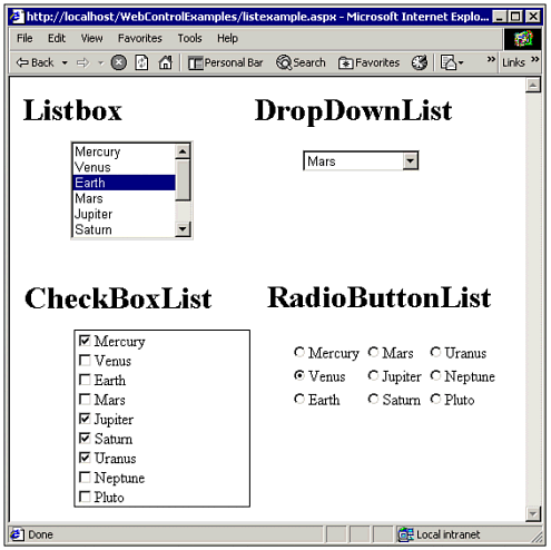 Working with Items in a ListControl Each of the simple list controls pictured in Figure 19.10 derives from a common class called the ListControl. Therefore, once you know how to manipulate list items for one type of control, you can easily apply that knowledge to the others. Each type of list control has an Items collection that contains the list items. Each list item has a Text property, which is displayed for the user, and a Value property, which is associated with the displayed item but not displayed on the screen. Listing 19.4 shows a function that fills a list control with a list of the planets in the solar system. Listing 19.4 WEBCONTROLS.ZIP Using List Controls Private Sub ListPlanets(ByVal MyList As ListControl) Dim PlanetNames() As String = {"Mercury", "Venus", "Earth",_ "Mars", "Jupiter", "Saturn", "Uranus",_ "Neptune", "Pluto"} Dim OrbitInYears() As Double = _ {0.2, 0.6, 1, 1.9, 11.9, 29.5,_ 84, 164.8, 247.9} Dim i As Integer For i = 0 To 8 MyList.Items.Add(New ListItem(PlanetNames(i),_ OrbitInYears(i))) Next End Sub The ListPlanets function in Listing 19.4 specifies the Value and Text properties for each item using the constructor function of the ListItem class. This function will work with any of the previously mentioned list controls on a Web form. Note You are not required to populate the Value property of a list item. It is intended to store another piece of information about the list item that is needed by your program, such as an ID number for a database retrieval.
All controls inherited from the ListControl class allow the user to select some range of items. The DropDownList and RadioButtonList controls are designed for situations where the user must pick one and only one item. The CheckListBox control allows the user to select one, several, or no items, entirely at his discretion. The ListBox control has two selection modes, which determine whether the user can highlight one or multiple items. In any case, each element in the Items collection has a Selected property that can be used to programmatically determine whether the user selected it: Dim TempItem As ListItem For Each TempItem In MyList.Items If TempItem.Selected Then lblInfo.Text &= "You selected " & TempItem.Text & vbCrLf End If Next The previous lines of code use a loop to check each member of the Items collection. However, if you are working with a single selection list, there is a much easier way to determine the selected item: If Not IsNothing(MyList.SelectedItem) Then lblInfo.Text = "You selected " & MyList.SelectedItem.Text Else lblInfo.Text = "No item selected!" End If As the example demonstrates, the SelectedItem property returns the currently selected list item. If you access the SelectedItem property for a multiple-selection list, you will get the item with the lowest list index. Note To create default selections, you can set the Selected property of the desired items to True when building the list.
You can also access items in a list by their numeric index numbers. Each ListItem has a numeric index, which can be used to retrieve or set item values: MyList.Items(2).Text = "Hey you" To find out the index number of the selected item, use the SelectedIndex property. If no item has been selected, this property contains the value 1. To determine the number of elements in the Items collection of a list, use the Count property. Note Index values are zero-based, so if the count of items in a list control is 20, their index values will range from 0 to 19.
The Items also contains other useful methods for managing a list, including search and delete functions: TempItem = MyList.Items.FindByText("Pluto") If Not IsNothing(TempItem) Then MyList.Items.Remove(TempItem) End If There are two find methods, FindByText and FindByValue. These functions perform an exact-match, case-sensitive search of the Items collection and return the first item matching the search string. Using a ListBox The ListBox control allows the user to view multiple items on the screen at the same time and provides a scrollbar if there are too many items to display at once. As with other controls, you can set the size of a list box when you draw it or set its Height and Width properties. However, the list box also allows you to control its height based on the number of items you want to display on the screen at once, by setting the Rows property. To use the Rows property, you must delete any value for the Height property. If you do set the Height property, the size of the list box is rounded to fit an exact number of rows; it will not display partial rows. Figure 19.11 shows two list boxes using different height settings. Figure 19.11. The height of the leftmost list box was set using the Rows property to display only two rows; the height of the list box on the right was set using the Height property. 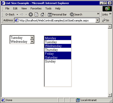 Notice that Figure 19.11 also demonstrates a list box that contains multiple selected items, indicated by their highlighted backgrounds. To allow the user to select multiple items in a list box, you must set the SelectionMode property to Multiple. To use a multiple-selection list box, single-click the desired items with the mouse while holding down the Ctrl key or use the Shift key to select ranges. Tip Make sure your ListBox control is sized appropriately in relation to the number of items it contains. For example, it may be very difficult for the user to scroll through 100 items if the list is sized to show only three at a time. If you have a very large number of items, you may want to consider breaking your list into multiple parts and having the user narrow down her choices gradually.
Tip The keyboard can be used to quickly move through a list. The PageUp, PageDown, Home, End, and arrow keys cause the list box to scroll. For sorted lists, typing the first letter of a word causes the list to jump to an item that begins with that letter.
Displaying Items in Multiple Columns Items in the ListBox and DropDownList controls are always stacked vertically, but the RadioButtonList control and CheckBoxList controls allow you to arrange them in columnar format. By setting the RepeatColumns property, you can specify how many columns you want in your list. The RepeatDirection property determines how the list is filled, horizontally or vertically. Figure 19.12 illustrates the use of this property. Figure 19.12. The RadioButtonList controls were filled in the same order, to show the effect of different RepeatDirection settings; the CheckBoxList controls demonstrate the use of the RepeatFlow property. 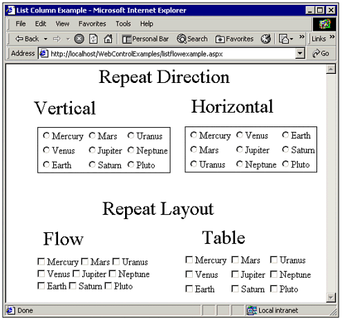 Also note the two CheckBoxList controls. By default when you use a multi-column list, the columns are arranged using an HTML table so they line up. However, you can turn off this property if desired. Note When filling a multi-column list dynamically, you may want to delete any setting for the Width property while in design mode. This will allow it to automatically expand as necessary.
Displaying Information in a Table Although list controls can be used for displaying selecting items, their formatting capabilities are somewhat limited. HTML tables, on the other hand, have always been popular elements on a Web page for displaying lists. Not only can you use them to organize your Web page, but they are also very well suited to handling multiple columns of information. To work with tables in the Web Forms programming model, you use the Table control. Every table is made up of rows, which in turn are made up of cells. Table, TableRow, and TableCell are all classes in the .NET framework whose properties closely resemble their HTML counterparts. Figure 19.13 shows an example of a Table control that was filled with data from a database at runtime. Figure 19.13. The Table control provides an easy way to display a read-only, multi-column list. Special formatting can easily be applied to the entire table, certain rows, or individual cells. 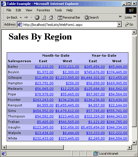 In Chapter 3, "Creating Your First Web Application," we demonstrated the code necessary to dynamically add rows and cells to a table by creating TableRow and TableCell objects.  For a step-by-step example of adding data to a Table control, p. 49 For a step-by-step example of adding data to a Table control, p. 49
Controlling Table Appearance As you learned, the Text property of a TableCell determines what text actually appears in the cell. However, there are also many other properties available to control the table's appearance. The sample table in Figure 19.13 has alternating light and dark rows for easy readability. To create this effect, simply change the BackColor property of the row depending on the contents of a variable: bDark = Not bDark If bDark Then CurRow.BackColor = Color.FromName("#AAAADD") End If Assuming the code sample is placed in the middle of a loop, the first statement will cause the variable bDark to alternate between values of True and False. In effect, the previous code sample sets the background color to dark for every other iteration of the loop, making the table rows resemble old-fashioned "greenbar" computer paper. Some of the other types of table elements you can customize are Borders You can customize the width and style of the border surrounding each table cell by setting the GridLines, BorderStyle, and BorderWidth properties. Alignment You can center or justify the text in a cell by setting the HorizontalAlign and VerticalAlign properties. In Figure 19.13, the cells containing currency values are aligned to the rightmost side of the cell so the decimal points line up. Size and Spacing You can control cell height, width, padding, as well as whether text in a cell wraps to multiple lines. Fonts and Colors Fonts and colors for the foreground and background can be set for the entire table, each row, or even each cell. You can also place a background image behind the table by setting the BackImageURL property.
You customize the look of a table by setting properties at the table, row, or cell level. Some properties, such as colors and fonts, apply to lower levels unless overridden by other values. (That is why we didn't have to set a light background color explicitly in the previous code sample.) You can set table properties at runtime or at design time. If you set up a table at design time, you probably will need to access the Collection Editor dialog box, shown in Figure 19.14. This screen is used to set cell and row properties and can be displayed from the Properties window. Figure 19.14. You can set up table headers and fonts within Visual Studio at design time. 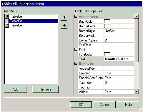 Although most of the time you will probably be adding the data in a table's cells dynamically with code, the Collection Editor provides an easy way to set up the table headings. Using HTML in the Text Property Part of the advantage of using the Web Forms programming model is the fact that as a developer you do not have to deal with HTML. However, HTML is what is sent to the end user's browser, so it makes sense that at certain times you might want to have precise control over it. For example, if you have ever coded a <TABLE> in HTML manually, you know that you can put almost anything in a table cell, such as a hyperlink or an input field. You can do this with the ASP.NET Table control by putting HTML codes in the Text property: CurrCell.Text = "<A HREF=detail.asp?>" & SalesAmount & "</A>" The previous line of code builds a hyperlink in the Text property. When the table control appears in the user's browser, the cell will contain a link to the detail.asp page. Working with Data Bound Lists In our examples thus far, we have populated lists by adding one item at a time. However, many of the ASP.NET server controls, such as ListBox, also support data binding. Data binding means the contents of a list are associated with a data source. Rather than explicitly setting up each list item, you simply tell the list a data source to provide it some data. In Chapter 22, "Using ADO.NET (ADO)," we discuss data binding in the context of ADO.NET and describe how to use the DataGrid control. The DataGrid control allows the end user to edit the items stored in a list and update the underlying data source. In this case, the grid is a vehicle for data entry, rather than just a simple selection and display list. You'll learn more about binding database fields to controls in Chapter 22. For more on data binding, p. 618 However, for the purposes of this chapter, you need to know about data binding because two of the list-related controls, Repeater and DataList, only support data binding to set up the list. Although it is more common to use data binding with an ADO.NET DataSet, data binding also works with arrays, so do not worry if you have not yet read the ADO.NET chapter. Creating a Custom HTML List If you want total control over how your list is rendered in the end user's browser, you need to investigate using the Repeater control. The Repeater control makes it easy to create a custom HTML list through the use of templates. You simply define a template for how each item in your list should appear, and then the Repeater control takes care of merging the template with each list item. The easiest way to define a template is just to type it into the HTML view in the Web form designer. Listing 19.5 shows a Repeater item template that specifies an image hyperlink followed by some text. Listing 19.5 WEBCONTROLS.ZIP Creating a Repeater Template <asp:Repeater runat="server"> <ItemTemplate> <a href="displayreport.aspx?id=<%#_ Container.DataItem.ReportID %>"> <img src="/books/3/115/1/html/2//print.gif"></a> <%# Container.DataItem.ReportName %> Report <br> </ItemTemplate> </asp:Repeater> When you draw a Repeater control, the <asp:Repeater> tag is automatically added to your Web form. To create the template for items in the Repeater list, enclose your HTML in an <ItemTemplate> tag. Note You can also specify templates for other parts of a Repeater list, such as the header and footer.
Binding a DataSource to the Repeater To get the reader to display your list items, you need to reference them in the template. To accomplish this, access the Container.DataItem object with server-side script tags. In Listing 19.5, the ReportID and ReportName fields are used in each list item. Listing 19.6 shows the code necessary to provide this data to the Repeater control. Listing 19.6 WEBCONTROLS.ZIP Setting Up the Repeater Private Class ReportInfo Public ReportName As String Public ReportID As Integer Public Sub New(ByVal Name As String, ByVal ID As Integer) Me.ReportName = Name Me.ReportID = ID End Sub End Class Private Sub Page_Load(ByVal sender As Object, _ ByVal e As EventArgs) Handles MyBase.Load Dim ReportList As New ArrayList() ReportList.Add(New ReportInfo("Profit and Loss", 1)) ReportList.Add(New ReportInfo("General Ledger", 2)) ReportList.Add(New ReportInfo("Accounts Payable", 3)) Repeater1.DataSource = ReportList Repeater1.DataBind() End Sub Figure 19.15 shows how the list looks when the template is merged with the data items in the ReportList array. Figure 19.15. The Repeater allows you to generate custom HTML for each item in a data set. 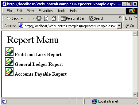 | 
