Tool 130: Pareto Chart
| AKA | Pareto Analysis, Pareto Principle |
| Classification | Analyzing/Irending (AT) |
Tool description
The Pareto chart is a bar chart arranged in a descending order of size or importance from left to right to separate and display the critical few from the trivial many causes of a problem. It is named after Vilfredo Pareto who, in the late 1800s, postulated the 80/20 role, which states that 80 percent of the trouble is due to 20 percent of the causes. The Pareto chart will also show the cumulative percentage for each cause on the chart.
Typical application
-
To prioritize potential causes of a problem.
-
To establish and verify cause and effect.
-
To reach consensus on what needs to be addressed first.
-
To identify improvement opportunities.
-
To measure success of corrective action.
Problem-solving phase
| → | Select and define problem or opportunity |
| → | Identify and analyze causes or potential change |
| Develop and plan possible solutions or change | |
| → | Implement and evaluate solution or change |
| → | Measure and report solution or change results |
| Recognize and reward team efforts |
Typically used by
| Research/statistics | |
| Creativity/innovation | |
| Engineering | |
| Project management | |
| 2 | Manufacturing |
| 5 | Marketing/sales |
| Administration/documentation | |
| 3 | Servicing/support |
| 4 | Customer/quality metrics |
| 1 | Change management |
before
-
Checksheet
-
Data Collection Strategy
-
Sampling Methods
-
Frequency Distribution
-
Yield Chart
after
-
Problem Specification
-
Process Analysis
-
Problem Analysis
-
Process Mapping
-
Action Plan
Notes and key points
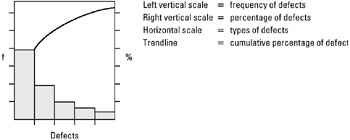
Step-by-step procedure
-
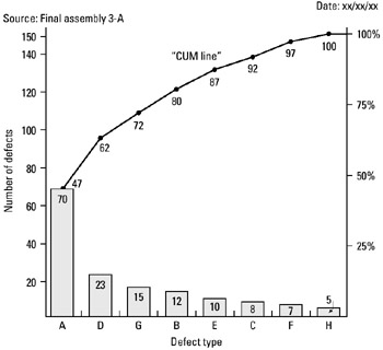
STEP 1 Identify the data source. See example Tape Unit Assembly Defects.
-
STEP 2 Calculate percentages for totals of each type of defect.
-
STEP 3 Draw a Pareto chart as shown in the notes and key points above.
-
STEP 4 Designate left and right vertical scales.
-
STEP 5 Draw the bars in accordance with total defects per type.
-
STEP 6 Construct the cumulative line (left to right) by adding the respective percentage for each defect type and connect plots with straight lines, as shown in the example.
-
STEP 7 Title the Pareto chart; include time period covered and source of data.
Example of tool application
Tape Unit Assembly Defects
| Tape Unit Assembly Defects (April) | Quantity | %[*] |
|---|---|---|
| A - Unit surface (scars/scratches) | 70 | 47 |
| B - Sub-assembly (defective) | 12 | 8 |
| C - Mounting parts (incorrect/missing) | 8 | 5 |
| D - Insulators (cracked/missing) | 23 | 15 |
| E - Wire (incorrect lenght) | 10 | 7 |
| F - Assembling (incorrect) | 7 | 5 |
| G - Soldering (% fill rejects) | 15 | 10 |
| H - Labeling (missing/incorrect) | 5 | 3 |
| — | — | |
| 150 | 100 | |
|
[*]Rounded | ||
EAN: 2147483647
Pages: 326
- ERP System Acquisition: A Process Model and Results From an Austrian Survey
- The Effects of an Enterprise Resource Planning System (ERP) Implementation on Job Characteristics – A Study using the Hackman and Oldham Job Characteristics Model
- Context Management of ERP Processes in Virtual Communities
- Healthcare Information: From Administrative to Practice Databases
- A Hybrid Clustering Technique to Improve Patient Data Quality