Section 5.3. Font Size
5.3. Font SizeThe methods for determining font size are both very familiar and very different.
In a fashion very similar to the font-weight keywords bolder and lighter, the property font-size has relative-size keywords called larger and smaller. Much like what we saw with relative font weights, these keywords cause the computed value of font-size to move up and down a scale of size values, which you'll need to understand before you can explore larger and smaller. First, though, we need to examine how fonts are sized in the first place. In fact, the actual relation of the font-size property to what you see rendered is determined by the font's designer. This relationship is set as an em square (some call it an em box) within the font itself. This em square (and thus the font size) doesn't have to refer to any boundaries established by the characters in a font. Instead, it refers to the distance between baselines when the font is set without any extra leading (line-height in CSS). It is quite possible for fonts to have characters that are taller than the default distance between baselines. For that matter, a font might be defined such that all of its characters are smaller than its em square, as many fonts do. Some hypothetical examples are shown in Figure 5-9. Figure 5-9. Font characters and em squares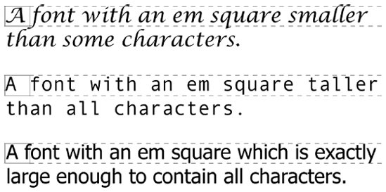 Thus, the effect of font-size is to provide a size for the em box of a given font. This does not guarantee that any of the actual displayed characters will be this size. 5.3.1. Absolute SizesHaving established all of that, we turn now to the absolute-size keywords. There are seven absolute-size values for font-size: xx-small, x-small, small, medium, large, x-large, and xx-large. These are not defined precisely, but are relative to each other, as Figure 5-10 demonstrates: p.one {font-size: xx-small;} p.two {font-size: x-small;} p.three {font-size: small;} p.four {font-size: medium;} p.five {font-size: large;} p.six {font-size: x-large;} p.seven {font-size: xx-large;} Figure 5-10. Absolute font sizes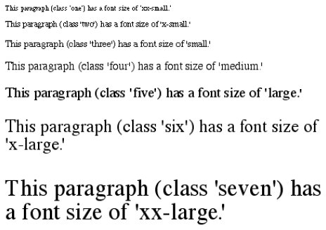 According to the CSS1 specification, the difference (or scaling factor) between one absolute size and the next should be about 1.5 going up the ladder, or 0.66 going down. Thus, if medium is the same as 10px, then large should be the same as 15px. On the other hand, the scaling factor does not have to be 1.5; not only might it be different for different user agents, but it was changed to a factor somewhere between 1.0 and 1.2 in CSS2. Working from the assumption that medium equals 16px, for different scaling factors, we get the absolute sizes shown in Table 5-3. (The following values are approximations, of course.)
Further complicating the situation is the fact that different user agents have assigned the "default" font size to different absolute keywords. Take the Version 4 browsers as an example: Navigator 4 makes medium the same size as unstyled text, whereas Internet Explorer 4 assumes that small text is equivalent in size to unstyled text. Despite the fact that the default value for font-style is supposed to be medium, IE4's behavior may be wrong, but not quite so wrong as it might first appear.[*] Fortunately, IE6 fixed the problem, at least when the browser is in standards mode, and treats medium as the default.
5.3.2. Relative SizesComparatively speaking, the keywords larger and smaller are simple: they cause the size of an element to be shifted up or down the absolute-size scale, relative to their parent element, using the same scaling factor employed to calculate absolute sizes. In other words, if the browser used a scaling factor of 1.2 for absolute sizes, then it should use the same factor when applying relative-size keywords: p {font-size: medium;} strong, em {font-size: larger;} <p>This paragraph element contains <strong>a strong-emphasis element which itself contains <em>an emphasis element that also contains <strong>a strong element.</strong></em></strong></p> <p> medium <strong>large <em> x-large <strong>xx-large</strong></em></strong></p> Unlike the relative values for weight, the relative-size values are not necessarily constrained to the limits of the absolute-size range. Thus, a font's size can be pushed beyond the sizes for xx-small and xx-large. For example: h1 {font-size: xx-large;} em {font-size: larger;} <h1>A Heading with <em>Emphasis</em> added</h1> <p>This paragraph has some <em>emphasis</em> as well.</p> As you can see in Figure 5-11, the emphasized text in the h1 element is slightly larger than xx-large. The amount of scaling is left up to the user agent, with the scaling factor of 1.2 being preferred. The em text in the paragraph, of course, is shifted one slot up the absolute-size scale (large). Figure 5-11. Relative font sizing at the edges of the absolute sizes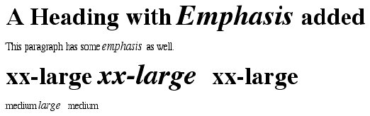
5.3.3. Percentages and SizesIn a way, percentage values are very similar to the relative-size keywords. A percentage value is always computed in terms of whatever size is inherited from an element's parent. Percentages, unlike the relative-size keywords, permit much finer control over the computed font size. Consider the following example, illustrated in Figure 5-12: body {font-size: 15px;} p {font-size: 12px;} em {font-size: 120%;} strong {font-size: 135%;} small, .fnote {font-size: 75%;} <body> <p>This paragraph contains both <em>emphasis</em> and <strong>strong emphasis</strong>, both of which are larger than their parent element. The <small>small text</small>, on the other hand, is smaller by a quarter.</p> <p >This is a 'footnote' and is smaller than regular text.</p> <p> 12px <em> 14.4px </em> 12px <strong> 16.2px </strong> 12px <small> 9px </small> 12px </p> <p > 10.5px </p> </body> Figure 5-12. Throwing percentages into the mix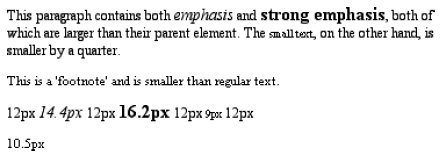 In this example, the exact pixel size values are shown. In practice, a web browser would very likely round the values off to the nearest whole-number pixel, such as 14px, although advanced user agents may approximate fractional pixels through anti-aliasing or when printing the document. For other font-size values, the browser may (or may not) preserve fractions. Incidentally, CSS defines the length value em to be equivalent to percentage values, in the sense that 1em is the same as 100% when sizing fonts. Thus, the following would yield identical results (assuming both paragraphs have the same parent element): p.one {font-size: 166%;} p.two {font-size: 1.6em;} When using em measurements, the same principles apply as with percentages, such as the inheritance of computed sizes, and so forth. 5.3.4. Font Size and InheritanceFigure 5-12 also demonstrates that, although font-size is inherited in CSS, it is the computed values that are inherited, not percentages. Thus, the value inherited by the strong element is 12px, and this value is modified by the declared value 135% to arrive at 16.2px (which will probably be rounded off to 16px). For the "footnote" paragraph, the percentage is calculated in relation to the font-size value that's inherited from the body element, which is 15px. Multiplying that value by 75% yields 11.25px. As with the relative-size keywords, percentages are effectively cumulative. Thus, the following markup is displayed as shown in Figure 5-13: p {font-size: 12px;} em {font-size: 120%;} strong {font-size: 135%;} <p>This paragraph contains both<em>emphasis and <strong>strong emphasis</strong></em>, both of which are larger than the paragraph text. </p> <p> 12px <em>14.4px <strong> 19.44px </strong></em> 12px </p> Figure 5-13. The issues of inheritance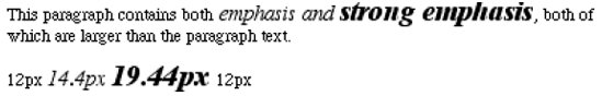 The size value for the strong element shown in Figure 5-13 is computed as follows:
There is an alternative scenario, however, in which the final value is slightly different. In this scenario, the user agent rounds off pixel size, and these rounded values are then inherited normally by any child elements. Although this behavior would be incorrect according to the specification, let's assume that the work agent does it. Therefore, you would have:
If one assumes that the user agent is rounding off at each step, then the end result of both this calculation and the previous one is the same: 19 pixels. However, as more and more percentages are multiplied together, the rounding errors will begin to accumulate. The problem of runaway scaling can go the other direction, too. Consider for a moment a document that is nothing but a series of unordered lists, many of them nested inside other lists. Some of these lists are four nested levels deep. Imagine the effect of the following rule on such a document: ul {font-size: 80%;} Assuming a four-level deep nesting, the most deeply nested unordered list would have a computed font-size value 40.96 percent the size of the parent of the top-level list. Every nested list would have a font size 80 percent as big as its parent list, causing each level to become harder and harder to read. A similar problem can happen if you have a document that uses nested tables for layout. You would then write a rule such as: td {font-size: 0.8em;} Either way, you're likely to end up with a page that's nearly impossible to read. 5.3.5. Using Length UnitsThe font-size can be set using any of the length values discussed in detail in Chapter 4. All of the following font-size declarations should be equivalent: p.one {font-size: 36pt;} p.two {font-size: 3pc;} p.three {font-size: 0.5in;} p.four {font-size: 1.27cm;} p.five {font-size: 12.7mm;} The display in Figure 5-14 assumes that the user agent knows how many dots per inch are used in the display medium. Different user agents make different assumptionssome based on the operating system, some based on preferences settings, and some based on the assumptions of the programmer who wrote the user agent. However, the five lines should always be the same size. So, while the result may not exactly match reality (for example, the actual size of p.three may not be half an inch), the measurements should all be consistent with one another. Figure 5-14. Various font sizes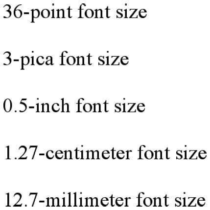 There is one more value that is potentially the same as those shown in Figure 5-14, and that's 36px, which would be the same physical distance if the display medium is 72 pixels-per-inch (ppi). However, there are very few monitors with that setting anymore. Most are much higher, in the range of 96ppi to 120ppi. Many very old Macintosh web browsers treat points and pixels as though they are equivalent, so the values 14pt and 14px may look the same on them. This is not, however, the case for Windows and other platforms, including Mac OS X, which is one of the primary reasons why points can be a very difficult measurement to use in document design. Because of these variations between operating systems, many authors choose to use pixel values for font sizes. This approach is especially attractive when mixing text and images on a web page, since text can (in theory) be set to the same height as graphic elements on the page by declaring font-size: 11px; or something similar, as illustrated by Figure 5-15. Figure 5-15. Keeping text and graphics in scale with pixel sizes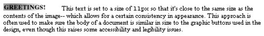 Using pixel measurements for font-size is certainly one way to get "consistent" results with font-size (and, indeed, with any length at all), but there is a major drawback. Internet Explorer for Windows up through Version 6.0 does not allow users to easily resize text that has been set with pixels. Other browsers, including Mozilla, Netscape 6+, IE5+/Mac, Opera, and even IE7, allow the user to resize text no matter how it's been set. Thus, using pixels to size text is no more of a guarantee that it will stay the same size than is any other method. The other approaches discussed in this chapter, such as keywords and percentages, are a much more robust (and user-friendly) way to go, as they can be used to scale text from the user's default font size. |

 14px]
14px] The Definitive Guide")
EAN: 2147483647
Pages: 130