7.5. Determining Height and Width Two other CSS properties that form part of the CSS box model are useful for assigning dimensions to an object, such as a table, column, banner, or sidebar. The height and width properties assign a height and width to the content area of a style. You'll use these properties often when building the kinds of CSS layouts described in Part III of this book, but they're also useful for more basic design chores like assigning the width of a table, creating a simple sidebar, or creating a gallery of thumbnail images (like the one described in the steps in Section 8.6). Adding these properties to a style is very easy. Just type the property followed by any of the CSS measurement systems you've already encountered . For example: width: 300px; width: 30%; height: 20em;
Pixels are, well, pixels. They're simple to understand and easy to use. They also create an exact width or height that doesn't change. An em is the same as the text size for the styled element. Say you set the text size to 24px; an em for that style is 24px, so if you set the width to 2em, then it would be 2x24 or 48 pixels. If you don't set a text size in the style, the em is based on the inherited text size (see Section 6.2.2.3). For the width property, percentage values are based on the percentage of the width of the style's containing element. If you set the width of a headline to 75 percent and that headline isn't inside any other elements with a set width, then the headline will be 75 percent of the width of the browser window. If the visitor adjusts the size of his browser, then the width of the headline will change. However, if the headline's contained inside a <div> (maybe to create a column), that's 200 pixels wide, so the width of that headline will be 150 pixels. Percentage values for the height property work similarly, but are based on the containing element's height, instead of width. GEM IN THE ROUGH
Minimum and Maximum | | CSS also supports a few other properties related to height and width: min-height, min-width, max-height , and max-width . These properties let you set a minimum width or heightmeaning the element must be at least that width or heightor a maximum width or height. The element can't be wider or taller than a set amount. These properties are useful in the flexible layouts described in Section 11.1, since they let you keep your design within a reasonable space for either very small monitors or very large monitors . Unfortunately, Internet Explorer 6 and earlier doesn't understand these properties. C'est la guerre . You can read more about these properties in Section 11.4.3. |
7.5.1. Calculating a Box's Actual Width and Height While the width and height properties seem pretty straightforward, there are a few nuances that often throw people for a loop. First of all, there's a difference between the value you set for a style's width and height and the amount of space that a Web browser actually uses to display the style's box. The width and height properties set the width and height of the content area of the stylethe place where the text, images, or other nested tags sit. (See Figure 7-1 for a refresher on where the content area sits within the overall box model.) The actual widththat is, the amount of screen real estate given by the Web browseris the total of the widths of the margins, borders, padding, and width properties, as illustrated in Figure 7-8. Say you've set the following properties: margin: 10px; border-width: 5px; padding: 15px; width: 100px;
When the width property is set, you always know how much room is allocated just for your contentthe words and images that fill the spaceregardless of any other properties you may set. You don't need to do any math, because the value of the width property is the room for your content (in the above example, 100 pixels). Of course, you do have to perform a little math when you're trying to figure out exactly how much space an element will take up on a Web page. In the above example, the width that a Web browser allocates for the style's box is 160 pixels: 20 pixels for the left and right margins, 10 pixels for the left and right borders, 30 pixels for the left and right padding, and 100 pixels for the width. (And versions of Internet Explorer for Windows older than version 6 get the whole thing wrongsee Section 7.5.3forcing you to do a little extra work for those browsers.) Figure 7-8. Calculate the actual width of a styled element's box by adding up its margins, borders, padding, and width properties. The height occupied on the screen by the element is calculated in the same waythe total of the height property, the top and bottom margins, the top and bottom borders, and the top and bottom padding. 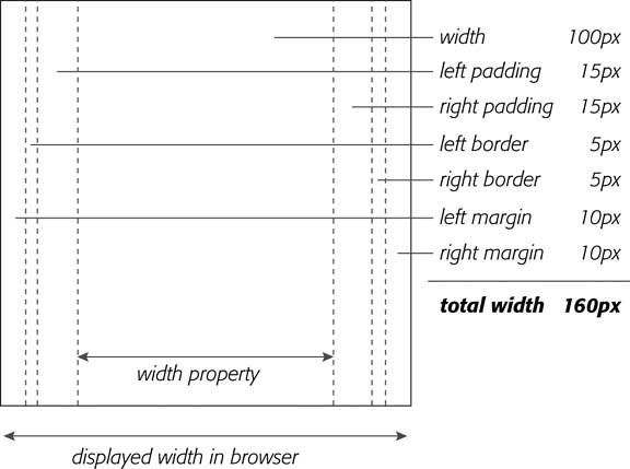
Be careful when you specify heights for page elements. Unless you're sure of the exact dimensions of the content of a tag, it's hard to know exactly how tall a box will be. Say you created a style for a pull quote to highlight an interesting comment from an article and you set the pull quote box to a width of 100px and a height of 100px. When you add too much text to the pull quote, the box will grow taller than 100 pixels and you'll run into some weird problems (see Figure 7-9). Even if the text fits within the 100-pixel height, a visitor to your site may increase the font size in her browser, making the text larger than the height you specified. 7.5.2. Controlling the Tap with the Overflow Property When the content inside a styled tag's larger than the style's defined width and height, some weird things happen. As shown in Figure 7-9, IE 6 and earlier just let the box expand to fit the larger content, while other browsers let the content spill out of the box (past the borders and often over other content). Figure 7-9. Depending on the browser you're using, the content in a box will display in one of two ways if it's taller than the box's set height. Internet Explorer 6 (left) and earlier for Windows will simply expand the box to fit the content. But other browsers, like Firefox (right) and Internet Explorer 7, keep the box the same height and spill the content out and below the edges. 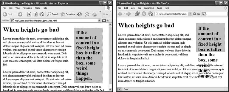
Fortunately, you can control what a browser should do in this situation with the overflow property. Overflow accepts four keywords that control how content that overflows the edges of a box should be displayed: -
visible . This option is what browsers do normally. It's the same as not setting the property at all (Figure 7-10, top). -
scroll . Lets you add scroll bars (Figure 7-10, middle). It creates a kind of mini-browser window in your page and looks similar to old-school HTML frames , or the HTML <iframe> tag. You can use scroll to provide a lot of content in a small amount of space. Unfortunately, scroll bars always appear when you use this option, even if the content fits within the box. Figure 7-10. The overflow property gives you three basic ways to deal with text that doesn't fit inside a box. Visible displays the content anyway (top); scroll and auto add scroll bars (middle); and hidden just doesn't show anything that doesn't fit (bottom). 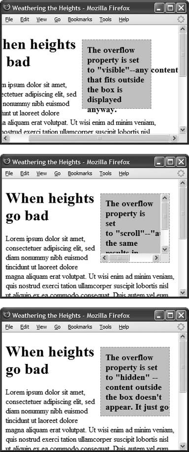 -
auto . To make scroll bars optional, use the auto option. It does the same thing as scroll, but adds scroll bars only when needed. -
hidden . Hides any content that extends outside the box (Figure 7-10, bottom). This option's a bit dangerous, since it can make some content disappear from the page. But it comes in handy for solving some IE browser bugs (see Section 11.1). 7.5.3. Fixing IE 5's Broken Box Model Here's a bit of bad news: Versions 5.5 and earlier of Internet Explorer for Windows doesn't always calculate width and height correctly. Unlike other browsers, it doesn't set the actual area taken up by an element to the total value of the margins, border, padding, and width (or height) property. Instead, IE 5.5and IE 6 in quirks mode (Section 1.3)only uses the margin and width. It includes padding and borders as part of the width property value , making the content area smaller than in most browsers, as illustrated in Figure 7-11. Figure 7-11. Internet Explorer 5 for Windows doesn't get the CSS box model. (The earlier versions don't either.) IE 5 includes any padding and borders as part of a style's width andheight properties. This removes area that's normally reserved for content. As a result, IE 5 can display an element much thinner (or much shorter) than it should. 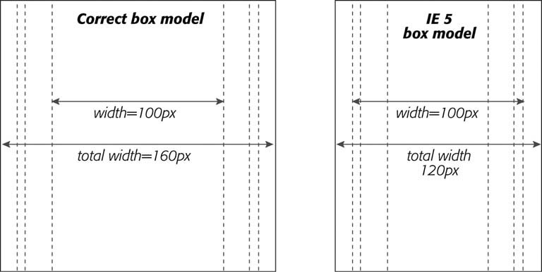
Here's how IE 5 would handle the box in Figure 7-8. All current browsers set aside 160 pixels for the width of the box. The total width of that same styled element would be 10 + 10 (left and right margins) + 100 (width property) for a grand total of 120 pixels . But in Windows IE 5, that sidebar would look 40 pixels thinner than in other browsers. In fact, the actual width dedicated to the content is equal to 100 (the width property)30 (left and right padding)10 (left and right border). The text in a sidebar with these settings would be crammed into 60 pixels, instead of the appropriate 100 pixels. The same's true for the height property. IE 5 treats the height value as the total of the content, top and bottom padding, and top and bottom border. So boxes also appear shorter in IE 5 than in other browsers. You have many different ways around this problem. Here are a few of the most common: -
Don't apply padding or borders to the style containing the width or height property . The problem crops up only when padding or borders are set, so avoiding these properties prevents the problem entirely. But if you want to add a decorative border, you can't very well avoid the border property. -
Use two tagsone to set the width/height and another, nested tag, to set padding and borders . Say you want to have a 100 pixel wide pull quote style, but you also want it to have borders and padding (and, of course, you want it to work in IE 5). You can create the following HTML for the pull quote: <div class="pullquote"> <div class="inner_pullquote"> This is the content of the pull quote. </div> </div>
Then, in your style sheet, add the following two styles: .pullquote { width: 100px; } .inner_pullquote { padding: 10px; background-color: #333; border: 1px dotted red; }
The first style sets the width for the first <div> tagthe parent tag that surrounds the other parts of the pull quote. Since it has only a width specified, all browsers (including IE 5) will display the box at 100 pixels wide. The second, inner <div> has the padding and border set, but no width, so once again there's no IE 5 problem. This solution lets you use borders and padding and works in all browsers, but it requires extra HTML coding and an extraneous <div> tag just to support one dying browser. -
Send IE 5 a different width/height value . Many Web developers prefer this elegant solution, although it requires a little math. The basic idea is to give IE 5.5 and earlier a special width value that's equal to the width value you set for other browsers, plus the combined value of the padding and borders. You have many different ways to specify a CSS property and value to just one browser, like the advanced method discussed in Chapter 14 (Section 14.5.2). A simple method is the star html hack (see the box in Section 7.6). Take the example in Figure 7-8. The width value in this case is 100 pixels: There are 15 pixels worth of left padding and 15 pixels of right padding, as well as 10 pixels of total border width (both left and right borders). Adding those together you get 140 pixels. Now say you've created a class style for this page called .pullquote . This style has all of the basic settings you want: margins, padding, borders, width, and so on. All you need to do is feed IE 5.5 and earlier a different width. So below the .pullquote style, add the following: * html .pullquote { width: 140px; w\idth: 100px; }
This style must come after the original .pullquote style, since it overrides the width property for that style. Essentially, this new style's invisible to every browser except IE 6 and earlier. (IE 7 ignores it as well.) The first property sets the width to 140px (the correct value for IE 5), but since IE 6 gets this new value and handles the box model correctly, you have to reset the width to 100 pixels in order for IE 6 to display the style correctly. That's where that second, weirdo property w\idth comes in. It's actually valid CSS, but it's understood only by IE 6IE 5.5 throws its hands up in disgust and ignores it. Thus, w\idth resets the width property to 100 pixels for IE 6 and everyone's happy (except for the poor Web designers who have to learn these crazy workarounds). -
Ignore IE 5 entirely . This last option may sound a little discriminatory, but it's worth checking out your Web server's log file to see if you even have any visitors coming to your site with IE 5.5 or earlier. Although this antiquated browser still has a few dedicated fans, their numbers are dwindling. And if your site targets a more tech-savvy crowd , then you may not even need to bother designing with IE 5 in mind. (Lucky you.) BROWSER BUG
Special Rules for IE 6 and Earlier | | Dealing with the surprisingly inconsistent ways different browsers display pages is the bane of every Web designer. What looks great in Internet Explorer may fall completely apart in Firefox, or vice versa. Throughout this book you'll find tips on browser management and ways to overcome the worst browser bugs. Not surprisingly, Internet Explorer 6, which is over half a decade old, is plagued by many display problems. Internet Explorer 5 has even more. For example, both IE 5 and 6 have trouble displaying float-based layouts, as you'll see in Chapter 11 (Section 11.1). And IE 5 doesn't always calculate the width of a box correctly (Section 7.5.3). To overcome these bugs, you frequently have to send properties and values to IE that are different than the ones used by other browsers. To that end, there's an easy way to create CSS styles that apply only to IE 6 and earlierthe star html hack . In this method, you begin the style with the following: * html . If you want to have an h1 tag style that applies only to IE 6 and earlier, then name the style * html h1 . All other browsers see the style as a descendent selector that doesn't make any sense, so they promptly ignore it. You'll frequently use the star html hack to override some setting from a style that other (better) browsers display properly but IE gets wrong. In that case, apply the * html hack after the correct style. Say you create a class style named .sidebar that creates an attractive sidebar box for news and site navigation links. Due to a weird bug in IE, the sidebar may appear three pixels off to the left or right (see Section 11.1.1). To counteract this snafu, you can add this IE only special fix after the regular .sidebar style: * html .sidebar { margin-left: -3px }
You'll see the * html hack in a couple of places in this book (like this chapter's tutorial in Section 7.7.5). You'll learn other techniques for managing Internet Explorer in Chapter 14 (Section 14.5.2). Internet Explorer 7 doesn't understand the * html hack, so it'll ignore these types of styles. Fortunately, IE 7 has fixed many of the bugs that plagued earlier versions of the browser so the fixes supplied by * html styles aren't usually needed for that browser. |
|
![CSS[c] The Missing Manual](/icons/6360-small.jpg "CSS[c] The Missing Manual")