Section 7.3. Adding Borders
7.3. Adding BordersA border is simply a line that runs around an element. As shown back in Figure 7-1, it sits between any padding and margins you set. A border around every edge can frame an image or mark the boundaries of a banner or other page element. But borders don't necessarily have to create a full box around your content. While you can add a border to all four edges, you can just as easily add a border to just the bottom or any combination of sides. This flexibility lets you add design elements that don't necessarily feel like a border. For example, add a border to the left of an element, make it around 1em thick, and it looks like a square bullet. A single border under a paragraph can function just like the <hr> (horizontal rule) by providing a visual separator between sections of a page. You control three different properties of each border: color , width , and style . The color can be a hexadecimal number, a keyword or an RGB value, just like with text (see Section 6.1.2). A border's width is the thickness of the line used to draw the border. You can use any CSS measurement type (except percentages) or the keywords thin, medium , and thick . The most common and easily understood method is simply pixels. Finally, the style controls the type of line drawn. There are many different styles, and some look very different from browser to browser, as you can see in Figure 7-7. You specify the style with a keyword. For example solid draws a solid line and dashed creates a line made up of dashes. CSS offers these styles: solid, dotted , dashed, double, groove, ridge, inset, outset, none , and hidden . Tip: None and hidden work the same way: they remove the border entirely. The none value's useful for turning off a single border. (See the example in Section 7.3.1.) Figure 7-7. The appearance of border styles can vary greatly from browser to browser. The browsers pictured here are Internet Explorer 6 for Windows (top left), Firefox for Windows (top right), Opera 8.5 for Windows (bottom left), and Safari 2 for Mac (bottom right). Internet Explorer 7 displays borders the same as IE 6 in this image, and the Mac version of Firefox and Camino look just like the Firefox example pictured here.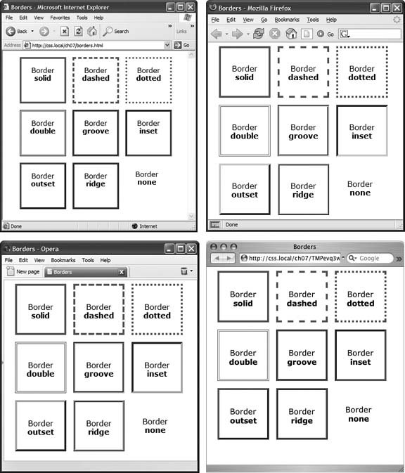 Note: In Windows' Internet Explorer version 6 and earlier, a 1 pixel dotted border looks just like a 1 pixel dashed border. 7.3.1. Border Property ShorthandIf you've ever seen a list of the different border properties available in CSS, you may think borders are really complex. After all, there are 20 different border properties, which you'll meet in the following sections, plus a couple that apply to tables. But all these properties are merely variations on a theme that provide different ways of controlling the same three propertiescolor, width, and stylefor each of the four borders. The most basic and straightforward property is border , which simply adds four borders: border: 4px solid #F00; The above style creates a solid, red, 4-pixel border. You can use this property to create a basic frame around a picture, navigation bar, or other item that you want to appear as a self-contained box. Note: The order in which you write the properties doesn't matter. border: 4px solid #F00 ; works as well as border: #F00 solid 4px ;. 7.3.2. Formatting Individual BordersYou can control each border individually using the appropriate property: border-top, border-bottom, border-left , or border-right . These properties work just like the regular border property, but they control just one side. The following property declaration adds a 2-pixel, red, dashed line below the style: border-bottom: 2px dashed red; You can combine the border property with one of the edge-specific properties like border-left to define the basic box for the entire style, but customize a single border. Say you want the top, left, and right sides of a paragraph to have the same type of border but you want the bottom border to look slightly different. You can write four lines of CSS, like this: border-top: 2px solid black; border-left: 2px solid black; border-right: 2px solid black; border-bottom: 4px dashed #333; Or, you can achieve the same effect as the previous four lines of CSS with just two lines: border: 2px solid black; border-bottom: 4px dashed #333; The first line of code defines the basic look of all four borders, and the second line redefines just the look of the bottom border. Not only is it easier to write two lines of CSS instead of four but it also makes changing the style easier. If you want to change the color of the top, left, and right borders to red, then you only have to edit a single line, instead of three: border: 2px solid red; When you use this shortcut methoddefining the basic look of all four borders using the border property and then overriding the look of a single border with one of the edge-specific properties like border-leftit's crucial that you write the code in a specific order. The more general, global border setting must come first, and the edge-specific setting second, like so: border: 2px solid black; border-bottom: 4px dashed #333; Because the border-bottom property appears second, it overrides the setting of the border property. If the border-bottom line came before the border property, then it would be cancelled out by the border property, and all four borders would be identical. The last property listed can overrule any related properties listed above it. This is an example of the CSS Cascade that you read about in Chapter 5. You can also use this shortcut method to turn off the display of a single border with the none keyword. Say you want to put a border around three sides of a style (top, left, and bottom) but no border on the last side (right). Just two lines of code get you the look you're after: border: 2px inset #FFCC33; border-right: none; The ability to subtly tweak the different sides of each border is the reason there are so many different border properties. The remaining 15 properties let you define individual colors, styles, and widths for the border and for each border side. For example, you could rewrite border: 2px double #FFCC33 ; like this: border-width: 2px; border-style: double; border-color: #FFCC33; Since you're using three lines of code instead of one, you'll probably want to avoid this method. However, each border edge has its own set of three properties, which are helpful for overriding just one border property for a single border edge. The right border has these three properties: border-right-width, border-right-style , and border-right-color . The left, top, and bottom borders have similarly named properties border-left-width, border-left-style , and so on. Imagine that you want to have a two-pixel, dashed border around the four edges of a style, but you want each border to be a different color. (Perhaps you're doing a Web site for kids .) Here's a quick way to do that: border: 2px dashed green; border-left-color: blue; border-right-color: yellow; border-bottom-color: red; This set of rules creates a two-pixel dashed border around all four edges, while making the top edge green (from the first property declaration), the left edge blue, the right edge yellow, and the bottom edge red. You can change the width of just a single border like this: border-right-width: 4px ;. One nice thing about this approach is that if you later decide the border should be solid, you need to edit only the generic border property by changing dashed to solid . Tip: You usually add padding whenever you use borders. Padding provides space between the border and any content, such as text, images, or other tags. Without padding, borderlines usually sit too close to the content. |
![CSS[c] The Missing Manual](/icons/6360-small.jpg "CSS[c] The Missing Manual")
EAN: 2147483647
Pages: 154