Your Monitor is Not Made of Paper
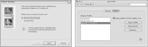
| Seems hardly worth mentioning: Your monitor uses transmitted light to display a semblance of your design piece, whereas the final printed job consists of ink on physical paper. When you think of things in those terms, you shouldn't be surprised that the two realities don't look the same. Yet, it's easy to forget the fundamental fact that your monitor is not displaying ink on paper, and it can be tempting to make color decisions based on what you view on screen. Wouldn't it be great if your monitor could more closely match the printed outcome of your job? Your monitor will never be identical to the printed piece, but it is possible to control your software and your monitor for a much closer match. A Quick Overview of Color ManagementIt's a challenge to modify your monitor's display to simulate ink on paper. It involves color management, which is the science of profiling one device (such as a monitor) to match another device (such as a press). Profiling is the process of using specialized (and often expensive) equipment to evaluate devices such as scanners, monitors, proofing systems, and presses to determine the color characteristics of each device. Once these characteristics are known, the information can be used by software such as Adobe Photoshop to display an image on screen in a way that more realistically represents how the image will appear when it is printed. Implementing color management is not cheap, it's not easy, and it's not for the faint of heart. Using color management gets easier as more software incorporates support for it, but it's best left to dedicated color-management consultants to set up a color-managed workflow. Even then, the setup must subsequently be maintained with conscientious calibration of monitors and printers in order to have optimal results. An in-depth exploration of color management is outside the scope of this book. For an excellentand very readableresource on color management, buy a copy of Real World Color Management, 2nd Edition by Bruce Fraser, Chris Murphy, and Fred Bunting (Peachpit Press, 2004), and take it to the beach with you. Feeling a bit intimidated by the concepts of color management? Don't feel badthat's normal and appropriate. But here's some good news: Even if you fall short of a fully color-managed workflow, you can still benefit by implementing some simple procedures in the interest of consistency between the color on your monitor and the appearance of ink on paper. Control Your Environment
Realistic ExpectationsIf your expensive monitor is freshly calibrated, you've profiled all of your printers, painted your room a neutral gray, and you wear nothing but nonreflective black clothing...well, you're very stylish. But even the best monitor and most expensive desktop printer are, at best, an approximation of what will happen when your job goes to press. It's important to have a realistic idea of how your job will look, and everything you can do to improve its appearance on your monitor and your in-house output is beneficial. You don't want any surprises late in the game. Consequently, your final judgment on job appearance should be based on contract proofs created by your print service provider. Contract ProofsBefore a commercial print service provider cranks up a multimillion-dollar press for your job, proofs will be generated to check color and content. Internally, print service providers may use various kinds of proofs to check various aspects of a job. For example, desktop inkjet or laser output is used to check for problem fonts or mechanical issues, large-format prints are used to check imposed pages, and film-based proofs or digital proofs are used for color matching. Whereas in the olden days, print service providers generated film to create proofs, we've moved into the age of computer-to-plate (CTP) printing, so film output is increasingly rare. But don't feel that a digital proof is somehow less official than a film-based proof. In fact, if digital proofs are based on the same data from the raster image processor (RIP) that creates plates, they should be even more reliable for content. However, not all digital proofs show halftones, so you may be unable to check for problems such as moiré. And it may not be possible to generate a digital proof on all paper stocks. A signed contract proof carries obligations (hence the name contract). The designer's signature says "this proof accurately reflects my intended design. Match this on press, and I'll be happy." And the print service provider's responsibility is to match the color and mechanical content of the contract proof on press. In addition to portraying the mechanics of the piece, such as type flow, image crop, and page content, contract proofs also represent final color on press. If you're going to be viewing proofs in your own office or a client's office, it's important that the viewing conditions be as close as possible to those used by the print service provider. This avoids a phenomenon known as metamerism, wherein two colors may appear to match under one light source but don't match under different lighting conditions. For example, a sample paint chip and a piece of fabric might appear very close in color under a store's commercial lighting, but look very different in your living room. There are companies such as GretagMacbeth that specialize in color-viewing solutions, and your printer's viewing booth will give you an idea of industry standards. There are also suppliers who sell lighting (although not specific to the graphic arts industry) that falls in the desired 50006500 K color temperature range. For more information on viewing conditions and color temperature, see Chapter 1, "Life Cycle of a Print Job." If the printed piece doesn't match the proof you signed, you have a legitimate gripe with the print service provider. If you miss something important on the proof, but the print service provider faithfully matches it, you're at fault. So it behooves you to very carefully inspect a contract proof before signing off on it. |
EAN: 2147483647
Pages: 132
- Enterprise Application Integration: New Solutions for a Solved Problem or a Challenging Research Field?
- Context Management of ERP Processes in Virtual Communities
- Distributed Data Warehouse for Geo-spatial Services
- Healthcare Information: From Administrative to Practice Databases
- A Hybrid Clustering Technique to Improve Patient Data Quality