Blend Modes
The 23 blend modes available in the layers palette are identical to the 23 brush modes discussed in Chapter 1. However, there's a big difference between laying down a color or pattern with a brush and merging the myriad colors that inhabit a single layer, and that's what this chapter is all about.
To demonstrate the effects of Photoshop's blend modes, the series of images shown in Figure 6-6 will be composited, more or less in the order shown. The background layer (being a true background layer) can have no blend mode applied to it. Also note that the face includes a drop shadow layer effect, fading off to the left.
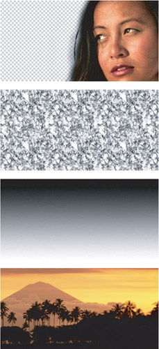
Figure 6-6: The default order of the images is the order pictured here ” the face (top), followed by the Blistered Paint pattern (one of the predefined patterns included with Photoshop), the gradient, and the tranquil background (bottom). However, sometimes the pattern and gradient layers will be slid around if it better suits the discussion.
| Tip | You can apply every one of the blend modes to a layer from the keyboard by pressing Shift+Alt (Shift+Option on the Mac) plus a letter, provided that the active tool doesn't offer its own brush mode options. If the tool supports brush modes ” as in the case of the Brush tool, Pencil, Clone Stamp, Healing Brush, and others ” the shortcuts set the mode for the tool and not the layer. |
Photoshop's 23 blend modes, in order of appearance, are:
-
Normal (N): In combination with Opacity and Fill settings of 100 percent, this option displays every pixel in the active layer normally, regardless of the colors in the underlying layers. When you use opacity values (whether Opacity or Fill) of less than 100 percent, the color of each pixel in the active layer is averaged with the composite pixel in the layers behind it. Figure 6-7 shows examples applied to the face layer on its own. Composite pixel means the pixel color that results from all the mixing that's going on beneath the active layer. For example, your document may contain hordes of layers with all sorts of blend modes in effect, but as long as you're working on, say, Layer 23, Photoshop treats the image formed by Layers 1 through 22 as if it were one flattened image filled with a bunch of static composite pixels.
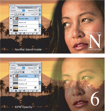
Figure 6-7: The face layer subject to the Normal mode when combined with Opacity values of 100 percent (top) and 60 percent (bottom). The superimposed characters indicate the keyboard shortcut Shift+Alt+N (Shift+Option+N on the Mac) and 6 for 60 percent opacity. -
Dissolve (I): This option specifically affects feathered or softened edges. If the active layer is entirely opaque with hard edges, Dissolve has no effect. But when the edges of the layer fade into view, as seen in Figure 6-8, Dissolve randomizes, or dithers, the pixels. If you look closely, you'll see that Dissolve does not dither pixels in the drop shadow; as discussed in Chapter 7, layer effects are governed by their own, independent blend modes. Things change, however, when you drop the Opacity value below 100 percent, in which case Dissolve dithers all pixels, as demonstrated in the second example of the figure.
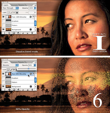
Figure 6-8: Here the Dissolve mode is applied to a layer at 100 percent (top) and 60 percent (bottom) Opacity settings. Instead of creating translucent pixels, Dissolve turns pixels on and off to simulate transparency. -
Darken (K): The first of the four darkening modes, Darken applies colors in the active layer only if they are darker than the corresponding pixels below. Keep in mind that Photoshop compares the brightness levels of pixels in a full-color image on a channel-by-channel basis. So although the blue component of a pixel in the active layer may be darker than the blue component of the underlying composite pixel, the red and green components may be lighter. In this case, Photoshop assigns the blue component but not the red or green, thereby subtracting blue and shifting the pixel toward yellow. Darken is most useful for covering up light portions of an image while letting dark areas show through.
To illustrate Darken and the other darkening modes, first a light background was established by setting the pattern layer on top of the background and lowering its Opacity to 25 percent. Then the gradient layer was placed on top of that and set to the Screen mode, which left the white portion of the gradient visible and dropped out the black portion. The face layer was then added and set to the Darken mode. The result (Figure 6-9) is a face that appears smooth in the midtones and the shadows and patterned in the light areas, with relatively sharp transitions between the two.
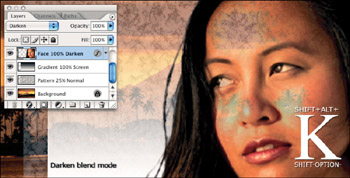
Figure 6-9: A backdrop composed of the background, pattern, and gradient layers followed by an application of the face in the Darken mode. Only those pixels in the face that are darker than the pixels in the patterned backdrop remain visible. -
Multiply (M): Multiply is one of the rare blend modes that emulate a real- world scenario. Imagine that the active layer and the underlying composite are both photos on transparent slides. The Multiply mode produces the same effect as holding these slides up to the light, one slide in front of the other.
Because the light has to travel through two slides, the outcome invariably combines the darkest elements from both images. So unlike Darken, Multiply universally darkens , resulting in smooth transitions, ideal for preserving contours and shadows, as shown in Figure 6-10.
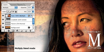
Figure 6-10: The Multiply blend mode produces the same effect as holding two overlapping transparencies up to the light.Tip If the Multiply mode produces too dark an effect, reduce the Opacity or Fill value. If it isn't dark enough, clone the layer by pressing Ctrl+J ( z +J on the Mac).This technique holds true throughout Photoshop: Provided that two layers share a common blend mode, you can merge the layers and preserve the effect.
-
Color Burn (B) and Linear Burn (A): Whereas the Multiply mode darkens your images, the two burn modes can literally char them. They both use colors in the active layer to reduce brightness values, resulting in radical color transformations. As demonstrated in Figure 6-11, Color Burn results in crisp, often colorful , toasted edges; Linear Burn creates a smoother, less vibrant effect. Both modes have an uncanny ability to draw colors from background layers. For example, although the background was lightened by applying Screen to the pattern layer in Figure 6-11, you see more contrast in this figure than in the Multiply example from Figure 6-10. So for high-contrast stamping effects, these are the blend modes to use.
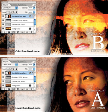
Figure 6-11: After applying Screen to the pattern layer, the Color Burn (top) and Linear Burn (bottom) blend modes were applied to the face layer. Although the background is lighter, many portions of the face appear darker than they did after a single application of Multiply. -
Lighten (G): The next four options use the active layer to lighten those below it. If you select Lighten, for example, Photoshop applies colors in the active layer only if they are lighter than the corresponding pixels in the underlying image. As with Darken, Photoshop compares the brightness levels of all channels in a full-color image.
To set the stage for the lightening figures, the background layers were modified, restoring the pattern layer to Normal and switching the gradient layer to Multiply. As a result, Photoshop dropped out the whites in the gradient and kept the blacks. The Lighten blend mode was then assigned to the face. But the drop shadow was also modified ” which would have otherwise remained black ” by changing its color to white and its blend mode to Screen. The result (Figure 6-12) is a drop glow, which is described in the next chapter.
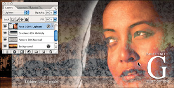
Figure 6-12: Here a dark background was prepared by assigning Multiply to the gradient layer. Then Lighten was applied to the face layer and its drop shadow changed to white. -
Screen (S): From a creative standpoint, Screen is the opposite of Multiply. Rather than creating a darker image, you create a lighter image, as demonstrated in Figure 6-13.
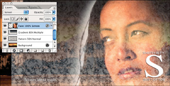
Figure 6-13: The Screen mode produces the same effect as shining two projectors at the same screen. In this case, one projector contains the background layers, and the other contains the face.You can use the Screen blend mode to emulate film that has been exposed multiple times. However, you should only apply Screen when working with images that are sufficiently dark so that you avoid over-lightening. Screen is equally useful for creating glows , retaining just the light colors in a gradient, and creating light noise effects such as snow and stars.
-
Color Dodge (D) and Linear Dodge (W): When you apply one of the two Dodge modes, each color in the layer becomes a brightness-value multiplier . Light colors such as white produce the greatest effect, and black drops away. As a result, the Dodge modes are Photoshop's most dramatic whitening agents ” imagine mounting your image on a gel and projecting it from a spotlight. Of the two, Color Dodge produces the sharper, rougher effect; Linear Dodge smoothes out the transitions (see Figure 6-14). Because they send so much of an image to white, the dodge modes are most useful for simulating hot spots and other intensely bright effects.
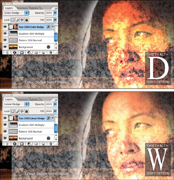
Figure 6-14: After slightly darkening the gradient layer and fading the pattern layer, Color Dodge (top) and Linear Dodge (bottom) were applied to the face. Never subtle, both modes simultaneously bleach the image and draw out some of the dark outlines from the Blistered Paint pattern. -
Overlay (O), Soft Light (F), and Hard Light (H): Photoshop's six light modes darken the darkest colors and lighten the lightest colors, thereby allowing the midtones to intermix, so that foreground and background remain independently identifiable. Of the six, the first three ” Overlay, Soft Light, and Hard Light ” are arguably the most useful.
Each of these three modes alternatively multiplies the blacks and screens the whites, but to different degrees. For example, whereas Overlay favors the background layers, Hard Light emphasizes the active layer. In fact, the two are direct opposites ” Layer A set to Overlay in front of Layer B produces the same effect as Layer B set to Hard Light in front of Layer A. Meanwhile, Soft Light is a modified version of Hard Light that results in a more subtle effect than either Hard Light or Overlay.
Tip When experimenting with these modes, you should always start with Overlay. If Overlay produces too strong an effect, reduce the Opacity or Fill value to favor the composite pixels. Figure 6-15 shows three compositions created using the background, face, and pattern layers. Throughout, the face is set to Normal, fully opaque. To add texture to the image, the blend mode for the pattern layer was set to Overlay. But as shown in the first example, this overwhelms the image. Pressing the 5 key to reduce the Opacity to 50 percent results in the second image.
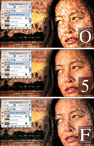
Figure 6-15: With the pattern layer in front, the Overlay mode was applied (top), its Opacity setting reduced to 50 percent (middle), and finally, the layer was set to Soft Light mode with an Opacity of 100 percent (bottom).Alternatively, you can switch from Overlay to Soft Light, as in the final example in Figure 6-15. On first glance, the second and third examples in the figure ” one showing Overlay at 50 percent and the other Soft Light at full opacity ” look very close to identical. But on closer inspection, you will notice that where the balance of lights and darks is roughly equivalent, their distribution is quite different. The Overlay example favors the details in the face; the Soft Light example favors the marbleized edges of the Blistered Paint pattern.
If the Overlay mode at 100 percent seems too subtle, consider switching to the Hard Light mode, shown in Figure 6-16, which provides the best marriage of emphasis on the face and balance with the background.
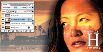
Figure 6-16: Here the face layer is set to Hard Light in front with the gradient set to Screen behind it. -
Vivid Light (V) and Linear Light (J): Whereas Overlay and family combine Multiply and Screen, the next two light modes combine Dodge and Burn. Vivid Light combines Color Dodge and Color Burn, and Linear Light combines Linear Dodge and Linear Burn. Figure 6-17 shows examples. This time, the Opacity setting was reduced for the gradient layer to 50 percent and the pattern layer was brought back, also at 50 percent Opacity, but set to Soft Light. Sandwiched in between is the face, set to Vivid Light at top and Linear Light at bottom.
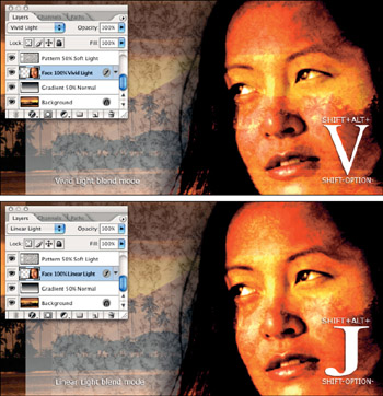
Figure 6-17: The effect of setting the face to the Vivid Light (top) and Linear Light (bottom) modes. Because the effects are so hot, they were sandwiched between a Soft Light pattern layer and a Screen gradient layer, each with Opacity settings of 50 percent. -
Pin Light (Z): One of the simplest modes in all of Photoshop, Pin Light keeps the darkest blacks and the lightest whites and then makes everything else invisible. Pin Light is particularly useful for modifying edge filters. In Figure 6-18, the gradient layer is set to Pin Light to enhance its extremes. The face is returned to Normal. The face is then cloned to a new layer and Filter Sharpen Unsharp Mask applied with an Amount of 100 percent and a Radius of 20 pixels. By applying the Pin Light mode, just the lightest and darkest edges of the sharpened layer are retained. The result is a more subtle effect that still manages to exhibit thick, high-contrast outlines.
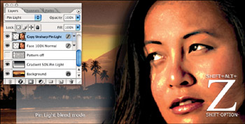
Figure 6-18: After returning the face to the Normal mode, the gradient layer was set to Pin Light. Then the face was cloned, the edges sharpened using the Unsharp Mask filter, and the Pin Light mode applied to keep just the lightest and darkest pixels. -
Hard Mix (L): The Hard Mix blend mode combines the pixels in your layers using the Vivid Light blend mode and then performs a color threshold operation on them. The results that Hard Mix produces don't fit a standard definition of "pretty," as shown in Figure 6-19. Hard Mix mixes two layers and pushes the colors to their absolute extreme. All in all, Hard Mixed pixels come in only eight colors: black, white, red, green, blue, cyan, magenta , and yellow, the end result being quite similar to the Posterize command (Image Adjustments Posterize).
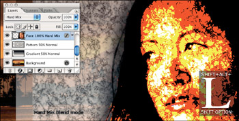
Figure 6-19: Here, only the face layer is set to Hard Mix. Although it is by no means smooth or anti-aliased, Hard Mix isolates the eyes from the other details in the face (by completely obliterating those details). -
Difference (E) and Exclusion (X): Difference inverts lower layers according to the brightness values in the active layer. White inverts the composite pixels absolutely , black inverts them not at all, and the other brightness values invert them to some degree in between. In the first example in Figure 6-20,the Difference mode was applied to the face layer, which is set against the gradient layer set to Screen. The light colors from the background show through the black pixels around the eyebrows , nose, and mouth, and the light areas in the face invert the corresponding areas in the background.
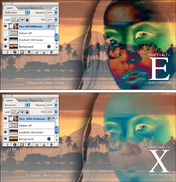
Figure 6-20: When you apply the Difference mode (top), white pixels invert the pixels beneath them; black pixels leave the background untouched. The Exclusion mode (bottom) performs a similar effect, but instead of inverting medium colors, it changes them to gray.Exclusion works just like Difference except for one difference. Illustrated in the second example in Figure 6-20, Exclusion sends midtones to gray ” much as Pin Light sends midtones to transparent ” creating a lower-contrast, often smoother effect.
Cross-Reference One possible use for the Difference and Exclusion modes is to create a "Difference sandwich," in which you slide a filtered version of an image onto a layer between two originals . This and other related techniques are explained in the upcoming section "Sandwiching a filtered image."
-
Hue (U): Hue and the remaining three blend modes make use of the HSL color model to mix colors between the active layer and the underlying composite. When you select Hue, Photoshop retains the hue values from the active layer and mixes them with the saturation and luminosity values from the underlying image.
To demonstrate the HSL blend modes, a layer filled with a red-to-white gradient was added above the face layer. This was accomplished by creating a new layer, and then loading a selection of the face layer by Ctrl+clicking the face layer's thumbnail ( z +clicking on the Mac), and filling the selection with the gradient via the Gradient tool.
Next the Hue blend mode was applied to the red-to-white gradient. As far as Photoshop is concerned , the hue of the gradient is uniformly red, varying strictly in saturation as it fades to white. Hence, the Hue mode retains the red from the gradient and blends it with the saturation and luminosity values from the face layer, in effect colorizing the face red, as seen in the top example of Figure 6-21.
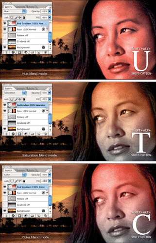
Figure 6-21: Examples of the Hue (top), Saturation (middle), and Color (bottom) blend modes, each applied to the red-to-white gradient. The gradient is constant in hue and varies in saturation, which is why the top of the face appears so vivid in the Saturation and Color examples. -
Saturation (T): When you select this option, Photoshop retains the saturation values from the active layer and mixes them with the hue and luminosity values from the underlying image. In the middle example of Figure 6-21, the redto-white gradient is most saturated at the top and least saturated at the bottom, resulting in brighter colors starting at the forehead, fading to less vibrant colors below the lips.
Note The Saturation mode produces such subtle effects that you typically want to apply it in combination with other blend modes. For example, after applying a random blend mode to a layer, you might duplicate the layer and then apply the Saturation mode to either boost or downplay the colors, much like printing a gloss or matte coating over an image.
-
Color (C): This option combines the Hue and Saturation modes. As shown in the third example in Figure 6-21, Photoshop retains both the hue and saturation values from the active layer and mixes them with the luminosity values from the underlying layers. Because the saturation ingredient of the Color mode produces such a slight effect, Color frequently produces a very similar effect to Hue.
-
Luminosity (Y): The Luminosity blend mode retains the lightness values from the active layer and mixes them with the hue and saturation values from the composite pixels below. Just as the Color mode uses the layer to colorize its background, the Luminosity mode uses the background to colorize the layer.
In Figure 6-22, Luminosity was applied to the red-to-white gradient layer. Because the gradient is uniform in brightness (only the saturation varies), the result is a flattening of surface detail in the face. The shadows of the eyes, nose, and mouth are distinguishable only by their grayish coloring.
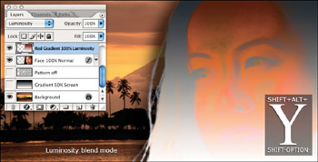
Figure 6-22: The results of applying the Luminosity mode to the red-to-white gradient layer.
The hierarchy of blend modes
Blend modes are amazing. They enable you to try out so many permutations that you can lose yourself for hours. Predicting the outcome of these permutations might require a brain on par with Einstein's, but let's leave prediction to Nostradamus. Experimenting with Photoshop's different blend mode settings requires no intelligence at all, just the willingness to begin the experimentation in the first place ” and that's where this book comes in. An excellent technique to incorporate into your scientific method is "sandwiching," meaning placing one heavily filtered version of an image between two originals and then going to town with Photoshop's various blend mode options. This technique is built on one simple principle:
The effects of more than half the blend modes ” including Normal, Dissolve, Color Dodge and Burn, the six Light modes, and the four HSL modes ” vary depending on which of two images is on top.
For example, Figure 6-23 shows two layers, A and B, and what happens when they are blended with the Overlay mode. When the moon is on top, as in the third example, the Overlay mode favors the man; but when the man is on top, Overlay favors the moon.
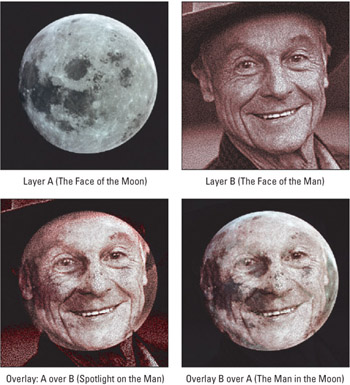
Figure 6-23: After establishing two layers, moon and man, the moon was placed on top and Overlay was applied to get the third image. Then the order of the layers was switched and Overlay was applied to the man to get the last image.
Overlay just happens to be balanced by its opposite, the Hard Light blend mode, which favors the layer to which it's applied. Therefore, you could have achieved the exact effect shown earlier in Figure 6-23 by placing the man under the moon and setting the moon to Hard Light.
So, to beat a dead horse, the order in which you stack your layers is as important as the blend mode you select. Even modes that have no stacking opposites ” Color Dodge, Linear Light, and others ” produce different effects depending on which layer is on top.
| Note | Like Overlay, Color Dodge favors the composite pixels below the active layer. This holds true for Color Burn as well. Meanwhile, Linear Light, Pin Light, and all the other modes with Light in their names favor the active layer. Modes that do not change based on layering order ” Multiply, Screen, Difference, and the like ” favor neither the front nor rear layer. |
Sandwiching a filtered image
When you sandwich a filtered image between two unfiltered images, you can lessen the effect of the filter and achieve different effects than those discussed in Chapter 9. Layers and blend modes give you the flexibility to experiment as much and as long as you want.
Returning to the bathing beauty again in Figure 6-24, her face was copied to a new layer and Filter Sketch Charcoal was applied with the foreground and background colors set to their defaults, black and white. The right-hand image lists the specific settings.
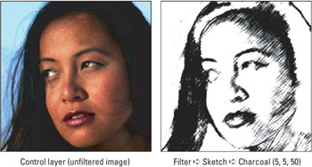
Figure 6-24: The fixings for a blend mode sandwich include the original image layer (left) and a cloned version on an independent layer subject to the Charcoal filter (right).
Like most filters under the Sketch submenu, Charcoal absolutely destroys the detail in the image, replacing all brightness values with the foreground and background colors, in this case, black and white. Fortunately, because I applied Charcoal to a clone of the image, I can use a blend mode to restore some of the detail. Figure 6-25 shows two of the myriad possibilities that exist ” one using the Multiply mode, which kept the blacks in the Charcoal effect and threw away the whites, and the other using Pin Light, which allowed colors from the original image to show through the gray areas of the Charcoal rendering.
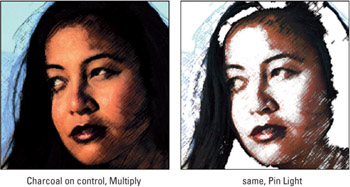
Figure 6-25: Each of two blend modes applied to the filtered layer in front of the original image.
So far the examples have only really been working with an open -faced sandwich. By once again cloning the background layer and moving it above the Charcoal layer, so that the filtered image resides between two originals, you can increase the opportunity for blend mode variations. In this full sandwich, the original images serve as the bread and the Charcoal layer is the sandwich contents. Figure 6-26 provides a small menu of sandwich choices.
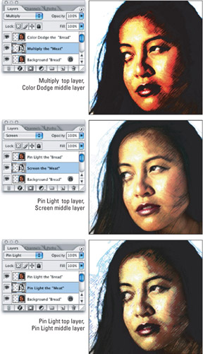
Figure 6-26: When you've got a hunger, only a full sandwich will do. Here several top slices of bread have been thrown on, each slathered with a different, delicious blend mode.
EAN: 2147483647
Pages: 95