Working with Sections
In the previous chapters, you have been presented with a simplistic view of form design—placing individual data entry objects on a form from some fairly simple data sources. These data sources have typically just been a list of fields relating to an underlying data source. While InfoPath makes it easy to create simple forms from these data sources, it can be used to do so much more. This chapter introduces not only some new objects, but also a new data source concept: groups. Groups are collections of fields within a data source. A typical group might look something like the one shown in Figure 7-1.
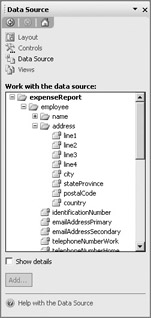
Figure 7-1: A typical group
This is an actual data source from the sample Expense Report form presented in Chapter 3 and includes groups of fields for the name and address information, as well as the expense items in the form and other repeating information. So, why would you have groups of fields in a data source? To start, the underlying data source may require more than a 1:1 relationship in the data. In addition, you may want to organize the fields in your data source according to the hierarchy of the form or an existing data source. You could also use groups to hold information that would appear more than once—such as multiple addresses for a single customer or employee.
For example, in the data source for the sample Expense Form, there are multiple expense items that are included on the form—those fields will eventually be used to populate another data source where the Expense Details table may require those detailed expense items. Grouping within a data source allows you to create more complex data structures that break the 1:1 relationship with the data in favor of a 1:many relationship.
With this technique, you can create complex forms from a single data source without resorting to multiple data structures (databases, tables, and so on) for the different types of information gathered on your form. When the resulting form data is submitted or processed, back-end processes can denormalize this data and place it into the correct tables.
One of the tools that enables you to create this type of complex form are sections. Sections are special areas within your form that can be used for a number of different purposes. Sections in a form are bound to groups. For example, in the sample Expense Report form, the group of fields for Name could all be organized into a single section on your form, as shown in Figure 7-2.
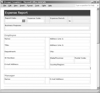
Figure 7-2: A nonrepeating section
This type of section is called a nonrepeating section, because the fields within the Name group don’t repeat in the data source—this group of fields is used to enter the name of the person who is filling out the expense report, and the name appears only once on the form.
If you were to look at the Item group instead, you would see that you could insert a section bound to this group, but it would have to be a repeating section, because the fields in the Item group are used to collect the detailed expense item information, as shown in Figure 7-3. Users can utilize this section to add one item or many, depending on how many expenses they have incurred for the month.
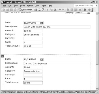
Figure 7-3: A repeating section
The last type of section is an optional section, which is not required to be completed when the form is filled out. Like the other types of sections that have been described, optional sections are bound to a particular group of fields, but the difference is that the user can add or remove the optional section of the form.
For example, in the Expense Report form, you could add an optional section at the bottom of the form that enables the user to enter the names of the clients they have entertained. If they don’t have any client-related expenses, they can leave this section off, but if they need to fill out this section, they can click either the icon or text link to insert the section.
Now that you have had a brief overview of sections, you are actually going to create some sections on your own forms. Throughout the following sections, you are going to be working with a data source that is available with the downloadable files available at www.osborne.com.
Working with Nonrepeating Sections
Nonrepeating sections are sections that are shown once within a particular form. There are a number of reasons that you would want to use a nonrepeating section (as opposed to just showing the fields in a particular area) but they are mainly used to organize your form and to enable you to format an entire section of your report without having to format each individual element.
For example, when you want to validate a particular field, you can change the color of the background of the entire section to draw attention to the validation error. The following section explains how to use nonrepeating sections in your own forms and how to format them.
Inserting Nonrepeating Sections
There are two different methods that you can use to insert a nonrepeating section into your form, depending on whether you are creating the form on-the-fly (creating the data source as you go along) or are creating the form from an existing data source.
If you are working with a blank form and creating the data source as you go, you can create a new section by simply dragging the Section control from the list of Controls and dropping it onto your form, as shown in Figure 7-4.
Figure 7-4: A new section
A new group called Group1 will be created in your data source and bound to the section you have just created. To rename this group, select View | Data Source to open the Data Source task pane, locate the group, and then right-click the group name and select Properties from the right-click menu to open the Properties dialog box. You can then change the name to something more meaningful.
| Tip | You can also change the name through the property pages for the individual section. |
You could then add data entry objects to this section, and with each data entry object, a new field will be added to your data source, until your form and data source look something like the ones shown in Figure 7-5.
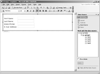
Figure 7-5: A section with data entry objects
The second method of creating a section is used for forms that are created from an existing data source. When you add a section to this type of form from the Controls task pane, the Section Binding dialog box opens, as shown in Figure 7-6, and prompts you for the group to associate with this section. After you have inserted the section into your form, you can add data entry objects from this group and format them as you normally would.
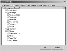
Figure 7-6: A section created from a group in an existing data source
| Tip | To see the data source that a particular section is bound to, right-click the section and select Show Data Source from the right-click menu. This opens the Data Source task pane and highlights the group your section is bound to. |
If at a later date you would like to change the group of fields that this section (or any other) is bound to, you can right-click directly on top of the section and select Change Binding from the right-click menu to open the Section Binding dialog box again and select a new group to bind to.
| Tip | Changing the binding may cause errors if the controls within a section do not correspond to the fields in the group. |
If you already have an existing data source, there is an even easier method you can use to insert a section directly from the Data Source task pane. Locate the group you want to bind to the section and drag the group onto your form. A drop-down menu appears that enables you to insert a section or a section with controls, so you don’t actually have to add the data entry objects by hand.
Formatting Sections
Nonrepeating sections have some of the same formatting options that are available for other objects on your form, including size, position, and so forth, as well as some attributes that are unique to sections. To format the section you have just inserted, right-click the section and select Properties from the right-click menu to open the dialog box shown in Figure 7-7.
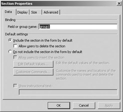
Figure 7-7: Section Properties dialog box
You can use the Field or Group Name text box to rename the group that this section is bound to, but remember to check the spelling of the group you are binding to, because a misspelling could cause a binding error. In the Default Settings area, the default setting for a nonrepeating section is Include the Section in the Form by Default. Don’t worry about the other settings on this page for the moment; they are described later in the chapter, in the context of optional and repeating sections. However, you now are going to look at some of the generic section-formatting options, which apply to all three different types of sections and thus won’t be repeated later in the chapter (so pay attention to them now!).
After you add a section to a form, you can resize the section by using the “handles” that appear on each side of the section when you click to select it. Like the other objects you have looked at in previous chapters, you can gain more precise control over the size and appearance of a section through the Size tab of the Properties dialog box. The Height setting of a new section is set to Auto by default, which means that the height of the object is set in proportion to the objects that are placed inside of it. You can change this setting and the Width setting of the field by entering values in the fields provided and then selecting a unit of measure (cm, px, and so on).
| Tip | If your section has objects inside of it, you will never be able to set the height below the size taken up by these objects. |
The two other dimensions that you can set on the Size tab are the padding and the margins. Padding refers to the buffer of space on the inside of the section, in between the perimeter of the section and the other objects inside the section. Increasing the Padding setting results in a white border that appears around the inside of your section. Padding can be useful to add some white space to your form and evenly space the text boxes and text that appears on your form.
Margins, just like with other objects, refers to the buffer of space on the outside of the box, between the perimeter of the section and any other objects that may appear on your form.
The final property page associated with sections is the Advanced tab, which is used as a catch-all for properties that are associated with a section but really don’t belong anywhere else.
Screen tips are used to display text when your mouse moves over a particular section. You can use the ScreenTip text box to enter text that will appear when the user moves their mouse near the section and holds it there for a few seconds.
As when working with data entry objects, you can change the tab order that is associated with a form by using the Advanced tab’s Tab Index setting. Enter a value from 1 to the total number of fields, where 1 is the first field that will be selected when the form is opened. When the user presses the TAB key on their keyboard, this index is used to determine where the cursor will go next—if you don’t set the Tab Index for every field and section on your form, InfoPath follow the index values that it does have and then defaults back to the left-to-right method to move through the form field and sections.
| Note | This section does not cover the properties on the Display tab, which include Conditional Formatting for sections. Because Conditional Formatting can be used on a wide variety of objects, it has been given its own section in Chapter 8. |
Working with Optional Sections
Optional sections are a special type of section that can be used on a form to collect information that is not required by all form users. The advantage of using optional sections is that they can be used to eliminate clutter on a form by displaying only the required sections of a form—objects that are used to collect optional information are hidden until the user inserts the optional section into the form. An example of a form with an optional section is shown in Figure 7-8. When the user clicks the link provided (Insert Manager Evaluation of this Objective), the optional section is inserted into the form.
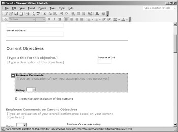
Figure 7-8: A form with an optional section
In addition to links that appear on the form, you can also insert optional sections by using commands added to the different InfoPath menus or from toolbar buttons, like the buttons shown in Figure 7-9.
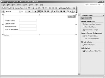
Figure 7-9: Optional methods of inserting sections
This provides a quick and easy method to build flexible forms that have a wide variety of uses—you don’t need to create one massive form with all the different sections, but instead can just let the users insert the sections they need.
Inserting Optional Sections
Again, to insert an optional section into a form, you can user either of two methods. If you are building the data source on-the-fly, dragging the Optional Section control onto your form creates a new group in your data source. You can then add data entry objects and build up your form and data source at the same time.
If you are creating a form from an existing data source, the Section Binding dialog box opens (refer to Figure 7-6), prompting you to bind your Optional Section control to a group within your data source.
In either case, once your optional section has been added to your form, it will appear as an outline of the section. When your form is previewed, this section is collapsed to a single line that the user can click to insert the section you have created. By default, the user is prompted with the text shown at the bottom of Figure 7-10. In InfoPath, this is called “instructional text,” but you don’t have to use the default text or even show it all.
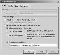
Figure 7-10: The default text for inserting an optional section
Formatting Optional Sections
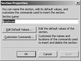
To change the instructional text and other options, right-click the section you have inserted and select Properties to open the Section Properties dialog box, shown in Figure 7-10. The properties for an optional section are the same for the other types of sections we have looked at, except that the option Do Not Include the Section in the Form by Default is selected. This means that the section itself will not appear on the form—when the user is filling out the form, they see only the instructional text that you have entered (for example, “Click here to insert”) and they have to click the link to insert the optional section into their form.
To set the default values for this section, click the Edit Default Values button to open the dialog box shown in Figure 7-11.
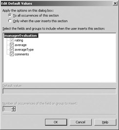
Figure 7-11: Edit Default Values dialog box
By using the radio buttons at the top of the dialog box, you can select whether you want to use these default values in all occurrences of the section or only when the user inserts the section; all the fields in the associated group are listed in the middle of the dialog box. To add a default value, click to select a field from the list and enter some text in the Default Area text box. These values will then be used to indicate what type of data should be entered into the data entry object when the form is filled out. When you are finished entering the default values, click OK to return to the Section Properties dialog box.
Earlier, we looked at the different ways you could insert an optional section and saw that you could show both an icon and some instructional text on your form to alert the user that there was an optional section available. But that is not the only way you can advertise an optional section—the Customize Commands button is used to specify the commands that are used to insert and delete these sections. When you click the Customize Commands button, the Section Commands dialog box (shown in Figure 7-12) appears, enabling you to specify where these commands should appear.
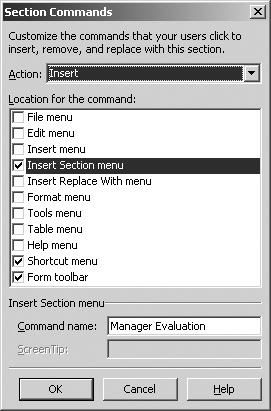
Figure 7-12: Customizing the commands that users click
The two actions that are available for optional sections are Insert and Delete. Use the Action drop-down list to select the action you want to work with and then use the check boxes to specify where the commands should appear. The majority of the locations shown are in existing InfoPath menus (File, Edit, and so on); check the location to select it and use the Command Name text box at the bottom of the dialog box to specify what label should appear on the menu.
If you want to add a command to a toolbar, check the Form Toolbar box. Note that, below the Command Name text box, the ScreenTip text box enables you to customize what text will appear to the user when they move their mouse over the toolbar button.
| Tip | If your group names are well thought out, working with group names will be much easier. For instance, the menu for a group named Item will be labeled Insert New Item, whereas the menu for a group named inv_item_ with_ product will be labeled Insert New inv_item_with_ product. |
When you are finished setting the command options, click OK to return to the Section Properties dialog box. The last formatting option that you need to look at is the Show Instructional Text check box and its accompanying text box at the bottom of the dialog box. You can enter some text that will appear on the form beside the Optional Section icon, as shown in Figure 7-13.
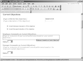
Figure 7-13: An optional section icon with some instructional text
You also have the option of not showing any instructional text at all, but you need to provide an alternate method to insert the section (for example, with a menu or toolbar command, as just described).
| Tip | If you decide not to display the instructional text for an optional section on your form, you may want to put a note on the form reminding users that other sections are available to be inserted. |
Working with Repeating Sections
Repeating sections are used in forms to add information that has a 1:many relationship with your data. By using repeating sections, you can create a form that can be used to enter a number of different records. For example, the Employee Roster form shown in Figure 7-14 uses a repeating section that allows the user to enter information for one or more employees on the roster—the user can insert as many sections as required to enter all the information required.
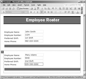
Figure 7-14: A form with repeating sections
Inserting Repeating Sections
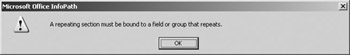
To insert a repeating section into your form, drag the Repeating Section control from the Controls task pane onto your form. If you are creating your data source on-the-fly, this creates two new nested groups (a standard group containing a repeating group); if you are working with an existing data source, this opens the Section Binding dialog box and allows you to select the group of fields to be associated with this section. You need to select a repeating group—otherwise, you will receive an error message like the one shown in the following illustration and you will not be able to insert the section into your form.
After you insert the section into your form, you can then start adding all the data entry objects that you want to use in the section. Remember, if you don’t want to go to the trouble of creating all the data entry objects by hand, you can also create a section from the Data Source task pane. Simply drag a repeating group onto your form to open the dialog box shown in Figure 7-15, and then select Repeating Section with Controls.
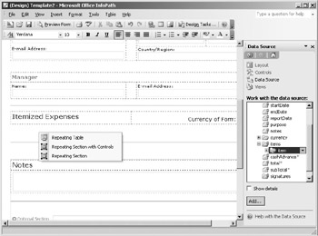
Figure 7-15: Repeating section options
A section will be inserted with data entry objects added for all the different fields that are in your group.
You’ll notice that when you preview the form (File | Preview Form | Default), the section is displayed with a small arrow icon shown to the left of the section— click the icon to open a drop-down menu similar to the one shown in Figure 7-16.
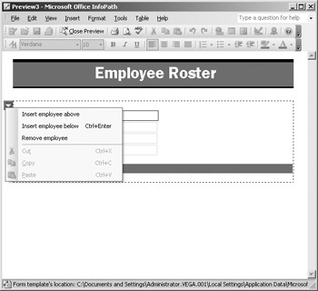
Figure 7-16: Repeating section menu
When filing out the form, users can use this menu to insert or remove sections as required—the standard Windows Clipboard shortcuts (Cut, Paste, Copy, and so on) can also be used with repeating sections and are available from the same menu.
Formatting Repeating Sections
To format a repeating section, right-click the section and select Properties to open the dialog box shown here.
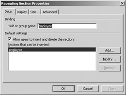
When working with a repeating section, you can specify which sections you will allow users to insert—this option can be used to add multiple sections on the same form. For example, in the Meeting Agenda sample form that is included with InfoPath (shown in Figure 7-17), there is a repeating section for the Agenda Items and then another repeating section within the Agenda Items for entering any guest speakers who may be presenting that Agenda Item.
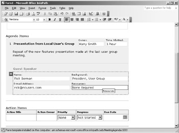
Figure 7-17: A repeating or nested section
To add a new section to the option list, click the Add button on the Data tab and enter a name for the group. To modify settings for an existing section, highlight the section and click Modify to open the Section Properties dialog box, shown next.
You have similar options to the ones that you have when formatting a normal section, including the ability to edit the default values that will be used in this section and the ability to customize the commands that can be used to add additional sections to your form. When you are finished formatting your section, click OK to return to your form’s design.
EAN: 2147483647
Pages: 142