Working with Text Boxes
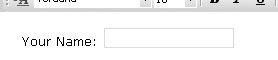
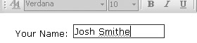
The majority of data entered into an InfoPath form is entered using simple Text Boxes, like the one shown here.
To insert a Text Box onto your form, you can simply drag it from the Controls view of the task pane or from your Data Source and drop it on your form. You can set the formatting attributes for a Text Box to change its appearance or how text is displayed inside the box itself, but the information that is entered into a Text Box is entered into the underlying database or XML file as plain text.
| Tip | If you want to let the user enter some text formatting and retain that formatting in the field in the underlying data source, you need to use a Rich Text Box, which we will look at later in the chapter. |
To change the properties of a Text Box, right-click the object and select Properties from the right-click menu to open the dialog box shown in Figure 6-5.
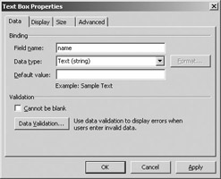
Figure 6-5: Text Box Properties dialog box
Working with Basic Properties
If you have added a field from an existing data source, you will not be able to change the Field Name or Data Type on the Data property page, because this information is defined by the underlying data source. If you are using the on-the-fly method to build your form, you can specify the name and select one of the data types shown here from the drop-down list provided.
-
Text
-
Whole Number
-
Decimal
-
True/False
-
Hyperlink
-
Date
-
Time
-
Date and Time
As you work with these different data types, a Format button may appear beside the Data Type drop-down list. This button is enabled only for certain data type formats and allows you to specify the format of the data that is entered. For example, if you were to select a Data Type of Date and click the Format button, the dialog box shown in Figure 6-6 would open and allow you to set the formatting options available for this data type.
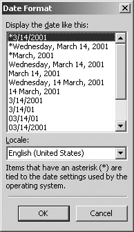
Figure 6-6: Formatting options for dates
You can select the format “by example” using the list of formats provided; the Locale drop-down list at the bottom of the dialog box provides access to different formats used in different countries.
| Note | “Format by example” is available for a number of different data entry objects (text boxes, and so on) to allow you to control the format of data entered using those objects. |
Also, by using the Default Value option on the Data property page, you can specify any default text that will appear in the field when your form is to be filled out. This option is best used to set the default values for a text box (for example, entering USA in a text box for Country).
| Tip | You also have the option of placing some “placeholder” text in your text box to provide instructions (for example, “Click here and type your name”), which is discussed later in this section. |
At the bottom of the Data property page are some options for validation of the data that has been entered. Validation works on the basis of rules that you can establish by using this dialog box. When the criteria for one of the rules is met, you can show an error message or pop up an error message box to allow the user to correct their entry. If this seems a little confusing now, don’t worry—data validation is covered in Chapter 9.
One validation option that is easy to set is the Cannot Be Blank option at the bottom of the dialog box, which forces users to enter data into this field before they can proceed with submitting the form.
Controlling Display Settings
In addition to controlling the default value and basic validation settings, you can also control how a text field will appear, by using the Display property page of the Text Box Properties dialog box, shown in Figure 6-7.
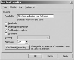
Figure 6-7: Text box display options
You can use the Display property page to enter a placeholder for the field—a placeholder is similar to a default value, with the exception that when a user clicks or tabs into a field to enter some data, the entire placeholder is highlighted. This allows the user to immediately overtype the placeholder without having to highlight and delete the text. Another distinction is that placeholder text never gets written back to the underlying data source, while default values could be saved or submitted to the underlying data source.
Selecting the Read-Only option will lock your text field so that the user cannot enter or edit any field information. Referring to the earlier example in which a default value of USA was set for a Country field, you could also make the field read-only so that the user wouldn’t have to worry about changing the Country field each time. Also, for forms that are prepared for specific use (with fixed department or expenditure codes, for example), you can easily set the default values and then make these fields read-only.
InfoPath also has an integrated spell-checking facility that you can use to check the data that has been entered onto a form through a standard interface. By default, all the fields that you create on your form are enabled for spell-checking—when a user enters a word into the form that is not in the dictionary, the word is underlined, as shown here.
If you don’t want this field to be checked for spelling or if the field is used to enter a proper name that may not be in the dictionary, you can turn this option off. InfoPath also enables an Auto Complete function by default, which completes for you commonly used text, URIs, and URLs after you type the first few characters. You can turn either of these options off by using the check boxes provided on the Display property page.
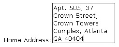
You can determine whether or not the text in your text box will wrap by using the Wrap Text check box. If you select this option, users will be able to enter text into a text box and have that text wrap to the next line, increasing the size of the text box, as shown here.
This behavior is set by default, because the size of a text box object is automatically set to Auto, which causes the field to expand as more data is entered. You can stop this from happening by using the technique described earlier (refer to the section “Working with Control Size”) to change the size of the object to specify a precise height instead of the default Auto setting.
After you set a definite size for your Text Box object, you will find that the options provided in the Scrolling drop-down list (immediately below the Wrap Text option) come in handy for controlling how this text appears when scrolling in a fixed-size text box. These options include
-
Show scrollbar when necessary
-
Scroll automatically while typing
-
Show scrollbars
-
Expand to show all text
Of these options, you will probably use the Show Scrollbar When Necessary option the most—this eliminates showing the scroll bar unless the text in the text box wraps to the next line.
The last settings on the Display property page are used to control the alignment of your field contents (Left, Right, Centered, and so on) and to apply any conditional formatting that you want to specify for this Text Box object. Conditional formatting works on the basis of creating a condition and where that condition is true, some formatting attribute will be applied (for example, If Country is equal to “USA” then you can make the text box background Blue.)
| Tip | Since conditional formatting can be applied to many different types of objects, it’s actually covered in its own section in the next chapter, so you can flip ahead to Chapter 7 if you just can’t wait. |
One more important note about formatting Text Box objects: You can use the Formatting toolbar to apply formatting attributes to your Text Box object, including fonts and alignment, but this formatting only applies to how the Text Box object appears on your form. When users enter data using this control, it is still passed to the back-end database or XML file as plain, unformatted text.
| Tip | You can apply the same font formatting to other Text Box objects that appear on your form by right-clicking the object you have formatted and selecting Apply Font to All Text Box Controls. This trick also works with other types of objects. |
EAN: 2147483647
Pages: 142
- Chapter IV How Consumers Think About Interactive Aspects of Web Advertising
- Chapter VI Web Site Quality and Usability in E-Commerce
- Chapter XI User Satisfaction with Web Portals: An Empirical Study
- Chapter XV Customer Trust in Online Commerce
- Chapter XVI Turning Web Surfers into Loyal Customers: Cognitive Lock-In Through Interface Design and Web Site Usability