Using Templates To Standardize Layout
|
When developing a web site, you often need to repeat the same design features on a number of different pages. To do this you could simply copy and paste all of the relevant sections of HTML code from a previously created page, and then add the rest of the page content. While this method does indeed work, it isn't very efficient. Say, for example, you are creating a web site for a client, who at the last minute makes a sweeping design change, such as they change the size and color of their logo? If you have used the above method, then your only recourse is to manually edit each page to effect the change. Dreamweaver allows you to have more control over the creation process, and in so doing it uses two technologies that help you in the generation of web pages, templates and libraries. If you create a number of web pages based on a template within Dreamweaver, if the client does decide to change the size and color of the logo, you only have to change one file, the template. Once it has been changed, Dreamweaver automatically adjusts all the pages that have been created using that template. A library is like a template in many ways. The biggest difference though, is that while a template contains information about the layout of an entire page, a library is more focused, containing information about an element within that page, like a menu or a navigation bar. To better understand how templates and libraries work, we shall make full use of them when creating our example site, The Dreamweaver Hotel.
Getting StartedFor our example, we start by creating the overall 'Look' of the site, in a graphics package such as Macromedia's Fireworks MX, though you can of course use your preferred software package. I use Fireworks because it is designed to integrate with Dreamweaver, and it allows you to easily break an image up into its component parts, also known as slicing. This allows us to easily create a table-based layout, as Fireworks exports all the necessary HTML for use within Dreamweaver.
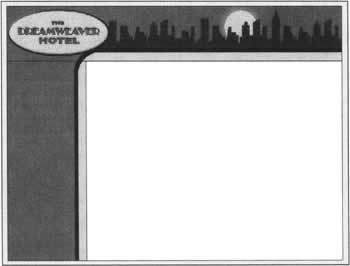
Creating the Layout This layout has been constructed in such a way that when it is broken up, or sliced, there will be only two images creating the layout. These two images comprise the horizontal graphic at the top of the image, and the vertical bar on the right. The image below demonstrates how this looks when slicing the image in Fireworks. Once this has been done, you can export the sliced images directly from Fireworks MX into Dreamweaver by using the Quick Export feature, which automatically creates the images and HTML code necessary, and puts that code within Dreamweaver. The process is similar if you aren't using Fireworks. Simply use the selection tool in your chosen graphics package to choose the area that you want to slice. Once selected, copy the region and paste it as a new image. Repeat this process for each slice in your layout. Once done, save the images into your web site's images folder. You then need to create a table layout within Dreamweaver MX, and insert the images into the appropriate places. The HTML code necessary for this is not at all complicated.
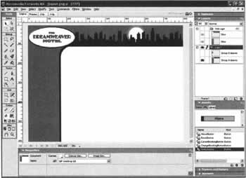
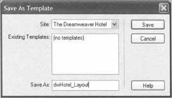
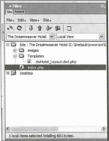
<table width="800" border="0" cellpadding="0" cellspacing="0"> <tr> <td colspan="2"><img src="/books/2/757/1/html/2/images/dwHotelLayout_rl_cl.gif" width="800" height="130"></td> </tr> <tr> <td width=" 190"><img src="/books/2/757/1/html/2/images/dwHotelLayout_r2_c1.gif" width="190" height="470"></td> <td width="610" valign="top"> </td> </tr> </table> In this code images/dwHotelLayout_r1_c1.gif is the horizontal slice, and images/dwHotelLayout_r2_c1.gif is the vertical slice of your image. Now that we have the general layout of the page, we should save it as a template. The template is not yet complete, but we can build on it from here. Clicking on "File", then "Save As Template" will open a dialog box like the one below. Enter the name of the template in the "Save As" textbox, we have called this template dwHotel_Layout, and then click on "Save". You should immediately notice a change in the Files panel, a new folder called Templates is created, along with a new file called dwHotel_Layout.dwt.php; the dwt part of this filename stands for Dreamweaver Template.
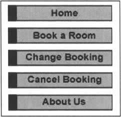
Adding Elements To the TemplateNow that we have the basic layout of our template set, we need to add a new element to the layout, the Navigation Bar. The bar in our site consists of five buttons, pointing to the 5 sections of our site on which we wish to concentrate: Home, Book a Room, Change Booking, Cancel Booking, and About Us. These buttons can be created using your preferred graphics package. For our example, we used Fireworks MX to create the buttons, and at the same time we produced a number of variations to illustrate each button's rollover state. We can now insert these images into our template using Dreamweaver's Navigation Bar Object.
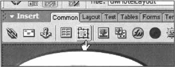
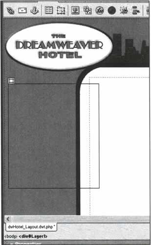
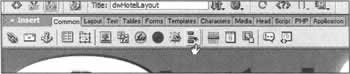
Creating the Navigation BarFirst of all, we need somewhere in our template page to place the navigation bar. We can do this by using the layer tool to draw out the area we wish to use. Layers are extremely useful as we can use them to accurately place anything onto the page. The layer tool can be found in the "Insert" panel's "Common" tab as in the screenshot overleaf, or by clicking Insert -> Layer. When you hover over this symbol, a tool-tip will say Draw Layer to confirm that this is the tool you wish to use. Click on it once and the cursor will change to a crosshair symbol (+). To add a layer to the page, point to the section of the page where you wish the layer to be, left-click and hold the mouse button down, and drag the mouse pointer so that a rectangular area is drawn to the size you require. When done, let go of the left mouse button, and the layer is created leaving you with a rectangular element on your page similar to the image below. If the layer is not in exactly the right place, its position can be modified by clicking on the layer itself, and either dragging the layer into size and position, or by adjusting the layer's properties directly within the properties panel. Before we can proceed with the insertion of the navigation bar, we need to place the insert cursor within the layer, to ensure that our navigation bar goes inside the layer. This is easily done by clicking anywhere within the rectangle itself. Now we can use Dreamweaver's Navigation Bar behavior. This is found, once again, in the Insert panel's Common tab, or by clicking Insert -> Interactive Images -> Navigation Bar Clicking this button once opens a new dialog window that provides us with total control over the look, feel, and function of the navigation bar. This dialog can appear to be a little complex, so we shall explain it in detail here.
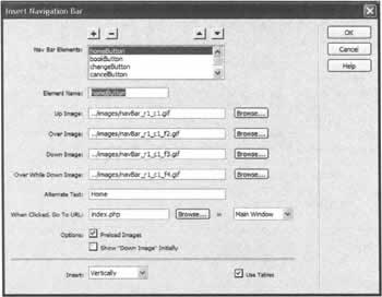
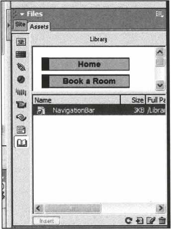
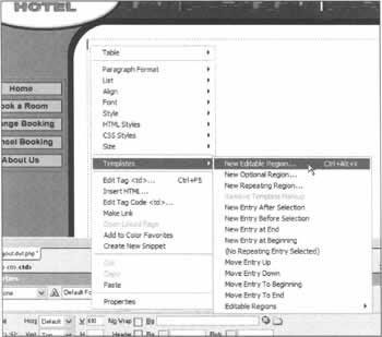
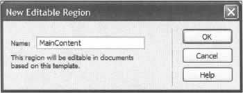
The Insert Navigation Bar Dialog As you can see from the screenshot, there are a number of options available in this dialog, however despite this, it is easy to use. When you first open the dialog, there will be no entries at all, so the first place you should start is with the "Element Name". This should be a unique name for each of the buttons within the navigation bar. The visitor does not get to see these names, as they are used internally by the generated code itself; however, it is always best to use names that have some form of meaning, so we have chosen homeButton, bookButton, changeButton, cancelButton, and aboutButton for each of the navigation bar elements. For now, we shall concentrate on the creation of the home button. Next, you should select the images that you have created for each of the navigation button states for the home button, which we looked at earlier. To select each image for each button state, click on the Browse button and find the relevant image. If the image is stored somewhere outside of your web site's root folder, then Dreamweaver will ask you whether you want to copy the image to a directory within the folder, which you should do. This is extremely important, as it will affect the path to that image when the navigation bar is inserted. Next you should enter appropriate Alt text for the button, which will appear in a tool-tip when the visitor moves the mouse cursor over it, and be shown in the image placeholder when the page is loading. The "When Clicked, Go To URL:" section allows us to specify the page that this button points to, the menu to the right of this allows us to control which frame the page should open in, if we are using a frame-based site. As we aren't, we leave this option at its default setting. The next section defines whether we want images to be preloaded or not. Preloading is a technique that is used to ensure that graphics are downloaded to the visitors web browser in advance of them being used. This is essential to achieve the correct effect when the visitor moves the mouse pointer over a button. Without preloading, when the user points at a button, the image will have to be downloaded from the web server, and this will incur a small delay, resulting in no rollover image being visible until it is downloaded. Preloading avoids this delay, and ensures that the rollover image is immediately visible the moment an event is triggered. This option is checked by default, so we will leave it this way. The "Show 'Down Image' Initially" checkbox allows us to specify that the down image is used initially for this button in the navigation bar. This is useful if you are not using a template, but wish to ensure that the navigation bar reflects the page you are currently working on. We don't use this in a template, as this would specify the same button for each repeated page. The "Insert" menu allows us to determine whether the navigation bar is horizontal or vertical in alignment. For our purposes, we want the navigation bar to be vertical. Finally, the "Use Tables"checkbox allows us to specify whether the navigation bar makes use of tables to control the bar's layout. For better control over spacing and positioning, it is usually a good idea to leave this box checked. Now that we have completed the dialog for the home button, we should repeat the above steps for each of the other buttons in our navigation bar. When complete, click "OK", to insert the bar into our layer. When initially inserted, all of the buttons will appear to be on top of each other, with no spacing in between. This is perfectly normal, and it is for this reason we left the "Use Tables" checkbox checked in the "Insert Navigation Bar" dialog. To add spacing to the table, first select one of the images in the navigation bar, and then look just above the "Properties" panel within Dreamweaver. Here we can see some of the basic structure leading up to the image that we have just selected. If we now click on <table> we instead select the navigation bar's table. This automatically changes the properties panel, so that it is relevant to a table. In this panel, we change the "CellSpace" attribute from zero to six, which automatically spreads out the buttons, and improves the layout of the navigation bar. Now that we have successfully created the navigation bar, we can save this as a Library Item within Dreamweaver, so that it can be reused elsewhere within the site. We do this, because we might need to create an alternative template within the site at a future time. By creating a Library Item now, we can ensure that the same navigation bar be used throughout, and if we ever need to add or remove options to this bar, changing only the library item will automatically update all templates that contain it, and subsequently all pages based on those templates! To turn the navigation bar into a Library Item, we keep the bar's table selected, and click on "Modify->Library->Add Object to Library". This immediately places the bar into the Assets tab of the Files panel; if you look there now, you will see that the name is 'untitled', which we should change to something more meaningful. Now that we have created our layout, and inserted the navigation bar, we have nearly completed our template. All that remains is to define the area where we will be placing content. To do this, we click in the main blank area within the template design, just below the point where the horizontal and vertical images meet. Once selected right-click (Control Click for Macintosh) and go to Templates->New Editable Region, this opens a new dialog window that allows us to assign a name to this editable region. As this is where the main content of each page will be located, we call this page MainContent. Our template is now complete, and we can save the file and close it.
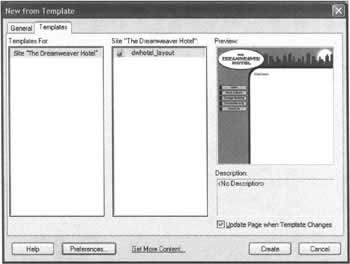
Accessing Your TemplatesYou might be wondering now, how we actually use this new template that we've just created. Well, this has been made very simple within Dreamweaver MX. If you click on File -> New you'll see that the "New Document' dialog has a "Templates" tab. Click on this, and you will see a list of all your defined sites. Within each entry, you have easy access to all of the templates created within each site. All we do is click on the site we have defined; select the template from the list, and click "Create", to create a new page based on this template. We have looked at templates now in their simplest form. However, there is a great deal more flexibility and power offered to us via the new advanced template features in Dreamweaver MX. Whilst, for the purpose of this book, it isn't necessary to study these features in depth, it is useful to know what these features are and how they can be used.
Advanced Template FeaturesDreamweaver MX introduces a wealth of new template-related features, all of them designed to assist in the consistent production of a web site. Some of these more advanced features might, on the surface, appear to be esoteric, but all of them are useful.
Nested TemplatesNested templates are probably the most useful of all the new templating features. A nested template is a template that is based on another template. They are useful for creating pages that each share a common theme, the general site layout, but has specific elements that are completely unique to them. You often find this kind of layout in sites like www.ebay.com where specific design elements are determined by a selected category, yet the overall look of the site remains the same. To create a nested template, simply create a new document using your existing template, and then save that document as a template too. In this way, the nesting template is generated, and you can add whatever design elements to the page that you require. The only restriction on this is that you can only work within the editable regions of the previous document. This can cause some confusion, especially when you want to create design elements in your nested template that fall outside of the original editable region.
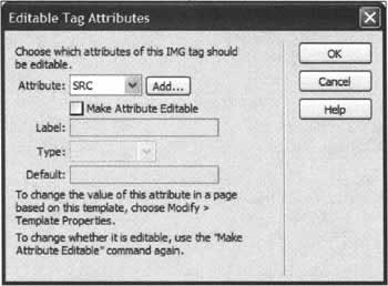
Editable Tag AttributesEditable Tag Attributes allow you to define elements of a tag itself that can be modified in subsequent pages. This is a great addition, as historically, if you wished to change only the background color of a table that was contained within a template, you would have had to create a completely alternative template containing this minor modification. The same holds true with links and other HTML elements that were previously locked inside a template, and remained unchangeable. Editable tag attributes allow you to lock all of the HTML elements you wish to lock, but allow some room for maneuverability by specifying parts of an HTML tag, like background color, that can subsequently be changed. Editable tag attributes are created by opening the template, selecting the element that you wish to use, say a table or an image, and going to Modify->Templates->Make Attribute Editable. In the dialog box that opens, you are given complete access to all of the attributes available for the selected object. If you cannot see the appropriate attribute in the menu, click Add and enter the name of the attribute you wish to add, and then click OK. Once you have selected the attribute you wish to make editable from the list, enter a unique name for this template element in "Label". The Dreamweaver MX manual recommends that you use a name that is both a combination of the type of object (image, table, etc.) and the attribute that is editable, and I would recommend that you maintain this convention for clarity. In the Type menu, there are a number of options. These specify the type of data that can be entered for this attribute from a choice of Text, URL, Color or Number. The "Default" text box, will initially display the current value for that attribute within the template. However, if you wish this to be different, you can amend that value here. In the screenshot above you can see that we have selected an image within our template. By selecting the SRC attribute we can directly access the content of that attribute and change it as necessary. When the OK button is clicked, this attribute is made editable, enabling this image to be changed on pages created with this template. Repeat the above procedure for each attribute that you wish to make editable without having to close this dialog box and starting over, simply select the next attribute you wish to make editable from the "Attribute" menu.
Optional RegionsAn optional region within a template allows you to show or hide an element based on a condition. The conditions are based on Template Parameters, which can be added to the template. Template Parameters are in essence variables, which can be set a particular value, and the conditions used for Optional Regions are based on these parameters. This might all sounds a little confusing, after all, why would you want to do this? Well, simply put, these can be very useful when working with Nested Templates, as it allows you to control which of the new design elements are visible, and which aren't. For example, say you have 3 categories within your site all with different design elements. Optional Regions and Template Parameters allow you to:
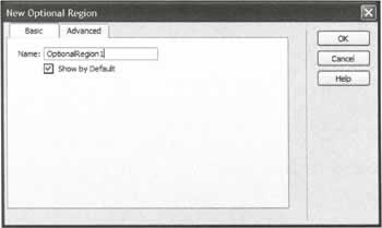
In this way, you can standardize layout and fully control the way your site looks without having to create a separate nested template for each different design possibility. To insert an optional region in a template, open your template for editing, and select the element you wish to tie an optional region to, click on Insert->Template Objects->New Optional Region. This will open the New Optional Region dialog.
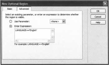
Inserting an Optional RegionThe screenshot below shows how the New Optional Region window appears when it is first opened. As you can see there are two tabs within this window, "Basic" and "Advanced", that allow you determine how your optional region will display. In the "Basic" section of this window, you can simply determine whether or not this region is shown or hidden by default when your template is used. To apply the optional region to your template using the Basic options, you should enter a unique name for this region in the "Name" field, and check or uncheck the "Show by Default" option. The unique name that you enter here, also serves another purpose. When using Advanced Optional Regions, the name that you enter here creates a parameter of the same name that you can refer to in other Optional Regions. In this way, you can create complex templates where certain regions will display only if specific regions are also visible. If you require even more control over how the optional region is handled by Dreamweaver, then clicking on the "Advanced" tab will present you with some more options, as shown below. Here you can create conditions that allow you to specify when a region should be displayed. These conditions can be based on a parameter, or another previously created optional region, or a conditional expression. In the screenshot above we have used a conditional expression that will display the inserted region if the current language is English. Just as there are Optional Regions, there are also Editable Optional Regions, which allow you to modify the condition in pages based on that template. Editable Optional Regions provide the same functionality as Optional Regions, with the added advantage that the contents of these regions can be modified at any time.
Repeating RegionsJust as you can have Repeating Regions within your dynamically generated web site, when using recordsets or other data sources, you can also have Repeating Regions within your templates. Repeating Regions in templates allow you to have multiple instances of a specific element in your template, usually a table, and are especially useful when you are creating pages that have a recurring element in their design, like the product page of an eCommerce web site for example. Repeating Regions are created by selecting the element you wish to repeat in the template and then clicking Insert->Template Objects->Repeating Region. In the dialog box that opens give the Repeating Region a unique, but identifiable, name, and then click OK. When using Repeating Regions, it is important to understand that no element of the region will be editable unless you add an Editable Region within it. As you can see from these advanced template features, there is a lot more to the creation of templates than meets the eye. Of course you don't have to use any of these advanced features at all in your pages, but if you work with other developers, or you concentrate purely on the design elements of a website while someone else works on the actual content, knowing more about templates and the way they work can help you to work safely in the knowledge that your designs won't be accidentally modified. | ||||||||||||||||||||||||||||||

EAN: 2147483647
Pages: 88
- ERP Systems Impact on Organizations
- ERP System Acquisition: A Process Model and Results From an Austrian Survey
- Healthcare Information: From Administrative to Practice Databases
- Relevance and Micro-Relevance for the Professional as Determinants of IT-Diffusion and IT-Use in Healthcare
- Development of Interactive Web Sites to Enhance Police/Community Relations