Data Binding in Simple Web Forms Controls
Chapter 14 discussed data-bound controls briefly. As mentioned, there are two types of data-bound controls: simple and complex. The Button, TextBox, and ListBox controls are simple data-bound controls, and the DataList and DataGrid controls are complex data-bound controls.
The following sections discuss data-bound Web server controls. The System.Web.UI.WebControls namespace provides a ton of classes for Web server controls. In fact, an entire book could be written on this namespace itself. Unfortunately, we won't be able to cover all of these controls in this chapter because this book targets ADO.NET-related controls. Because this book's scope is limited to data binding and data-bound controls, you'll see some of the most commonly used Web server controls in data-driven applications.
Using the Button Control
Similar to a Windows Forms Button control, a Web Forms Button control provides users with the ability to click the button and perform some action on the button click event. A Web Button control can be of three types: a button, a link button, and an image button. The Button, LinkButton, and ImageButton classes in the System.Web.UI.WebControls classes represent a button, link button, and image button, respectively.
The simple Button control is a standard command button, rendered as a Hypertext Markup Language (HTML) submit button. The LinkButton control represents a button with a hyperlink, and an ImageButton control represents a button with an image.
You can add the Button control to a Web page by dragging the control from the Toolbox to the page. For this example, drag a Button, LinkButton, and an ImageButton control to the page, as shown in Figure 16-1.
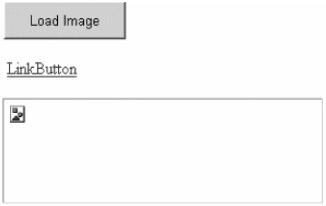
Figure 16-1: Adding Button controls to a Web page
Now, simply double-click the Button and LinkButton controls. This action adds button click event handlers. Use the ImageUrl property of ImageButton to set an image for the ImageButton control. Listing 16-1 shows the code of the button click event handlers for the Button and LinkButton controls.
Listing 16-1: Writing Button Click Handlers
 |
Private Sub Button1_Click(ByVal sender As System.Object, _ ByVal e As System.EventArgs) Handles Button1.Click ImageButton1.ImageUrl = _ "http://www.c-sharpcorner.com/images/csLogo102.gif" ImageButton1.ImageAlign = ImageAlign.Baseline End Sub Private Sub LinkButton1_Click(ByVal sender As System.Object, _ ByVal e As System.EventArgs) Handles LinkButton1.Click Response.Write("LinkButton clicked") End Sub |
If you click the Load Image button, the output looks like Figure 16-2.
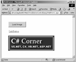
Figure 16-2: Loading an image in an ImageButton control
Using the Calendar Control
The Calendar control, represented by the Calendar class, displays a one-month calendar. A calendar on Web pages allows users to view and select dates such as in an airline reservation application. The Calendar control displays and selects dates, but it can also display appointments and other information.
The Calendar control is based on the DataTime data type of the .NET Framework, which displays any date between the years 0 and 9999 A.D.
| Note | In VB .NET, the Date data type is equivalent to the .NET Framework's DateTime data type. |
To create a Calendar control, you simply drag a Calendar control from the Toolbox to the Web page. After that, if you run the application, it displays the current month and provides options to move to the next and previous months by default.
The default month for the Calendar control is the month of today's date represented by the TodaysDate property. If you want to change the starting month of a Calendar control, you can use the VisibleDate property. For example, the following line sets the visible month of a Calendar control to January 2002:
' Set VisibleDate to Dec 01, 2002 Calendar1.VisibleDate = New Date(2002, 12, 1)
After adding a Calendar control to a Web page, add a button called SelectedDate and write the code in Listing 16-2 on this button's click event.
Listing 16-2: Getting Selected Date of a Calendar Control
|
Private Sub GetPropsBtn_Click(ByVal sender As System.Object, _ ByVal e As System.EventArgs) Handles GetPropsBtn.Click Label1.Text = "The selected date is " & _ Calendar1.SelectedDate.ToShortDateString() End Sub
|
Setting the Calendar Class's Properties
Table 16-1 describes some of the common properties of the Calendar control.
| PROPERTY | DESCRIPTION |
|---|---|
| DayHeaderStyle | This represents the style of the section that displays the day of the week. Read only. |
| DayNameFormat | This represents the style of the section that displays the day of the week. Read only. |
| DayStyle | This represents the style of the days in the displayed month. Read only. |
| FirstDayOfWeek | This represents the day of the week to display in the first day column. Both get and set. |
| NextMonthText | This represents the text of the next month navigation control. Both get and set. |
| NextPrevFormat | This represents the format of the next and previous month navigation elements in the title section. Both get and set. |
| NextPrevStyle | This represents the style of the next and previous month navigation. Both get and set. |
| OtherMonthDayStyle | This represents the style of the days that are not in the displayed month. Read only. |
| PrevMonthText | This represents the text of the previous month navigation control. Both get and set. |
| SelectedDate | This represents the selected date. Both get and set. |
| SelectedDates | This represents a collection of selected dates. Both get and set. |
| SelectedDayStyle | This represents the style of the selected dates. Read only. |
| SelectionMode | This represents the date selection mode. It represents whether a user can select a single day, a week, or an entire month. Both get and set. |
| SelectMonthText | This represents the text displayed for the month selection element in the selector column. Both get and set. |
| SelectorStyle | This represents the style of the week and month selector column. Read only. |
| SelectWeekText | This represents the text displayed for the week selection element in the selector column. Both get and set. |
| ShowDayHeader | This value indicates whether the heading for the days of the week is displayed. Both get and set. |
| ShowGridLines | This value indicates whether the days are separated with grid lines. Both get and set. |
| ShowNextPrevMonth | This indicates whether the control displays the next and previous month navigation elements in the title section. Both get and set. |
| ShowTitle | This indicates whether the title section is displayed. Both get and set. |
| TitleFormat | This represents the title format for the title section. Both get and set. |
| TitleStyle | This represents the style properties of the title heading. Read only. |
| TodayDayStyle | This represents the style of today's date. Read only. |
| TodaysDate | This indicates the value of today's date. Both get and set. |
| VisibleDate | This date specifies the default month. Both get and set. |
| WeekendDayStyle | This represents the style of the weekend dates. Read only. |
Now let's set some properties of the Calendar control (see Listing 16-3).
Listing 16-3: Setting a Calendar Control's Properties
|
' Set VisibleDate to Dec 01, 2002 Calendar1.ShowTitle = True Calendar1.ShowGridLines = False Calendar1.ShowNextPrevMonth = True Calendar1.VisibleDate = New Date(2002, 12, 1) Calendar1.NextMonthText = "Next" Calendar1.PrevMonthText = "Back" Calendar1.FirstDayOfWeek = _ System.Web.UI.WebControls.FirstDayOfWeek.Friday Calendar1.ShowDayHeader = True Calendar1.TitleFormat = TitleFormat.MonthYear
|
Navigating Months Programmatically
There will probably be cases when you'll want to customize the default behavior of the Calendar control. For example, say some airline only has flights between the 15th and 25th of the month. You'll want to develop a system so that the user can select dates between the 15th and 25th only. Set the control's VisibleDate property to a date in the month you want to display.
The control's VisibleMonthChanged event fires when a user moves to the next or previous months by using the Next and Back navigational links. Listing 16-4 shows the code for the VisibleMonthChanged event.
Listing 16-4: The VisibleMonthChanged Event
|
Public Sub Calendar1_VisibleMonthChanged(ByVal sender As Object, _ ByVal e As System.Web.UI.WebControls.MonthChangedEventArgs) _ Handles Calendar1.VisibleMonthChanged Calendar1.SelectedDates.Clear() Calendar1.SelectedDates.Add _ (New DateTime(e.NewDate.Year, e.NewDate.Month, 15)) Calendar1.SelectedDates.Add _ (New DateTime(e.NewDate.Year, e.NewDate.Month, 25)) End Sub
|
When you run the Calendar control application, you'll see the Calendar control. When you select a date and click the Selected Date button, the output looks like Figure 16-3.
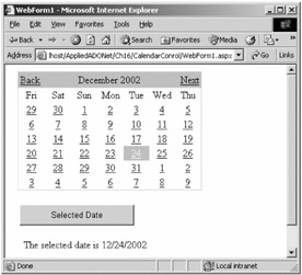
Figure 16-3: The Calendar control in action
Understanding Web Server Control Templates
Before discussing more controls, we'll first cover templates. Templates play a major role in managing the layout and format of the data being displayed in ASP.NET data-bound controls. You'll apply templates on various data-bound controls in this chapter. Before using templates, though, let's quickly look at template basics and how they work.
Templates provide a way to apply complex formatting to a control's parts such as the header, footer, and items (text being displayed by the control). A template is a set of HTML tags that define the layout for a particular part of a control. Besides HTML tags, a template can also contain other controls and ASP.NET inline code.
For a better understanding, let's take a look at a simple use of templates. Listing 16-5 uses templates in a Repeater control. As you can see, this listing uses the AlternatingItemTemplate and ItemTemplate templates. (We discuss the different types of templates in the following section.) Specifically, AlternatingItemTemplate, sets the font color to red, the font face to Verdana, and the font size to 3. ItemTemplate sets the font color to green, the font face to Tahoma, and the font size to 2. The listing also uses the HTML Table control to display items. As you probably can guess from this code, the items of a Repeater control will have a green color, the font face Tahoma with a size of 2. Alternating rows and their items will have the color red, the face Verdana, and a size of 3.
Listing 16-5: Applying a Simple Template on a Repeater Control
|
<ASP:Repeater runat="server"> <AlternatingItemTemplate> <font color="red" face = "verdana" size = 3> <table> <tr> alternating data </tr> </table> </font> </AlternatingItemTemplate> <ItemTemplate> <font color="green" face = "tahoma" size = 2> <table> <tr> some item </tr> </table> </font> </ItemTemplate> <FooterTemplate> </FooterTemplate> </ASP:Repeater></P>
|
Using Different Template Types
A template describes the layout and formatting of the parts of a control. Similar to other control tags, templates have a starting and ending pair of tags. For example, HeaderTemplate describes the layout and format of header of a control, and the <HeaderTemplate></HeaderTemplate> pair represents a header template of a control. Table 16-2 describes the available templates.
| TEMPLATE | SYNTAX | DESCRIPTION |
|---|---|---|
| Header template | HeaderTemplate | Describes the layout and format of a control's header. |
| Footer template | FooterTemplate | Describes the layout and format of a control's footer. |
| Item template | ItemTemplate | Describes the layout and format of a control's items. |
| Alternating item template | AlternatingItemTemplate | Describes the layout and format of a control's alternating items. |
| Separator template | SeparatorTemplate | Describes the layout and format of a control's separator. (A separator separates two items of a control.) |
| Selected item template | SelectedItemTemplate | Describes the layout and format of a control's selected items. |
| Edit item template | EditItemTemplate | Some controls such as a DataGrid control allow users to edit items. EditItemTemplate describes the layout and format of the items being edited. |
| Pager template | Pager | The DataGrid control allows users to have a paging option through the pager. The Pager template describes the layout and format of the DataGrid control's pager. |
Which Controls Support Templates?
Not all ASP.NET data-bound controls support templates. Only complex controls support templates. In addition, each control supports a different set of templates that specify layouts for different portions of the control, such as the header, footer, item, and selected items. The Repeater, DataList, and DataGrid controls utilize templates.
The Repeater control supports HeaderTemplate, FooterTemplate, ItemTemplate, AlternatingItemTemplate, and SeparatorTemplate.
The DataList control supports HeaderTemplate, FooterTemplate, ItemTemplate, AlternatingItemTemplate, SeparatorTemplate, SelectedItemTemplate, and EditItemTemplate.
The DataGrid control supports HeaderTemplate, FooterTemplate, ItemTemplate, EditItemTemplate, and Pager.
| Tip | Even though you can use the Visual Studio .NET (VS .NET) Integrated Development Environment (IDE) to create controls and add templates to the controls, you should add templates programmatically. Adding templates programmatically is simple. After completing the following section, you'll find out how easy working with templates is. |
Creating Templates Using the HTML View
You can create templates using template tags by simply editing your .aspx page in a text editor or in the HTML View of VS .NET.
In Listing 16-5, you saw how you can easily create and use templates in an ASP.NET page by defining template tags and specifying the formatting layout inside the tags. For example, say you want to add some templates to a DataList control. Well, what templates do you want to use? A DataList control supports header, footer, item, separator, alternating item, selected item, and edit item templates.
So, let's say you want to use header, item, alternating item, and footer templates. Listing 16-6 adds the header, item, alternating item, and footer templates to a DataList control. The RepeatColumns property of the DataList control represents how many columns appear in a row of a DataList control.
Listing 16-6: Adding Templates to a DataList Control
|
<ASP:DataList RepeatColumns="5" RepeatDirection="Horizontal" runat="server"> <HeaderTemplate> </HeaderTemplate> <AlternatingItemTemplate> </AlternatingItemTemplate> <ItemTemplate> </ItemTemplate> <FooterTemplate> </FooterTemplate> </ASP: DataList >
|
So far, this code would do nothing. You need to add the format of the template within the template tags. Listing 16-7 adds content to the templates of a DataList control. As you can see from this code, the header, footer, item, alternating item templates have different formats. You can make these formats as complex as you want. You can even add Web controls to these templates.
Listing 16-7: Adding Formatting to the Templates of a DataList Control
|
<HeaderTemplate> <font color = #cc3333 face ="verdana" size = 3> <b>DataList Control Header</b> </font> </HeaderTemplate> <AlternatingItemTemplate> <font face ="verdana" size = 2 color ="green" > <br> <b>Category ID: </b> <%# DataBinder.Eval(Container.DataItem, "CategoryID") %> <br> <b>Category Name: </b> <%# DataBinder.Eval(Container.DataItem, "CategoryName")%> <br> <b>Description: </b> <%# DataBinder.Eval(Container.DataItem, "Description") %> <br> <b>Picture: </b> <%# DataBinder.Eval(Container.DataItem, "Picture") %> <p> </div> </font> </AlternatingItemTemplate> <ItemTemplate> <font face ="verdana" size = 2> <br> <b>Category ID: </b> <%# DataBinder.Eval(Container.DataItem, "CategoryID") %> <br> <b>Category Name: </b> <%# DataBinder.Eval(Container.DataItem, "CategoryName")%> <br> <b>Description: </b> <%# DataBinder.Eval(Container.DataItem, "Description") %> <br> <b>Picture: </b> <%# DataBinder.Eval(Container.DataItem, "Picture") %> <p> </div> </font> </ItemTemplate> <FooterTemplate> <font color= #996600 face ="verdana" size = 1> DataList Control footer </font> </FooterTemplate>
|
| Note | You may have noticed a line containing DataBinder and other syntaxes. You'll learn about this in the following sections. |
Creating Templates Using the Form Designer
Besides using the HTML View, you can create templates in VS .NET by using the form designer. You simply drag the control onto an ASP.NET page and right-click the control. For example, if you drag a DataList control and right-click it, you'll see the Edit Template menu item. The Edit Template menu item has three submenu items: Header and Footer Templates, Item Templates, and Separator Templates. Clicking any of these menu items opens the form designer.
Once you're in the form designer, you can enter HTML text and drop HTML or ASP.NET controls onto a data-bound control. You'll see how to use the form designer with data binding in the following sections.
| Tip | The Auto Format option of data-bound controls lets you select a format of the control from predefined formats. |
Working with Templates Programmatically
So far you've seen two methods for creating templates: using an HTML editor and the VS .NET IDE. Both of the methods force you to write code in an .aspx file at design-time. What if you're not sure what format of template you want to create, or you want to create an application where users can pick the format of template?
There are two ways to accomplish this. The first way is to provide prebuilt templates similar to the Auto Format option that the DataGrid control provides. In this method, you create and save the layout of the templates with an .ascx extension and load the file using the LoadTemplate method of the Page object. The second way is to create templates in memory based on the user selection.
Using the Repeater Control
The Repeater control is a data-bound container control that produces a list of individual items of a data source. By default the Repeater control doesn't support any style, formatting, or layout. To provide a layout to a Repeater control, you define the layout of individual items on a Web page using templates. If there's no template specified, the control does not appear on a Web page. The Repeater control supports HeaderTemplate, FooterTemplate, ItemTemplate, AlternatingItemTemplate, and SeparatorTemplate, as described in Table 16-3.
| TEMPLATE | DESCRIPTION |
|---|---|
| ItemTemplate | Elements that are rendered once for each row in the data source. |
| AlternatingItemTemplate | Like the ItemTemplate element, but rendered for every other row in the Repeater control. You can specify a different look for the AlternatingItemTemplate element by setting its style properties. |
| HeaderTemplate | Header elements. |
| FooterTemplate | Footer elements. |
| SeparatorTemplate | Elements to render between each row, such as line breaks (<BR> tags), lines (<HR> tags), or commas. |
Creating a Repeater Control
Unlike other Web server controls, the Repeater control doesn't have much design-time support from the IDE. You can only drag and drop a control onto the page and set its data-binding and data source properties. Everything else you have to do manually in the HTML View of the editor.
The best way to create a Repeater control is to just use the HTML syntax. For example, the following code creates a simple Repeater control with three templates:
<ASP:Repeater runat="server"> <HeaderTemplate> </HeaderTemplate> <ItemTemplate> </ItemTemplate> <FooterTemplate> </FooterTemplate> </ASP:Repeater>
Data Binding and the Repeater Control
The DataSource property of the Repeater control binds data to the control. Like other controls, you can assign any data source that implements the IEnumerable interface. Some of the valid data sources are DataSet, DataView, and an Array. The syntax for binding the controls to the Repeater control uses "Container" as the data source because the Repeater is the container for all the controls. The following code binds the CategoryID column of a DataSource:
<%# DataBinder.Eval(Container.DataItem, "CategoryID") %>
| Note | You can't bind controls in the header, footer, and separator templates using DataBinder.Eval expressions in HTML View.You must bind these controls in the code. Like other data-bound controls, you must call the DataBind method of the control to get the records to be displayed. |
Calling the Repeater Control Events
The Repeater.ItemCreated event is called each time the table is rendered. It allows you to customize the item-creation process. Similar to the other controls, the Repeater.ItemCommand event is raised in response to button clicks in individual items such as a Button, LinkButton, or ImageButton control. You use this event when you implement add, updated, and delete operations in a control.
Seeing the Repeater Control in Action
Listing 16-8 fills data from the Categories table of the Northwind database and displays it in a Repeater control.
Listing 16-8: Using the Repeater Control
|
<%@ Import Namespace="System.Data" %> <%@ Import Namespace="System.Data.SqlClient" %> <HTML> <script language="VB" runat="server"> Sub Page_Load(sender As Object, e As EventArgs) Dim conn As SqlConnection Dim adapter As SqlDataAdapter dim connectionString = _ "Data Source=MCB;Initial Catalog=Northwind;user id=sa;password=;" conn = new SqlConnection(connectionString) conn.Open() dim sql = "SELECT * FROM Categories" adapter = new SqlDataAdapter(sql, conn) Dim ds As Dataset = new DataSet() adapter.Fill(ds) repeaterControl.DataSource = ds repeaterControl.DataBind() End Sub </script> <body> <P> <ASP:Repeater runat="server"> <HeaderTemplate> <Table width="100%" style="font: 8pt verdana"> <tr style="background-color:DFA894"> <th>CategoryID</th> <th>CategoryName</th> <th>Description</th> <th>Picture</th> </tr> </HeaderTemplate> <ItemTemplate> <tr style="background-color:FFECD8"> <td> <%# DataBinder.Eval(Container.DataItem, "CategoryID") %> </td> <td> <%# DataBinder.Eval(Container.DataItem, "CategoryName") %> </td> <td> <%# DataBinder.Eval(Container.DataItem, "Description") %> </td> <td> <%# DataBinder.Eval(Container.DataItem, "Picture") %> </td> </tr> </ItemTemplate> <FooterTemplate> </FooterTemplate> </ASP:Repeater></P> </body> </HTML>
|
Understanding the Role of the ListControl Class
The Web Controls namespace provides a rich set of list controls, and the ListControl class is the abstract base class for these controls. This class defines the properties, methods, and events common for all list controls. These controls are CheckBoxList, DropDownList, ListBox, and RadioButtonList.
This class defines the data-binding functionality of list controls. Similar to other data-bound controls, the DataSource property of the ListControl class represents the data source. This property has both get and set access.
A data source such as a DataSet can have multiple tables. The DataMember property of the ListControl class represents a table in a data source. This property also has both get and set access.
Normally, you bind list controls to a specific field of a table. The DataTextField represents the field of the data source. This property has both get and set access.
The DataTextFormatString property of ListControl represents the format of string, which presents how data that is bound to the list control is displayed. This property provides a custom display format for list control contents. This property also has both get and set access.
The data format string consists of two parts separated by a colon in the form { A: Bxx }, where A specifies the parameter number, which is 0 because there's only one item in a cell. Table 16-4 describes the B part of the string.
| CHARACTER | DESCRIPTION |
|---|---|
| C | Currency format |
| D | Decimal format |
| E | Exponential format |
| F | Fixed format |
| G | General format |
| N | Number format |
| X | Hexadecimal format |
See the help topic "Standard Numeric Format Strings" in the documentation for more details on these formats.
Using the ListBox Control
Similar to the Windows Forms ListBox control, the ListBox server control can display a list of items and allows single or multiple item selection. Because ListBox inherits from the ListControl, you can use the members discussed previously.
The easiest way to create a ListBox control is simply by dragging a control from the Toolbox to a page. To make the sample program interactive, add two Button controls and a Label control along with a ListBox control, as shown in Figure 16-4.
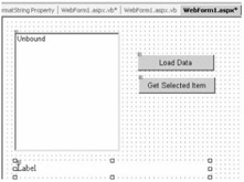
Figure 16-4: Using a ListBox Web server control
The Load Data button click reads data from the Northwind database and binds data to the ListBox control. The Get Selected Item button click returns the selected item. Listing 16-9 shows the code for both button click event handlers.
Listing 16-9: Data Binding in ListBox Control
|
Private Sub LoadDataBtn_Click(ByVal sender As System.Object, _ ByVal e As System.EventArgs) Handles LoadDataBtn.Click Dim conn As SqlConnection = Nothing Dim adapter As SqlDataAdapter = Nothing Dim reader As SqlDataReader = Nothing Dim cmd As SqlCommand = Nothing Dim connectionString = _ "Data Source=MCB;Initial Catalog=Northwind;user id=sa;password=;" conn = New SqlConnection(connectionString) conn.Open() Dim sql = "SELECT * FROM Products" ' Use DataSet adapter = New SqlDataAdapter(sql, conn) Dim ds As DataSet = New DataSet() adapter.Fill(ds) ListBox1.DataSource = ds ListBox1.DataTextFormatString = "Unit Price: {0:C}" ListBox1.DataTextField = "UnitPrice" ListBox1.DataBind() End Sub Private Sub GetSetBtn_Click(ByVal sender As System.Object, _ ByVal e As System.EventArgs) Handles GetSetBtn.Click Label1.Text = "Selected Item: " & _ ListBox1.SelectedItem.Value End Sub |
As you can see from this listing, it simply creates and fills a DataSet and sets the DataSource property of the ListBox control to DataSet. It also sets the DataTextField and DataTextFormatString properties of the ListBox control. DataTextField is the name of the table column, which you want to display in the control. This sample displays the UnitPrice column's data from the Products table. Format the data so it displays in currency format by using the DataTextFormatString property.
If you run the application and load the data, the output looks like Figure 16-5. As you can see from this figure, the data displays in currency format.
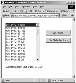
Figure 16-5: Data binding in a ListBox control
Using the DropDownList Control
The DropDownList control is a list control, which displays only the selected data. However, all data items are available when you drop the control. Data binding in the DropDownList control works in the same way as in the ListBox control. You simply set the DataSource, DataMember, and DataTextField properties and call the control's DataBind method.
| Note | Data binding works in a similar way with the CheckBoxList and RadioButtonList controls, too. You just need to set the DataSource and DataTextField properties and call the DataBind method. |
Let's create a similar application as in the last sample. To make the application little more interactive, add one CheckBox control to the page, as shown in Figure 16-6. As you can see from this figure, when you check the Use DataReader check box, the Load Data button click reads data in a SqlDataReader and binds it with the DropDownList control; otherwise it uses the DataSet.
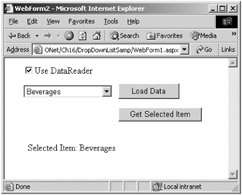
Figure 16-6: Data binding in a DropDownList control
Listing 16-10 shows the code for the Load Data and Get Selected Item button click event handlers. As you can see, it binds the CategoryName column of the Categories table to the control.
Listing 16-10: Data Binding in a DropDownList Control
|
Private Sub LoadDataBtn_Click(ByVal sender As System.Object, _ ByVal e As System.EventArgs) Handles LoadDataBtn.Click Dim conn As SqlConnection = Nothing Dim adapter As SqlDataAdapter = Nothing Dim reader As SqlDataReader = Nothing Dim cmd As SqlCommand = Nothing Dim connectionString = _ "Data Source=MCB;Initial Catalog=Northwind;user id=sa;password=;" conn = New SqlConnection(connectionString) conn.Open() Dim sql = "SELECT * FROM Categories" If CheckBox1.Checked Then ' Use DataReader cmd = New SqlCommand(sql, conn) reader = cmd.ExecuteReader() DropDownList1.DataSource = reader DropDownList1.DataTextField = "CategoryName" DropDownList1.DataBind() If Not reader.IsClosed Then reader.Close() End If Else ' Use DataSet adapter = New SqlDataAdapter(sql, conn) Dim ds As DataSet = New DataSet() adapter.Fill(ds) DropDownList1.DataSource = ds DropDownList1.DataTextField = "CategoryName" DropDownList1.DataBind() End If End Sub Private Sub GetSelItem_Click(ByVal sender As System.Object, _ ByVal e As System.EventArgs) Handles GetSelItem.Click Label1.Text = "Selected Item: " & _ DropDownList1.SelectedItem.Value End Sub
|
Data Binding in Other Simple Controls
How about data binding in simple TextBox, Button, and Image controls? These controls don't provide a DataSource property. The ImageUrl property of the Image control binds an image to the control. You use the Repeater control to bind data with these controls.
| Caution | When binding data to a TextBox control, you must write the runat="server" syntax after the Text property of these controls; otherwise you'll get the error "TextBox cannot have children of DataBoundLiteralControl." |
Listing 16-11 creates a TextBox, a Button, and an Image control and binds data from the Employees table of the Northwind database.
Listing 16-11: Data Binding in the TextBox, Button, and Image Controls
|
<%@ Import Namespace="System.Data" %> <%@ Import Namespace="System.Data.SqlClient" %> <script language="VB" runat=server> Sub Page_Load(sender As Object, e As EventArgs) Dim conn As SqlConnection Dim adapter As SqlDataAdapter dim connectionString = _ "Data Source=MCB;Initial Catalog=Northwind;user id=sa;password=;" conn = new SqlConnection(connectionString) conn.Open() dim sql = "SELECT * FROM Employees" dim cmd as SqlCommand = new SqlCommand(sql, conn) Dim reader as SqlDataReader = cmd.ExecuteReader() repeaterControl.DataSource = reader repeaterControl.DataBind() reader.Close() conn.Close() End Sub </script> <HTML> <HEAD><title>Other Controls Data Binding</title></HEAD> <form method="post" runat="server"> <asp:Repeater runat="server"> <ItemTemplate> <asp:Button Text='<%# Container.DataItem("LastName") %>' runat="server"> </asp:Button> <asp:TextBox Text='<%# Container.DataItem("Title") %>' runat="server"> </asp:TextBox> <asp:Image ImageUrl='<%# Container.DataItem("Photo") %>' runat="server"> </asp:Image> </ItemTemplate> </asp:Repeater> </form> </HTML> |
| Tip | If you want to bind data to a LinkButton control, just replace asp:Button with asp:LinkButton in Listing 16-10. |
 Building Data-Driven Solutions")
EAN: 2147483647
Pages: 214
- Assessing Business-IT Alignment Maturity
- A View on Knowledge Management: Utilizing a Balanced Scorecard Methodology for Analyzing Knowledge Metrics
- Measuring ROI in E-Commerce Applications: Analysis to Action
- The Evolution of IT Governance at NB Power
- Governance Structures for IT in the Health Care Industry