Understanding Data Binding in ASP.NET
Web Forms provide many controls that support data binding. You can connect these controls to ADO.NET components such as a DataView, a DataSet, or a DataViewManager at design-time as well as at runtime. Data binding in Web Forms works in the same way as it does in the Windows Forms with a few exceptions. For example, to bind a DataSet to a DataGrid, you call the DataBind method of the DataGrid control. We discuss all this in a moment. First let's see some basics of data-bound controls.
The following sections discuss data binding and how it works in ASP.NET.
Data-Bound Controls
ASP.NET provides a rich set of data-bound server-side controls. These controls are easy to use and provide a Rapid Application Development (RAD) Web development. You can categorize these controls in two groups: single-item data-bound controls and multi-item data-bound controls.
You use the single-item data-bound controls to display the value of a single item of a database table. These controls don't provide direct binding with the data source. The highlighted part of Figure 14-14 shows an item of a database table. You use the Text, Caption, or Value property of these controls to show the data of a field.
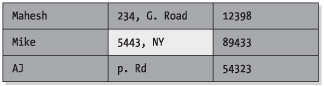
Figure 14-14: An item
Examples of single-item data-bound controls are a TextBox, Button, Label, Image, and so on.
You use the multi-item data-bound controls to display the entire table or a partial table. These controls provide direct binding to the data source. You use the DataSource property of these controls to bind a database table to these controls (see Figure 14-15).
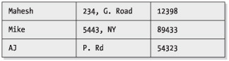
Figure 14-15: Multi-item controls
Some examples of multi-item data-bound controls are DataGrid, ListBox, DataList, DropDownList, and so on. Figure 14-16 shows some of the data-bound controls.
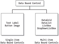
Figure 14-16: Data-bound controls
In ASP.NET, you create these controls using an <asp:controlName> tag. Table 14-4 describes some common data-bound server-side controls.
| CONTROL | ASP.NET CODE | DESCRIPTION |
|---|---|---|
| DataGrid | <asp:DataGrid> | This control displays a database (through ADO.NET) in a scrollable grid format and supports selection, adding, updating, sorting, and paging. |
| DataList | <asp:DataList> | This control displays data in templates and style format. |
| ListBox | <asp:ListBox> | This control can be associated to ADO.NET data fields to display data in a list format. |
| DropDownList | <asp:DropDownList> | This control displays ADO.NET data source data in a drop-down combo box format. |
| CheckBox | <asp:CheckBox> | This can be connected to an item of the ADO.NET data source. |
| CheckBoxList | <asp:CheckBoxList> | This control can be connected to the ADO.NET data source. |
| Repeater | <asp:Repeater> | A templated data-bound list. |
| TextBox | <asp:TextBox> | This control displays ADO.NET using its Text property. |
DataGrid and DataList Controls
A DataGrid control is one of the most powerful Web controls. By using just a DataGrid control, you can write full-fledged Web applications for your Web site. In this section, you'll learn all about the DataGrid methods and properties. The following examples are heavily based on this control.
You can use a DataGrid control to display tabular data. It also provides the ability to insert, update, sort, and scroll the data. Using and binding a DataGrid control is easy with the help of the ADO.NET DataSets. This grid is capable of auto-generating the columns and rows depending on which data you're connecting.
Another control worth mentioning is the DataList control. A DataList control provides a list view of the data from a data source. These controls work similarly.
DataGrid and DataList controls have similar properties. Table 14-5 describes some of the common DataGrid properties.
| PROPERTY | DESCRIPTION |
|---|---|
| AllowPaging, AllowCustomPaging | Boolean values indicate whether paging or custom paging are allowed in the grid. SYNTAX AllowPaging="true" |
| AllowSorting | Boolean value indicates whether sorting is allowed in the grid. SYNTAX AllowSorting="true" |
| AutoGenerateColumns | Gets or sets a value that indicates whether columns will automatically be created for each bound data field. SYNTAX AutoGenerateColumns="true" |
| BackColor, ForeColor, Font | Sets the background, foreground color, and font of the grid control. SYNTAX BorderColor="black"; ForeColor="green"; Font-Name="Verdana"; Font-Size="10pt" |
| BackImageUrl | Gets or sets the URL of an image to display in the background of the DataGrid. |
| BorderColor, BorderStyle, BorderWidth | Sets the border properties of the control. SYNTAX BorderColor="black"; BorderWidth="1" |
| CellPadding, CellSpacing | Sets the cell spacing and padding. SYNTAX CellPadding="10"; CellSpacing="5" |
| Columns | Gets a collection of column controls in the DataGrid. |
| CurrentPageIndex | Index of the currently displayed page. |
| DataKeyField | Primary key field in the data source. |
| DataSource | Fills the grid with the data. SYNTAX DataGrid1.DataSource = ds.Tables["Student"].DefaultView; |
| EditItemIndex | Index of the item to be edited. |
| EditItemStyle | Style of the item to be edited. |
| HeaderStyle, FooterStyle | Header and footer styles. SYNTAX HeaderStyle-BackColor="#00aaaa"; FooterStyle-BackColor="#00aaaa" |
| GridLines | Gets or sets the grid line style. SYNTAX GridLines="Vertical" |
| Height, Width | Width and height of the control. |
| ID | ID of the control. |
| Page | Returns the Page object that contains the current control. SYNTAX Page.DataBind(); |
| PageCount, PageSize | Returns the total number of pages and number of items in a page to be displayed. SYNTAX NumPages = ItemsGrid.PageCount; Items = ItemsGrid.PageCount |
| SelectedIndex | Index of the currently selected item. |
| SelectedItem | Returns the selected item in the DataGrid. |
| ShowFooter, ShowHeader | Shows header and footers. SYNTAX ShowFooter="true";; ShowHeader="true"; |
| UniqueID | Returns the unique ID for a control. |
| VirtualItemCount | Total number of items on the page when AllowCustomPaging is true. |
Setting DataGrid Control Properties at Design-Time
In VS .NET, you can set the DataGrid control's properties at design-time by right-clicking the control and selecting the Properties menu item. This displays the Properties window (see Figure 14-17).
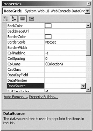
Figure 14-17: DataGrid properties
Most of these properties should look familiar to you by now. You can set the DataSource property to a DataView, DataSet, DataViewManager, or a DataReader. The DataMember property represents a column of a data table if you want to display only one column in the control.
AutoFormat
Besides the general properties of a DataGrid, in Figure 14-17, you see two links: Auto Format and Property Builder. The Auto Format option provides you with predefined formats for rows, columns, headers, footers, and so on (see Figure 14-18).
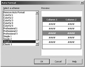
Figure 14-18: DataGrid's Auto Format dialog box
Property Builder
The Property Builder option launches the Properties dialog box. Before setting the DataGrid properties, let's do one thing. Drag a SqlDataAdapter from the Toolbox's Data tab to the Web page, which launches the DataAdapter Configuration Wizard. Follow the steps and build a SQL query using SQL Query tool. Select EmployeeID, LastName, FirstName, and Title from Employees table.
After completing this step, generate a DataSet from the DataAdapter. You can right-click and select the Generate DataSet option to generate a DataSet from a DataAdapter. The Generate DataSet option asks you to use an existing DataSet or create a new DataSet.
This action asks the DataSet name and adds the DataSet11 DataSet object with a DataSet1 class derived from DataSet and DataSet1.xsd XML schema to the project.
Next, drop a DataView on the page and set DataSet11.Employees as its Table property. All these steps are explained in Chapter 2. Now you're all set to use the DataGrid Property Builder.
The first property page is General. This page lets you set a DataSource name at design-time. All available DataSet, DataView, and other data-bindable objects are available in the drop-down combo list. In this case, we have DataSet11 and DataView1. You can also set the DataMember and DataKeyField properties from this page. In this case, select DataSet11 as the DataSource option, Employees as the DataMember option (the only available option; if you have multiple tables in a DataSet, you'll have all tables listed here), and EmployeeID as the Data Key Field option. If you want to add headers and footers to the DataGrid control, you can set them by checking the Show Header and Show Footer check boxes on this page. The Allow Sorting check box enables sorting in a DataGrid control. Check all of these options as shown in Figure 14-19.
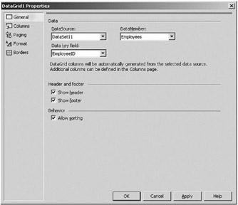
Figure 14-19: DataGrid general properties
Columns Property Page
By default, a DataGrid control adds columns at runtime depending upon the DataSource property of the grid. By using the Columns property page, you can add DataGrid columns at design-time by unchecking the Create Columns Automatically at Run Time check box (as shown in Figure 14-20). We also added four columns to the Selected Columns list: ID, LastName, FirstName, and Title. This page also lets you change the header text and footer text. Not only that, you can also define whether a column is read-only. The Header Image option allows you to set the image of a DataGrid header. We selected an image for the column headers.
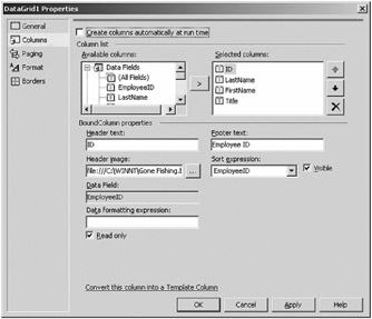
Figure 14-20: DataGrid Columns properties page
| Note | If you set the Header image option to some image, the header title will display as the image, not the text. |
If you scroll down your Available Columns list, you can even add DataGrid columns as a button, a hyperlink, or a template column.
Paging Property Page
The Paging page enables the paging feature in the grid control. The Paging page allows you to set the number of records per page in a DataGrid control. For example, if DataGrid grid control has 50 records and you set the Page Size as 5, the DataGrid will show all 50 records in 10 pages. The Paging page also allows you to navigate to the first page, next page, previous page, last page, and even to a particular page number. By using the Paging property page, you can set the number of pages viewed in a grid and the mode of navigation for navigating pages. In other words, you can either have previous and next options or have the number of pages option. As you can see from Figure 14-21, we check the Allow Paging check box and set the Page Size as 5 rows. We also set the page navigation buttons to include Next and Previous buttons and change the text of buttons.
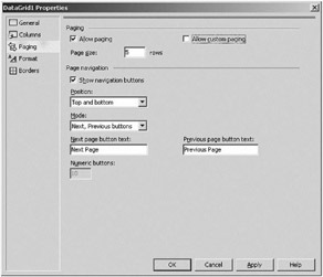
Figure 14-21: DataGrid Paging properties page
Format Property Page
If you don't want to use the Auto Format option, you can use the Format page. This page enables you to set the color and font of a DataGrid control. In fact, this page allows you control over every part of a DataGrid. You can set colors, fonts, style of the DataGrid, as well as its header and footers, page navigators, individual columns, and even column headers and footers (see Figure 14-22).
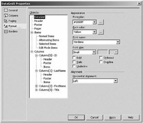
Figure 14-22: DataGrid Format properties page
Borders Property Page
The Borders page enables you to set the border, color, font, cell padding and spacing, and the type of lines in the grid (see Figure 14-23).
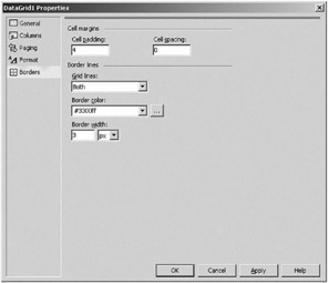
Figure 14-23: DataGrid Border properties page
The final DataGrid control looks like Figure 14-24.
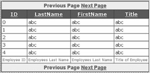
Figure 14-24: The final DataGrid after setting various properties
Filling a DataSet
You're almost there. Now the only thing you need to do is to call the DataAdapter's Fill method and fill the DataSet, and you're all set. Call the sqlDataAdapter1.Fill method with DataSet11 as the only argument on the Page_Load event and then call the DataGrid1.DataBind or Page.DataBind method to bind the DataGrid with the data. Listing 14-3 shows how do to this.
Listing 14-3: Filling the DataSet from DataAdapter
 |
Private Sub Page_Load(ByVal sender As System.Object, _ ByVal e As System.EventArgs) Handles MyBase.Load 'Put user code to initialize the page here SqlDataAdapter1.Fill(DataSet11) Page.DataBind() End Sub
|
Now run the project. The output of the project looks like Figure 14-25.
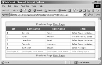
Figure 14-25: Viewing data in a DataGrid using the design-time data binding method
As you can see from this sample, by writing only two lines of code, you've developed a database application. Don't click the Next Page link just yet…it won't work right now. You need to add few lines of code for that.
Paging in the DataGrid Control
As discussed earlier in the "Paging Property Page" section (Figure 14-24), using the Paging page of the Property Builder for a DataGrid controlyou can set paging options of a DataGrid at design-time as well as at runtime.
After enabling paging in a DataGrid, there's one more small addition you need to do to make the paging work. You need to write the PageIndexChanged event handler, which allows you to jump to a specific page by the page index. The easiest way to write a PageIndexChanged event handler is to set a method to the OnPageIndexChanged value, which you can do in the ASP.NET page itself. Add the bold part of the following line to <asp:DataGrid>
<asp:DataGrid OnPageIndexChanged="Grid_Change" ..... >
Now write the Grid_Change method as shown in Listing 14-4. As you can see, we set DataGrid.CurrentPageIndex as DataGridPageChangedEventArgs's NewPageIndex and call the DataGrid1.DataBind method.
Listing 14-4: The PageIndexChanged Handler of the DataGrid Control
|
Sub Grid_Change(ByVal sender As Object, _ ByVal e As DataGridPageChangedEventArgs) DataGrid1.CurrentPageIndex = e.NewPageIndex DataGrid1.DataBind() End Sub
|
Now, if you run the application, you'll find paging working for you. The first page of looks like Figure 14-26, and if you click the Next Page link, DataGrid loads the data, which after the first five records looks like Figure 14-26.
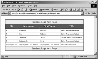
Figure 14-26: Paging option in a DataGrid
Now if you click the Previous Page link, the DataGrid loads the old data again.
Enabling Paging Programmatically
You can also enable paging programmatically from your .aspx file. Listing 14-5 shows the HTML code for a DataGrid control and its properties.
Listing 14-5: HTML View of asp:DataGrid
|
<asp:DataGrid style="Z-INDEX: 101; LEFT: 204px; POSITION: absolute; TOP: 174px" runat="server" Width="279px" Height="212px" BorderStyle="None" BorderWidth="1px" BorderColor="#CC9966" BackColor="White" CellPadding="4" PageSize="5" AllowPaging="True"> <FooterStyle ForeColor="#330099" BackColor="#FFFFCC"></FooterStyle> <HeaderStyle Font-Bold="True" ForeColor="#FFFFCC" BackColor="#990000"></HeaderStyle> <PagerStyle HorizontalAlign="Center" ForeColor="#330099" BackColor="#FFFFCC"></PagerStyle> <SelectedItemStyle Font-Bold="True" ForeColor="#663399" BackColor="#FFCC66"></SelectedItemStyle> <ItemStyle ForeColor="#330099" BackColor="White"></ItemStyle> </asp:DataGrid>
|
The General paging properties include AllowPaging and PageSize. Both are pretty self-explanatory. Basically, AllowPaging enables paging, and PageSize sets the number of pages in a page. You can set these properties programmatically, as shown in Listing 14-6.
Listing 14-6: Setting the AllowPaging, PageSize, and AllowSorting Properties
|
DataGrid1.AllowPaging = True DataGrid1.PageSize = 5 DataGrid1.AllowSorting = True
|
Like in the Property Builder, you can choose to have either the numeric page mode or the previous/next page mode. The numeric mode option shows you the number of pages to move to the previous or next pages (1, 2, and so on), and the previous/next mode displays angle brackets (< and >) to move to the previous and next pages. Listing 14-7 shows how to set the DataGrid control's page style modes to the Numeric and NextPrev styles.
Listing 14-7: Setting DataGrid's PageStyle Modes
|
DataGrid1.PagerStyle.Mode = PagerMode.NumericPages DataGrid1.PagerStyle.Mode = PagerMode.NextPrev
|
You can even change the text of your previous/next mode from angle brackets to the text you want (see Listing 14-8).
Listing 14-8: Setting the DataGrid Control's PageStyle Text
|
DataGrid1.PagerStyle.NextPageText = "Go to Next Page" DataGrid1.PagerStyle.PrevPageText = "Go to Previous Page"
|
If you want to use your own images for the Next and Previous buttons, you can do that as well. Just use the simple HTML <IMG> tag (see Listing 14-9).
Listing 14-9: Setting an Image as the DataGrid Control's Next and Previous Page Text
|
DataGrid1.PagerStyle.NextPageText = "<img srv=next.gif>" DataGrid1.PagerStyle.PrevPageText = "<img srv=prev.gif>"
|
Adding, Editing, and Deleting Data in Web Forms
You'll now add more functionality to your application. In this application, you'll add options to add, delete, and update data. There are two ways you can add these options. One way is to use SQL statements and execute them with the help of SqlCommand, and other way is to do add, edit, and delete operations on a DataSet through DataTable objects. In this sample, you'll use the SqlCommand option. In the next chapter, you'll see the DataSet option to add, edit, and delete data in a DataGrid control.
Adding Web Forms Controls
To provide add, edit, and delete options, you add four TextBox, three Label, and three Button controls, as shown in Figure 14-27.
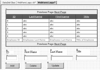
Figure 14-27: Adding, editing, and deleting pages
The Add button click adds data entered in the text boxes to the database. The Delete button click deletes the data based on the ID entered in the ID text box. The Update button updates the data of a record in the database based on the ID value.
The FillDataGrid Method
Before writing any code to add, update, or delete data, let's write a method that will refresh the DataGrid contents. Listing 14-10 shows the FillDataGrid method. As you can see from the code, this method just fills the DataSet from the DataAdapter and binds data to the DataGrid.
Listing 14-10: The FillDataGrid Method
|
' Refresh DataGrid Private Sub FillDataGrid() SqlDataAdapter1.Fill(DataSet11) DataGrid1.DataBind() End Sub
|
Executing SQL Queries
As discussed in Chapter 4, you can use the SqlCommand object's Execute and ExecuteNonQuery methods to execute SQL queries. If you want to add, update, or delete data from a database, executing SQL queries is one of the easiest ways to do so. It's fast and requires a minimum of code to write.
You use the SqlCommand object to execute a SQL command. The Execute and ExecuteNonQuery methods of SqlCommand execute a SQL query. The SqlCommand.Execute method executes the CommandText property and returns data in the SqlDataReader object. The SqlCommand.ExecuteNonQuery method executes CommandText and doesn't return any data. The logical time to use this method is when you're writing to the database or executing SQL statements that don't return any data, which works in this case when you need to add, update, and delete data from a database.
In this example, we've used the SqlCommand.ExecuteNonQuery() method to execute the INSERT, UPDATE, and DELETE SQL queries as obviously we don't need to return any data. This ExecuteSQL method wraps the execution of a SQL query, as shown in Listing 14-11.
Listing 14-11: The ExecuteSQL Method
|
Public Function ExecuteSQL(ByVal strSQL As String) As Boolean ' Creating a connection Dim conn As SqlConnection = New SqlConnection() conn = New SqlConnection(SqlConnection1.ConnectionString) Dim myCmd As SqlCommand = New SqlCommand(strSQL, conn) Try conn.Open() myCmd.ExecuteNonQuery() Catch exp As Exception 'Error message Return False Finally ' clean up here conn.Close() conn.Dispose() End Try Return True End Function
|
Adding Data
The Add button adds a new record to the database and calls the FillDataGrid method, which rebinds the data source and fills the DataGrid control with the updated data. Because the ID column of the database table is AutoNumber, you don't have to enter it. You only need to enter the first name, last name, and title. Listing 14-12 shows the Add button click event handler. As you can see, you create an INSERT SQL statement, call ExecuteSQL, and refill the data using the FillDataGrid method.
Listing 14-12: Add Button Click Event Handler
|
Private Sub AddBtn_Click(ByVal sender As System.Object, _ ByVal e As System.EventArgs) Handles AddBtn.Click ' Build a SQL Statement Dim SQL As String = _ "INSERT INTO Employees(FirstName, LastName, Title)" & _ " VALUES('" + TextBox2.Text + "','" + TextBox3.Text + _ "','" + TextBox4.Text + "')" ' Execute SQL and refresh the data grid ExecuteSQL(SQL) FillDataGrid() End Sub |
In Figure 14-28, we add a new record with first name as "Amy," the last name as "Sue," and the title as "Customer Support." Clicking the Add button adds data to the database and refreshes the DataGrid contents, as you can see from the figure.
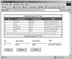
Figure 14-28: Adding a new record in the Web application
Updating Data
The Update button updates a record corresponding to an ID. This is where you build an UPDATE...SET SQL statement and execute it by calling the ExecuteSQL method, as shown in Listing 14-13.
Listing 14-13: Updating Data on the Update Button Click
|
Private Sub UpdateBtn_Click(ByVal sender As System.Object, _ ByVal e As System.EventArgs) Handles UpdateBtn.Click ' Build a SQL Statement Dim SQL As String = _ "UPDATE Employees SET FirstName='" & _ TextBox2.Text + "',LastName='" + TextBox3.Text + _ "',Title='" + TextBox4.Text & _ "' WHERE EmployeeBlueLine" border="0" cellspacing="0" cellpadding="0" width="100%">
Now to test the code, enter "Mel," "0Tel," and "Marketing Rep," in the First Name, Last Name, and Title text boxes (respectively) and ID = 26 and then click the Updated button. The result updates the row with ID=26, and the output looks like Figure 14-29. As you can see, that record is updated as Mel Tel.
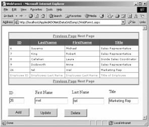
Figure 14-29: Updating records in a Web application
Deleting Data
The Delete button deletes a record corresponding with the ID from the database. You then build a DELETE SQL statement and execute it by calling the ExecuteSQL method, as shown in Listing 14-14.
Listing 14-14: Deleting Data on the Delete Button Click
|
Private Sub DeleteBtn_Click(ByVal sender As System.Object, _ ByVal e As System.EventArgs) Handles DeleteBtn.Click ' Build a SQL Statement Dim SQL As String = "DELETE * FROM Employees WHERE EmployeeID= " + TextBox1.Text ' Execute SQL and refresh the data grid ExecuteSQL(SQL) FillDataGrid() End Sub
|
To delete the newly added record, just enter 26 in the ID field or the ID of the record you want to delete and click the Delete button.
By using these insert, update, and delete data operations, you can write a full-fledged database application for your Web site.
 Building Data-Driven Solutions")
EAN: 2147483647
Pages: 214