17.7 Rendering and Editing
| As with the table cells covered in previous chapters, you can create your own tree cell renderers and editors. The default renderers and editors usually do the trick, but you're probably reading this because they don't do the trick for you, so forge onward! If you went through building your own renderers and editors for tables, you'll find this material quite familiar. The tree uses renderers and editors in much the same way that tables do. In fact, you might recall that the DefaultCellEditor class can return both table and tree cell editors. 17.7.1 Rendering NodesWhy would you want to render a node? Good question. One reason is that you want to modify the L&F of a tree without writing a whole UI package for trees. If you had some special way of presenting the "selected" look, for example, you could write your own tree renderer and still use the default L&F for your other components. You might want to render something other than a string with an icon for the nodes of your tree. Or, as we mentioned above, you might want tooltips that vary based on the particular node you rest your cursor on. "Because I can" is also a good reason. 17.7.1.1 But I just want to change the icons!Before we tackle creating our own renderers, we should point out that the Metal L&F lets you modify the set of icons used by a tree for the leaves and folders. To change the icons, use the UIManager class and the L&F icons for trees. You can also use the client property JTree.lineStyle to affect the type of lines drawn from folders to leaves. Chapter 26 has much more detail on L&Fs, but this short example should get you started for the tree-specific properties. Call the putClientProperty( ) method on your instance of the tree to set its line style. Your choices of styles are:
Call the UIManager.put( ) method to modify the icons used by all trees. The icons you can replace are:
Thus, if t is a JTree, and icon is some kind of Icon, the code: t.putClientProperty ("JTree.lineStyle", "Angled"); UIManager.put ("Tree.openIcon", icon); sets the tree's line style to Angled and sets the icon for opened folders to icon. Figure 17-10 shows a tree with custom icons and angled lines connecting the nodes. (This is also a sample of a JTree used for some hierarchical data other than a filesystem. Here, we have a Virtual Reality Markup Language [VRML] world builder with the containers representing composite scenes and the leaves representing atomic objects in the world.) Figure 17-10. A sample JTree with custom icons and line style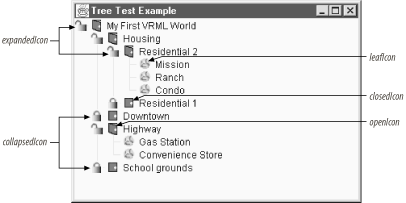 Here's the code that installed these customizations. The customizations happen in two places. The various icons used throughout the tree are installed in our constructor and apply to any tree instance we create. The lineStyle property is something we associated with the particular instance of JTree in our init( ) method. Again, this property affects only the Metal L&F. // TestTree3.java // A simple test to see how we can build a tree and customize its icons // import java.awt.*; import java.util.*; import java.awt.event.*; import javax.swing.*; import javax.swing.plaf.*; import javax.swing.tree.*; public class TestTree3 extends JFrame { JTree tree; DefaultTreeModel treeModel; public TestTree3( ) { super("Tree Test Example"); setSize(200, 150); setDefaultCloseOperation(EXIT_ON_CLOSE); // Add our own customized tree icons. UIManager.put("Tree.leafIcon", new ImageIcon("world.gif")); UIManager.put("Tree.openIcon", new ImageIcon("door.open.gif")); UIManager.put("Tree.closedIcon", new ImageIcon("door.closed.gif")); UIManager.put("Tree.expandedIcon", new ImageIcon("unlocked.gif")); UIManager.put("Tree.collapsedIcon", new ImageIcon("locked.gif")); } public void init( ) { // Build the hierarchy of containers and objects. String[] schoolyard = {"School", "Playground", "Parking Lot", "Field"}; String[] mainstreet = {"Grocery", "Shoe Shop", "Five & Dime", "Post Office"}; String[] highway = {"Gas Station", "Convenience Store"}; String[] housing = {"Victorian_blue", "Faux Colonial", "Victorian_white"}; String[] housing2 = {"Mission", "Ranch", "Condo"}; Hashtable homeHash = new Hashtable( ); homeHash.put("Residential 1", housing); homeHash.put("Residential 2", housing2); Hashtable cityHash = new Hashtable( ); cityHash.put("School grounds", schoolyard); cityHash.put("Downtown", mainstreet); cityHash.put("Highway", highway); cityHash.put("Housing", homeHash); Hashtable worldHash = new Hashtable( ); worldHash.put("My First VRML World", cityHash); // Build our tree out of our big hashtable. tree = new JTree(worldHash); // Pick an angled line style. tree.putClientProperty("JTree.lineStyle", "Angled"); getContentPane( ).add(tree, BorderLayout.CENTER); } public static void main(String args[]) { TestTree3 tt = new TestTree3( ); tt.init( ); tt.setVisible(true); } } 17.7.2 The DefaultTreeCellRenderer Class[DK 1.2 introduced another alternative to the L&F setup for trees. In addition to setting up icons and line styles as we do in the previous example, you can use the DefaultTreeCellRenderer class and its properties to customize tree display. DefaultTreeCellRenderer is an extension of the JLabel class that implements the TreeCellRenderer interface (discussed later) and is devoted to tailoring your tree's display. 17.7.2.1 PropertiesTable 17-18 shows the properties associated with this new class:
The various properties let you configure the icons for leaves, open folders, and closed folders. You can also control the colors used for the text and selected elements. 17.7.2.2 ConstructorThe DefaultTreeCellRenderer class has only one constructor:
The default renderer can be very handy for changing the L&F of one tree as opposed to every tree. Figure 17-11 shows an example of such a tree in a split pane. The top tree is a normal tree. The tree on the bottom was built with the same data, but it alters the icons of its renderer. Figure 17-11. Sample JTrees; the second tree uses custom icons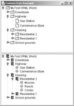 Here's the code that produced the trees and custom icons for the second tree: // Build our tree out of our big hashtable. tree1 = new JTree(worldHash); tree2 = new JTree(worldHash); DefaultTreeCellRenderer renderer = (DefaultTreeCellRenderer)tree2.getCellRenderer( ); renderer.setClosedIcon(new ImageIcon("door.closed.gif")); renderer.setOpenIcon(new ImageIcon("door.open.gif")); renderer.setLeafIcon(new ImageIcon("world.gif")); 17.7.3 Custom RenderersWhat if we wanted more tailored icons or node-specific tooltips or even HTML text for the nodes? Such features would require writing our own renderer. Our XML tree uses the default folder and leaf icons, which are more appropriate for files and filesystems. We can write a custom renderer that uses icons specified by the XML tags if they're available. (It uses the default icons if not.) Figure 17-12 shows such a renderer in action. Figure 17-12. XML JTree tree with a custom interface and tooltips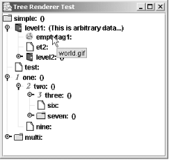 17.7.4 The TreeCellRenderer InterfaceWith the TreeCellRenderer interface and your favorite Component subclass, you can render a tree cell any way you like, regardless of the L&F in place. While you can return any component as a renderer, because of the problems with mixing heavyweight and lightweight components, you'll probably want to return a subclass of JComponent. If you want multiple components to do your rendering (or your editing, for that matter), extending Container is a good place to start. This interface defines one method:
A simple way to build your first renderer is to extend the JLabel class. You'll probably want to keep some other state information around as well. The following is the code that built the above renderer. When the program renders a cell or displays a cell's tooltip (by calling getTreeCellRendererComponent( )), we set the current color for the foreground and background according to the selected status of our object. We could also query our object for other bits of information, if needed. We implement the IconAndTipCarrier interface to let our renderer know it should use a custom icon and text for the tooltips. IconAndTipCarrier was written for this example and has only two methods: getIcon( ) and getToolTipText( ). To get the more interesting tooltips working, we override the getToolTipText( ) method to return a different string for each node or leaf. In our case, we show the filename of the icon being used. // IconAndTipRenderer.java // A renderer for our XML cells // import java.awt.*; import javax.swing.*; import javax.swing.tree.*; public class IconAndTipRenderer extends JLabel implements TreeCellRenderer { Color backColor = new Color(0xFF, 0xCC, 0xFF); Icon openIcon, closedIcon, leafIcon; String tipText = ""; public IconAndTipRenderer(Icon open, Icon closed, Icon leaf) { openIcon = open; closedIcon = closed; leafIcon = leaf; setBackground(backColor); setForeground(Color.black); } public Component getTreeCellRendererComponent(JTree tree, Object value, boolean selected, boolean expanded, boolean leaf, int row, boolean hasFocus) { setText(value.toString( )); if (selected) { setOpaque(true); } else { setOpaque(false); } // Try to find an IconAndTipCarrier version of the current node. IconAndTipCarrier itc = null; if (value instanceof DefaultMutableTreeNode) { Object uo = ((DefaultMutableTreeNode)value).getUserObject( ); if (uo instanceof IconAndTipCarrier) { itc = (IconAndTipCarrier)uo; } } else if (value instanceof IconAndTipCarrier) { itc = (IconAndTipCarrier)value; } if ((itc != null) && (itc.getIcon( ) != null)) { // Great! Use itc's values to customize this label. setIcon(itc.getIcon( )); tipText = itc.getToolTipText( ); } else { // Hmmm, nothing available, so rely on the defaults. tipText = " "; if (expanded) { setIcon(openIcon); } else if (leaf) { setIcon(leafIcon); } else { setIcon(closedIcon); } } return this; } // Override the default to send back different strings for folders and leaves. public String getToolTipText( ) { return tipText; } } Here are the lines in VSX2.java that create the new renderer and tell our tree to use it instead of the default renderer: // Steal the default icons from a default renderer. DefaultTreeCellRenderer rend1 = new DefaultTreeCellRenderer( ); IconAndTipRenderer rend2 = new IconAndTipRenderer( rend1.getOpenIcon( ), rend1.getClosedIcon( ), rend1.getLeafIcon( )); tree.setCellRenderer(rend2); If you want the tooltips to be active, you have to register the tree with the ToolTipManager (see Chapter 27 for details) like so: ToolTipManager.sharedInstance( ).registerComponent(tree); 17.7.5 Editing NodesOne of the other things you may want to do with a tree node is edit it. Each L&F shipped with Swing implements basic text field editors for tree nodes, but it is possible to use other components to edit nodes. In fact, since editors are just subclasses of Component, you can even build your own editor. For example, we can create an expression editor (see Figure 17-13) that picks one of two possible components. If you want to edit an operator, you get a JComboBox with the four supported operators in the list. If you want to edit an integer, you get a JTextField. Figure 17-13. Expression tree with a custom editor for the operator nodes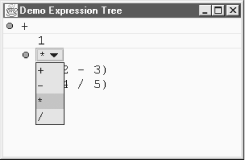 17.7.6 The TreeCellEditor InterfaceLike the TreeCellRenderer interface, the TreeCellEditor interface has one method:
In addition to this method, you also need to keep track of things like whether you can even edit this tree node. Most of that information comes from the CellEditor interface (which TreeCellEditor extends). 17.7.7 The DefaultTreeCellEditor ClassJDK 1.2 introduced another useful component to the tree package: the DefaultTreeCellEditor class. This class can be used to supply an editor for your tree cells that lets icons associated with the cells remain on the screen during editing. (This was a problem in previous releases.) You can use a default text field to edit cells or wrap your own custom editor in this class to use the start-up and rendering features. The DefaultTreeCellEditor class starts editing a cell after a triple-click of the mouse or after a "click-pause-click wait for 1,200 milliseconds" sequence. 17.7.7.1 PropertiesTable 17-19 lists the DefaultTreeCellEditor properties.
The font and borderSelectionColor properties determine the visible qualities of the editor. The cellEditorValue property comes from the CellEditor interface discussed in detail in Chapter 27. (It contains the current value stored in the editor.) The tree property is the JTree whose cell is being edited. 17.7.7.2 EventsAs dictated by the CellEditor interface, the DefaultTreeCellEditor class generates ChangeEvent objects for cell editor events. The usual add and remove methods are present:
17.7.7.3 ConstructorsTwo constructors allow you to build your own version of the "default" editor:
17.7.7.4 CellEditor and TreeCellEditor methodsThe DefaultTreeCellEditor class implements the TreeCellEditor interface (and by extension, the CellEditor interface). The methods from these interfaces are present in the class. The methods for CellEditor are usually delegated to the realEditor component. Chapter 27 has more details on the CellEditor interface. One of the most common tasks a cell editor encounters is validating the input provided by the user. The default editor has no skill in this area, but if we build our own editors, we can add as much functionality as we need. Two ways of validating input come to mind. An easy way is to restrict the input to a range of choices. The JComboBox class is an excellent candidate for this type of work. We can supply a list of valid values, and the user picks something from the list. Another way of handling input is testing the value before you accept it. If the user supplies an invalid entry, just leave the editor open. If she supplies a valid entry, accept it and close the editor. We'll build both types of editors in the example below. For the tree itself, we need one class that we can designate as our editor. That class, in turn, delegates its editing capabilities to one of the two editors mentioned above. This delegating class does not have to be a component itself since the actual editor the tree uses comes from the getTreeCellEditorComponent( ) call, which returns the real editing component. In our case, it returns an EmailEditor or an EditorComboBox, depending on whether we're editing a node or a leaf. However, EmailTreeCellEditor does have to implement the TreeCellEditor interface; as you can see from the code, after the real editors are set up, it delegates the other methods to the current editor: // EmailTreeCellEditor.java // import javax.swing.*; import javax.swing.event.*; import java.awt.*; import java.awt.event.*; import java.util.*; import javax.swing.tree.*; public class EmailTreeCellEditor implements TreeCellEditor { EditorComboBox nodeEditor; EmailEditor leafEditor; CellEditor currentEditor; static String[] emailTypes = { "Home", "Work", "Pager", "Spam" }; public EmailTreeCellEditor( ) { EmailEditor tf = new EmailEditor( ); EditorComboBox cb = new EditorComboBox(emailTypes); nodeEditor = cb; leafEditor = tf; } public Component getTreeCellEditorComponent(JTree tree, Object value, boolean isSelected, boolean expanded, boolean leaf, int row) { if (leaf) { currentEditor = leafEditor; leafEditor.setText(value.toString( )); } else { currentEditor = nodeEditor; nodeEditor.setSelectedItem( ((DefaultMutableTreeNode)value).getUserObject( )); } return (Component)currentEditor; } public Object getCellEditorValue( ) { return currentEditor.getCellEditorValue( ); } // All cells are editable in this example. public boolean isCellEditable(EventObject event) { return true; } public boolean shouldSelectCell(EventObject event) { return currentEditor.shouldSelectCell(event); } public boolean stopCellEditing( ) { return currentEditor.stopCellEditing( ); } public void cancelCellEditing( ) { currentEditor.cancelCellEditing( ); } public void addCellEditorListener(CellEditorListener l) { nodeEditor.addCellEditorListener(l); leafEditor.addCellEditorListener(l); } public void removeCellEditorListener(CellEditorListener l) { nodeEditor.removeCellEditorListener(l); leafEditor.removeCellEditorListener(l); } } Next, we need to set up our first custom editor. For nodes, we want a combo box that gives us some address categories as choices. The EditorComboBox class is really a bit more flexible than that. It accepts any array of objects as an argument to its constructor and returns a JComboBox editor containing that list as its choices. This class also implements the CellEditor interface so that it can perform the duties required of an editor. As you saw in the above code, the EmailTreeCellEditor delegates most of its responsibilities here. In setting up the constructor, we attach an action listener that stops the editing process when the user chooses one of the items in the list. The JTree object using this editor registers as a CellEditorListener when you begin editing a node. It then waits for the ChangeEvent that we distribute in the fireEditingStopped( ) method before removing the editor component from the screen. Using the isCellEditable( ) method, we'll start editing if the user right-clicks on our node. // EditorComboBox.java // A CellEditor JComboBox subclass for use with Trees (and possibly tables) // import javax.swing.*; import javax.swing.event.*; import java.awt.event.*; import java.awt.*; import java.util.*; public class EditorComboBox extends JComboBox implements CellEditor { String value; Vector listeners = new Vector( ); // Mimic all the constructors people expect with ComboBoxes. public EditorComboBox(Object[] list) { super(list); setEditable(false); value = list[0].toString( ); // Listen to our own action events so that we know when to stop editing. addActionListener(new ActionListener( ) { public void actionPerformed(ActionEvent ae) { if (stopCellEditing( )) { fireEditingStopped( ); } } }); } // Implement the CellEditor methods. public void cancelCellEditing( ) { } // Stop editing only if the user entered a valid value. public boolean stopCellEditing( ) { try { value = (String)getSelectedItem( ); if (value == null) { value = (String)getItemAt(0); } return true; } catch (Exception e) { // Something went wrong. return false; } } public Object getCellEditorValue( ) { return value; } // Start editing when the right mouse button is clicked. public boolean isCellEditable(EventObject eo) { if ((eo == null) || ((eo instanceof MouseEvent) && (((MouseEvent)eo).isMetaDown( )))) { return true; } return false; } public boolean shouldSelectCell(EventObject eo) { return true; } // Add support for listeners. public void addCellEditorListener(CellEditorListener cel) { listeners.addElement(cel); } public void removeCellEditorListener(CellEditorListener cel) { listeners.removeElement(cel); } protected void fireEditingStopped( ) { if (listeners.size( ) > 0) { ChangeEvent ce = new ChangeEvent(this); for (int i = listeners.size( ) - 1; i >= 0; i--) { ((CellEditorListener)listeners.elementAt(i)).editingStopped(ce); } } } } The next step is to build our editor delegate for the leaves. We'll use the same approach, but this time, we will make sure that the user enters a valid value. We do this in the stopCellEditing( ) method. If the value in the text field does not look like an email address (i.e., does not have an "@" in it somewhere), we return false and do not fire the ChangeEvent. (See Chapter 20 for a more proactive approach to restricting the text field input.) This leaves the text field on the screen. Until the user types a valid email address into the text field, pressing Enter has no effect, and the editor remains visible. // EmailEditor.java // import javax.swing.*; import javax.swing.event.*; import java.awt.event.*; import java.awt.*; import java.util.*; public class EmailEditor extends JTextField implements CellEditor { String value = ""; Vector listeners = new Vector( ); // Mimic all the constructors people expect with text fields. public EmailEditor( ) { this("", 5); } public EmailEditor(String s) { this(s, 5); } public EmailEditor(int w) { this("", w); } public EmailEditor(String s, int w) { super(s, w); // Listen to our own action events so that we know when to stop editing. addActionListener(new ActionListener( ) { public void actionPerformed(ActionEvent ae) { if (stopCellEditing( )) { fireEditingStopped( ); } } }); } // Implement the CellEditor methods. public void cancelCellEditing( ) { setText(""); } // Stop editing only if the user entered a valid value. public boolean stopCellEditing( ) { try { String tmp = getText( ); int at = tmp.indexOf("@"); if (at != -1) { value = tmp; return true; } return false; } catch (Exception e) { // Something went wrong (most likely we don't have a valid integer). return false; } } public Object getCellEditorValue( ) { return value; } // Start editing when the right mouse button is clicked. public boolean isCellEditable(EventObject eo) { if ((eo == null) || ((eo instanceof MouseEvent) && (((MouseEvent)eo).isMetaDown( )))) { return true; } return false; } public boolean shouldSelectCell(EventObject eo) { return true; } // Add support for listeners. public void addCellEditorListener(CellEditorListener cel) { listeners.addElement(cel); } public void removeCellEditorListener(CellEditorListener cel) { listeners.removeElement(cel); } protected void fireEditingStopped( ) { if (listeners.size( ) > 0) { ChangeEvent ce = new ChangeEvent(this); for (int i = listeners.size( ) - 1; i >= 0; i--) { ((CellEditorListener)listeners.elementAt(i)).editingStopped(ce); } } } } And of course, as the last step, we must register this new delegating editor with our JTree object in the init( ) method of the EmailTree class: tree.setCellEditor(new EmailTreeCellEditor( )); tree.setEditable(true); If you recall from the constructor descriptions for DefaultTreeCellEditor, you can also use that class to keep the icon associated with a node on the screen while you are editing. To accomplish this, you could use the following code: DefaultTreeCellRenderer renderer = (DefaultTreeCellRenderer)tree.getCellRenderer( ); EmailTreeCellEditor emailEditor = new EmailTreeCellEditor( ); DefaultTreeCellEditor editor = new DefaultTreeCellEditor( tree, renderer, emailEditor); tree.setCellEditor(editor); 17.7.8 Look-and-Feel Helper ClassesJDK 1.2 added three other classes to the tree package that help the L&F code do its job:
The documentation for these classes notes that they will become "more open" with future releases of the JDK. (As of the 1.4 release, that same note still exists. Ah, well.) Fortunately, the JTree class itself is not concerned with these classes there are no methods for setting or modifying the layout cache. The L&F classes, however, do use these classes, and developers building their own L&Fs may want to look closer. |
EAN: 2147483647
Pages: 289
- Step 1.1 Install OpenSSH to Replace the Remote Access Protocols with Encrypted Versions
- Step 1.2 Install SSH Windows Clients to Access Remote Machines Securely
- Step 2.1 Use the OpenSSH Tool Suite to Replace Clear-Text Programs
- Step 4.4 How to Generate a Key Using PuTTY
- Appendix - Sample sshd_config File