Correcting Tone and Contrast with Levels
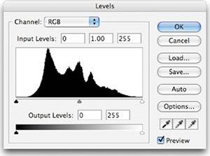
| Once you've identified that an image has contrast or exposure troubles, you'll probably want to do something about it. Almost all image editing programs have a Levels feature, and most Levels interfaces follow the design of Adobe's original Levels control from Photoshop 1 (Figure 3.11). Figure 3.11. Photoshop's Levels dialog box.
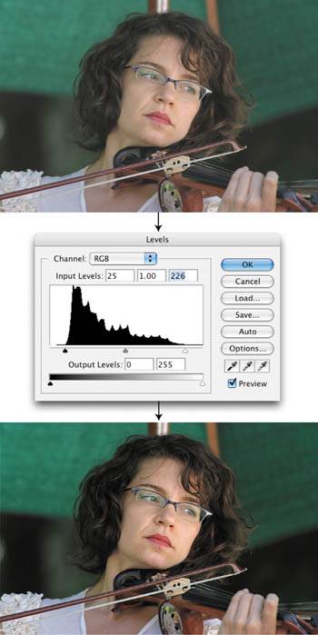
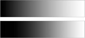
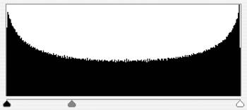
In addition to a histogram display, Photoshop's Levels dialog box provides a pop-up Channel menu that lets you switch from adjusting the full-color image to adjusting individual color channels. Most important, though, are the three sliders positioned below the histogram. At the far left is the black slider, which points to the leftmost edge of the histogramthe edge representing black. On the right is the white slider, and in the middle is the midpoint, or gamma, slider. You can use the black and white sliders to redefine which tones in your image should be black, and which should be white. Photoshop will automatically stretch the tones in between, redistributing them accordingly. For example, to correct the low-contrast image shown at the top in Figure 3.12, you can simply drag the leftmost slider so that it points to the darkest tone in the histogram and then drag the rightmost slider so that it points to the lightest tone in the histogram. Figure 3.12. By sliding the white and black points in the Levels dialog box, you can redefine which tones are black and which tones are white, resulting in improved contrast, as shown in the bottom image.
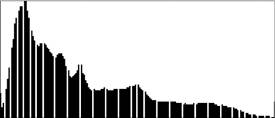
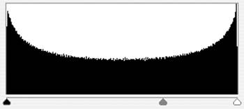
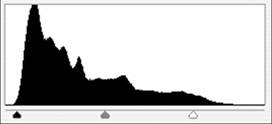
When you click OK, Photoshop will adjust the tones in your image so that the darkest tone is black and the lightest tone is white. The middle shades will be stretched across the intervening tonal range. TIP In Photoshop Elements, you'll find the Levels control by choosing Enhance > Adjust Lighting > Levels. In Photoshop CS and CS2, choose Image > Adjustments > Levels. The Levels dialog box is a very interactive tool, and to really understand it you must get a feel for it. If you've never used the Levels tool before, open some of your own images and give it a try. Losing dataNow the bad news: Just as there's no such thing as a free lunch, there's no such thing as a Levels adjustment that doesn't result in a little data loss. Consider the histogram of the adjusted image at the bottom of Figure 3.12. The histogram now has a lot of gaps (Figure 3.13). When we moved the white point and black point in the Levels dialog box, we told Photoshop to expand the data between those two points to provide a full range of black to white. However, there wasn't enough data to fill a full range of black to white (if there was, our image wouldn't have been problematic in the first place), so Photoshop had to spread out the existing tones to cover the full range. In redistributing the tones, Photoshop had to leave some tonal values empty. These are the gaps that now exist in the histogram. Figure 3.13. The adjusted image in Figure 3.12 produces a histogram riddled with gaps because Photoshop has had to throw out data to make the adjustment.
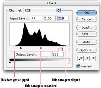
Is the elimination of tones a bad thing? It depends. As you saw in Figure 3.2, subtle gradients and details are composed of many different shades. If some of those shades are eliminated, those gradients and details will become a little rougher and more coarse. The good news is that you usually have to throw out a fair amount of data before you see a significant degradation in your image. Avoiding data loss when editing is impossible, so don't feel like you have to try to make edits that preserve all of your data. However, it's important to keep an eye on this issue and to plan your edits accordingly. For example, trying to use a single Levels adjustment to improve contrast and saturation in one fell swoop will often result in less data loss than using a Levels adjustment to improve contrast and then using another type of tool to adjust saturation. The main downside to data loss is that it limits the amount of editing you can do. The histogram in Figure 3.13 shows an image that has already had a lot of its data used up just to get back to the level of contrast that should have been there in the first place. If you want to make additional editscolor corrections, for examplethen you have a little less room to maneuver. Because you've already used up some data, further edits will more readily result in visible image degradation. This is why proper exposure and good photography skills are so important. Though people often think "It doesn't matter how I shoot, because I can always fix it in Photoshop," the fact is, if you don't carefully calculate your exposure so as to capture the maximum amount of image data, you may not be able to "fix it in Photoshop" without severely degrading the image. TIP Too much data loss can leave very noticeable artifacts in your image. If you aren't already familiar with the term posterization, check out "What Missing Data Looks Like" later in this chapter. As you'll see in the next chapter, shooting raw not only yields more image data; it also provides you with additional tools that are less damaging to that data. Compression vs. clippingTwo things happen to your image data when you move a control point in the Levels dialog box. The data between the control points is either compressed or expanded, while the image data that falls outside the black and white control points gets clipped (Figure 3.14). Figure 3.14. When you click OK after moving the black and white control points for an image, the image data outside those points will get clipped. The image data between the white and black points will get expanded to fill a full range from black to white.
When data is expanded or compressed, it is redistributed to fit inside the new space. If you're trying to fit a lot of data into a smaller space, then your image editor will have to discard some tones. When pixels with different gray values are compressed into a single gray value, that value is shown on the histogram as a spike, to indicate that it is the product of multiple, combined tones. If you're expanding data to fit into a wider space, then the program will redistribute the tones, spreading them out to cover the new space. As seen earlier, where there's no data for a particular value, a gap will appear in the histogram. In both cases, the software will try to preserve the distribution of tones, keeping the overall "shape" of the histogram. This ensures that the relative brightness between two areas remains the same. When you clip part of the tonal range, everything outside of the clipping is simply eliminated. Because the data leading up to the white point is expanded, you end up with fewer tones being used to create the transition to white or black. Thus, clipping the highlights or shadows can result in a sudden transition to solid black or white tones. This can often look harsh and unrealistic. Clipping is more apparent in highlights than in shadows, because clipped shadows are often embedded in dark areas where the sudden change to black is not so apparent. Return to Figures 3.1 and 3.2 and take a look at the bright highlights on the top of the chrome headlight. In Figure 3.1, the highlights are clipped, resulting in a rather sudden transition from the chrome of the headlight to the bright white of the highlight. In Figure 3.2, this transition is much smoother, with far more intermediate tones. When using the Levels dialog box, if you hold down the Alt (Windows) or Option (Mac) key while dragging the white or black point, Photoshop will highlight the clipped areas of your image with black or white (Figure 3.15). Figure 3.15. If you hold down the Alt or Option key while moving the black or white slider in Photoshop's Levels dialog box, you'll see exactly which areas of your image are getting clipped.
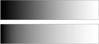
Adjusting midtonesWhile the white and black points allow you to increase contrast as well as to brighten or darken an image overall, there will be times when you want to brighten or darken the image while leaving the blacks and whites untouched. For this, the Levels control provides the midpoint, or gamma, slider. Perhaps the easiest way to understand the gamma slider is to look at its effect on some simple gradients. In Figure 3.16, the gamma slider has been moved to the right, causing all of the tones between the midpoint and white to be compressed, while at the same time expanding all of the tones between the midpoint and black. Overall, the image is darker because the darker tones have been expanded into more of the image. Figure 3.16. A positive gamma adjustment shifts the midtones to the right, darkening the image.
If the slider is moved the other way, as in Figure 3.17, the opposite happens, and the overall image is lighter. Figure 3.17. A negative gamma adjustment lightens the middle tones of the image.
What's important to notice is that the black and white points did not change at all. In other words, we were able to preserve the lightest and darkest tones in the image, while adjusting all of the tones in between. For a less conceptual example, return to Figure 3.12. Though we were able to improve the contrast in this image by making white and black point adjustments, overall the image is still a little dark. A more aggressive white point adjustment would brighten the image further, but it would also blow out the highlight areas, resulting in a loss of detail and a generally uglier image (Figure 3.18). Figure 3.18. You could brighten this image further with a more aggressive white point adjustment, but then the highlights would blow out.
Instead, we want to brighten the image without brightening the white tones, since they're already as bright as they can go. As you've already seen, a gamma adjustment lets you brighten or darken middle tones without affecting the white and black tones. With a gamma adjustment, we can easily brighten the image without blowing it out (Figure 3.19). Figure 3.19. A simple gamma adjustment brightens the image without blowing out the highlights.
The Levels control is a very powerful editing tool, and one you'll probably use on almost every image you work with. As with most tools, the Levels control becomes much easier to use with practice. Once you start shooting raw, you may be a little less dependent on Levels, since you'll be able to control your white and black points and midpoint during your initial raw processing. You'll learn more about this in the next chapter. |

EAN: 2147483647
Pages: 76