A Common Approach
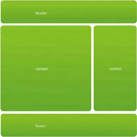
| As I just mentioned, multicolumn layouts are not exclusive to CSS. Additionally, fluid layouts, which expand and contract along with whatever width the browser window happens to occupy, can also be achieved using tables. Traditionally, a designer may think in columns, forming each using a series of table cells. Figure 8.1 shows a commonly used layout structure, with a header that spans across the top, then two columns for content, followed by a footer that spans across the bottom. Figure 8.1. You often see a two-column layout structure like this.
Historically, a table seemed like a natural way to mark up this structure, using the colspan attribute to span the header and footer across multiple content columns. A rough approximation of that markup would look something like this: <table> <tr> <td colspan="2">header</td> </tr> <tr> <td>content</td> <td>sidebar</td> </tr> <tr> <td colspan="2">footer</td> </tr> </table> But most designers and developers didn't stop there. Once they constructed a basic shell, they could nest additional tables inside each cell to create borders and pixel-precise spacing for the layout. In the end, an enormous amount of markup was used to create both the framework for the layout as well as the visual style of the page. To achieve fluidity, it's possible to set table cell widths as percentages, which allows the layout to fully expand regardless of browser window size: <table width="100%"> <tr> <td colspan="2">header</td> </tr> <tr> <td width="70%">content</td> <td width="30%">sidebar</td> </tr> <tr> <td colspan="2">footer</td> </tr> </table> The entire table gets a width of 100%, while the columns get broken down into whatever widths are desiredin this case, a larger content column to the left of a narrower sidebar. Expanding or contracting the browser window will resize the layout and proportionately render the columns. So, it's proven that tables can work for creating layouts, and it's also proven that tables can be used to achieve fluid layouts that stretch along with the browser window. But there's an easier waya better way. Let's talk about why the table method is unbulletproof. |
 Improving flexibility and protecting against worst-case scenarios with XHTML and CSS")
EAN: N/A
Pages: 97