Why It s Not Bulletproof
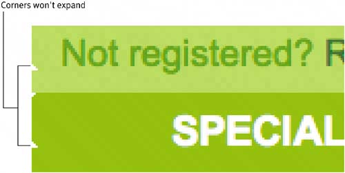
Why It's Not BulletproofWe can make several improvements to the construction of these horizontal rowsimprovements that will enhance this section's flexibility. Let's outline what's wrong so that we can gain a better understanding of what we'll need to bulletproof in this design. NONESSENTIAL GRAPHICSAs we discovered earlier, the rows are built using a series of nested tables, with each section of the row surrounded by its own table cell. Nonessential graphics, such as the rounded ends, are placed in the markup alongside the text. These graphics will just get in the way of someone trying to access this site via a text browser or screen reader. Assigning the proper alt attribute values to the images would certainly help, although The Best Store Ever chose to omit those useful bits of information. "Nonessential graphics" refers to graphics that don't apply any meaning to the content, or that don't provide any instruction or direction to the user. Rounded corners are a design element, and we'll be moving those to the style sheet later on. THINKING IN FIXED HEIGHTIf we try bumping up the text size a few notches, you'll notice that the rows' design breaks down (Figure 3.3). Increasing the text size is always a good test for discovering how flexible design components are. Not only does it give you a sense for how well the readability fares at larger text sizes, but it can also reveal whether the design can handle a varying amount of content, regardless of its text size. In other words, if an editor later decides that he or she would like two lines of promotional text instead of the one that happened to be in the specification, then in a bulletproof world the row would expand without any adjustments. This saves time, money, and, well, that should be reason enough. Figure 3.3. When text is increased, the static corner images won't expand with the rest of the design.
Looking again at Figure 3.3, we can see that the rounded-corner images that were created to cap off each row end have been designed for a fixed height. Anything tall stuffed inside will spill out, breaking the design. What I'm trying to convey in this chapter (and many others) is a shift in thought in terms of height. It is possible to compensate for larger text, more content, and whatever else is placed inside certain design components. We'll get to that in just a minute. CODE BLOATAs with most traditional methods of Web design, a large amount of code was needed to construct these rows. As you'll recall from Chapter 2, "Scalable Navigation," nesting tables adds a considerable amount to the markup. This code bloating will fill up servers, clog bandwidth, and wreak havoc with nonbrowser software and devices. Imagine trying to navigate through the sea of code using a text browser. Fortunately, there is a cleaner, flexible way to approach this same design requirement. Let's get to it. |
 Improving flexibility and protecting against worst-case scenarios with XHTML and CSS")
EAN: N/A
Pages: 97