Additional Examples
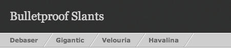
| To take the concepts from this chapter a step further, be sure to dig into these additional examples that offer distinct designs that share the flexibility of the tabs we've just constructed. MOZILLA.ORGwww.mozilla.orgA recent redesign of Mozilla.org introduced rounded tab navigation that scales along with whatever text size or textual content that's thrown at it (Figure 2.16). Figure 2.16. Rounded corners can be easily achieved by using the Sliding Doors technique, as seen here at Mozilla.org.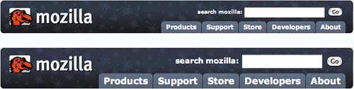 The Mozilla team utilized a technique developed by Douglas Bowman called the Sliding Doors of CSS (www.alistapart.com/articles/slidingdoors/). Bowman devised a clever way of using two back-ground images that spread apart as the contents inside them expand. By using two separate images, rounded corners and other non-box treatments can be aligned to the edges of tabs and other containersall the while remaining flexible and accessible. SLANTSwww.simplebits.com/bits/bulletproof_slants.htmlThe need for slant-separated yet flexible navigation arose for a client project, and the results required just a single background image that would reveal more or less of itself depending on the size of text contained within (Figure 2.17). Figure 2.17. By using a larger-than-necessary slant background image, the effect can remain intact no matter what text is placed in between.
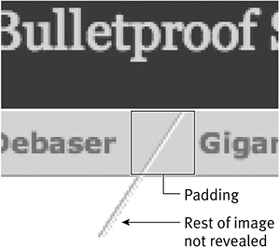
By aligning a single-slant image that is larger than necessary (at a default text size) as a background image, we ensured that more of that slanted image will expose itself as you increase the text size (Figure 2.18). Figure 2.18. Here's a close-up of the slant, with only just enough of the image revealed.
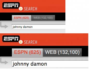
ESPN.COM SEARCHwww.espn.comThe tabs used to toggle filters for ESPN.com's Search were created using a method similar to this chapter's example. A larger image with a gradient fade is used as a background, where more of the image appears as the user increases text size. Figure 2.19 shows the tabs at two different text sizes. Figure 2.19. The tabs of ESPN Search will scale with varying text size and length.
To explain how this was achieved, we'll use the unselected tab state as an example, where there is a slight, one-pixel highlight on both the top and left sides of the background image. Because this highlight appears on these two sides only, we can get away with using a single image as a background, making it large enough to accommodate text at a large size. Figure 2.20 shows the tab at default text size, with only the top-left portion of the background image revealed, while Figure 2.21 shows the tab at a much larger text size, with a larger area of the background image revealed. By creatively positioning the image to the top left of the tab's <a> element, we can still show the highlight and gradient detail no matter what amount or size of text is placed inside. Figure 2.20. This shows a tab at default text size, with only the top-left portion of the background image revealed.
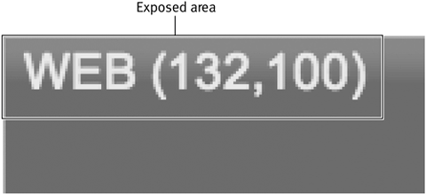
Figure 2.21. With an increased text size, more of the background image is revealed, yet the subtle highlight remains in the top and left of the tab.
Ensuring a flexible width was crucial to the design of these tabs, because the number of results would be displayed alongside each tab's label (the number in parentheses). Due the varying length of the results number, the tab needed room to "breathe," expanding or contracting as necessary, while still maintaining the design. |

EAN: N/A
Pages: 97