Extra Credit
|
| < Day Day Up > |
|
For extra credit, let's look at a few different ways we can take advantage of our marked-up grocery list, using CSS to style it several different ways. We'll throw away defaults, add custom bullets, and then turn it horizontal for a few navigation bar ideas.
Bite the Bullet
"But I hate the way the bullets look on my grocery list, so I should just keep using those <br /> tags."
No need to revert to old habits—we can continue to use our structured unordered list and let CSS turn off the bullets and indenting (if that sort of thing floats your boat). The key here is to keep our list structured, and then let CSS handle presentation details.
First add a CSS rule that will turn off the bullets:
ul { list-style: none; } the results of which can be seen in Figure 1-4.
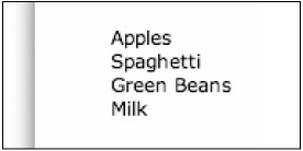
Figure 1-4: A list with bullets turned off
Now, we'll turn off indenting. By default, there is a certain amount of padding added to the left side of any unordered list. But don't worry, we can just chop it off if we'd like:
ul { list-style: none; padding-left: 0; } The results are seen in Figure 1-5.
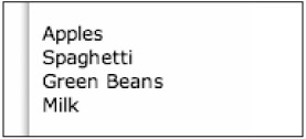
Figure 1-5: A list with bullets and indenting turned off
While the example in Figure 1-5 looks like we've just marked it up with a few <br /> tags, it's still the same structured, valid, unordered list—ready to be viewed in any browser or device and styled differently with the update of a few CSS rules, if so desired.
Getting Fancier with Custom Bullets
Perhaps you would like bullets for your list, but instead using your own bullet image, rather than letting the browser use its boring defaults. There are two ways to do this—the second of which I prefer due to its more consistent results across various browsers.
The first option would be to use the list-style-image property to assign an image to use in place of the default bullet.
ul { list-style-image: url(fancybullet.gif); } This is the simplest method; however, it renders somewhat inconsistent results in some browsers in respect to the vertical positioning of the image. Some browsers will line it up directly in the middle of list item text; others may position it slightly higher. It's a bit inconsistent.
To get around the vertical placement issue that list-style-image reveals on a few popular browsers, I like to use an alternate method, which is to set the image as a background for each <li> element.
First we'll turn off the default bulleting, and then add our own background image:
ul { list-style: none; } li { background-image: url(fancybullet.gif) no-repeat 0 50%; padding-left: 17px; } no-repeat tells the browser not to tile the image (which it does by default), while the 0 50% tells the browser to place the background-image 0 pixels from the left and 50 percent down from the top, essentially vertically centering the fancybullet.gif. We could have also used exact pixel locations from left and top the same way. 0 6px would have placed the bullet 0 pixels from the left and 6 pixels from the top.
We also add 17 pixels of padding to the left of the list item so that our 15-pixel-wide by 5-pixel-high image will show through completely, and with a little whitespace, without any overlapping of the text. This value would be adjusted depending on the width of the bullet image you were using (see Figure 1-6).
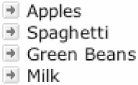
Figure 1-6: A list with custom bullets
Lists that Navigate
I've shared a few methods of turning unordered lists into horizontal navigation on my personal site (www.simplebits.com), creating tab-like effects using ordinary, structured XHTML—just like the example grocery list.
For instance, here we'll take the grocery list and turn it into a navigation bar for an online supermarket (that happens to only sell a handful of items).
We'd like the navigation in this case to be horizontal and also have some way of highlighting an item when it's hovered over or selected, creating a tab-like effect.
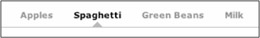
First, we'll add an id to our list so that we can apply specific CSS styles to it. We'll also make each grocery item a link.
<ul > <li><a href="/apples/">Apples</a></li> <li><a href="/spaghetti/">Spaghetti</a></li> <li><a href="/greenbeans/">Green Beans</a></li> <li><a href="/milk/">Milk</a></li> </ul>
Now, start to add the accompanying CSS:
#minitabs { margin: 0; padding: 0 0 20px 10px; border-bottom: 1px solid #696; } #minitabs li { margin: 0; padding: 0; display: inline; list-style: none; } What we've done here is essentially turn off bullets and default indenting. We've also taken the first step in making the list horizontal, rather than vertical, by setting the display to inline. A bottom border has been added as well to help define the group of links.
The second step in making the navigation bar horizontal is to float our links to the left. We'll also style the hyperlinks a little and adjust some padding and margins:
#minitabs { margin: 0; padding: 0 0 20px 10px; border-bottom: 1px solid #696; } #minitabs li { margin: 0; padding: 0; display: inline; list-style-type: none; } #minitabs a { float: left; line-height: 14px; font-weight: bold; margin: 0 10px 4px 10px; text-decoration: none; color: #9c9; } Here we've told all a elements within our list to float: left, essentially forcing them all to line up horizontally in a row. We've also added some color, made the links bold, and turned off underlines.
Next, create a tab-like border below the links that is activated when hovered or selected:
#minitabs { margin: 0; padding: 0 0 20px 10px; border-bottom: 1px solid #696; } #minitabs li { margin: 0; padding: 0; display: inline; list-style-type: none; } #minitabs a { float: left; line-height: 14px; font-weight: bold; margin: 0 10px 4px 10px; text-decoration: none; color: #9c9; } #minitabs a.active, #minitabs a:hover { border-bottom: 4px solid #696; padding-bottom: 2px; color: #363; } #minitabs a:hover { color: #696; } For highlighting and hovering, we've added a 4-pixel-tall bottom border to the selected or hovered <li> elements to create a tab-like effect. Highlighted tabs can also be "kept lit" by adding to the href of our choice:
<li><a href="/spaghetti/" >spaghetti</a></li>
This active class shares identical CSS rules with a:hover.
Figure 1-7 shows the resulting navigation bar.
Figure 1-7: The resulting mini-tab navigation bar
I've used this method of navigation for my own personal site (www.simplebits.com) as well as on an Inc.com (www.inc.com) redesign in July 2003. Feel free to check the source of these sites for more code examples.
With some padding and border width adjustments, a variety of different tab-like effects can be achieved, and we've done all of this so far using zero images or JavaScript and our basic XHTML-structured grocery list. Hooray for us!
Mini-Tab Shapes
For something a little different than your average, boxy CSS border, with a few slight modifications we can add fun shapes to the mix to create some interesting navigational effects.
We can use the same unordered list, building on similar CSS from the previous mini-tab example:
#minitabs { margin: 0; padding: 0 0 20px 10px; border-bottom: 1px solid #9FB1BC; } #minitabs li { margin: 0; padding: 0; display: inline; list-style-type: none; } #minitabs a { float: left; line-height: 14px; font-weight: bold; padding: 0 12px 6px 12px; text-decoration: none; color: #708491; } #minitabs a.active, #minitabs a:hover { color: #000; background: url(tab_pyra.gif) no-repeat bottom center; } This CSS will probably look similar to the previous example. The main difference here is the absence of a border-bottom that created the 4-pixel-tall tab and the addition of a single background-image set to sit bottom center for all hover and selected states (see Figure 1-8).
Figure 1-8: A mini-tab navigation bar with shaped background images
The trick here is to choose an image that is narrow enough to fit under your smallest navigation item. This ensures you'll only need one single image to use for highlighting all of your navigational links, regardless of varying character widths. There are, of course, unlimited possibilities in regards to the shapes you could use on your own projects (see Figure 1-9).
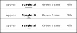
Figure 1-9: A few other various shape possibilities
For source code and working examples of these mini-tabs, see www.simplebits.com/tips/. And for more creative ways to style lists, check out Mark Newhouse's "Taming Lists article" at A List Apart magazine (www.alistapart.com/stories/taminglists/).
|
| < Day Day Up > |
|
EAN: 2147483647
Pages: 119
- Chapter V Consumer Complaint Behavior in the Online Environment
- Chapter XI User Satisfaction with Web Portals: An Empirical Study
- Chapter XIII Shopping Agent Web Sites: A Comparative Shopping Environment
- Chapter XV Customer Trust in Online Commerce
- Chapter XVIII Web Systems Design, Litigation, and Online Consumer Behavior