Linking to Style Sheets
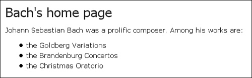
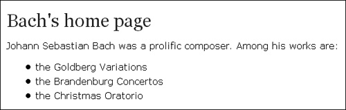
| The easiest way to apply a style sheet to multiple documents is via the LINK element. For LINK to work, the style sheet being linked to must exist as a separate file. Then, the following line must be added at the head of each document that is to link to the style sheet: <LINK REL="stylesheet" TYPE="text/css" HREF="mystyle"> The value of the HREF attribute, mystyle, is the URL of the requested style sheet. The attribute REL="STYLESHEET" tells the browser that the link is to a style sheet and not to something else. Without this attribute, the browser will not attempt to load the style sheet designated by the URL. Here is a more complete example: <HTML> <TITLE>Bach's home page</TITLE> <LINK REL="stylesheet" TYPE="text/css" HREF="http://www.w3.org/StyleSheets/Core/Steely"> <BODY> <H1>Bach's home page</H1> <P>Johann Sebastian Bach was a prolific composer. Among his works are: <UL> <LI>the Goldberg Variations <LI>the Brandenburg Concertos <LI>the Christmas Oratorio </UL> </BODY> </HTML> This example links to the Steely style sheet, which is one of several in the suite of W3C Core Styles (described later). Figure 14.1 shows the result of linking Steely to the sample document used in Chapter 2. Feel free to put the same link into your own documents. Figure 14.1. The sample page from Chapter 2, styled with one of the W3C Core Styles. In this example, the external style sheet has replaced the STYLE element and Steely is fully in charge of the presentation. Often, it's convenient to base the presentation on an external style sheet, but it's equally convenient to be able to make small adjustments that are specific to the document. This can be easily achieved by reintroducing the STYLE element: <HTML> <TITLE>Bach's home page</TITLE> <LINK REL="stylesheet" TYPE="text/css" HREF="http://www.w3.org/StyleSheets/Core/Steely"> <STYLE TYPE="text/css"> H1, H2, H3 { font-family: serif } </STYLE> <BODY> <H1>Bach's home page</H1> <P>Johann Sebastian Bach was a prolific composer. Among his works are: <UL> <LI>the Goldberg Variations <LI>the Brandenburg Concertos <LI>the Christmas Oratorio </UL> </BODY> </HTML> The external style sheet and the rules in the STYLE element are now cascaded together i.e., they are combined when displaying the document. The result is a page where headlines use serif fonts and all other stylistic settings come from Steely (see Figure 14.2). Figure 14.2. A small document-specific style sheet cascades with an external style sheet. Persistent, Preferred, and Alternate Author Style SheetsAs used in the previous example, both the external style sheet and the one inside the STYLE element are examples of what HTML calls persistent style sheets. Persistent style sheets are always applied to the document. That is, unless the user has turned off author style sheets in the browser setting, the persistent style sheets will always be applied to the document.
In addition to persistent style sheets, the HTML specification defines two other categories of author style sheets: preferred and alternate. Preferred style sheets, like persistent style sheets, are applied to the document by default. The difference between preferred and persistent style sheets is that preferred style sheets can be turned on and off individually by the user. For this reason, preferred style sheets are given a name (through the TITLE attribute) that can be used in a dialog box with the user. Alternate style sheets are not applied by default. For them to have any effect, the user must actively select the alternate style sheet. CSS doesn't describe how this user interaction should be performed, but having a pull-down menu that lists alternate style sheets seems like a natural way. Table 14.1 summarizes the differences between the three categories.
Here is a document that uses all three types of author style sheets: <HTML> <TITLE>Bach's home page</TITLE> <LINK REL="stylesheet" TITLE="Steely" TYPE="text/css" HREF="http://www.w3.org/StyleSheets/Core/Steely"> <LINK REL="alternate stylesheet" TYPE="text/css" HREF="http://www.w3.org/StyleSheets/Core/Midnight"> <LINK REL="alternate stylesheet" TYPE="text/css" HREF="http://www.w3.org/StyleSheets/Core/Swiss"> <STYLE TYPE="text/css"> H1, H2, H3 { font-family: serif } </STYLE> <BODY> <H1>Bach's home page</H1> <P>Johann Sebastian Bach was a prolific composer. Among his works are: <UL> <LI>the Goldberg Variations <LI>the Brandenburg Concertos <LI>the Christmas Oratorio </UL> </BODY> </HTML> In this document, the Steely style sheet and the rules inside the STYLE element are initially applied to the document. User interaction might lead to Steely being turned off and Midnight or Swiss (two of the other W3C Core Styles) being turned on. The STYLE element is always persistent and is only turned off if the browser provides a switch to turn off all author style sheets. A word of warning: When providing a combination of persistent, preferred, and alternate style sheets, it's important that you test all combinations to make sure that they work well together. For example, the Midnight style sheet (one of the alternate style sheets in the previous example) displays light text on a dark background, while Swiss and Steely do the opposite. Therefore, the STYLE element, which is applied after the external style sheets, shouldn't say anything about colors because it doesn't know if the text is light on dark or dark on light. The MEDIA AttributeCSS2 allows you to write different style sheets for different kinds of Web devices. These are known as media-specific style sheets and in Chapter 12, "Printing and other media," we showed how you could label a style sheet or part of a style sheet using an at-rule: @media screen { BODY { font-size: 12pt } H1 { font-size: 2em } } This method is good if only part of the style sheet is media-specific. In cases where the entire style sheet applies to one media type, there is a better way. By using the MEDIA attribute of the LINK element, browsers can find out what media types a style sheet applies to without downloading it. Here is an example: <LINK REL="stylesheet" TITLE="Steely" TYPE="text/css" MEDIA="screen" HREF="http://www.w3.org/StyleSheets/Core/Steely"> The value of the MEDIA attribute is one of the media type keywords described in Chapter 12: screen, print, aural, braille, embossed, handheld, projection, tty, tv, and all. The previous example makes the external style sheet (the by-now famous Steely) apply only to computer screens. The MEDIA attribute can take a list of different media types to indicate that the external style sheet applies to more than one media type: <LINK REL="stylesheet" TITLE="Steely" TYPE="text/css" MEDIA="screen, print" HREF="http://www.w3.org/StyleSheets/Core/Steely"> In this example, Steely would be applied to both screen presentation and printouts. |
 Designing for the Web")
EAN: 2147483647
Pages: 215