The Whole Story on Width Computation
| We explained the normal uses of the various margin, padding, and border properties earlier in this chapter as they relate to block-level elements. In this section, we summarize all this information. We also explain some of the unusual cases you may run into. The horizontal position and width of a nonfloating, block-level element is determined by seven properties:
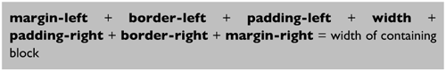
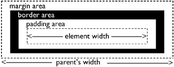
For any element, the values of these seven properties must always total the width of the block element in which the element is contained the inherited width. This width is always known and cannot be changed from within. An element's width is computed according to the formula shown in Figure 8.17. Figure 8.17. The relation between margin, padding, border, and width. Figure 8.18 shows how the width is computed. Figure 8.18. Diagram of the width computation. When specific values are used, adjustments may need to be made to one or more values to ensure that the total width does not exceed the inherited width. To simplify making these adjustments, CSS1 provides that the border and padding values are never adjusted. Only the width, margin-left, and margin-right values can be adjusted. That is, only they may be auto. However, the meaning of auto, as it relates to these properties, depends on the type of element. For replaced elements (such as images and objects), the width is automatically set to the intrinsic width. An image is assumed to have a preferred or built-in size as determined by its artist or designer. Although the image may be scaled larger or smaller, it still has this preferred size. This is its intrinsic size. Any other value means the element is scaled. For normal (non-replaced) elements, the meaning of auto depends on whether the element floats, and if not, on whether it is block or inline. For floating elements, a width of auto always means 0, so it is not very useful; for inline elements, the width property is ignored altogether; for block (and list-item) elements, the width will be what is left after subtracting the element's padding, border, and margin from the inherited width. For inline elements and for floating elements, a value of auto on margin-left or margin-right means that margin is 0. A margin with value auto in a block element, on the other hand, means that the margin should be as large as possible. Table 8.1 summarizes the meaning of auto for width, margin-left, and margin-right.
What gets changed when depends on the interaction of auto and specified values. These are the possibilities:
| ||||||||||||||||||||||||||||
 Designing for the Web")
EAN: 2147483647
Pages: 215