Formatting the DataList
| for RuBoard |
Formatting the DataList
Each of the list controls can be formatted easily using a set of built-in style properties. A complete list of these properties can be found in the documentation for the Microsoft .NET Framework. Additionally, you can see these properties by looking up the list control in the Microsoft Classbrowser sample application provided with the .NET Framework SDK (list controls are located in the System.Web.UI.WebControls namespace). However, Listing 12.5 shows a few of the properties available.
Listing 12.5 Formatting the DataList Control
<% @Page Language="VB" %> <%@ Import Namespace="System.Data" %> <%@ Import Namespace="System.Data.SqlClient" %> <HTML> <HEAD> <LINK rel="stylesheet" type="text/css" href="Main.css"> <!-- End Style Sheet --> <script language="VB" runat="server" > Sub Page_Load(Source as Object, E as EventArgs) LoadGridData( products ) End Sub Private Sub LoadGridData( _ myDataList as System.Web.UI.WebControls.DataList ) Dim conn as New SqlConnection("Initial Catalog=Northwind;" + _ "Server=(local);UID=sa;PWD=;") Dim cmd as New SqlCommand("Exec Products_GetAll ", conn) conn.Open() myDataList.DataSource = cmd.ExecuteReader() myDataList.DataBind() conn.Close() End Sub </script> </HEAD> <BODY> <h1>Product List</h1> <hr> <form runat="server" id=form1 name=form1> <asp:DataList id="products" RepeatColumns="3" AlternatingItemStyle-backcolor="#DDDDDD" runat="server"> <ItemTemplate> <table border="0" width="300"> <tr> <td width="25">   </td> <td width="72" valign="middle" align="right"> <a href='productdetails.aspx?productID= <%# DataBinder.Eval(Container.  DataItem, "ProductID") %>'> <img src='/ADO24HOURS<%# DataBinder.Eval( Container.DataItem, "ImagePath") %>' width="72" height="72" border="0"> </a> </td> <td width="150" valign="middle"> <a href='ProductDetails.aspx?productID= <%# trim(DataBinder.Eval( Container.DataItem, "ProductID")) %>'> <%# DataBinder.Eval(Container.DataItem, "ProductName") %></a><br> <b>Price: </b> <%# DataBinder.Eval(Container.DataItem, "UnitPrice", "{0:c} ") %><br> <b>Units In Stock: </b> <%# DataBinder.Eval(Container.DataItem, "UnitsInStock") %> <br> </a> </td> </tr> </table> </ItemTemplate> </asp:DataList> </form> <hr> </BODY> </HTML>
 Generally speaking, the property names are built from the template name and then the actual property you are specifying. From Listing 12.5, you can see that AlternatingItemStyle-backcolor is set to grey. For every other row in the DataList , the background color will be set to grey, improving the readability of your content in many cases. This is a very useful way to make changes to alternate rows without having to specify an entirely new AlternatingItemTemplate that only differs from the ItemTemplate by the background color.
Figure 12.5. The appearance of the code in Listing 12.5 when the Web form is loaded.
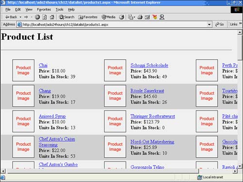
The DataList control also has a property called RepeatColumns . This value determines the number of columns the DataList will output to the page. As you can see in Figure 12.4, the number of RepeatColumns has been set to 3 in the code in Listing 12.5.
The DataList control provides all templates provided by the Repeater control plus one additional one: the SelectedItemTemplate . It's possible to set a particular look and feel for a selected item within the DataList . You can create a brand new template for the selected item, giving you complete control over its appearance, or you can just use the aforementioned style properties.
Only two additional changes are necessary to the code in Listing 12.5 to change the appearance of the selected item. Within the DataList control, specify the SelectedIndex property to whichever item should be selected (as determined by a user click or programmatically). Then, specify a style for the selected item. In the case in Figure 12.6, the background color has been set to blue as follows :
Figure 12.6. The appearance of the code in Listing 12.5 when the Web form is loaded.
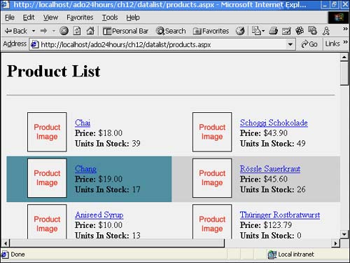
SelectedItemStyle-backcolor="cadetblue"
In Figure 12.4, you can see that this has changed the background of the Aniseed Syrup product listing.
| for RuBoard |
EAN: 2147483647
Pages: 237