Creating Rollover Buttons
| Rollover buttons change their appearance when your visitor points at or hovers over them. To change links on rollover:
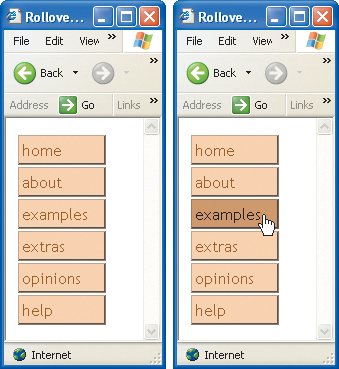
Figure 12.7. In this simple example, the unvisited and visited links have one color for background and border, the focus and hover links have a slightly darker background and border, and black text, and the active links have an even darker background and border. Figure 12.8. The unvisited and visited states are shown at left. When the visitor points (hovers) or gives the focus to the link, it appears darker with black text (as shown on the right). |
 Tips
Tips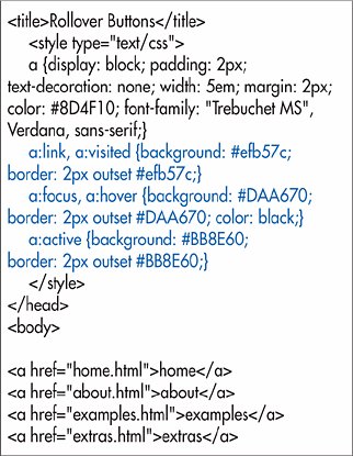
 Visual QuickStart Guide")
EAN: 2147483647
Pages: 340