Report Creation
We begin working with Reporting Services by using the Report Designer to create several reports. Next, in the section "Report Manager," we deploy these reports to the Report Server and explore the report administration and distribution features offered by Reporting Services. In the section "Ad Hoc Reporting," we look at the capabilities that enable power users to create their own reports.
Reports are created using a drag-and-drop approach. Report items are taken from the Toolbox window and placed on the report. The function of some of these report items is not hard to figure out: text boxes contain text, images display image files. Other report items are more complex and vital to the workings of Reporting Services reports.
Data Regions
Four special report items are designed specifically for working with datasets. These special report items are called data regions. The four data regions are the table, the matrix, the list, and the chart.
Data regions are able to work with multiple records from a dataset. The data region reads a record from the dataset, creates a portion of the report using the data found in that record, and then moves on to the next record. It does this until all the records from the dataset have been processed.
The table data region contains rows and columns. The table creates detail rows and grouping rows from the records in the dataset. The matrix data region creates both rows and columns based on the contents of the dataset. The list data region is not limited to rows and columns. It creates a whole section, perhaps a whole page or more, for each record in the dataset. The chart data region creates elements on a graph for each record in a dataset.
Each data region item has a property called DataSetName. This property contains the name of the dataset used by the data region. In most cases, the Report Designer sets this automatically. This property is set to the dataset of the first field placed in the data region.
In many cases, a report includes a single data region to create the body of the report. In other cases, multiple data regions are combined on a single report. This mix and match has no limit. Perhaps a chart data region containing a line graph and a table containing the detail information from the chart are placed in the same report. We can mix and match to our hearts' content.
The Table Data Region
The table data region creates the traditional style report with rows and columns. Rows are created from the records in the dataset. Columns are created from the fields in the dataset.
The table data region creates what is called a banded report in some other report authoring environments. The detail bands in these reports correspond to the detail row in the table. The summary bands in these reports correspond to the header and footer rows in the table.
The table data region includes a table header and footer. The table header often contains column headings for the table. The table footer often contains the grand totals for the entire table.
In addition to the table header and footer, the table data region can also include multiple group headers and footers. The group headers often contain the information to identify a grouping. The group footers usually contain totals for the group.
Learn By Doing—Creating a Table Report
Features Highlighted
-
Creating a Reporting Services report using the Report Wizard
-
Using the table report item
-
Using query parameters
Business Need Back in Chapter 6, the vice president (VP) of production for Maximum Miniatures, Incorporated asked for statistics on the number of products accepted and the number of products rejected as they come off the production line. He also asked for information on the amount of time it took to produce these items. We created a data mart to hold this information, as well as an OLAP cube on top of that data mart. Now it is time to take this information and put it into a format the VP is comfortable with, namely a report.
The VP has asked to see these three statistics for each product. The products should be grouped by the machine where they were manufactured. The VP would like to see this information for a single year, which will be specified when the report is run.
We could use either the MaxMinManufacturingDM relational database or the Max Min Manufacturing DM OLAP cube as the source for this data. For the sake of demonstrating a number of data sources, we use the relational database for this report. We create this report using the Report Wizard. The remainder of the reports created in this chapter are going to be created from scratch.
Steps
-
Open the Business Intelligence Development Studio.
-
Click the New Project button in the toolbar.
-
Make sure Business Intelligence Projects is selected from the Project Types, and then select Report Server Project from the Templates.
-
Enter MaxMinReports for Name and set the Location to the appropriate folder. Leave Create Directory for Solution unchecked.
-
Click OK to create the project.
-
Right-click the Reports folder in the Solution Explorer window and select Add New Report from the Context menu. The Welcome page of the Report Wizard appears.
-
Click Next. The Select the Data Source page of the wizard appears.
-
Enter MaxMinManufacturingDM for Name. Click Edit. The Connection Properties dialog box appears.
-
Enter the name of the server hosting the MaxMinManufacturingDM relational database for Server Name. Enter the appropriate credentials to access this server.
-
From the Select or Enter a Database Name drop-down list, select MaxMinManufacturingDM.
-
Click OK to exit the Connection Properties dialog box.
-
Check the Make This a Shared Data Source check box.
-
Click Next. The Design the Query page of the wizard appears.
-
Click the Query Builder button. The Query Builder dialog box appears.
Note If you prefer additional assistance while building queries, you can click the Generic Query Designer button in the Query Builder toolbar to switch from the Generic Query Designer to the Graphical Query Designer.
-
Enter the following query:
SELECT DimMachine.MachineName, DimProduct.ProductName, SUM(ManufacturingFact.AcceptedProducts) AS AcceptedProducts, SUM(ManufacturingFact.RejectedProducts) AS RejectedProduct, SUM(ManufacturingFact.ElapsedTimeForManufacture) AS ElapsedTimeForManufacture FROM DimMachine INNER JOIN ManufacturingFact ON DimMachine.MachineNumber = ManufacturingFact.MachineNumber INNER JOIN DimProduct ON ManufacturingFact.ProductCode = DimProduct.ProductCode GROUP BY DimMachine.MachineName, DimProduct.ProductName, DimMachine.MachineNumber, DimMachine.ProductCode, YEAR(ManufacturingFact.DateOfManufacture) HAVING (YEAR(ManufacturingFact.DateOfManufacture) = @Year) ORDER BY DimMachine.MachineNumber, DimProduct.ProductCode
-
Click the Execute button (the red exclamation point). The Define Query Parameters dialog box appears. This dialog box appears because we included the @Year parameter in our query. This parameter enables us to specify which year's data we want to see in the report. We need to specify a value for this parameter before the query can execute. Enter 2005 for the parameter value and click OK. The Query Builder screen should appear as shown in Figure 15-6.
Note The @Year in our query is a query parameter. A value must be specified for this parameter at the time the report is run. To facilitate this, query parameters are automatically mapped to report parameters with the same name. A report parameter named Year has been automatically created for us.
-
Click OK to exit the Query Builder. You return to the Design the Query page of the wizard.
-
Click Next. The Select the Report Type page of the wizard appears.
-
Leave Tabular selected to produce a report using a table data region. (We can create reports using the matrix data region from the Report Wizard as well. We cannot create reports using the chart or list data region from the Report Wizard.)
-
Click Next. The Design the Table page appears. On this page, we specify how each field is to be used in the table.
-
With the MachineName field selected in the Available Fields list, click Group. The MachineName field is placed in the Group list for Displayed fields. Data is grouped by MachineName in the table.
-
Click Details four times to place the remaining fields in the Details list. The wizard page appears as shown in Figure 15-7.
-
Click Next. The Choose the Table Layout page appears.
-
Leave the Stepped radio button selected. Check both the Include Subtotals and Enable Drilldown check boxes. The wizard page appears as shown in Figure 15-8.
Note Include Subtotals places totals in the footer for each group and in the footer at the end of the table. Enable Drilldown causes the report to start out at a summary or group level. We can drill down to the detail level by clicking the plus (+) sign next to a grouping.
-
Click Next. The Choose the Table Style page of the wizard appears.
-
Select the Corporate style and click Next. The Completing the Wizard page appears.
-
Enter Manufacturing By Machine Report for Report Name. The wizard page appears as shown in Figure 15-9.
-
Click Finish. The report design appears in the Layout tab on the Report Design tab. The Report Wizard placed two report items in the body of the report it created for us. The first is a text box containing the report title: Manufacturing By Machine Report. The second is a table data region. Click any of the cells in the table. This displays the gray column and row handles as shown in Figure 15-10. The table contains three rows: a table header row, a group header row, and a detail row.
-
Grab the divider between the Machine column and the Product column handles, and then drag the Machine column wider. This is shown in Figure 15-11.
-
Repeat this process to widen the Product Name column and the Elapsed Time For Manufacture column.
-
Right-click the table cell directly under the Accepted Products heading(it contains "=Sum(Fields!Ac"). This is the group header cell in the Accepted Products column. Select Properties from the Context menu. The Textbox Properties dialog box appears, as shown in Figure 15-12.
Note Each type of report item has its own custom properties dialog box. These properties dialog boxes are used to control the appearance and behavior of each item on the report. In addition to the properties dialog boxes, we can also modify the properties of a report item using the Properties window. Some of the formatting properties of the report items can also be modified using buttons and drop-down lists in the toolbar.
-
Select the Format tab.
-
Click the ellipsis (…) button next to Format Code. The Choose Format dialog box appears. Select Number in the left-hand list. Select 1,234.00 in the right-hand list.
-
Click OK to exit the Choose Format dialog box.
-
Note the N placed in Format Code. This is a Visual Basic format code. It formats the content of the text box as a number with commas. Type 0 after the N. This causes the formatting to have zero digits to the right of the decimal point.
-
Click OK to exit the Textbox Properties dialog box.
-
Place NO in Format Code for the other table cell in the Accepted Products column. This is the detail cell in the Accepted Products column.
-
Select the group header cell in the Rejected Products column. Find the Format property in the Properties window. Enter NO for the Format property.
-
Repeat Step 38 for the detail cell in the Rejected Products column and for both the group header cell and the detail cell in the Elapsed Time For Manufacture column.
-
Click the Preview tab to view the report. Enter 2005 for Year. This value is then fed to the query parameter we created in our SELECT statement.
-
Click View Report. The report is rendered on the Preview tab. Note, only the group headers for our grouping on Machine Name are visible. This occurs because we checked Enable Drilldown in the Report Wizard. When we enable drilldown, a report starts at a summary or group level and lets the user selectively drill down to the detail level.
-
Click the plus sign next to Duramolder to see all of the products created on this machine in 2005. This is shown in Figure 15-13.
-
Let's examine a few more of the properties that make this report work. Select the Layout tab.
-
Click the Elapsed Time For Manufacture cell in the table heading row.
Note Only the words "Elapsed Time" are visible. However, when we previewed the report, the entire heading is visible. The cell grows taller when the report is rendered. The cell can grow because the CanGrow property of the text box is set to True. If the CanGrow property is set to False, the text box cannot change size when it is rendered.
-
Right-click the detail cell in the Elapsed Time For Manufacture column. Select Expression from the Context menu. The Edit Expression dialog box appears as shown in Figure 15-14. The expression shown in the dialog box returns the value of the ElapsedTimeForManufacture field. Click Cancel to exit the Edit Expression dialog box.
Note The expressions in Reporting Services use Visual Basic.NET. Access to dataset information is provided through a collection called Fields, which contains a member called ElapsedTimeForManufacture. The ElapsedTimeForManufacture has a property called Value that contains the value of this field.
-
Right-click the group header cell in the Elapsed Time For Manufacture column. Select Expression from the Context menu. The Edit Expression dialog box again appears, this time with the Sum aggregate function around the field expression as shown in Figure 15-15. Click Cancel to exit the Edit Expression dialog box.
Note The Sum aggregate function is used here because we are looking at a cell in a group header. Group headers (and footers for that matter) must, by definition, group together a number of records to get a single value for each column. To do that, we use aggregate functions. Here, the Sum aggregate function is used to add all detail values together to get group totals. We can use aggregates in both headers and footers. In some reporting environments, aggregates are calculated as the detail rows are processed and can only be placed in the footers. That is not the case with Reporting Services. Aggregates are calculated separately and can be placed anywhere in the report.
-
The drop-down box on the top of the Properties window shows the name of the selected report item. The currently selected table cell contains a text box called textbox11. Click the detail cell in the Elapsed Time For Manufacture column. This cell is named for the dataset field placed in the cell. Click the group header cell in the Machine Name column. The text box in this cell, MachineName, is also named for the dataset field placed here.
Note Each cell in a table (or a matrix) must contain another report item. There is no such thing as an empty table cell. If no other report item has been placed in a table cell, a text box is automatically created and placed there by default. Report item names are only important when one report item is referenced by another item. In all other cases, the default names, such as table 1 or textbox2, work just fine.
-
Click the gray square in the upper-left corner of the table. This is how we select the table itself. Click in any of the cells to unselect the table, and then right-click that same gray square. The Context menu that appears is the Context menu for the table itself. Select Properties from the Context menu. The Table Properties dialog box appears. The General tab, shown in Figure 15-16, controls several properties of the table, including whether the table header and footer rows should be displayed and whether the report should begin a new page either before or after the table.
-
Select the Visibility tab. This is shown in Figure 15-17. The Visibility tab controls whether a report item is seen or is hidden. We explore the workings of the Visibility tab more in a moment.
-
Select the Navigation tab. This is shown in Figure 15-18. The Navigation tab enables us to assign expressions to the Document map label, sort of a table of contents for the report, and the Bookmark ID, which lets us jump right to this table from other locations in the report. Neither of these items is specified in this report.
-
Select the Sorting tab. This is shown in Figure 15-19. The Sorting tab enables us to specify an expression for sorting the detail rows in the table. Any sorting expression specified here overrides the sort in the SELECT statement. No sorting expression is specified here in this report.
-
Select the Groups tab. This is shown in Figure 15-20. The Groups tab controls the groupings defined in the table. Our report has one group, table 1_MachineName, defined. Of course, a table may include a number of nested groupings.
-
Select this group and click Edit. The Grouping and Sorting Properties dialog box, which controls the definition of a grouping within a report, appears as shown in Figure 15-21. We can specify whether to place a page break in the report before or after a grouping. We can also specify whether to include group header and footer rows in the table, as well as whether to repeat those rows on every page, if a group spans more than one report page. Additional tabs let us filter and sort content, and control the visibility of the group itself.
-
Click Cancel to exit the Grouping and Sorting Properties dialog box.
-
In addition to the groupings, the detail rows of the table can be considered a special type of group for some table definition purposes. Click Details Grouping. The Details Grouping dialog box appears as shown in Figure 15-22. This dialog box is similar to the Grouping and Sorting Properties dialog box.
-
Select the Visibility tab. The Visibility tab has been changed from the default settings as shown in Figure 15-23.
Note The settings on the Visibility tab can be used to implement the drilldown feature in our report. To implement drilldown, the initial visibility of the report item (the detail group in this report) is set to Hidden. In addition, the properties on the Visibility tab are set so the visibility of the item is toggled by another report item (the MachineName text box in this report). This setting places a plus sign next to the toggling report item and causes the display of the previously hidden report item when the plus sign is clicked.
-
Click Cancel to exit the Details Grouping dialog box.
-
Select the Filters tab of the Table Properties dialog box. This is shown in Figure 15-24. The Filters tab enables us to specify an expression for filtering the rows in the dataset. No filtering expression is specified in this report.
-
Select the Data Output tab. This is shown in Figure 15-25. Reporting Services can output a report in a number of different formats. One of those formats is an XML data export. The Data Output tab determines whether, and in what format, a report item is included in this XML export.
-
Click Cancel to exit the Table Properties dialog box.
-
Click the Save All button in the toolbar.
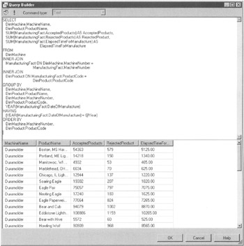
Figure 15-6: The Query Builder screen
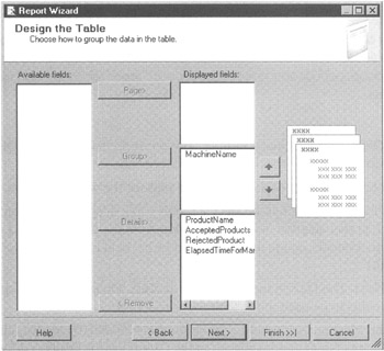
Figure 15-7: The Design the Table page of the Report Wizard
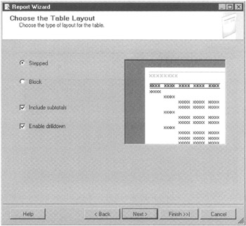
Figure 15-8: The Choose the Table Layout page of the Report Wizard
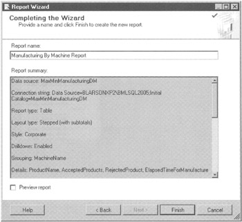
Figure 15-9: The Completing the Wizard page of the Report Wizard
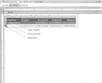
Figure 15-10: The table data region created by the Report Wizard
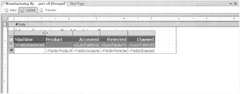
Figure 15-11: Widening a table column
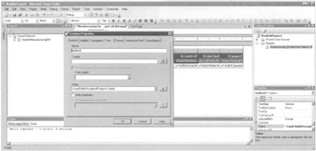
Figure 15-12: The Textbox Properties dialog box
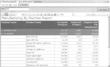
Figure 15-13: The Manufacturing By Machine Report preview
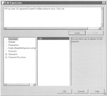
Figure 15-14: The database field expression for a detail cell
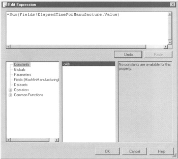
Figure 15-15: The database field expression with an aggregate function for a group header cell
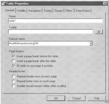
Figure 15-16: The General tab of the Table Properties dialog box
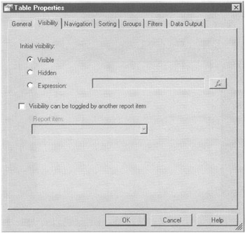
Figure 15-17: The Visibility tab of the Table Properties dialog box
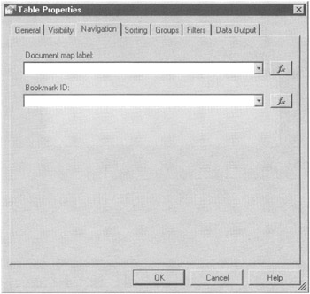
Figure 15-18: The Navigation tab of the Table Properties dialog box
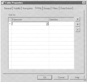
Figure 15-19: The Sorting tab of the Table Properties dialog box
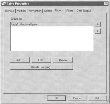
Figure 15-20: The Groups tab of the Table Properties dialog box
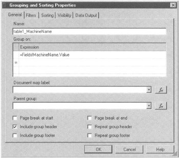
Figure 15-21: The Grouping and Sorting Properties dialog box
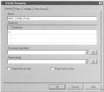
Figure 15-22: The General tab of the Details Grouping dialog box
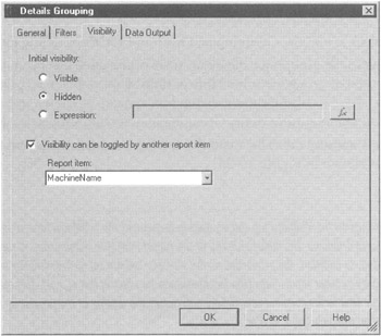
Figure 15-23: The Visibility tab of the Details Grouping dialog box
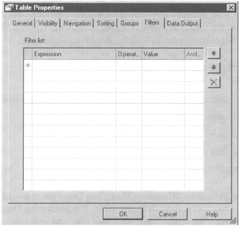
Figure 15-24: The Filters tab of the Table Properties dialog box
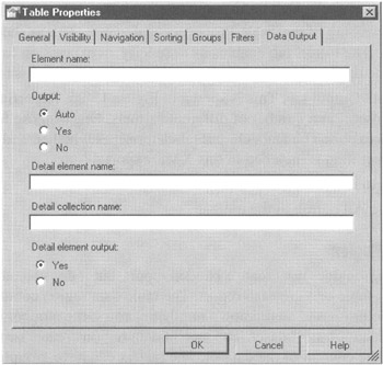
Figure 15-25: The Data Output tab of the Table Properties dialog box
The Matrix Data Region
The matrix data region does not create a banded report, but it does create what is known as a pivot table or a crosstab report. The table data region contains a predefined set of columns and an unknown number of rows; the number of rows depends on the content of the dataset. The matrix data region creates both rows and columns based on the content of the dataset. The matrix can have grouping on both rows and columns. Drilldown can be defined for both rows and columns as well.
The data in the matrix itself is always aggregate data. Therefore, the data in the matrix is numeric. Because of this, the matrix mirrors the fact and dimension structure of an OLAP cube and works well for displaying cube data.
Learn By Doing—Creating a Matrix Report
Features Highlighted
-
Creating a Reporting Services report without using the Report Wizard
-
Using a matrix report item
-
Specifying scope in aggregate functions
-
Manually enabling drilldown
-
Formatting report items
Business Need The Maximum Miniatures Marketing Department would like to analyze wholesale sales for each product over time. The Marketing Department wants to be able to begin the analysis at the product type and year levels, and then drill down to the product level and to the quarter and month level. In addition to the sales dollar amount, they would like to see the sales as a percent of total sales for the year.
We use the Max Min Sales DM cube as the data source for this report.
Steps
-
Open the Business Intelligence Development Studio, if it is not already open.
-
Open the MaxMinReports project, if it is not already open.
-
Close the Report Design tab containing the Manufacturing By Machine Report, if it is open.
-
Right-click the Shared Data Sources folder in the Solution Explorer window and select Add New Data Source from the Context menu. The Shared Data Source dialog box appears.
-
Enter Max Min Sales DM Cube for Name.
-
Select Microsoft SQL Server Analysis Services from the Type drop-down list.
-
Click Edit. The Connection Properties dialog box appears.
-
Enter the name of the Analysis Services server hosting the Max Min Sales DM OLAP cube for Server Name.
-
From the Select or Enter a Database Name drop-down list, select MaxMinSalesDM.
-
Click OK to exit the Connection Properties dialog box. Click OK to exit the Shared Data Source dialog box. The shared data source is created.
-
Right-click the Reports folder in the Solution Explorer window and select Add | New Item. (Selecting Add New Report launches the Report Wizard, which we are not using for this report.) The Add New Item dialog box appears.
-
Select Report in the Templates area. Enter Wholesale Sales By Month Report for Name.
-
Click Add. The Report Design tab appears with its Data tab selected.
-
Select <New Dataset> from the Dataset drop-down list. The Dataset dialog box appears.
-
Enter WholesaleSales for Name.
-
Select MaxMinSalesDMCube (shared) from the Data Source drop-down list.
-
Click OK. The MDX Query Builder appears.
-
Expand the Time dimension and drag the Year, Quarter, and Month attributes onto the query area. (The area labeled Drop Levels or Measures Here to add to the query.)
-
Expand the Product dimension and drag the Brand Name and Product Name attributes onto the query area.
-
Expand Measures and the Sales Fact 1997 measure group and drag the Store Sales measure onto the query area. The query executes.
-
Because our business requirements were for wholesale sales only, we need to add a filter to the query to include only wholesale customers (customer numbers below 5000). In the Filter pane (directly above the query pane), click the cell labeled <Select Dimension>. From the drop-down list, select Customer.
-
For Hierarchy, select Account Num.
-
For Operator, select Range (Inclusive).
-
For Filter Expression, create a range from 04500 to 04996.
-
The query executes again. The MDX Query Builder appears as shown in Figure 15-26.
-
Select the Layout tab.
-
Drag a text box from the toolbox and drop it on the report body layout area. Using the Properties window, modify the properties of the text box as follows:
Property
Value
Font: FontSize
16pt
Font: FontWeight
Bold
Location: Left
0in
Location: Top
0in
Size: Width
4in
Size: Height
0.375in
Value
Wholesale Sales By Month Report
Note Several properties, such as the font property, contain subproperties. The property must be expanded to view the subproperties. These are referred to with the following format: Property: Subproperty.
-
Drag a matrix from the toolbox and drop it on the report body layout area below the text box.
-
Expand the WholesaleSales dataset in the Datasets window.
-
Drag the Month field and drop it in the Columns cell.
-
Drag the Product_Name field and drop it in the Rows cell.
-
Drag the Store_Sales field and drop it in the Data cell.
-
Drag the Brand_Name field and drop it on the line forming the left side of the Product_Name cell. This creates a new cell for a column grouping.
-
Drag the Quarter field and drop it on the line forming the top of the Month cell.
-
Drag the Year field and drop it on the line forming the top of the Quarter cell. The report layout should appear as shown in Figure 15-27.
-
Right-click the gray square in the upper-left corner of the matrix and select Properties from the Context menu. The Matrix Properties dialog box appears as shown in Figure 15-28. The tabs function almost identically to the tabs on the Table Properties dialog box.
-
Select the Groups tab.
-
To prevent the user from being overwhelmed with information, we are going to manually enable drilldown in this report. Select the matrix 1_Product_Name row group and click Edit. The Grouping and Sorting Properties dialog box appears.
-
Select the Visibility tab.
-
Select Hidden for Initial Visibility.
-
Check the Visibility Can Be Toggled by Another Report Item check box.
-
Select Brand_Name from the Report Item drop-down list.
-
Click OK to exit the Grouping and Sorting Properties dialog box.
-
Select the matrix 1_Month column group and click Edit. The Grouping and Sorting Properties dialog box appears.
-
Select the Visibility tab.
-
Select Hidden for Initial Visibility.
-
Check the Visibility Can Be Toggled by Another Report Item check box.
-
Select Quarter from the Report Item drop-down list.
-
Click OK to exit the Grouping and Sorting Properties dialog box.
-
Select the matrix 1_Quarter column group and click Edit. The Grouping and Sorting Properties dialog box appears.
-
Select the Visibility tab.
-
Select Hidden for Initial Visibility.
-
Check the Visibility Can Be Toggled by Another Report Item check box.
-
Select Year from the Report Item drop-down list.
-
Click OK to exit the Grouping and Sorting Properties dialog box. Click OK to exit the Matrix Properties dialog box.
-
Click the Preview tab. The report appears as shown in Figure 15-29.
-
Click the Layout tab. Let's make a few changes to improve the looks and readability of the matrix.
-
Select the cell containing the Sum of the Store_Sales field (the detail cell for the matrix). Set the following properties in the Properties window:
Property
Value
Format
C
Size: Width
1.5 in
-
Select the cell containing the Year field. Set the following properties in the Properties window:
Property
Value
BackgroundColor
MediumBlue
Color
White
Font: FontWeight
Bold
-
Select the cell containing the Quarter field. Set the following properties in the Properties window:
Property
value
BackgroundColor
CornflowerBlue
Font: FontWeight
Bold
TextAlign
Right
-
Select the cell containing the Month field. Use the toolbar buttons to set the font weight to bold, the background color to PowderBlue, and the alignment to align right.
-
Select the cell containing the Brand_Name field. Use the toolbar buttons to set the font weight to bold, the background color to MediumBlue, and the foreground color to white.
-
Select the cell containing the Product_Name field. Use the toolbar buttons to set the font weight to bold and the background color to PowderBlue.
-
Select the cell containing the Year field. Hold down SHIFT and click the detail cell. Hold down CTRL and click the cell containing the Product_Name field and the cell containing the Brand_Name field. The selected cells appear as shown in Figure 15-30.
-
With these cells selected, set the following properties in the Properties window:
Property
Value
BorderColor
MediumBlue
BorderStyle
Solid
BorderWidth
2pt
Note The border properties can be either set at the default level to affect all four sides of the report item or expanded and set for each side individually.
-
Click the Preview tab. Expand Calendar 2004. Expand Quarter 1, 2004. Expand Mystic World. The report should appear similar to Figure 15-31.
-
We have one business goal left to fulfill: product sales as a percent of product type (brand name) sales. Click the Layout tab.
-
Right-click the detail cell. Select Add Column from the Context menu. A new detail cell is created to the right of the existing detail cell. In addition, a title cell is created for each detail cell. The title cell for the existing detail cell says Store Sales.
-
In the title cell for the new detail cell, type % of Product Type. (You can type this right in the cell itself.)
-
Click the existing detail cell to select it. Copy the textbox in this cell.
-
Click the new detail cell to select it. Paste the textbox into this cell.
-
Right-click the new detail cell and select Expression from the Context menu.
-
Edit the expression, so it appears as follows:
=Sum(Fields!Store_Sales.Value) / Sum(Fields!Store_Sales.Value, "matrix1_Year")
Note The first Sum aggregate function in this expression adds all the sales for the current detail cell. This aggregate function determines what items to add based on the scope of the cell it is in. When no items are expanded in the matrix, the scope of each cell is the year column and product type row the cell is in. When we pass a second parameter to the aggregate function, we explicitly specify the scope of the function. In this case, we require the second Sum aggregate function to always add sales for the current year column grouping. This enables us to calculate the total for the column to complete the percent of total calculation.
-
Click OK. In the Properties window, change the Format property for this cell to ##0.00%.
-
Let's also create a total for each column to serve as a reference for our percentage calculation. Right-click the Brand_Name cell and select Subtotal in the Context menu. A Total row appears.
-
Set the background color of this new Total cell to Dark Blue.
-
Select the Preview tab. Your report appears as shown in Figure 15-32. Everything looks great, except for the background color of our total row; it is still white with black text. We only changed the background for the cell containing the Total label, not for the total cells themselves.
-
Select the Layout tab.
-
A small green triangle is in the upper-right corner of the total cell. The triangle is hard to see against our dark blue background. This is our access to the total cells themselves. Carefully click this green triangle.
-
You know you've got it when the drop-down list at the top of the Properties window says Subtotal. (No, you cannot simply select Subtotal from the Properties window drop-down list. It is not in the drop-down list until you click the triangle.) If you miss on your first attempt and select the total cell instead, click elsewhere to unselect the total cell and try again.
-
Change the following properties in the Properties window for the subtotal:
Property
Value
BotkgroundColor
DarkBlue
Color
White
Font: FontWeight
Bold
-
Select the Preview tab. Your report appears similar to Figure 15-33.
-
Click the Save All button in the toolbar.
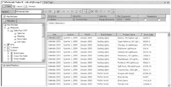
Figure 15-26: The MDX Query Builder with the query for the Wholesale Sales By Month Report
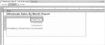
Figure 15-27: The report layout for the Wholesale Sales By Month Report
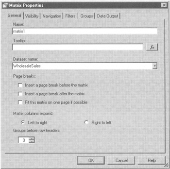
Figure 15-28: The Matrix Properties dialog box
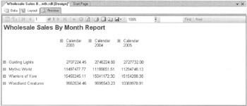
Figure 15-29: The Wholesale Sales By Month Report preview
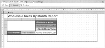
Figure 15-30: The matrix layout with multiple cells selected
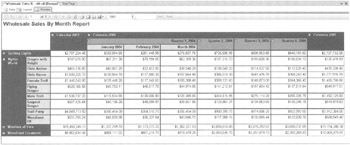
Figure 15-31: The final version of the Wholesale Sales By Month Report
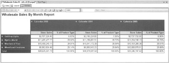
Figure 15-32: The Wholesale Sales By Month Report preview—almost done
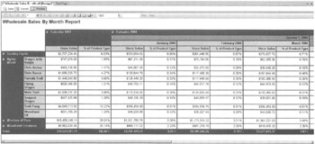
Figure 15-33: The Wholesale Sales By Month Report preview—completed
The List Data Region
The list data region does not deal in columns and rows at all. Instead, the list data region provides a freeform layout area that is repeated for each record in the dataset. This makes it a good choice for creating a report that is meant to resemble a form.
The list data region cannot create any groupings with group headers or group footers. It can create detail-level grouping. When a detail-level grouping is specified, the layout area repeats once for a group of records, rather than for each individual record in the dataset.
Learn By Doing—Creating a List Report
Features Highlighted
-
Creating a list report item
-
Adding an image to a report
-
Using rectangles and lines in a report
-
Controlling report item formatting with expressions
Business Need The Maximum Miniatures Marketing Department would like a list of its newly purchased mailing list, discussed in Chapter 14. The list should include the name and address of each household, along with houseowner status, marital status, number of cars owned, and the predicted number of children at home. The Marketing Department also wants a graphic to appear with entries predicted to have no children at home, indicating these are likely Mythic World buyers.
We can use the Neural Network - Children At Home mining model and the Customer dimension from the Max Min Sales DM cube as the data source for this report.
Steps
-
Open the Business Intelligence Development Studio, if it is not already open.
-
Open the MaxMinReports project, if it is not already open.
-
Close the Report Design tab containing the Wholesale Sales By Month Report, if it is open.
-
Right-click the Reports folder in the Solution Explorer window and select Add | New Item. The Add New Item dialog box appears.
-
Select Report in the Templates area. Enter Customer List With Prediction Report for Name.
-
Click Add. The Report Design tab appears with its Data tab selected.
-
Select <New Dataset> from the Dataset drop-down list. The Dataset dialog box appears.
-
Enter MailingListPrediction for Name.
-
Select MaxMinSalesDMCube (shared) from the Data Source drop-down list.
-
Click OK. The MDX Query Builder appears.
-
Click the Command Type DMX button in the MDX Query Builder toolbar to switch to the DMX Query Builder.
-
Click Yes, when asked if you want to proceed with the switch. The DMX Query Builder appears.
-
Click Select Model. The Select Mining Model dialog box appears.
-
Expand Classification - Children At Home.
-
Select Neural Network - Children At Home and click OK to exit the Select Mining Model dialog box.
-
Click Select Case Table. The Select Table dialog box appears.
-
Select Customer (MaxMinSalesDM) and click OK to exit the Select Table dialog box.
-
Highlight the mapping of the Num Children At Home predictable to the Num_Children_At_Home field. Press DELETE to remove this mapping.
-
Click the Source column of the grid in the DMX Query Builder to activate the drop-down list.
-
Select Customer Table from the drop-down list.
-
Activate the drop-down list in the Field column and select Fname_Name.
-
Repeat Steps 19 through 21 to add the following fields to the query output:
-
Lname_Name
-
Address 1_Name
-
City_Name
-
State_Province_Name
-
Postal_Code_Name
-
Num_Cars_Owned_Name
-
Houseowner_Name
-
Marital_Status_Name
-
-
In the next available row, select Neural Network - Children At Home from the Source drop-down list. Num Children At Home is selected in the Field column by default.
-
When completed, the DMX Query Builder appears as shown in Figure 15-34.
-
Select the Layout tab.
-
Drag the right edge of the report body layout area so it is ten inches wide.
-
Place a list data region in the report body, so it takes up almost the entire layout area.
-
Set the properties of the list as follows:
Property
Value
BorderStyle
Double
BorderWidth
5pt
-
Place a rectangle report item inside the list, so it takes up almost the entire list.
-
Set the properties of the rectangle as follows:
Property
Value
BorderStyle
Solid
BorderWidth
3pt
Note In addition to providing a visible rectangle on a report, the rectangle report item can be used with the border turned off to create report item groupings. This can be helpful in controlling the behavior of a complex report layout.
-
Expand the MailingListPrediction dataset and drag fields onto the rectangle to create the layout shown in Figure 15-35. The text boxes have been expanded to show the entire field expression in each text box.
-
Right-click the text box containing the Fname_Name field and select Expression from the Context menu. The Edit Expression dialog box appears.
-
Type & " " & at the end of the existing field expression. Put a space before the first ampersand, between the quotes, and after the second ampersand.
-
Select Fields (MailingListPrediction) from the left-hand list. The fields in this dataset appear in the right-hand list. Double-click the Lname_Name field to add it to the expression. It will be inserted at the point of your cursor. If you have text selected, it is inserted in place of that text.
-
Click OK to exit the Edit Expression dialog box.
-
Use the same technique to enter the following expression in the text box containing the City_Name field:
=Fields!City_Name.Value & ", " & Fields!State_Province_Name.Value & " " & Fields!Postal_Code_Name.Value
-
Increase the length of the three address fields.
-
Decrease the length of the four numeric value fields.
-
Add text boxes to create labels for the numeric value fields as shown in Figure 15-36. The labels should be right-aligned.
-
Add a line report item to separate the address section from the numeric value section of the layout.
-
Add an image report item to the upper-right corner of the rectangle. The Image Wizard dialog box appears as shown in Figure 15-37.
-
Leave Embedded selected and click Next. The Choose the Embedded Image page of the wizard appears.
Note The images we use in reports can be stored in four different locations. Embedded images are placed right in the RDL file for the report. This insures the image is always available to the report, but it makes the RDL file larger and it makes the image hard to update. Project images are stored within the report project and deployed with the report to the Report Server. Project images cannot be shared between projects. Database images are stored as binary large objects (BLOBs) in the database itself. Database images can be hard to manage and can put a strain on database server resources. They do have an advantage in situations where each record in a dataset should reference a different image. Web images are pulled from a URL each time the report is rendered. Web images offer the most flexibility for updating and sharing images among reports. Of course, web images require that the URL be available for report rendering.
-
Click New Image. The Import Image dialog box appears. Browse to the copy of Mythic World Buyer.gif you downloaded from the book's website. Select this image file and click Open. You return to the Choose the Embedded Image page of the Image Wizard, which appears as shown in Figure 15-38.
-
Click Next. The Completing the Wizard page appears.
-
Click Finish to exit the wizard. You return to the report layout, which appears as shown in Figure 15-39.
Note You can use the Embedded Images dialog box to manage embedded images in a report. This dialog box is available by selecting Report | Embedded Images from the Main menu.
-
Right-click the image and select Properties from the Context menu. The Image Properties dialog box appears.
-
Select the Visibility tab.
-
Select Expression for Initial Visibility.
-
Click the fx button next to the Expression area. The Edit Expression dialog box appears.
-
Enter the following expression to control whether the image is visible or hidden for each record:
=IIF(Fields!Num_Children_At_Home.value = 0, False, True)
This expression displays the graphic, set hidden to False, when the predicted number of children at home is 0. Recall, this was the criterion for a Mythic World product type buyer.
-
Click OK to exit the Edit Expression dialog box. Click OK to exit the Image Properties dialog box.
-
We created a report body that is ten inches wide to accommodate our layout. If we print this report, we need to use a landscape orientation. We set the report properties for landscape printing. Select Report | Report Properties from the Main menu. The Report Properties dialog box appears.
-
Select the Layout tab.
-
Set the following properties:
Property
Value
Page width
11in
Page height
8.5in
Left margin
0.5in
Right margin
0.5in
The Report Properties dialog box appears as shown in Figure 15-40.
Note For a report to print properly, the width of the report body plus the width of the left and right margins must be less than or equal to the page width. If this is not the case, the rightmost portion of the report will be cut off and printed on a separate page. In addition to the Page Size properties we just set in the Report Properties dialog box, the Properties window contains a set of InteractiveSize properties. This is the page size used for interactive renderings of the report, as opposed to print renderings of the report.
-
Click OK to exit the Report Properties dialog box.
-
We seem to have left no room for a report heading on our layout. We can remedy this by using special layout areas: the page header and the page footer. The content of the page header and page footer layout areas will appear on each page of the report. Select Report | Page Header from the Main menu to toggle on the page header layout area.
-
Place a text box in the page header and set the properties as follows:
Property
Value
Font: FontSize
16pt
Font: FontWeight
Bold
Location: Left
0in
Location: Top
0in
Size: Width
4.5in
Size: Height
0.5in
Value
Customer List With Prediction Report
-
Select Report | Page Footer from the Main menu to toggle on the page footer layout area.
-
Place a text box in the pager footer and set the properties as follows:
Property
Value
Location: Left
4in
Location: Top
0in
Size: Width
1.9in
Size: Height
0.25in
TextAlign
Center
-
Right-click the text box and select Expression from the Context menu. The Edit Expression dialog box appears.
-
Select Globals in the left-hand list. The global variables are displayed in the center list.
-
Double-click PageNumber in the center list.
-
In the expression, after page number, type & "out of" &. There must be a space before the first ampersand and after the second ampersand.
-
Double-click TotalPages in the center list. The Edit Expression dialog box appears as shown in Figure 15-41.
-
Click OK to exit the Edit Expression dialog box.
Note Fields cannot be used in expressions in the page header or page footer. Only Globals, Parameters, and constant values are allowed.
-
The data in the dataset is not sorted so let's add sorting in the list data region itself. Right-click on the list's double border and select Properties from the Context menu. The List Properties dialog box appears.
-
Select the Sorting tab.
-
Select =Fields!Lname_Name.Value in the first row under Expression. The direction should be Ascending.
-
Select =Fields!Fname_Name.Value in the second row under Expression. The direction should be Ascending. This sorts the content of the list data region by last name, and then by first name. The Sorting tab of the List Properties dialog box is shown in Figure 15-42. Click OK to close the dialog box.
-
Let's use one of the navigation features of Reporting Services to make it easier to find a person in this report. Right-click the text box containing the first and last name, and then select Properties from the Context menu. The Textbox Properties dialog box appears.
-
Select the Navigation tab.
-
Enter the following expression for Document Map Label:
=Fields!Lname_Name.Value & " , " & Fields!Fname_Name.Value
Use the Edit Expression dialog box to help create this expression, if you like. The Navigation tab appears as shown in Figure 15-43. Click OK to close the Textbox Properties dialog box.
Note In addition to the document map we are creating here, Reporting Services provides three actions that can occur when a user clicks a text box or image. These actions are all configured using the Navigation tab of the Textbox Properties dialog box shown in Figure 15-43. The user can jump to another report. The user can jump to a predefined bookmark within the current report. And the user can jump to a website through a URL.
-
Select the Preview tab. The Document Map appears on the left. Expand the Customer List With Prediction Report entry. Scroll down to find the first entry for Ali, Lia. Click on this item and you go to the corresponding entry in the report. Note, the Mythic World Buyer graphic appears when the number of children at home is predicted to be 0. This page of the report appears as shown in Figure 15-44.
-
Scroll up and down the pages, and note the page header and page footer on every page.
-
Click the Save All button in the toolbar.
-
Click the Print Layout button in the Preview tab toolbar. A print preview of the report is created. This takes a minute or so to complete. The print preview appears as shown in Figure 15-45.
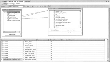
Figure 15-34: The DMX Query Builder
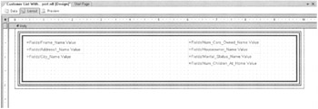
Figure 15-35: The initial field layout for the Customer List With Prediction Report
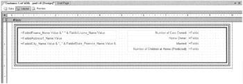
Figure 15-36: The Customer List With Prediction Report layout with labels added
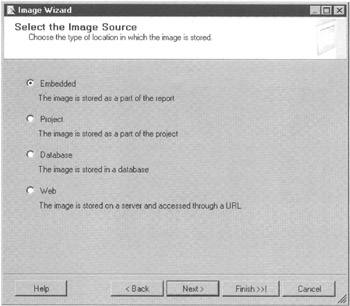
Figure 15-37: The Select the Image Source page of the Image Wizard
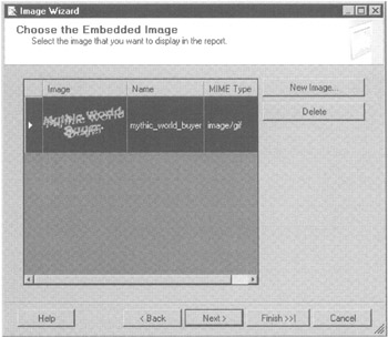
Figure 15-38: The Choose the Embedded Image page of the Image Wizard
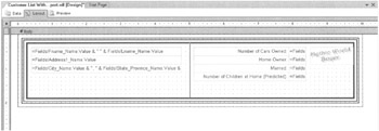
Figure 15-39: The Customer List With Prediction Report with the Mythic World Buyer image
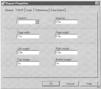
Figure 15-40: The Layout tab of the Report Properties dialog box
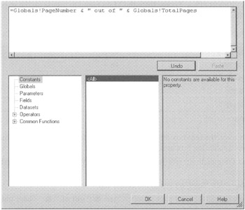
Figure 15-41: The page number expression for the text box in the page footer
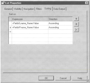
Figure 15-42: The Sorting tab of the List Properties dialog box
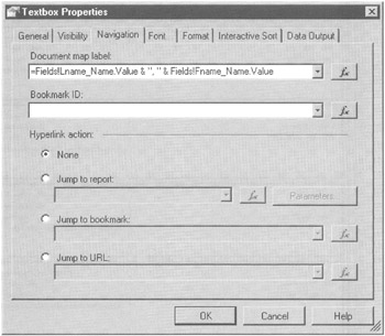
Figure 15-43: The Navigation tab of the Textbox Properties dialog box
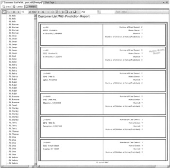
Figure 15-44: A page of the completed Customer List With Prediction Report
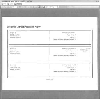
Figure 15-45: A page from the Customer List With Prediction Report print preview
The Chart Data Region
The chart report item is a data region like the table, matrix, and list report items, which means the chart can process multiple records from a dataset. The table, matrix, and list report items enable you to place other report items in a row, a column, or a list area that is repeated for every record in the dataset. The chart, on the other hand, uses the records in a dataset to create bars, lines, or pie wedges. You cannot place other report items inside a chart item.
Learn By Doing—Creating a Chart Report
Features Highlighted
-
Creating a chart report item
-
Working with report parameters
-
Using a subreport
Business Need The Maximum Miniatures Production Department would like a line graph showing the inventory levels of each product type at the end of each month for a selected year. The Production Department wants to select that year from a drop-down list showing which years have data available. In addition, they would like to see the number of each product type manufactured on each machine for the same year.
| Note | This report requires the stp_InventoryByTypeByMonth stored procedure. Download the Create InventoryByTypeByMonth Stored Proc.sql file from this hook's website and execute this script in a Query window for the MaxMinManufacturingDB relational database. |
Steps
-
Open the Business Intelligence Development Studio, if it is not already open.
-
Open the MaxMinReports project, if it is not already open.
-
Close the Report Design tab containing the Customer List With Prediction Report, if it is open.
-
Right-click the Reports folder in the Solution Explorer window and select Add | New Item. The Add New Item dialog box appears.
-
Select Report in the Templates area. Enter Inventory Levels By Month Report for Name.
-
Click Add. The Report Design tab appears with its Data tab selected.
-
Select <New Dataset> from the Dataset drop-down list. The Dataset dialog box appears.
-
Enter InventoryLevels for Name.
-
Select MaxMinManufacturingDM (shared) from the Data Source drop-down list.
-
Select Stored Procedure from the Command Type drop-down list.
-
Click OK. The stored procedure version of the Query Builder appears.
-
Select stp_InventoryByTypeByMonth from the Stored Procedure drop-down list.
-
Click Run to execute the stored procedure. The Query Builder determines what parameters are required by the stored procedure and prompts for them. It also creates report parameters to correspond to them. You are asked to supply a value for the @ Year parameter. Enter 2005 and click OK.
-
The stored procedure executes and the results are displayed in the Data tab as shown in Figure 15-46.
-
Click the Refresh Fields button in the Data tab toolbar.
Note The Report Designer tries to determine the fields that'll be returned by a stored procedure. It can't do this if the stored procedure uses a temporary table, as does the stp_InventoryBytypeByMonth stored procedure. To get around this shortcoming, we can manually run the stored procedure, and then click the Refresh Fields button to force the Report Designer to take the fields list from our manual execution of the stored procedure.
-
The business goals state that the user should select a year from a drop-down list. To do this, we need a dataset that can serve to populate this drop-down list. We create that dataset now. Select <New Dataset> from the Dataset drop-down list. The Dataset dialog box appears.
-
Enter YearList for Name.
-
MaxMinManufacturingDM should be selected in the Data Source drop-down list.
-
Enter the following for Query String:
SELECT DISTINCT YEAR(DateOfInventory) AS Year FROM InventoryFact ORDER BY YEAR(DateofInventory) DESC
This query puts the most recent year at the top of the list. This is probably the year selected most often by the users.
-
Click OK to exit the Dataset dialog box.
-
Click Run in the Query Builder toolbar.
-
Select the Layout tab.
-
Select Report | Report Parameters from the Main menu. The Report Parameters dialog box appears.
-
The Year report parameter was created to match the @ Year stored procedure parameter. We can provide a more user-friendly prompt and set up the drop-down list for selecting a year. Enter Select a Year: for Prompt.
-
Select From Query under Available Values.
-
Select the YearList dataset from the Dataset drop-down list.
-
Select Year from the Value Field drop-down list. This is the value passed to the report parameter when an item is selected from the drop-down list.
-
Select Year from the Label Field drop-down list. This determines what is displayed in the drop-down list for the user.
-
We can also create a default value for this parameter. We use the same dataset. The default is the value in the first record in the dataset. Select From Query under Default Values.
-
Select the YearList dataset from the Dataset drop-down list.
-
Select Year from the Value Field drop-down list. The Report Parameters dialog box appears as shown in Figure 15-47.
Note In addition to creating a drop-down list and a default value from a dataset, we can create a drop-down list and a default value from a hard-coded default value. This is done with the Non-queried options on the Report Parameters dialog box.
-
Click OK to exit the Report Parameters dialog box.
-
Place a chart data region in the report body, so it takes up almost the entire layout area. Charts look better when they are bigger.
-
When the chart is placed on the report body, it displays three drag-and-drop targets as shown in Figure 15-48. If these drag-and-drop targets are not visible, click the chart again and they will appear.
-
Expand the InventoryLevels dataset. Drag the InventoryLevel field and drop it on the Drop Data Fields Here target. This is the value to be charted.
-
Drag the ProductTypeName field and drop it on the Drop Series Fields Here target. This creates the series of lines or bars on the chart.
-
Drag the MonthName field and drop it on the Drop Category Fields Here target. This creates the items on the X axis.
-
Right-click the chart and select Chart Type | Line | Simple Line from the Context menu. The report layout appears as shown in Figure 15-49.
-
Select the Preview tab. The report appears as shown in Figure 15-50. The report did not wait for a parameter value to be selected. Instead, it rendered the report using the default value of 2005. Select 2004 from the Select a Year drop-down list and click View Report. The chart for the year 2004 is displayed.
-
Let's fancy-up our chart a bit. Select the Layout tab.
-
Right-click the chart and select Properties from the Context menu. The Chart Properties dialog box appears as shown in Figure 15-51.
-
Enter Inventory Levels By Month for Title.
-
Click the Style button (the paint brush and bucket) next to Title. The Style Properties dialog box appears.
-
Set Size to 16pt. Set Weight to Bold. Click OK to exit the Style Properties dialog box.
-
Select the Data tab. The Data tab has three sections as shown in Figure 15-52. The Values section controls the values being charted. The Category Groups section controls the data creating the X axis. The Series Groups section controls the data creating multiple series on the chart.
-
Click the Edit button in the Values section. The Edit Chart Value dialog box appears.
-
Select the Appearance tab.
-
Check the Show Markers check box.
-
Select Diamond for Marker Type. The Appearance tab of the Edit Chart Value dialog box appears as shown in Figure 15-53.
-
Click OK to exit the Edit Chart Value dialog box.
-
Select the X Axis tab. This tab controls the appearance of the labels on the X axis. It is shown in Figure 15-54.
-
Enter Months for Title.
-
Click the Style button next to Title. The Style Properties dialog box appears.
-
Set Size to 12pt. Set Weight to Bold. Click OK to exit the Style Properties dialog box.
-
Select the Y Axis tab. This tab controls the appearance of the labels on the Y axis. It is shown in Figure 15-55.
-
Enter Sales ($) for Title.
-
Click the Style button next to Title. The Style Properties dialog box appears.
-
Set Size to 12pt. Set Weight to Bold. Click OK to exit the Style Properties dialog box.
-
Enter ###,##OK for Format Code. The stored procedure divides the sales values by 1,000, so our graph scale should read thousands of dollars, thus the K on the end.
-
Uncheck the Logarithmic Scale check box, if it is checked.
-
Select the Legend tab. This tab controls the appearance and location of the series legend.
-
Move the legend to the center bottom of the chart by clicking the center-bottom position button as shown in Figure 15-56.
-
Select the 3D Effect tab. This tab controls the 3-D effects applied to the chart.
-
Check the Display Chart with 3-D Visual Effect check box.
-
Adjust the Horizontal Rotation to ten degrees.
-
Adjust the Vertical Rotation to ten degrees. The 3D Effect tab appears as shown in Figure 15-57.
-
Select the Filters tab. This tab enables us to filter the data coming from the dataset to be graphed.
-
Click OK to exit the Chart Properties dialog box.
-
Select the Preview tab. The chart appears as shown in Figure 15-58.
-
Select the Layout tab. The business needs stated we need to include the content of the Manufacturing By Machine Report at the bottom of this report. Instead of duplicating this report design in our current report, we can use the subreport report item to place one entire report inside another.
-
Lengthen the report body, so there is room below the chart.
-
Place a subreport report item in the report body below the chart. Drag the subreport larger so it nearly fills the space.
-
Right-click the subreport and select Properties from the Context menu. The Subreport Properties dialog box appears.
-
The Subreport drop-down list enables us to select another report from this report project that should appear inside the report we are editing. Select Manufacturing By Machine Report from the Subreport drop-down list. The General tab of the Subreport Properties dialog box appears as shown in Figure 15-59.
Note There is nothing special about a particular report that allows it to be used as a subreport. Any report in the project can be placed inside another report using the subreport report item.
-
Select the Parameters tab.
-
Select the cell below Parameter Name to activate the drop-down list. This list includes all of the report parameters defined in the report selected as the subreport. In this case, the Manufacturing By Machine Report we selected has only one report parameter, namely Year. Select Year from the drop-down list.
-
We need to pass values to the parameters in the subreport, so the subreport has enough information to execute. Here, we need to pass a value to the Year parameter in the subreport. In this report, we want to pass the Year report parameter in the Inventory Levels By Month Report to the subreport. Select <Expression> from the drop-down list under Parameter Value. The Edit Expression dialog box appears.
-
Select Parameters in the left-hand list. A list of the report parameters defined in this report is shown in the right-hand column. Double-click Year to add it to the expression.
-
Click OK to exit the Edit Expression dialog box.
-
The Parameters tab of the Subreport Properties dialog box appears as shown in Figure 15-60.
-
Click OK to exit the Subreport Properties dialog box.
-
The subreport report item appears in the report layout as shown in Figure 15-61.
-
Click the Preview tab. The report appears as shown in Figure 15-62.
-
Select 2004 from the Select a Year drop-down list and click View Report. Notice the values in the subreport change to 2004 values as well.
-
Click the Save All button in the toolbar.
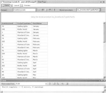
Figure 15-46: The stored procedure version of the Query Builder
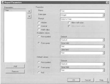
Figure 15-47: The Report Parameters dialog box
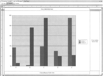
Figure 15-48: The chart data region with drag-and-drop targets
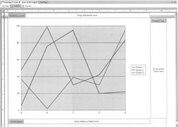
Figure 15-49: The basic Inventory Levels By Month Report layout
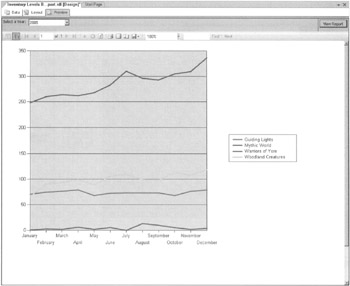
Figure 15-50: The basic Inventory Levels By Month Report preview
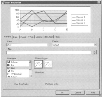
Figure 15-51: The General tab of the Chart Properties dialog box
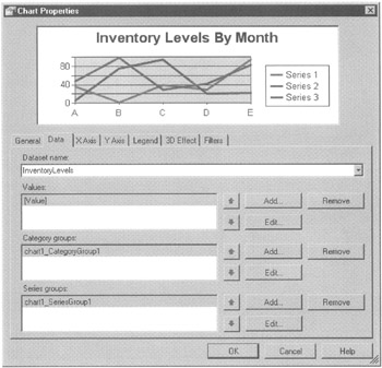
Figure 15-52: The Data tab of the Chart Properties dialog box
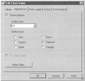
Figure 15-53: The Appearance tab of the Edit Chart Value dialog box
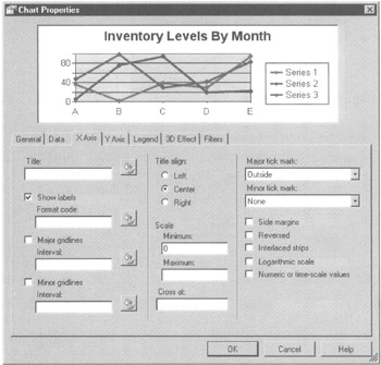
Figure 15-54: The X Axis tab of the Chart Properties dialog box

Figure 15-55: The Y Axis tab of the Chart Properties dialog box
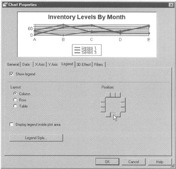
Figure 15-56: The Legend tab of the Chart Properties dialog box
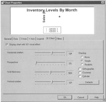
Figure 15-57: The 3D Effect tab of the Chart Properties dialog box
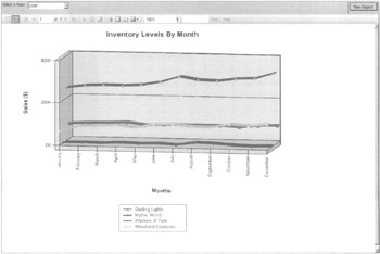
Figure 15-58: The completed chart in the Inventory Levels By Month Report
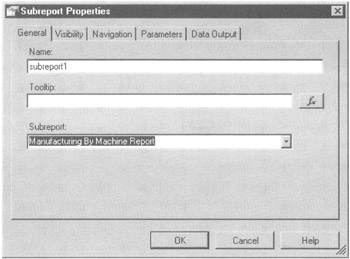
Figure 15-59: The General tab of the Subreport Properties dialog box
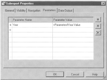
Figure 15-60: The Parameters tab of the Subreport Properties dialog box
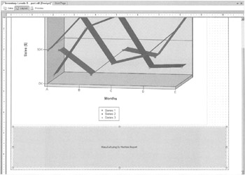
Figure 15-61: The Inventory Levels By Month Report layout with a subreport
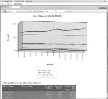
Figure 15-62: The Inventory Levels By Month Report preview with a subreport
EAN: 2147483647
Pages: 112