Building the Image
|
|
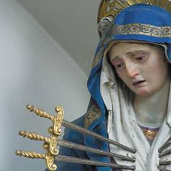
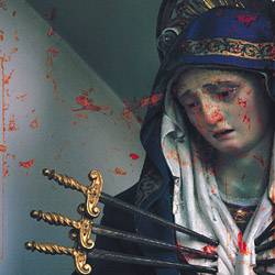
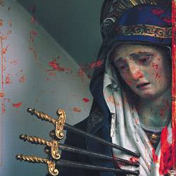
| After opening the Madonna photo, I wanted to crop the image to further emphasize the dramatic nature of the swords and her ensuing pain. The most dynamic elements were the swords, the direction of Mary's gaze, and the diagonal line in the wall behind the statue. The wall line and the swords all directed themselves to her heart in the lower right, and her pained gaze provided a counterpoint as it looked to the left. I cropped the image tightly on these components, pushing the drama right in the face of the viewer (see Figure
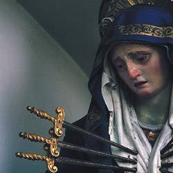
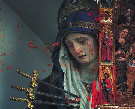
To add a sense of mystery to the image, I added a Curves adjustment layer by selecting Curves from the Adjustment Layer pull-down menu at the bottom of the Layers palette. I set the points to Input: 72, Output: 0; Input: 121, Output: 24; and Input: 207, Output: 130. With this Curves layer active in the Layers palette, I highlighted the layer mask icon associated with the Curves Adjustment layer to select it. I then selected a 200-pixel brush, set the foreground color to black, set opacity to 35%, and painted in the mask to lighten the face from the original Curves adjustment (see Figure
I liked how the Curves layer darkened the image, especially with how it added saturation and contrast to the scrolled handles of the swords. Having said that, I knew the subject was still a bit obscured, and that some of the color shifts were somewhat distracting. To address these issues, I did a fair amount of experimentation in an attempt to strike the right balance between contrast and detail. I finally ended up creating a separate layer group (formerly called a layer set) that arranged several adjustment layers over a duplicate of the original Madonna layer. As you know, layer order, blending modes, and clipping groups create different tonal results depending on their arrangement, and I found that the following constellation of elements worked best for the image. I selected New Layer Group from the Layers palette menu and named this new layer group Tone Adjustment Set. By creating a layer mask for the entire group and masking the background, I could use this group to lighten the midtones and adjust the color balance around the face. I pressed the Option key (Alt key in Windows) and dragged the Madonna layer to the layer group, creating a duplicate layer. I then added a Curves adjustment layer with a single point set to Input: 187, Output: 134 to deepen the shadows. I gave this layer its own layer mask and painted a light gray mask over the face to keep it light and preserve details. To cool the warm tones in the face, I created a Color Balance adjustment layer and added a bit of blue and cyan with the following settings: Shadows -6, +5, +10; Midtones -4, +6, 0; and Highlights +23, +8, -6. Finally, I highlighted the Tone Adjustment Set in the Layers palette and Option-clicked (Alt-clicked in Windows) the Create Layer Mask icon to create a mask filled with black, concealing the entire contents of the layer set. To add back the effects, I selected a large feathered brush with white as the foreground color and an opacity of 18%. I painted to erase the mask around the face, building more density while seamlessly adding the effect (see Figure
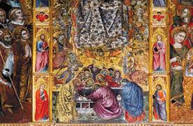
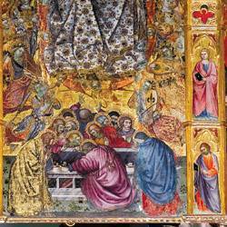
Seeing RedNext I opened the Assumption of the Virgin photo and corrected the distortion in perspective. Because this is such a huge painting, these was no way to shoot it without pointing the camera up at a strong angle, forcing the vertical perspective lines to converge at the top, making the image tilt away from the viewer. I selected View, Show, Grid to turn on the grid overlay, and then I double-clicked the background layer of the Assumption photo and clicked OK in the resulting dialog box to convert it from a Background layer to a standard layer. I then pressed I used the Warp tool to correct the distortion, selecting Edit, Transform, Warp to launch the Warp dialog box. Warp overlays the image with a mesh and allows you to drag the intersecting points to adjust distortions. You can also drag the Bezier handles on the outer edge points to control the warp further. I dragged the intersection point in the upper-left further to the left to correct the distortion on the left column of the image. I tweaked other intersection points to straighten the bottom and keep all edges perpendicular to the image plane (see Figure
After pressing Enter to correct the distortion, I copied the result and pasted it into the main composition, naming this new layer Altar. I selected the Move tool and dragged the layer into position, allowing the figures on the left side to fall outside of the composition (see Figure
One of the things I regretted about the first placement of the Altar layer was the loss of the figures on the left side. Specifically, I liked the red robe of the saint in the lower-left corner. When I decided to superimpose another layer of red texture, I looked for ways to bring back the red-robed guy who bled off the left edge and did not appear in the composition. To do this, I duplicated the Altar layer by dragging it to the New Layer icon in the Layers palette, and I assigned the layer name of Altar Copy 1. I selected the Move tool and held down the Shift key while dragging to the right, restricting the vertical movement of the layer as I dragged. I positioned the red-robed saint in the lower-right corner of the composite and repeated the procedure to isolate the red color areas (I selected the red, created the mask, and set the blending mode to Hard Light). Finishing the ImageThe vertical red fragments on the left edge suggested that some additional framing could further enhance the subject. As I explored potential framing elements, I settled on the right edge molding from the Altar layer, which would run right down behind the red robe that was anchoring the lower-right corner of the composite. I tried the easiest approach of modifying the mask in the Altar layer to let the molding show through. The problem was that the Hard Light blending mode created too harsh an effect that felt awkward and disconnected. I finally duplicated the Altar layer a third time and dragged it to the bottom of the layer stack, beneath the Madonna layer. This way I could leave the layer's blending mode at normal and introduce the edging into the composition. The final step was to add a mask to the Madonna layer along the right edge, allowing the molding to show through. I selected the Marquee tool and dragged down from the upper-right corner to create a thin vertical stripe. With the selection still active, I Option-clicked (Alt-clicked in Windows) the Add Layer Mask icon to hide the selected area. The finishing touch was to add the corner detail in the very bottom right (see Figure
|
|
|
EAN: 2147483647
Pages: 141