Hack 57. Plot Histograms in Excel
| Use Microsoft Excel to plot data distributions so that you can have a better understanding of statistics. There is some truth to the clich\x8e "a picture is worth a thousand words." A picture is often the best way to understand 1,000 numbers. People are visually oriented. We're good at looking at a picture and observing different characteristics; we're bad at looking at a list of 1,000 numbers. One of the most powerful tools available for understanding data is the histogram, a picture of the distribution of values. Here is the idea of a histogram. Suppose you have a lot of datasay, the batting averages for all 6,032 baseball players between 1955 and 2004 who averaged 3.1 or more plate appearances per game. Let's also assume you want to know how these values are distributed. What are the lowest and highest values? Are there more low values than high values? Were batting averages totally random numbers between 0 and .400, or was there some pattern? Batting average can take many different values. Between 1955 and 2004, 6,032 players had qualifying batting averages, and there were 1,229 unique values for batting average. You can plot the number of players with each unique batting average (though I can't imagine what this graph would look like). But we don't really care about each unique value; for example, the fact that 13 players had a batting average of .2862 is not that interesting. Instead, we might want to know the number of players with very similar batting averagessay, between .285 and .290. Let's think of each range as a bucket. Every player-season goes into a bucket. For example, in 1959, Hank Aaron had a .354 average, so we'll put that season in the .350-.355 bucket. So, here's our plan: we'll put each player-season into a bucket, count the number of player-seasons in each bucket, and draw a graph showing (in ascending order) the number of players in each bucket. This single diagram is a histogram. The CodeIn this example, I wanted to look at the distribution of batting average. I used a table containing the total batting statistics for each player in each year (and the list of all teams for which each player played), and I called the table b_and_t. I selected only batters with enough plate appearances to qualify for a league title, and only those players who played between 1955 and 2004: SELECT b.playerID, M.nameLast, M.nameFirst, b.yearID, b.teamG, b.teamIDs, b.AB, b.H, b.H/b.AB AS AVG, b.AB + b.BB + b.HBP + b.SF as PA FROM b_and_t b inner join Master M on b.playerID=m.playerID WHERE yearID > 1954 AND b.AB + b.BB + b.HBP + b.SF > b.teamG * 3.1; After running this query, I saved the results to an Excel file named batting_averages.xls. One way to draw histograms in Excel is to use the Analysis ToolPak add-in. You can add this by selecting Add-Ins... from the Tools menu, and then selecting Analysis ToolPak. This adds a new menu item to the Tools menu, called Data Analysis, which introduces several new functions, including a Histogram function. But I find this interface confusing and inflexible, so I do something else. Here is my method for creating a histogram:
Figure 5-5. Histogram from a pivot chart report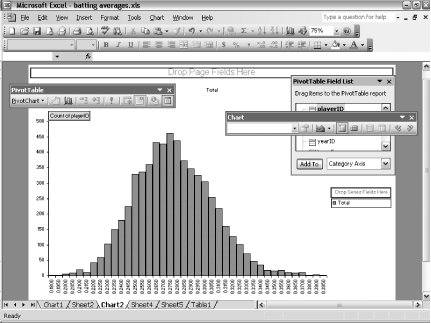 Looking at the histogram, we see that the distribution looks similar to a bell curve; it skews toward the right and is centered at around .275. Hacking the HackOne of the nice things about calculating bins with formulas is that you can easily change the formula for binning. Here are a few suggestions for other formulas:
If you want to take this to the next level, you can replace the bin size with a named value. (For example, name cell A1 bin_size.) This makes it easy to change the bin size dynamically and experiment with different numbers of bins. Joseph Adler |
EAN: 2147483647
Pages: 114