Hands-On Levels and Curves
| Armed with all the preceding information, let's look at some practical examples of working with Levels and Curves. We'll look at several different scenarios, because we have two different reasons for editing imagessee the upcoming sidebar, "Why We Edit." The classic order for preparing images for print is as follows.
We loosely adhere to this, but a great deal depends on the image and on the quality of the image capture. For instance, you often have to lighten an image before you can even consider removing dust and scratches. And sometimes it's impossible to separate tonal correction and color correction. Changes to the color balance affect tonal values, too, because you're manipulating the tone of the individual color channels. For example, if you add red to neutralize a cyan cast, you'll also brighten the image because you're adding light. If you reduce the green to neutralize a green cast, you'll darken the image because you're subtracting light. Image EvaluationBefore we edit an image, we always spend a few moments evaluating the image to see what needs doing and to spot any potential pitfalls that may be lying in wait. We check the Histogram palette to get a general sense of the image's dynamic range: If shadows or highlights are clipped, we can't bring back any detail, but we may still be able to make the image look good. If all the data is clumped in the middle, with no true blacks or whites, we'll probably want to expand the tonal range. We also check the values in bright highlights and dark shadows on the Info palette, in case there's detail lurking there that we can exploit. We're pretty good at identifying color casts by eye, but we still check the Info palettea magenta cast and a red cast, for example, appear fairly similar but the prescription for fixing each is quite different. Fix the biggest problem firstThe rule of thumb we've developed over the years is simple: Fix the biggest problem first. This is partly plain common sense. You often have to fix the biggest problem before you can even see what the other problems are. But it's usually also the most effective approach, the one requiring the least work, and the one that degrades the image the least. Tip: Look at the Image Before You Start This may seem obvious, but stop for a moment. Look at the image carefully. Zoom to 100 percent (Actual Pixels) and look at every pixel. Have you missed dust or scratches? Are there particularly noisy areas that might cause problems? Look at each channel individually. Are there details (or defects) lurking in one channel that are absent from others? Is noise concentrated in one channel? (It's usually most prevalent in the blue.) Look at the histogram. Is the image using the full tonal range? If not, should it? A few minutes spent critically evaluating the image can save hours later on. Develop a plan, and stick to it unless it obviously isn't working (in which case, see below).
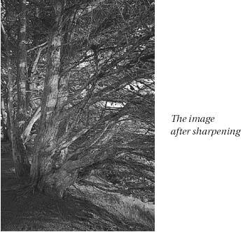
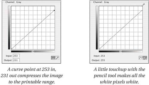
Tip: Leave Yourself an Escape Route The great Scots poet Robert Burns pointed out that the best-laid schemes o' mice and men gang aft agley. He didn't have the benefit of the History palette, or the Undo and Revert commands, but you do. History is a great feature, but it eventually it starts dropping states, so foster good habits. If a particular move doesn't work, just undo (Command-Z)you can reload any of the commands in the Adjustments submenu (in the Image menu) with the last-used settings by holding down the Option key while selecting them either from the menu or with a keyboard shortcut. If a whole train of moves has led you down a blind alley, revert to the original version. If you're working on a complex or critical problem, work on a copy of the image. When you apply a move using Levels, Curves, or Hue/Saturation, save the image before you apply it. That way, you can always retrace your steps up to the point where things started to go wrong. Photoshop's Adjustment Layers feature lets you avoid many of the pitfalls we've just discussed. You don't need to get your edits right the first time because you can go back and change them at will. You automatically leave yourself an escape route because your edits float above the original image rather than being burned into it. But sometimes it's impractical to use adjustment layers because of file size constraints, particularly with high-bit files, and to use adjustment layers effectively, you need to know how the various controls operate on a flat file. So even if you plan to use adjustment layers for as much of your editing as possibleand we encourage you to do soyou still need to master the techniques we discuss in this chapter, and the pitfalls they entail. For a much deeper discussion of adjustment layers, see Chapter 7, The Digital Darkroom. Evaluation ExamplesFigures 6-32 through 6-35 show several unedited images, and the conclusions we draw as to what we need to do to them. We'll execute the edits later in this chapter. Figure 6-32. A dark, muddy image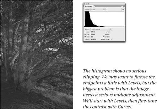 Figure 6-33. A washed-out image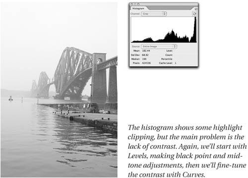 Figure 6-34. A severe color cast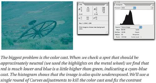 Figure 6-35. A flat image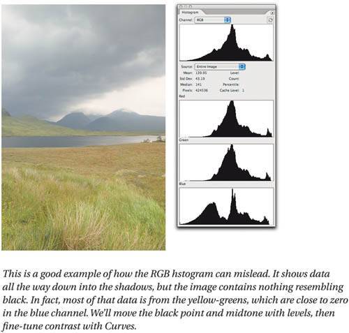 The evaluation process only takes a few seconds, and it's time well spent. We may encounter other problems that aren't obvious on the initial examination, but it's relatively rare that we'll encounter something that causes us to rethink the entire edit (and for those rare occasions, we always leave ourselves an escape route). In the following examples, we'll apply the edits directly to the image, but the edits are exactly the same when applied with adjustment layers. (None of these edits are likely to exceed the default 20 History States that Photoshop remembers, so we still have an escape route even though we're burning changes directly into the filessee "History and Virtual Layers" in Chapter 7, The Digital Darkroom.) So, armed with a plan, let's proceed to the edits. Getting a midpoint fixFigure 6-36 shows a simple Levels move. The Levels tweak makes a huge improvement, but we can improve matters even more by applying the Curves adjustment shown in Figure 6-37. Figure 6-36. A Levels fix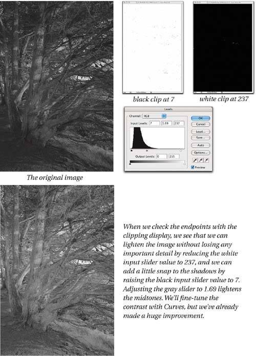 Figure 6-37. Fine-tuning with Curves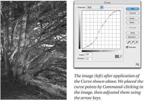 We started by placing points that corresponded to the light, middle, and dark tones on the main tree trunk (points 4, 5, and 6, counting from the shadow (0,0) point), and adjusted them to increase the contrast. This cause both ends of the curve to clip, so the additional points were added to fine-tune the highlight and shadow contrast. We could have made the entire set of adjustments using Curves, but we find that Levels' clipping display is often helpful in setting the endpointsin this case we wanted to make sure that we were getting hints of pure white and solid black without clipping any detail. We deliberately left a very little headroom to accommodate sharpening. As you'll learn in Chapter 9, Sharpness, Detail, and Noise Reduction, the process of sharpening images is really about adding contrast along edges, so sharpening always adds a little apparent contrast, and drives more pixels towards levels 255 and 0. The significance of this depends on the output process for which you're preparing the image. Individual pixels being driven to black and white usually isn't a concernunless you're printing at resolutions below 100ppi you're unlikely to see them on output. For Web work you may need to be a little more conservative. Figure 6-38 shows the sharpened image. Figure 6-38. The sharpened image Washed out, not washed upOur next image, shown in Figure 6-39, suffers from essentially the opposite problem from the one we've just edited. It's washed-out and too light. As with the previous example, we could go ahead and try to fix everything with a single Curves adjustment, but again we find that the clipping display in Levels provides sufficient reason to stop there before going on to the Curves command. Figure 6-39. Initial fix with Levels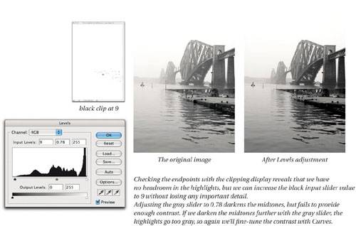 In this case, there's no headroom, though no serious clipping either, at the highlight endjust a few white pixels around the high-contrast edge of the bridge against the bright cloudy sky. At the shadow end, we can safely bring up the black input slider without clipping any significant detail. We complete the Levels adjustment by darkening the midtones with the gray input slider. Then we fine-tune contrast with Curves. As we did on the previous image, we place the curve points by Command-clicking in the image on areas whose contrast we want to enhance, then adding points as needed to stop the ends of the of the curve from blowing out highlights or plugging up shadows. The second curve point (the first is the shadow 0,0 point) darkens the bridge piers and adds contrast to the ripples in the foreground. Points 3, 4, and 5 address the dark, middle, and light tones of the main span of the bridge, while point 6 adds contrast to the brighter areas in the water. Figure 6-40 shows the image after the Curves edit, with sharpening applied. Figure 6-40. Final contrast with Curves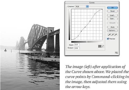 Cast away that colorMoving on to color, we'll use Curves to neutralize the nasty color cast in the image from Figure 6-34. Obeying our maxim to fix the biggest problem first, we'll start by tackling the color cast, then, since we're already working in Curves, we'll improve the contrast there. Using the technique described in the above tip, we use Curves to neutralize the color cast, as shown in Figure 6-41. Figure 6-41. Killing a color cast with Curves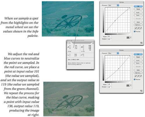 Tip: Look For Grays to Neutralize Color Casts Possibly the easiest way to eliminate color casts is to look for something in the image that should be approximately neutral, then use Curves to make it so. One of the more useful features of Photoshop's RGB working spaces is that they're gray-balanced, so equal R, G, and B values always produce a neutral gray. Check the values on a should-be-neutral area with the Info palette, then use Curves to adjust the highest and lowest values to match the middle one. Nine times out of ten, the rest of the color simply falls into place. Tip: Placing Curve Points in Color Channels Command-clicking in the image places a point on the composite curve, but in this situation we want a point on each of the individual channel curves. Command-Shift-clicking the point we sampled in the Info palette places a point on each of the channel curves, ready for quick adjustment. The following tip makes the adjustments even faster. Tip: Use the Number Fields in Curves In a situation like the one shown in Figure 6-37, where you're dealing with a known input and output value, the quickest way to adjust the points is to use the numeric entry fields. In each channel, press Control-Tab twice to highlight the point placed using the tip above, then press Tab twice to highlight the output field, and enter the value. Boom, you're done. This simple tweak removes the worst of the color cast, allowing us to turn our attention to the tonal issues. Figure 6-42 shows a tweak to the composite RGB curve that spreads the data across the entire dynamic range. We don't have the Levels clipping display to rely on here, so we keep a watchful eye on the Histogram palette as we move the black and white points on the curve. Then we add a couple of points to improve the contrast. Figure 6-42. Setting endpoints and contrast with Curves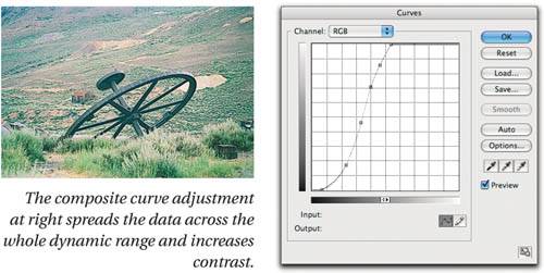 Now we can see that our first approximation at removing the color cast was less than totally successfulthe image is pretty green. We return to the individual color channels and tweak the existing points with the arrow keys to produce the result shown in Figure 6-43. Figure 6-43. Fine-tuning the color balance with Curves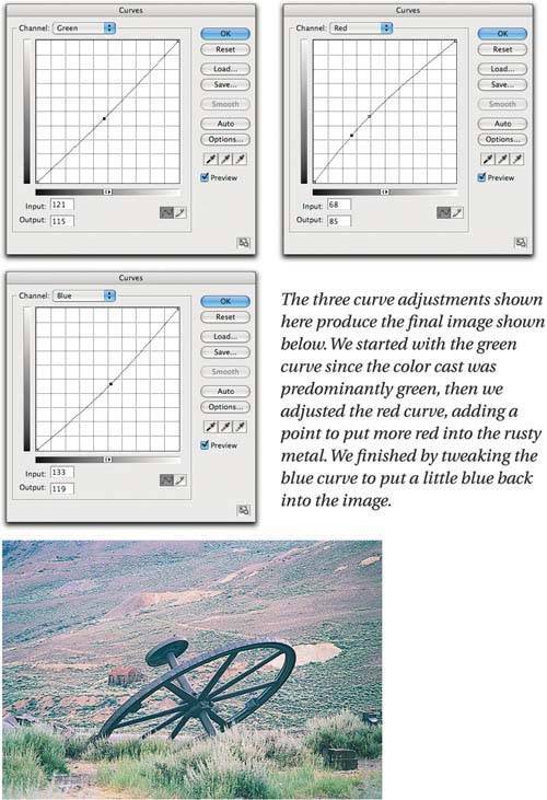 Note that we made all these edits without closing the Curves dialog box, so they're applied as a single pass, avoiding any unneccessary image degradation. In this case we decided to use Curves for the extra control it offers over contrast. But it's instructive to compare the Curves rendering with alternate results produced by our other favorite technique for killing color casts: Auto Color. Figure 6-44 shows the results produced by the various Auto options. Figure 6-44. Auto options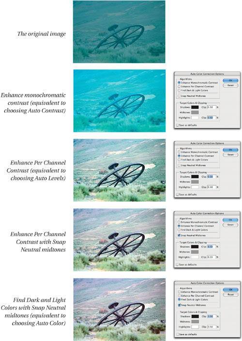 You need to be comfortable with both techniques to decide which approach makes sense, taking into account both the quality requirements and the time you can afford to spend. Photoshop offers several ways to accomplish any given task, and as we've mentioned, when all you have is a hammer, everything tends to look like a nail. You don't have to learn every single Photoshop featurewe doubt that's possiblebut if you master the techniques in this book, you'll have strong Photoshop skills. Make it popIn the next example, we'll use both Levels and Curves to correct the tone on a color image. Figure 6-45 shows the original image, and the Levels correction. This is an improvement, but we can make matters still better with judicious use of Curves, as shown in Figure 6-46. Figure 6-45. Setting endpoints and midtone with Levels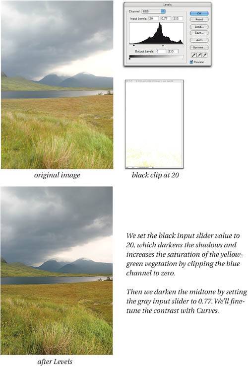 Figure 6-46. Final contrast with Curves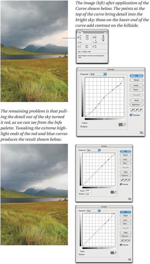
Subtle curvesThe image in the previous example had only one small color problemthe adjustments we made were essentially about contrast, though they had the desirable side effect of increasing saturation. Figure 6-47 shows a tougher example. The color is off, but only by a little. Small adjustments can have a big effect on the image, so in this exampe we'll look at more subtle problems. Figure 6-47. Endpoint adjustments in Levels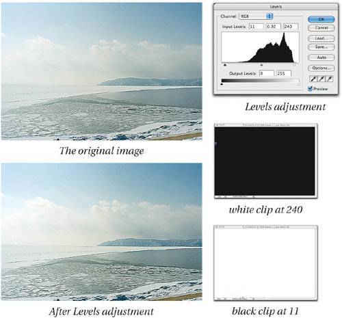 First, the Levels adjustment adds some contrast. The white clipping adjustment produced clipping in the blue channel only in the brightest part of the clouds, while the smaller black clipping adjustment produced a true black on the backlit post in the foreground. The midtone adjustment was mainly done to compensate for the fact that we clipped white slightly more than black, lightening the imagethe gray slider adjustment counteracted the lightening. The color, however, is a little offit has a cyan/green cast in the midtones, and the shadows on the snowbank in the foreground are a bit too blue (shadows on ice and snow are often blue, but they seem exaggeratedly so here). So we'll make a Curves edit, first to fix the color balance, then to fine-tune the contrast and bring some detail into the clouds. Figure 6-48 shows the Curves edits for color, then tone. Figure 6-48. Endpoint adjustments in Levels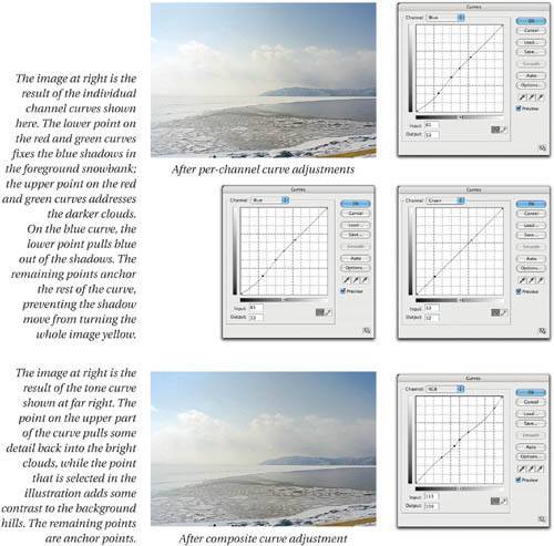 Levels and Curves ComparedThe only thing you can do in Levels that you can't do in Curves is to see the black and white clipping displays. The clipping display is the feature that keeps us coming back to Levels. We don't check the clipping on every single image. We do so only when there's a real question of what to clip and what not to clip. In the example shown back in Figure 6-49, for example, we just used Curves to set the clipping by eye. The clipping display is most useful when there's important detail near the highlight or shadow points, and particularly the highlight pointit's usually much harder to see details close to white on the monitor than it is to see details close to black. Figure 6-49. Clipping unwanted detail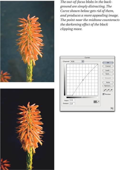 Clipping isn't necessarily bad, either. We keep using the qualifier "important detail" because sometimes the detail can be distracting, and we want to do away with it, as in the example shown in Figure 6-45. In cases like this, we don't really need to check the clipping display, so we just went ahead and used Curves. Tip: When All Else Is Equal... If it's a wash as to whether to use Levels or Curves, use Curves because it's faster. When you use Levels, Photoshop has to spend time building the histogram (on large layered files this can take a significant amount of time), while the Curves dialog box just pops up, ready for immediate use. The various Auto options (see Figure 6-44, earlier in this chapter) are available from either Curves or Levels, but despite the preceding tip, we usually invoke them from Levels, because the settings of the clipping percentages is quite critical, and we often want to check the result with the clipping display before we dismiss the Levels dialog box. The EyedroppersAlso common to both the Levels and Curves dialog boxes are the black, white, and gray eyedropper tools. Back in the days before color management these were mission-critical tools. Nowadays, we rely on them much less than before, but they still warrant a mention. The black and white eyedroppers let you force the image pixel on which you click to the target value set for the eyedropper, adjusting all other pixels accordingly. (If you want to know exactly what they do, see the sidebar, "The Math Behind the Eyedroppers" later in this chapter.) Setting minimum and maximum dotsIn pre-color-management days, we always used to set our minimum highlight dot with the white eyedropper, and more often than not we set our maximum shadow dot with the black one. Good ICC output profiles make this practice unneccessary, because the profile has a detailed understanding of the tonal behavior of the output device, but we still use the eyedroppers for unprofiled grayscale output, or in those increasingly rare situations where we're forced to rely on an old-style Custom CMYK setting with a single dot gain value.
Unlike the output sliders in Levels, which simply compress the entire tonal range to minimum and maximum values, the eyedroppers let us set a specific value for minimum highlight and maximum shadow dots. If we want to preserve specular highlights, we can set the white eyedropper to the minimum printable dot value, then click on a diffuse highlight. This pins the diffuse highlight to the minimum dot, while allowing the brighter specular highlights to blow out to paper white. Figure 6-50 shows a case in point. We want to hold a dot in the diffuse highlights while allowing the speculars to reach paper white. Here we're aiming for a 3 percent dot. Depending on the printing process you're targeting, you may want to set a lower or higher value. To translate Levels to dot percentages, divide the levels value by 2.55, then subtract the result from 100 to get the dot percentage (but see the following tip). Figure 6-50. Setting a highlight dot with the white eyedropper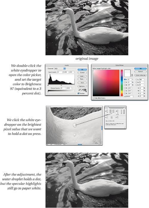 Tip: Use Brightness for Faster Figuring The fastest way to load the eyedroppers with a dot percentage is to use the Brightness field. Subtract the desired dot percentage from 100, then enter the result in the Color Picker's Brightness field. As previously mentioned, we only use this technique when we don't have a good ICC output profile available. Essentially, that boils down to three situations:
The rest of the time, we let the profile handle the minimum dot (though when highlight detail is critical, we always check the numbers in the Info palette). Killing color castsWe also use the eyedroppers on occasion as a quick way to eliminate color casts. The black and white eyedroppers force the pixel on which they're clicked to the target values you set for the tools (the defaults are RGB 255 and RGB 0, respectively), scaling the individual color channels to meet the target value. This behavior can cause some confusion. While the eyedroppers appear in two nonlinear editing tools (see the sidebar "The Nonlinear Advantage," earlier in this chapter), their effect is a linear adjustment. So if you labor mightily in Levels or Curves, then apply the black or white eyedroppers to the image, they promptly wipe out any adjustments you'd already madesee Figure 6-47. This behavior makes us use the eyedroppers only when there's a heavy cast near the shadows or highlights, and we've planned the correction. The gray eyedropperThe gray eyedropper behaves quite differently from the black and white ones. It forces the clicked pixel to the target hue, while attempting to preserve brightness. By default the target is set to RGB 128 gray, since the the tool was designed for gray-balancing. Unlike its black and white counterparts, it doesn't undo other edits you've made in Levels or Curves, though it may change their effect. Figure 6-51. Removing color casts with the eyedropper tools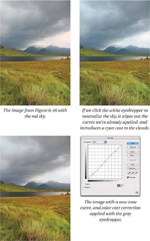 We still use the gray eyedropper occasionally for gray-balancing (as in the example shown in Figure 6-47), but we're much more likely to use Auto Color and tweak the target midtone swatch, because it's more controllable. The results produced by the gray eyedropper depend critically on where you click in the image, while Auto Color responds in a much more predictable fashion while you tweak the target midtone color swatch (see Figure 6-24, much earlier in this chapter). In the example shown in Figure 6-47, we were already in the Curves dialog box, and the gray eyedropper was right there, so it made sense to try it, and in this case we obtained a good result. Figure 6-48 shows a more typical scenario where the gray eyedropper proves to be less useful than Auto Color driven manually. Figure 6-48. The gray eyedropper versus Auto Color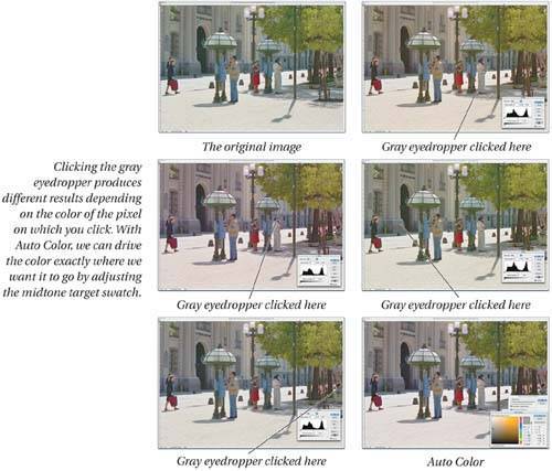 The eyedroppers are pretty old technology, and have largely been superseded by newer additions to Photoshop's Adjustment menu, but occasionally they're just what you need. So investigate them, learn their behavior, and use them, but be aware of their limitations. Freehand CurvesWe'd be remiss if we didn't mention the freehand (pencil) tool in the Curves dialog box, which lets you draw freehand curves rather than bending the curve by placing points. We really have only one use for this, but when we need it, nothing else does the job. We use the freehand tool to handle specular highlights on printing processes where the minimum highlight dot is relatively large, such as laser printer or newsprint output. Trouble in the transition zoneIf you're dealing with newsprint or low-quality printing, the transition zonethat ambiguous area between white paper and the minimum reliable dotcan make your specular highlights messy. Some may drop out, while others may print with a visible dot. The solution is to make a curve that sets your brightest highlight detail to the minimum highlight dot value, and then blows everything brighter than that directly out to white. This is a two-step process.
If this is something you have to do at all often, click the Save button to save the curve. Don't click the Smooth button, because it will smooth the curvewhich in this case is not what you want. You can load the saved curve whenever you need it, or even create an action that you run as a batch to process multiple images. |
EAN: N/A
Pages: 220