ADDING CONVENIENCE WITH TOOLBARS
Another feature commonly found on most Windows applications is toolbars. Toolbars display a collection of buttons, each of which when clicked executes a particular application command. By default, when you add a toolbar to a window, Visual Basic automatically places it at the top of the window, just below the menu, if one is present. However, you can move the toolbar to the bottom, right, or left side of the window if you prefer by setting the Dock property.
Typically, programmers use toolbars to give users single-click access to an application's most commonly used commands. Toolbar buttons can display either text, graphics, or both text and graphics.
The following procedure outlines the steps involved in adding a toolbar to a Visual Basic application and identifies various options that are available to you.
| Trick | The first step in adding a toolbar to a Visual Basic application is to add the ToolBar control located in the Toolbox to a form. However, by default, the ToolBar control is not found in the Toolbox window. But you can add it by right-clicking on the Toolbox window and selecting the Choose items option. This opens the Choose Toolbox Items dialog. Make sure that the .NET Framework Components property sheet is selected, and scroll down until you see ToolBar control. Select the ToolBar control and click on OK. The control will now be visible in the Toolbox window. |
-
Drag and drop the ToolBar control onto your form.
-
Select the ToolBar control, locate the Buttons property in the Properties window, and click on the (Collection) ellipses button located in its property's value field. The ToolBarButton Collection Editor appears as shown in Figure 4.26.
-
Click on the Add button to add as many buttons as you wish to the toolbar. Each time you click on the Add button, an entry for the button is displayed in the Members pane located on the left-hand side of the editor, as demonstrated in Figure 4.27.
-
To display a text string on the button, select the Text property and type in a string as its value.
-
To add a ToolTip to the button, select the ToolTipText property and type in the text that you want to be displayed.
-
Modify the Style property to specify the style that you wish to apply to the button. The following options are available:
-
PushButton. Displays the three-dimensional button.
-
ToggleButton. Toggles the button's appearance between a depressed and normal state each time the user clicks on it.
-
Separator. Changes the button into a separator bar.
-
DropDownButton. Modifies the button to behave as a drop-down control that displays menu items.
-
-
Click on OK to close the ToolBarButton Collection Editor.
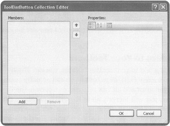
Figure 4.26: Adding and removing buttons to a toolbar.
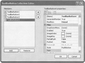
Figure 4.27: Use the up and down arrows to configure the order in which buttons are displayed on the toolbar.
| Trick | If you are adding text to your toolbar buttons, you may need to specify toolbar button width, depending on the amount of text you plan on displaying. To change the width or height of toolbar buttons, select the ToolBar control's ButtonSize property and specify a new size for your toolbar buttons. |
Adding Graphics to Your Toolbars
Instead of displaying text in your toolbar buttons, you can display graphic images. But to do so, you have to take a few extra steps before you can actually associate a graphic with a button. For starters, you must add an ImageList control from the Toolbox to your application. Using this control, you will identify all of the graphics images that you plan on adding to your toolbars. Once added to the ImageList, you can then configure each of your toolbar buttons to display one of the graphics images defined in the ImageList.
The following procedure identifies the steps that are involved in making all this work.
-
Add an ImageList control to your form.
-
In the Properties window, click on the (Collection) ellipses button located in the Images property's value field. The ImageCollection Collection Editor appears as shown in Figure 4.28.
-
Click on the Add button and specify the name of an image to be added to the ImageList. Repeat this step as many times as necessary and make sure that you take note of the index number that is assigned to each image that you add.
-
Click on OK to close the ImageCollection Collection Editor.
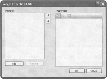
Figure 4.28: Identifying the images that you plan on using to add graphics to your toolbar.
Once you have finished adding images to the ImageList control, go back and select the ImageList property for your ToolBar control and specify the name of the ImageList that you just created. Then open the ToolBarButton Collection Editor by clicking on the Buttons property's (Collection) ellipses button. Modify the ImageIndex property for each button to associate the button with a given graphic image's index number within the ImageList control. For example, Figure 4.29 shows a toolbar under development with an image added to its first button.
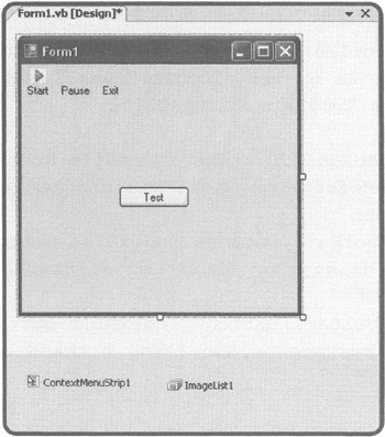
Figure 4.29: Adding a graphic image to a ToolBar control button.
Associating Program Statements with Toolbar Buttons
Unfortunately, individual toolBar buttons do not have their own click event. There is just a single click event for the entire ToolBar control. Therefore, it is up to you to programmatically figure out which button the user clicked on and then to execute the appropriate program statements. Fortunately, it is not too hard to make this happen.
The ToolBarButtonClickEventArgs object's Button property is automatically passed to the ButtonClick event handler at run time. If you look back at Figure 4.27, you will see that just to the left of each toolbar button, there is a number that uniquely identifies the button's indexed position within the toolbar. By querying the Button property and comparing it to the button index numbers, you can identify which button was clicked.
To see how this all comes together, let's look at an example. For starters, access the toolbar's click event by double-clicking on it. The following code will appear in the code editor.
Private Sub ToolBar1_ButtonClick(ByVal sender As System.Object, _ ByVal e As System.Windows.Forms.ToolBarButtonClickEventArgs) _ Handles ToolBar1.ButtonClick End Sub
In addition to defining the click event for the toolbar, this code automatically receives an argument that identifies the index number of the clicked button, which can then be accessed by your code as e.Button, as demonstrated in the following example.
Private Sub ToolBar1_ButtonClick(ByVal sender As System.Object, _ ByVal e As System.Windows.Forms.ToolBarButtonClickEventArgs) _ Handles ToolBar1.ButtonClick If ToolBar1.Buttons.IndexOf(e.Button) = 0 Then MessageBox.Show("You clicked on " & e.Button.Text) End If If ToolBar1.Buttons.IndexOf(e.Button) = 1 Then MessageBox.Show ("You clicked on " & e.Button.Text) End If If ToolBar1.Buttons.IndexOf(e.Button) = 2 Then MessageBox.Show ("You clicked on " & e.Button.Text) End If End Sub In this example, e.Button is an argument representing the index number of the button clicked by the user. The first three statements check to see if the first toolbar button was clicked. The next three statements check to see if the second toolbar button was clicked, and the last three statements check to see if the third toolbar button was clicked.
Figure 4.30 shows the output displayed when the previous example is executed and the user clicks on a button that is named start.
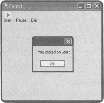
Figure 4.30: Setting up programming logic to respond to button clicks.
| Trick | Because toolbar buttons generally represent commonly used commands already found in a menu, you can speed up application development using the MenuItem object's PerformClick() method to set up the button so that it executes the corresponding menu's click event, just as if the user had clicked it. For example, the following statements execute the click event for a menu item named newToolStripMenuItem in the event the user clicks on the first toolbar button: |
Private Sub ToolBar1 ButtonClick(ByVal sender As System.Object, _ ByVal e As System.Windows.Forms.ToolBarButtonClickEventArgs) _ Handles ToolBar1.ButtonClick If ToolBar1.Buttons.IndexOf(e.Button) = 0 Then newToolStripMenuItem.PerformClick()= End If If ToolBar1.Buttons.IndexOf(e.Button) = 1 Then MessageBox.Show("You clicked on " & e.Button.Text) End If If ToolBar1.Buttons.IndexOf(e.Button) = 2 Then MessageBox.Show("You clicked on " & e.Button.Text) End If End Sub EAN: 2147483647
Pages: 126