Chapter 23: XML Form Development
Overview
Everyone is familiar with forms, either paper or electronic: a set of fields to be completed. Different types of fields exist, such as fill in the blank text boxes, pick one or pick many items, and so on. Some sort of validation usually ensures that fields are filled out (or filled out correctly). The completed form may need to be transmitted electronically. So, why do we need yet another form syntax? Because this new syntax eliminates some limitations of the previous implementations.
This chapter looks at using defining electronic forms using the W3C XForms standard, and the most commonly used proprietary standard, InfoPath. While neither of these methods is as familiar or offers the ease of development of XHTML forms, both bring benefits to the developer. Both syntaxes enforce best practices in software design, separating the model of the data from the implementation. This makes code and form reuse a much easier process. In addition, by enforcing XML standards, you can use other XML standards, such as XSLT or XPath when working with these XML form implementations. Finally, XForms is intended as the forms model of XHTML 2.0, currently a work in progress. Therefore, its importance will only increase as time goes by.
Creating Forms
The most common form syntax in use for electronic forms is that used in HTML/XHTML. Most developers are familiar with this syntax: an outer <form> tag that contains attributes identifying the target of the form and the means to encode the contents. Individual fields are contained within the <form> tags. Listing 23-1 shows a typical XHTML form.
Listing 23-1: An XHTML form
<form action="http://example.com/search" method="post"> Text to search for: <input type="text" name="q" /> <input type="submit" text="Search" /> </form>
This seems simple. So, what's the problem? The most notable problems with the XHTML model are:
-
q In the XHTML model, forms are all single step. The user completes the form and sends it to the target. If more information is needed, the target creates a new form. Creating multistep forms, such as wizards or polls, is a difficult process. Coordination of the steps and supporting the user moving back through the steps is even more difficult.
-
q XHTML forms are essentially a collection of name/value pairs. The data is flat: No way exists to present or create any structure over the data, such as one that identifies a group of fields as participating in an address.
-
q Validation and similar form handling requires the addition of script. Although this is not a problem, it does add another moving part to the system, increasing the chance of an error. In addition, because the script is not XML (it's usually JavaScript), you cannot use XML tools or technologies like XSLT.
Obviously, XForms is intended to solve these problems. XForms is currently a W3C Recommendation, now in the second edition of the 1.0 specification (as of March 2006). In addition, XForms is expected to be part of XHTML 2.0, a standard that is currently working its way through the approval process.
When you first begin to look at XForms, it may seem odd compared to other XML syntaxes. XForms does not define a visual UI as do XHTML or SVG. It does not define a new query syntax like XPath or XQuery. It does not define a schema for the form design or structure. No form element serves as a container for controls. These differences are all by design because XForms is intended to leverage existing standards. It uses XPath as the query syntax to identify nodes in XML data, and it uses XML schema to identify the data types of the form. Finally, although XForms does provide a set of UI controls, it uses them within the UI syntax of the containing XML. For example, you can use XForms syntax within XHTML pages, SVG documents, or any other XML syntax. When you use XForms with XHTML, you add the XForms controls within the XHTML page. By not requiring a new syntax for identifying the physical appearance of the forms, XForms makes it easier to use the same technique across multiple user interfaces.
XForms splits the actual form into three logical pieces: the model, the presentation, and the submit protocol (see Figure 23-1). By separating the form into these three components, XForms allows each to be used independently.
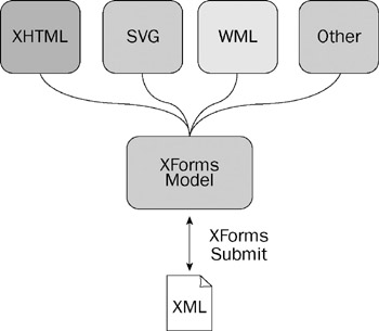
Figure 23-1
XForms Model
The XForms model is the data used by the form, including both the initial data displayed to the user and that submitted to the server. It contains information about the structure of the XML, as well as any constraints or calculations that will be applied to the data. This model is typically added to the <head> of an XHTML page, allowing it to be used anywhere on the page.
Listing 23-2 shows the XForms model for the query form shown in Listing 23-1.
Listing 23-2: The XForms model
<model> <instance> <search> <q>Enter search here</q> </search> </instance> <submission action="http://example.com/search" method="post" /> </model>
Notice that this model does not include controls to identify the fields the form will search. These appear later in the page. Instead, you have the identification of the data used and the action to perform when the model is activated. In this case, some input data is sent via HTTP post to some end point (http://www.example.com/search). Although the example shown here is trivial (and it could easily be argued that the original XHTML version is simpler), it still demonstrates a few benefits of the XForms model. In the XHTML version, the query item is identified as a text box (<input type=“text”>), whereas in the XForms version, this binding is not present. Therefore, the XForms model in Listing 23-2 is not limited to being used on an XHTML page. The same model can be associated with an SVG document, WML page, or even a proprietary XML syntax. It provides reuse of a given action.
The model element serves as a container for the other elements used to describe the data. These optional child elements are the instance, submission, and bind elements.
The instance element defines the initial data used when displaying the form. This may be static data (such as the usual Type here to enter data), default values, or dynamic content. The instance element represents an instance or sample of the model that is used to populate the fields. It should be a valid document based on the schema in use. In the sample in Listing 23-2, the instance holds a single node, search. This, in turn, has a single child element: q. This element holds the default value for the search field. If the instance were to be defined dynamically, it would have been written using linking syntax as shown in the following line.
<instance src="/books/2/381/1/html/2/http://example.com/sourceUrl" />
The submission element defines the target of the model. It is similar to the action attribute of XHTML or HTML forms. One major difference between XHTML and XForms forms, however, is that multiple submission elements can appear in each model.
In addition, the submission element has a number of optional attributes that provide further control over the submission process (see the following table).
| Attribute | Description |
|---|---|
| ref | An XPath expression that defines the data in the instance to be submitted. This is useful when most of the data in the instance is read-only. Using this attribute, you can define the changing data and submit only that data. |
| action | Like the XHTML form tag, this attribute defines the target URL for the submission. |
| method | Like the XHTML form tag, this attribute defines the HTTP method to use for the submission. Unlike XHTML, however, no default value exists for this attribute. |
| replace | Optional attribute that defines how to replace the instance data after submission. The default is to replace all the instance data. However, you can also set it to instance to replace the data in a named instance, none to replace none of the data, or use a qname to identify the data to replace. |
| version | Identifies the version of XML to use when serializing the data for submission, typically 1.0. |
| indent | Optional attribute that determines if additional whitespace should be added when serializing the data. Typically, you set this to yes if the target needs human-readable data, and to no if you want to reduce the data volume. |
| mediatype | String identifying the mediatype to use when submitting the data. This should either be application/xml, or a subtype that is compatible, such as application/atom+xml. |
| encoding | Optional attribute that defines the encoding to use when serializing the data before submission. |
| omit-xml-declaration | Optional attribute that determines whether the serialized data includes the XML declaration. |
| standalone | Optional attribute that determines whether the serialized data includes the standalone attribute on the XML declaration. |
| cdata-section-elements | Space-delimited string listing the child elements that are wrapped with CDATA sections before submission. |
| separator | String value that defines the character that are used to separate name/value pairs during encoding. The default value is ;. |
| includenamespaceprefixes | Space-delimited list of namespace prefixes that should be included in the serialized data. If this is omitted, the default behavior is to include all namespaces. However, this means that the XForms namespace are included in the serialized data unnecessarily. Typically, if you use this attribute, include only the namespace prefixes used to define the data in your model. |
The bind element is one of the methods of connecting user interface controls to the instance. The bind element serves as a named mapping of data to user interface. Typically, this element is used to create a global mapping, as opposed to the other methods that associate individual controls to their data. You see this and the other methods of connecting the two in the user interface section that follows.
The complete XHTML page containing the query model is shown in Listing 23-3.
Listing 23-3: XHTML page with XForms query
<?xml version="1.0" encoding="UTF-8"?> <html xmlns="http://www.w3.org/1999/xhtml" xmlns:xf="http://www.w3.org/2002/xforms" xmlns:ex="someURI"> <head> <title>Search</title> <xf:model> <xf:instance> <ex:search> <ex:q>default value</ex:q> </ex:search> </xf:instance> <xf:submission action="http://example.com/search" method="post" /> </xf:model> </head> <body> <p> <xf:input ref="ex:q"> <xf:label>Text to search for:</xf:label> </xf:input> <br/> <xf:submit submission="search"> <xf:label>Search</xf:label> </xf:submit> </p> </body> </html>
The page includes the XForms and XHTML namespaces. In addition, another namespace is defined for the instance. Although this last step is not completely essential, it is a good practice. Remember that this instance is not required to physically be part of this document and could, instead, be coming from some dynamic source such as a JSP, ASP.NET, or PHP file.
The model serves as the container for the instance, or sample data, and the submission. In this simple case, the instance consists of a root node with a single child. This particular form might have been much simpler in XHTML. However, this simple example shows you some of the benefits of XForms. The default value is set when the form is loaded (see Figure 23-2). In addition, notice the isolation between the model and the user interface. This isolation enables you to more easily use this same model in other XForms applications. As you move on to more complex XForms forms, more benefits become evident.

Figure 23-2
You are not limited to a single model in each XForms form. Listing 23-4 shows a form containing two models. The model attribute is used to identify the model providing data and structure for each control.
Listing 23-4: Hosting multiple models
<?xml version="1.0" encoding="UTF-8"?> <html xmlns="http://www.w3.org/1999/xhtml" xmlns:xf="http://www.w3.org/2002/xforms" xmlns:ex="someURI" xmlns:my="someOtherURI"> <head> <title>Hosting multiple models</title> <xf:model > <xf:instance> <ex:contact> <ex:name>Foo deBar</ex:name> <ex:title>Consultant</ex:title> </ex:contact> </xf:instance> </xf:model> <xf:model > <xf:instance> <my:company> <my:name>Foobar Ent.</my:name> </my:company> </xf:instance> </xf:model> </head> <body> <h1>Hosting multiple models</h1> <xf:input ref="/ex:contact/ex:name" model="model1"> <xf:label>Name: </xf:label> </xf:input><br /><br /> <xf:input ref="/my:company/my:name" model="model2"> <xf:label>Company: </xf:label> </xf:input> </body> </html>
Each model in the page is identified using the id attribute. Later, the desired model is selected via the model attribute on user interface controls. The resulting document (see Figure 23-3) displays one field from each of the two models. Each block of content could be simultaneously sent to the appropriate submission target.
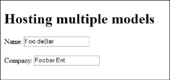
Figure 23-3
Just like XHTML (or HTML) and other form creation languages, XForms defines a number of user interface controls for creating items. These include simple text-entry fields, lists, check boxes, and file upload fields. One of the important distinctions between the XForms UI controls and their XHTML equivalents is that the XForms controls do not define their eventual appearance on the page. That is, the XHTML select element is defined as creating a list, and it has attributes that define the appearance of the eventual list (such as the number of elements to display); but the XForms select has no such definition of appearance. XForms clients are free to render the control in whatever form they desire, as long as the behavior remains constant. Therefore, a multiselect list can appear as a list box or as a series of check boxes. Either would provide the intent of a multiselect list. The XForms implementation is responsible for selecting the actual user interface.
XForms Controls
The controls defined with XForms are similar to their XHTML counterparts, and include:
-
q input-This is the XForms TextBox control (see Figure 23-4), and is similar to the XHTML input type=“text” control.
<input ref="contact/name"> <label>Name</label> </input>

Figure 23-4 -
q textarea-Used to enter multiple lines of text (see Figure 23-5). This is equivalent to the
<textarea ref="contact/address"> <label>Address</label> </textarea>

Figure 23-5 -
q secret-An input field that does not display the inputted text (see Figure 23-6), typically used for passwords or other information that should remain hidden. This is equivalent to the XHTML input type=“password” field.
<secret ref="contact/password"> <label>Password:</label> </secret>

Figure 23-6 -
q output-A field that displays content. This is comparable to a standalone Label control. Typically, the information comes from the model, but this is not essential.
<output ref="contact/company" />
-
q select-A field that enables selection from a list, as shown in Figure 23-7. This is equivalent to the XHTML select field. However, although the XHTML select field defines the output as a list box, this control does not. Both single and multiple selections are supported by the XForms select control. The options for the list can either be included in the definition of the select field or populated through binding. To include options in the definition, use one or more <item> elements, with label and value children. The label becomes the visible entry in the list, whereas the value is what is written to the model.
<select ref="/contact/lang"> <label>Languages spoken: </label> <item> <label>English</label> <value>en</value> </item> <item> <label>French</label> <value>fr</value> </item> <item> <label>Spanish</label> <value>es</value> </item> <item> <label>German</label> <value>de</value> </item> </select>
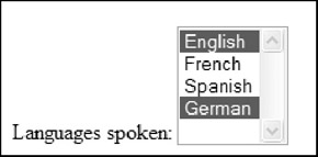
Figure 23-7 -
q select1-A version of the select control that ensures only a single item is selected, as shown in Figure 23-8. The implementation may render this control as a combo box, list box, or as a list of option buttons.
<select1 ref="ccard"> <label>Department</label> <item> <label>Development</label> <value>dev</value> </item> <item> <label>Human Resources</label> <value>hr</value> </item> <item> <label>Management/label> <value>mgmt</value> </item> </select1>
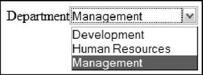
Figure 23-8 -
q range-A control that allows the user to select a value from a range of values, as shown in Figure 23-9. No equivalent to this control exists in XHTML, although some environments (such as Windows Forms) have this type of control. Those environments typically render this control either as a text box with associated up and down values or as a gauge.
<range ref="hireDate" start="1996" end="2006" step="1"> <label>Hire Date:</label> </range>

Figure 23-9As you can see from the preceding sample, the range element has three additional attributes. The start and end attributes define the lower and upper bounds of the range, whereas the step attribute defines the frequency of the available choices.
-
q upload-A control that enables file upload, as shown in Figure 23-10, equivalent to the XHTML input type=“file” field. This field requires more information than the others because you must define the fields that hold the URI and media type of the selected file.
<upload ref="photo" mediatype="image/*"> <label>Select photo: </label> <filename ref=@filename /> <mediatype ref=@mediatype/> </upload>

Figure 23-10
Two additional controls initiate an action, such as a calculation or submitting data.
-
q submit-A control that causes the data to be submitted to the server. This is equivalent to the input type=“submit” of XHTML. Typically, this control renders as a button, but that is not required. This control does not refer to an element in the model. Instead, it refers to a submission element in the model by id. It enables the separation of the user interface from the action performed when the item is clicked.
<submit submission="contactForm"> <label>Save</label> </submit>
-
q trigger-A control that initiates some action, such as a calculation. This is equivalent to the input type=“button” of XHTML. As you would expect, this is typically rendered using a button.
<trigger> <label>Add</label> </trigger>
Common Control Children
Keen-eyed developers might note that no static text or label control is listed in the preceding section. XForms defines a common child element (label) that provides this functionality. This and other child elements that may be applied to any of the controls include:
-
q label-Provides a caption for the control.
-
q help-Provides assistance to the user during the completion of the form.
-
q hint-Provides assistance to the user during the completion of the form. This differs from the help element as it is generally less intrusive than help.
-
q alert-Provides a message used if the data entered is not valid.
Rather than using a standalone label control as in XHTML, XForms requires a label child element for all controls. This provides two benefits. First, the implementation can provide additional support for merging the two items, such as mnemonics or arranging the two controls close to one another. It also ensures that a label defines what each field represents. The label is also provides a handy way of identifying field captions when you need to apply CSS to the page.
The message element provides a means of communicating to the user. The message element defines a string that is displayed, either constantly or in reaction to a particular event. This element has an optional attribute-level-that defines how the message should be displayed. This attribute can be modal, modeless or ephemeral. Each implementation is responsible for defining the result of these three levels, but on desktop implementations, they are usually rendered as modal dialog, modeless dialog and tooltip, respectively.
The setvalue element assigns a value to the control when an event occurs (see Listing 23-5). This can be an alternative to using the calculate attribute when you are interested only in when particular events, such as xforms-invalid or DOMFocusIn, occur.
Listing 23-5: Adding message and setvalue elements
<input ref="ex:startDate"> <label>Start Date: </label> <message level="ephemeral" ev:event="DOMFocusIn"> Enter the start date for the report </message> <setvalue ev:event="xforms-ready">2006-04-01</setvalue> </input>
The hint element is intended to assist the user while he is completing the form. The content of the hint can either be inline, as shown in the code listing, or from the instance or an external source (via the src attribute). Implementations typically show the hint using a ToolTip if available. Therefore, the hint element is equivalent to the following.
<message level="ephemeral" ev:event="xforms-hint">Message</message>
The help element is also intended to assist the user, but this assistance is more visible. For example, the FireFox implementation displays the help beside the field (see Figure 23-11). However, X-Smiles does not seem to display the help element. The help content can either be inline or from the instance or external source. The help element is equivalent to the following message.
<message level="modeless" ev:event="xforms-help" ev:propagate="stop">Message</message>

Figure 23-11
Listing 23-6 shows adding the help, hint and alert elements to form items.
Listing 23-6: Adding help, hint, and alert elements
<input ref="my:name"> <label>Name: </label> <help>Help for the name field</help> <hint>Hint for the name field</hint> <alert>Alert for the name field</alert> </input> <input ref="my:value"> <label>Integer Value: </label> <help>Help for the value field</help> <hint>Hint for the value field</hint> <alert>Alert for the value field</alert> </input>
The alert element is displayed if the field's value is invalid. As shown earlier, the implementation is responsible for the result, but the typical response is to display an error dialog (see Figure 23-12). Some implementations, such as X-Smiles, also highlight the fields containing errors.
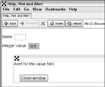
Figure 23-12
Changing Control Appearance
Many of the controls have multiple appearances. For example, the select and select1 controls may be rendered either as a list, or by using check boxes/option buttons (see Figure 23-13). This is not required, however, and each implementation is responsible for the final rendering. As an example, the X-Smiles implementation uses the same rendering for all settings for the select control.
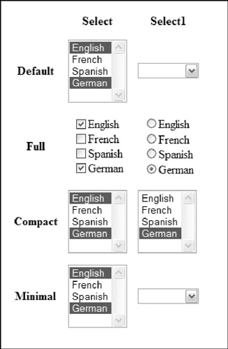
Figure 23-13
In addition, if the XForms content is in an XHTML container, the author can add CSS selectors or other elements, as needed, to style the controls and their labels.
Grouping Controls
When you are developing forms, note that data frequently fits into logical groups. For example, a form may have a number of fields that describe an address; those fields are a logical group. Alternately, when designing your forms, you may want certain fields to appear together, even on an independent page. XForms provides grouping functions to create these logical or visible groupings.
To create a simple association among multiple fields, use the group element. This is a container element that provides a hint to the implementation to associate the controls. Listing 23-7 shows a fragment containing two sets of the same controls; with and without a group element wrapping them. The result is shown in Figure 23-14.
Listing 23-7: Simple control grouping
<xf:input ref="ex:firstName"> <xf:label>First Name: </xf:label> </xf:input> <xf:input ref="ex:lastName"> <xf:label>Last Name: </xf:label> </xf:input> <xf:input ref="ex:title"> <xf:label>Title: </xf:label> </xf:input> <br/> <xf:group> <xf:label>Name: </xf:label> <xf:input ref="ex:firstName"> <xf:label>First: </xf:label> </xf:input> <xf:input ref="ex:lastName"> <xf:label>Last: </xf:label> </xf:input> </xf:group> <xf:input ref="ex:title"> <xf:label>Title: </xf:label> </xf:input>
![]()
Figure 23-14
Like other user interface controls, the group control accepts common child elements and attributes, such as label, ref, and so on. Using the ref attribute can simplify your forms if you are creating a form for a nested block of XML. The ref attribute can identify a common parent for the contained controls. Without the ref attribute, you must provide the full XPath expression for a child element. Listing 23-8 shows the group element with and without using ref.
Listing 23-8: Using ref with group
<xf:group> <xf:input ref="exp:employee/exp:name"> <xf:label>Employee:</xf:label> </xf:input> <xf:input ref="exp:employee/exp:employeeID"> <xf:label>Employee ID:</xf:label> </xf:input> </xf:group> <xf:group ref="exp:employee"> <xf:input ref="exp:name"> <xf:label>Employee:</xf:label> </xf:input> <xf:input ref="exp:employeeID"> <xf:label>Employee ID:</xf:label> </xf:input> </xf:group>
Without the reference, you must provide the full XPath to retrieve the employee name. With the intermediate ref, the context of all fields within the group is set to the employee element.
Although the group element does not really provide any feature that is not available in XHTML, the switch element does. The switch element enables the creation of multipage forms, such as wizards. Using switch elements, and the associated case elements, you define pages. The logic behind the form can then direct users to pages based on their input. Listing 23-9 shows a simple three-page form that steps the user through a set of questions.
Listing 23-9: Using switch to create multiple pages
<xf:switch> <xf:case selected="true"> <xf:input ref="ex:name"> <xf:label>What is your name?</xf:label> </xf:input> <xf:trigger> <xf:label>Next</xf:label> <xf:toggle ev:event="DOMActivate" case="two"/> </xf:trigger> </xf:case> <xf:case > <xf:textarea ref="ex:quest"> <xf:label>What is your quest?</xf:label> </xf:textarea><br /> <xf:trigger> <xf:label><</xf:label> <xf:toggle ev:event="DOMActivate" case="one"/> </xf:trigger> <xf:trigger> <xf:label>></xf:label> <xf:toggle ev:event="DOMActivate" case="three"/> </xf:trigger> </xf:case> <xf:case > <xf:input ref="ex:color"> <xf:label>What is your favorite color?</xf:label> </xf:input><br /> <xf:trigger> <xf:label><</xf:label> <xf:toggle ev:event="DOMActivate" case="two"/> </xf:trigger> <xf:trigger> <xf:label>Finish</xf:label> <xf:toggle ev:event="DOMActivate" case="summary"/> </xf:trigger> </xf:case> <xf:case > <xf:output value="ex:name"> <xf:label>Name:</xf:label> </xf:output> <br /> <xf:output value="ex:quest"> <xf:label>Quest:</xf:label> </xf:output> <br /> <xf:output value="ex:color"> <xf:label>Color:</xf:label> </xf:output> <br /> <br /> <xf:trigger> <xf:label>Start again</xf:label> <xf:toggle ev:event="DOMActivate" case="one"/> </xf:trigger> </xf:case> </xf:switch>
Each page of information is contained within a case element. The element should have an id to identify the case. This is used when navigating between pages. Figure 23-15 shows the three pages of this form.
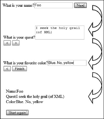
Figure 23-15
The cases do not need to be the entire content on each page, as shown here. You could have one section of the form that changes based on the selection made on another form.
The final form of complex user interfaces uses the repeat element. This creates a repeating section of other controls and is the typical way of creating a table-like structure in XForms. The contained controls are repeated for each element in a list of nodes (see Figure 23-16). See the binding section that follows for the syntax for binding to a repeating section.

Figure 23-16
Binding Instance Data
After you have the model and the user interface, the next step is to connect the two of them. XForms performs this act using binding via XPath expressions. After a user interface control has been bound to a field in the model, it is automatically updated as the underlying data changes.
Binding is done with the bind element, and the ref and nodeset attributes. The bind element is an optional child element of the model. The ref and nodeset attributes are typically applied directly to controls, although nodeset is also used in the bind element. Binding can either be simple or complex. Simple binding refers to a single node bound to a control, like the input element. The ref attribute is used to select a single node via an XPath expression. Complex binding associates multiple nodes with a single control, as is done with select controls. The nodeset attribute identifies the desired nodes via an XPath expression.
The bind element describes the rules that apply to a later reference to an element. Multiple bind elements can exist in the model element. Each identifies an XPath expression and can represent either a single node or nodeset. The bind rules are applied whenever that node or nodeset is displayed later in the form. When defining a bind element, you can apply additional attributes to the element to control how the binding occurs. These additional attributes, referred to as the model item properties, are described in the following table.
| Attribute | Description |
|---|---|
| type | This attribute is equivalent to the xsi:type attribute and identifies the data type of the binding. Adding the attribute here, as opposed to in the schema or instance, overrides default behavior. It also guarantees the intended type. One additional benefit of using this attribute is that it can be applied to attributes or elements. Therefore, you can use the binding to guarantee that an id attribute uses an xs:integer value. |
| readonly | Prevents the user of the form from changing the value. This also provides a hint to the user interface that implementations may use to grey out the field or otherwise identify the field as read-only data. |
| required | Ensures that the data is given a value before the form is submitted. The user interface implementation may use this to provide additional feedback to the user. |
| relevant | Identifies bindings to be included in the serialization and tab order. This is typically used in multipart wizards or forms that have optional sections. If a binding is set to relevant=false, it is ignored. Rather than an explicitly entered value, however, it is usually a calculated value. For example, the following fragment identifies three bindings. The discount field is only relevant if the product of the price and quantity bindings is greater than 100 (see Figure 23-17).
<xf:model> <xf:instance> <ex:data> <ex:item> <ex:price xsi:type="xs:decimal"/> <ex:qty xsi:type="xs:integer">1</ex:qty> <ex:discount xsi:type="xs:decimal"/> <ex:total xsi:type="xs:decimal"/> </ex:item> </ex:data> </xf:instance> <xf:bind nodeset="ex:item/ex:price" required="true()" /> <xf:bind nodeset="ex:item/ex:qty" required="true()" /> <xf:bind nodeset="ex:item/ex:discount" relevant="../ex:price*../ex:qty > 100" calculate="../ex:price*../ex:qty*0.1" readonly="true()" /> <xf:bind nodeset="ex:item/ex:total" readonly="true()" calculate="((../ex:price * ../ex:qty)-../ex:discount)" /> </xf:model> |
| calculate | Provides an expression that is used to calculate the value of a field. |
| constraint | Provides an expression that must be true for the model to be considered valid. This is useful to provide validation for your forms. The following fragment tests to ensure that the to field is later than the from field.
<xf:model> <xf:instance> <ex:dateRange> <ex:from xsi:type="xs:date"/> <ex:to xsi:type="xs:date" /> <ex:days xsi:type="xs:integer" /> </ex:dateRange> </xf:instance> <xf:bind nodeset="ex:from" required="true()" /> <xf:bind nodeset="ex:to" required="true()" constraint="days-from-date(.) > days-from-date(../ex:from)" /> <xf:bind nodeset="ex:days" calculate="days-from-date(../ex:to) - days-from-date(../ex:from)" readonly="true()" /> </xf:model> |

Figure 23-17
The ref attribute associates the single node identified by an XPath expression to a control. If an appropriate bind element is present, those rules are applied. The XPath expression is applied based on the current context and can include additional XPath or XForms functions (see Listing 23-10).
Listing 23-10: Simple binding
<xf:input ref="exp:date"> <xf:label>Date:</xf:label> </xf:input> <xf:input ref="exp:date" />
The nodeset attribute identifies a set of data for controls that require more information, such as select and select1. Although these controls still have a ref attribute that identifies the value of the controls, they also need to be bound to a list of items to display. This list is identified using either the <choices> element, or the <itemset nodeset=“”> child element (see Listing 23-11). The choices element is used to hard-code the list of items to display. The itemset extracts a set of nodes from the target instance.
Listing 23-11: Complex binding
<?xml version="1.0" encoding="UTF-8"?> <html xmlns="http://www.w3.org/1999/xhtml" xmlns:xf="http://www.w3.org/2002/xforms" xmlns:ev="http://www.w3.org/2001/xml-events" xmlns:xsi="http://www.w3.org/2001/XMLSchema-instance" xmlns:xs="http://www.w3.org/2001/XMLSchema" xmlns:ex="someURI"> <head> <title>Data binding</title> <xf:model> <xf:instance> <ex:months selected="apr"> <ex:month value="jan">January</ex:month> <ex:month value="feb">February</ex:month> <ex:month value="mar">March</ex:month> <ex:month value="apr">April</ex:month> <ex:month value="may">May</ex:month> <ex:month value="jun">June</ex:month> <ex:month value="jul">July</ex:month> <ex:month value="aug">August</ex:month> <ex:month value="sep">September</ex:month> <ex:month value="oct">October</ex:month> <ex:month value="nov">November</ex:month> <ex:month value="dec">December</ex:month> </ex:months> </xf:instance> </xf:model> </head> <body> <p> <xf:input ref="@selected"> <xf:label>Selected: </xf:label> </xf:input><br /> <xf:select ref="@selected"> <xf:itemset nodeset="/ex:months/ex:month"> <xf:label ref="." /> <xf:value ref="@value" /> </xf:itemset> </xf:select> </p> </body> </html> The ref attribute points at the selected attribute of the root element, whereas the nodeset expression in the itemset extracts the list of months to display. Both the choices and itemset elements require that you identify the text to display and the value for each item. This is done with the label and value elements respectively. Figure 23-18 shows this form running. The input control is also bound to show how changing either field updates the model and the controls. Try changing the text in the input field to nov to see the select field update.
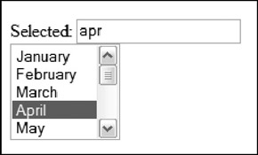
Figure 23-18
The second use of the nodeset attribute occurs when you are displaying repeating elements (see Listing 23-12).
Listing 23-12: Using the repeat element
<xf:repeat nodeset="ex:employee"> <xf:input ref="ex:name"> <xf:label>Name: </xf:label> </xf:input> <xf:input ref="ex:title"> <xf:label>Title: </xf:label> </xf:input> </xf:repeat>
The entire group of repeating elements is bound to the nodeset identified by the XPath expression, “ex:employee”. This also sets the context, so that the contained controls are mapped to the children of that node. Each of the controls within the repeat element repeats for each node in the selected set.
When the type of the data is identified, either by including a schema in the model or by adding the type attribute to the instance or a bind expression, many implementations change the appearance of the controls to data-type-aware versions. The most commonly used version occurs when the data type is “xs:date” or one of the related date types. Many implementations provide a date picker control (see Figure 23-19).
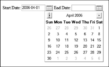
Figure 23-19
XForms Submit Protocol
After the user is finished interacting with the XForm, it is time to submit the form. The behavior during submission is defined by the active submission element. During submission, the data is serialized into a form for transmission. It is then sent to the target URL.
The first step in the submission process is the serialization of the form into the form needed. This is determined by the relationship of the protocol defined in the action attribute and the method used. Therefore, a different serialization model is used for sending the data via HTTP GET than for saving the file locally using a PUT. The following table outlines some of the more common combinations.
| Protocol | Method | Serialization format |
|---|---|---|
| HTTP, HTTPS | GET | application/x-www-form-urlencoded |
| HTTP, HTTPS, mailto | POST | application/xml |
| HTTP, HTTPS, file | PUT | application/xml |
The fragment in Listing 23-13 defines a form that saves the data locally.
Listing 23-13: Submitting XForms
<model> <instance> <ex:contact> <ex:firstName>Foo</ex:firstName> <ex:lastName>deBar</ex:lastName> <ex:title>Developer</ex:title> </ex:contact> </instance> <submission method="put" action="file:///C:/temp/output.xml" includenamespaceprefixes="ex"/> <submission method="GET" action="http://server/endPoint" includenamespaceprefixes="ex" separator="&"/> </model> Listing 23-14 shows the output of each of the submission methods.
Listing 23-14: Data serialization
PUT/file (application/xml):
<?xml version="1.0" encoding="utf-8"?> <ex:contact xmlns="http://www.w3.org/1999/xhtml" xmlns:ex="someURI"> <ex:firstName>Foo</ex:firstName> <ex:lastName>deBar</ex:lastName> <ex:title>Developer</ex:title> </ex:contact>
GET/HTTP (application/x-www-form-urlencoded):
http://www.localhost:32932/work/Dump.aspx?firstName=Foo&lastName=deBar&title=Developer
POST/HTTP (application/xml):
<ex:contact xmlns="http://www.w3.org/1999/xhtml" xmlns:ex="someURI"> <ex:firstName>Foo</ex:firstName> <ex:lastName>deBar</ex:lastName> <ex:title>Developer</ex:title> </ex:contact>
Multipart-POST/HTTP (application/multipart):
-----------------------------57052814523281 Content-Type: application/xml Content-ID: <41bb.26e9@mozilla.org> <ex:contact xmlns="http://www.w3.org/1999/xhtml" xmlns:ex="someURI"> <ex:firstname>Foo</ex:firstname> <ex:lastname>deBar</ex:lastname> <ex:title>Developer</ex:title> </ex:contact> -----------------------------57052814523281-
The includenamespaceprefixes attribute is applied to restrict the namespaces in the XML to the XHTML and example namepaces.
Note that for the GET request, the separator is set to “&”. This ensures that each parameter is sent as a name/value pair. If you fail to do this, the default separator (;) is sent.
EAN: 2147483647
Pages: 215