Using DTCs
You have seen several examples of using DTCs earlier in the book. Those examples were created using the drag-and-drop features of the Data Environment to hook up the DTCs to a data command object. In this section, we will explore how to use DTCs in our applications and either set their properties or manually link them to a database.
You can use DTCs in any ASP or HTML application. Like any HTML control, DTCs have properties and they can be driven by scripting exactly like HTML controls can. However, DTCs are quite different from HTML controls because they expose an event model that allows you to script activities for them on both the client and the server.
To use a DTC, simply place it on a page. The easiest way to do this is to drag the control from the Toolbox and drop it onto a page, as illustrated by the following steps:
- Open the file you wish to work on in the editor.
- Drag the DTC from the Toolbox.
- Drop the DTC onto the page.
The DTC will be added into the location where you drop it. If the page contains HTML tags, you can insert the DTC into a specific tag. For example, if your page contains an HTML table, you can place DTCs in the table. To demonstrate how to work with DTCs in production applications, I created a simple page that contains an HTML table and a few DTCs. The HTML table is used for formatting. The DTCs will contain the data. Figure 6-9 shows the page with a title and a subtitle. I typed both of these elements directly into the page using Design view. Then I highlighted each element and formatted its text with the HTML toolbar (the one containing the word Normal and showing the other style buttons).
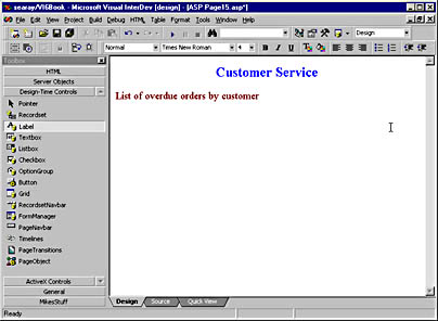
Figure 6-9. Using Design view is the easiest way to add new visual features to a page.
Next I selected Insert Table from the Table menu. This command displayed the dialog box shown in Figure 6-10.
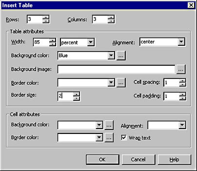
Figure 6-10. The Insert Table dialog box allows you to quickly insert an HTML table or change an existing HTML table's properties.
Then I clicked OK to close the dialog box and insert the table. This resulted in the following code being inserted into the file:
<TABLE align=center border=2 cellPadding=1 cellSpacing=1 width=85%> <TR> <TD></TD> <TD></TD> <TD></TD></TR> <TR> <TD></TD> <TD></TD> <TD></TD></TR> <TR> <TD></TD> <TD></TD> <TD></TD></TR></TABLE>
Using the HTML toolbar and other features—such as the Table menu—simplifies many of the standard procedures for building a Web application with Visual InterDev.
Now that we have a table in the page, we can add DTCs to it.
- Drag a DTC from the Toolbox.
- Drop it into the appropriate cell in the table.
The results of this operation are shown in Figure 6-11.
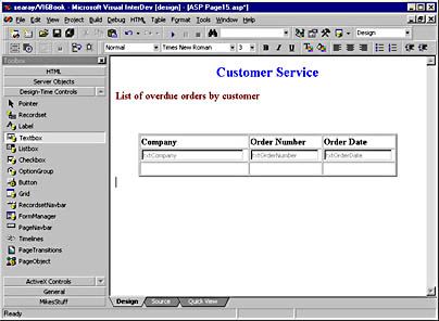
Figure 6-11. DTCs can be used with other HTML elements.
To complete the interface settings, I changed the widths of the Textbox DTCs from 20 characters to 30 characters. This also adjusted the DTCs' widths in the table.
Working with Data-Bound Controls
Now let's look at how to wire up DTCs to a page without dragging and dropping them from the Data Environment and a data command object. First you must place a Recordset DTC onto the page.
- Open an ASP file in the editor.
- Drag a Recordset DTC from the Toolbox.
- Drop the Recordset DTC onto the page.
- Right-click the Recordset DTC, and select Properties from the context menu.
- Change the properties for the Recordset DTC. To do so, you can enter the SQL for the command directly into the DTC, you can select a data command object, or you can use the SQL Builder button to start the Query Designer and build the query graphically. When you have finished updating the Recordset DTC's properties, click Close.
Now that you have a Recordset DTC on the page, you can add your other DTCs and bind them to the Recordset DTC.
- Drag a DTC from the Toolbox, and drop it onto the page.
- Right-click the DTC, and choose Properties.
- In the Recordset drop-down list, select the name of the Recordset DTC that will supply the data to this DTC.
- In the Field drop-down list, select the name of the recordset field that the data-bound DTC will display.
The above steps link the new DTC to the Recordset DTC. Figure 6-12 shows the txtCompany Textbox DTC. The Properties window shows the Recordset property set to Recordset1 and the DataField property set to CompanyName.
To complete the page shown in Figure 6-12, I added two more Textbox DTCs and the RecordsetNavbar DTC. The Textbox DTCs are wired to Recordset1, and their DataField property is set to the appropriate field from the recordset. The RecordsetNavbar DTC has its Recordset property set to Recordset1.
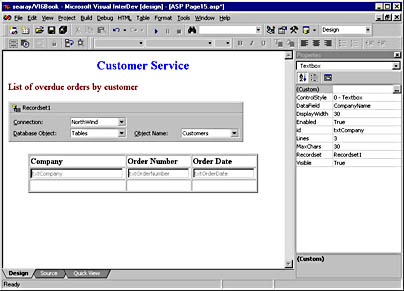
Figure 6-12. You can use the data-binding features of certain DTCs to wire the DTCs to a recordset.
If you change the Update On Move property of the RecordsetNavbar DTC to True, this DTC will let any user update the records displayed in the page. For example, to change the company name, you just make the change in the txtCompany Textbox and then click one of the RecordsetNavbar scroll buttons. The completed page is shown in the browser in Figure 6-13.
The following DTCs can be bound to data sources:
- Textbox
- Listbox
- Checkbox
- OptionGroup (radio buttons)
- Label
- Grid
- Recordset
- RecordsetNavbar
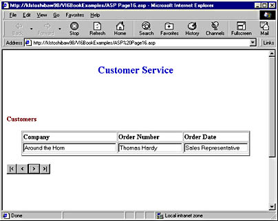
Figure 6-13. A Recordset DTC, a RecordsetNavbar DTC, and data-bound Textbox DTCs combine to produce a simple database-driven Web page.
When working with the Recordset DTC, you might see an error pop up. Figure 6-14 shows the error message you might receive when you drop a Recordset DTC on a page and the DTC cannot find the data connection it attempts to default to. The Recordset DTC tries to set itself to the first data connection (in alphabetical order) it finds. If it cannot find the first connection, it retries for several seconds and finally shows the message in Figure 6-14.
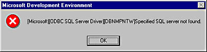
Figure 6-14. The Recordset DTC generates this error when it cannot find the default data connection.
Adding Other DTC Features
A number of DTCs included with Visual InterDev 6 allow you to better control both the appearance and the usability of a page.
Using the Textbox DTC
To demonstrate the Textbox DTC (and the rest of the DTCs in this chapter), the remaining examples will use a new ASP file. This file will start with the Recordset DTC and the Textbox DTC and then be modified to include other DTCs as well.
The first version of the page (CustomerInformation.asp) is shown in Figure 6-15.
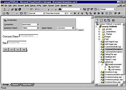
Figure 6-15. This page contains one Recordset DTC and two Textbox DTCs that are linked to the Recordset DTC.
The first thing you notice is that the two Textbox DTCs do not line up. We will fix this in the next version when we add the Label DTC.
Let's take a look at the Textbox DTCs and their properties. Figure 6-16 shows the Properties dialog box for one of the Textbox DTCs. You can see that we have changed the name of the DTC to txtName. The Display Width and Max Characters properties have been changed to 30. You can change one of these properties without changing the other, so be careful when modifying these properties.
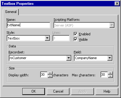
Figure 6-16. The Properties dialog box for the txtName Textbox DTC.
You can set the Style property to one of these options:
- Textbox Standard single-line text box
- Text Area Provides a multiline text box
- Password Provides an HTML password field for password data
The default for the Style property is Textbox. If you set Style to Text Area, the Lines property is enabled, allowing you to specify how many lines of display are allowed in the DTC.
If you want to hide the DTC when the page displays, you can uncheck the Visible property. This property can be set to True via script at run time.
The Enabled property allows users to edit data in the DTC. If you uncheck Enabled, the DTC will be read-only.
Using the Label DTC
The Label DTC can be used to insert read-only text onto a page. For example, let's say you want to retrieve a field such as CustomerName from the database, display it on an editable page, but restrict users from editing the field. The Label DTC is perfect for this task because it is always read-only. The text can be stored in the DTC or retrieved from a database by binding the Label DTC to a recordset.
Figure 6-17 shows the second version of the CustomerInformation.asp page. First I added an HTML table and placed the DTCs in it to align them. Then I replaced the first Textbox DTC with a Label DTC. Now the CustomerName field is read-only.
The data-binding properties for the Label DTC are set to the same settings as the Textbox DTC in the first version of the page. You cannot see the table in this example because the table has a border size of zero and is used merely to align the fields. By following the steps below, you can set Design view to display a border on tables (and other elements that have a zero border), making them easier to work with.
- Select Options from the Tools menu.
- Expand the HTML branch.
- Click the HTML Editor node.
- Check the Borders property in the Design View Display section.
The Format tab of the Label Properties dialog box is shown in Figure 6-18. The properties have been changed to specify a particular font and font size.
If you do not specify any properties on the Format tab, the Label DTC will use the properties currently in use in the page where the Label DTC is located. If you want to place the Label DTC on a page but not have it show, uncheck the Visible check box.
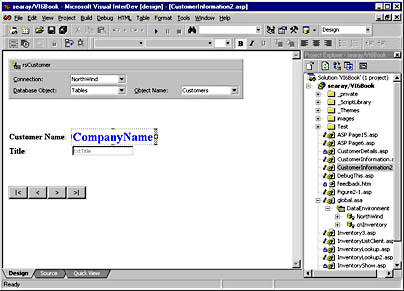
Figure 6-17. The Label DTC provides an easy way to display read-only information.
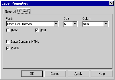
Figure 6-18. The Format tab of the Label Properties dialog box allows you to control the appearance of the Label DTC.
The Data Contains HTML check box should be checked when the field contains HTML coding. When you check this box, the field will be output with Response.HTMLEncode to ensure users that the HTML code is properly handled. If the field contains HTML and this option is not checked, the Label will display the field and HTML codes. If the option is checked, the Label will correctly display the field.
Using the Listbox DTC
The Listbox DTC can be used to display data from a database, look up data from a database, and display values from a static list. It works similarly to the Listbox control in Visual Basic.
Figure 6-19 shows the CustomerInformation3.asp file in Design view. The page now contains a Listbox DTC that displays the contact's title. The Listbox DTC is live in Design view—click the Listbox's arrow, and the options in the list will display. Figure 6-19 shows President (the first item in the list) as the first setting.
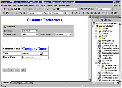
Figure 6-19. The Listbox DTC provides an easy way to set up user-selectable lists in a Web page.
Like the other DTCs, the Listbox is linked to the recordset using the data-binding properties, as shown in Figure 6-20. The Style property sets the type of list to display—this example uses a drop-down list. The other option is to set Style to ListBox, which will display a multirow list. If you select the ListBox option, you can control the number of lines that appear in the list by using the Lines property.
Also like most other DTCs, the Listbox DTC contains the Visible and Enabled properties.
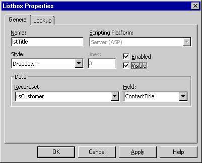
Figure 6-20. The General tab of the Listbox Properties dialog box is used to set the data-binding properties and the style attributes.
The values in the list are static and are set using the Lookup tab of the Listbox Properties dialog box, shown in Figure 6-21.
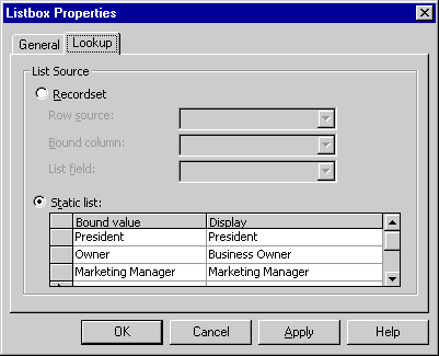
Figure 6-21. The Lookup tab of the Listbox Properties dialog box lets you specify how the list will be populated.
You set the static list's values by following these steps:
- Click the Static List option button.
- Click the first Bound Value cell, and enter the value of the first item in the list.
- Click the Display cell, and enter the name to display in the list.
- Repeat steps 2 and 3, as necessary, to populate the rest of the list.
When the application executes, the Listbox DTC will display the first item from the Display column of the static list. The value of the Listbox DTC is the item from the corresponding Bound Value column of the static list. When the user clicks the arrow for the list, he or she can select a new item. The DTC will update its display and value to match the entry selected from the list. For instance, if the user selects "Business Owner" from the list shown in Figure 6-21, the Listbox DTC displays "Business Owner" and its value is set to "Owner."
The Listbox DTC uses an intrinsic HTML Select list to display the list and provide the interaction for the user. Below is the list code inserted in the HTML stream for this example:
<SELECT name=lstTitle id=lstTitle size=1> <OPTION value="President">President</OPTION> <OPTION value="Owner">Business Owner</OPTION> <OPTION value="Marketing Manager">Marketing Manager</OPTION> </SELECT>
The Listbox DTC automates the process of binding the Select list to the database for both retrieval and update operations.
You can also set the properties on the Lookup tab to populate the list from a database. Populating the list from a database will be covered in later chapters.
Using the Checkbox DTC
The Checkbox DTC creates a Checkbox for a page. The DTC uses the intrinsic HTML check box but makes it bindable to a recordset, like the Listbox and other DTCs.
Figure 6-22 shows CustomerInformation4.asp with a Checkbox DTC in Design view. To create this page, I added a couple of rows to the existing table. To insert a row into a table, you must click a cell of the table and then select Insert Row from the Table menu. The new row is inserted just before the row of the cell you clicked.
Next I dropped a Checkbox DTC into the table, as shown in Figure 6-22. In the figure, the Checkbox DTC is bound to the rsCustomer recordset. The Field property of the Checkbox DTC is set to the MailBrochures field of the recordset. The MailBrochures field has an Access Yes/No data type. If you check the Checkbox DTC, its value will be set to 1, while unchecking the DTC sets its value to 0. The Name and Caption properties were changed to reflect the data contained in the DTC.
Table 6-1 (taken from the Visual InterDev documentation) lists the various values for a particular data type that will result in a checked or cleared Checkbox DTC. The MailBrochures field used in our example is an Access Yes/No field and results in 1 showing checked and 0 showing cleared. Make sure you understand the various options before you bind the Checkbox to a recordset field.
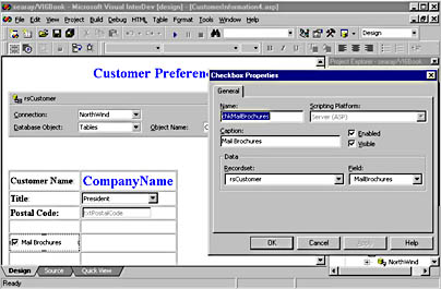
Figure 6-22. The Checkbox DTC can be bound to a database column.
Table 6-1.
| Data Type of DataField | Displays Checked | Displays Cleared |
|---|---|---|
| Boolean | True | False |
| Bit | 1 | 0 |
| String, Char | "True" | "" |
| Integer | Nonzero | 0 |
| Floating-point | Nonzero | 0 |
| Currency | Nonzero | 0 |
| Date/Time | N/A | N/A |
| All other data types | N/A | N/A |
The value that is written to the recordset depends on the field's data type and the Checkbox DTC's state. Table 6-2 below (also taken from the Visual InterDev documentation) lists the various values for a particular data type that will be stored in the recordset when the user checks or clears the check box.
Table 6-2.
| Data Type | Checked | Cleared |
|---|---|---|
| Boolean | True | False |
| Bit | 1 | 0 |
| String, Char | "True" | "" |
| Integer | -1 | 0 |
| Floating-point | -1.0 | 0.0 |
| Currency | -1 | 00.0 |
| Date/Time | N/A | N/A |
| All other data types | N/A | N/A |
Using the OptionGroup DTC
The OptionGroup DTC uses the intrinsic HTML radio buttons to create a group of buttons the user can choose from. Unlike a group of Checkbox DTCs, the user can choose only one button from the OptionGroup DTC. This allows you to create a group of mutually-exclusive items and let the user select one without your having to check the user's actions with script.
Figure 6-23 shows CustomerInformation4.asp with an OptionGroup DTC in Design view. To create this page, I added a new table with one row. Next I dropped the OptionGroup DTC into the table. Then I configured the DTC using the Properties dialog box.
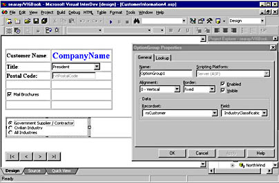
Figure 6-23. The OptionGroup Properties dialog box allows you to configure the OptionGroup DTC and bind it to a database.
Figure 6-23 shows the configuration of the properties to bind the OptionGroup DTC to a database table and to set the border for the control. The other properties on the General tab are set at their default values.
The OptionGroup buttons can be set from either a static list or from a database table. The values in the list are static and, as was the case with the Listbox DTC, are set using the Lookup tab of the OptionGroup Properties dialog box. You enter the list by following these steps:
- Click the Static List option button.
- Click the first Bound Value cell, and enter the value of the first option button.
- Click the corresponding Display cell, and enter the label that will appear next to the option button.
- Repeat steps 2 and 3 as necessary.
You can set the OptionGroup buttons from a database by binding the DTC to a field. The steps to accomplish this are:
- Display the OptionGroup Properties dialog box.
- Click the Lookup tab.
- Click the Recordset option button in the List Source section of the page.
- Select the Recordset DTC to use from the Row Source drop-down list.
- Select the field that will represent the values for the option buttons from the Bound Column drop-down list.
- Select the field that will provide the labels for the option buttons from the List Field drop-down list.
Using the Grid DTC
The Grid DTC allows you to build a page that displays data from a database and lets the user navigate through the rows in the recordset. The Grid Properties dialog box lets you easily set the properties that control the Grid DTC's run-time characteristics.
Figure 6-24 below shows the Grid DTC just after being dropped onto the CustomerList.asp file in Design view and having its properties displayed. The General tab allows you to select from a number of preset Autoformat styles for the Grid DTC. In this example, the Autoformat style is set to Basic Navy. The Autoformat style controls the appearance of the Grid DTC. The Preview box shows a sample of what the Grid DTC will look like at run time. If you select an Autoformat style and then change any formatting properties, Preview is disabled.
You can also uncheck the Display Header Row check box to turn off the header.
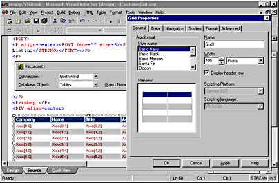
Figure 6-24. The General property page is used to change the layout and style of the Grid DTC.
Figure 6-25 shows the Data property page, which is used to bind the Grid DTC to a Recordset DTC. First, select the appropriate Recordset DTC from the Recordset drop-down list. Then, to add a field to the Grid DTC, check the check box to the left of the field's name in the Available Fields list. You can remove a field from the Grid DTC by unchecking this field.
You can also format the titles used for the header row on this page. Figure 6-25 shows the page after the titles have been reformatted:
- CompanyName becomes Company
- ContactName becomes Name
- ContactTitle becomes Title
To reformat a header caption, select the field to reformat in the Grid Columns list, change the caption for it in the Header property in the Edit Columns section, and then click the Update button.
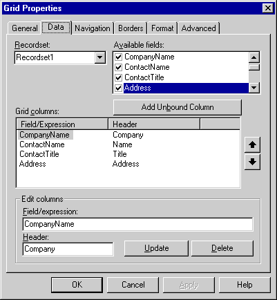
Figure 6-25. The Data property page is used to bind the Grid DTC to a Recordset DTC and to set the Grid DTC's related data-bound properties.
The Field/Expression property can contain expressions to reformat the data in the column. The following expression can be used to create an anchor tag that allows the user to link to another page based upon the company's name:
="<a href=www." + [CompanyName] + ".com>" + [CompanyName] + "</a>"
For example, the line above will output the following HTML if the CompanyName field contains the string "32X":
<a href=www.32X.com>32X</a>
You can use this technique with a Web address to format the data in any way you need to, such as creating an FTP link or an email link. You can also use HTML formatting and JScript functions in the Field/Expression property.
The Navigation page shown in Figure 6-26 below sets the properties that control how users navigate through the data in the Grid DTC. If you want to let users scroll through the data one page at a time, set this functionality by checking the Enable Paging check box and setting the Records/Page property. The default is 20, but it is often best to set it to 5 or 10, depending upon the length of the fields you are displaying.
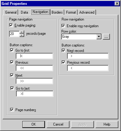
Figure 6-26. The Navigation property page is used to specify how the user can navigate through the data in a Grid DTC.
If you enable paging, the following default buttons are used to navigate through the pages in the recordset:
- |< Goes to the first page
- << Goes back one page
- >> Goes forward one page
- >| Goes to the last page
Checking the Enable Row Navigation check box allows the user to navigate through the page one row at a time. If you enable this option, the < and > buttons will move the highlight bar one row at a time.
You can also control exactly how the Grid DTC looks at run time by using the Borders page and the Format page, shown in Figures 6-27 and 6-28. The Borders page controls the style of borders used for the Grid DTC. Figure 6-27 shows the 3D border selected and a gray background color selected in the Grid Background property.
The Format property page controls the formatting of the Grid DTC. This page will override the default properties of one of the Autoformat styles. If you change a property here, the Preview box on the General tab will no longer work.
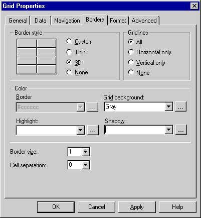
Figure 6-27. The Borders property page is used to set the border properties of the Grid DTC.

Figure 6-28. The Format property page is used to change the formatting of the Grid DTC.
The Format property page is useful for explicitly controlling the format of the Grid DTC. You can change the format for the header, the detail rows, or any particular column. First click the corresponding button at the top of the property page to select the area to change. Then make your changes, and click the Apply button when you are finished. You must click the Apply button before you move to the next section.
You can change the size of the columns directly by using the mouse. First click the Grid DTC to select it, then move the mouse over the border between two columns until you see it turn into a pointer with an arrow on each end. Now click the border and drag the mouse to change the size of the column. You can also change the size of the Grid DTC by dragging the sizing handles on either side to the right or left.
Figure 6-29 shows the Grid DTC in the CustomerList.asp page in Internet Explorer. You can see the formatting that was applied with the Grid DTC property pages.
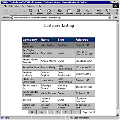
Figure 6-29. The finished Grid DTC in action.
The first row in the data area has a darker background than the others because it is the current row. If you click the < or > buttons, the highlight moves down one record at a time.
EAN: 2147483647
Pages: 143