Using an feGaussianBlur Filter Primitive
|
|
|
Shadows and the feGaussianBlur Filter Primitive
Consider the rectangles rendered in Figure 7.2.
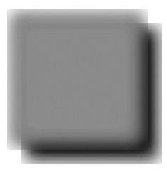
Figure 7.2: An feGaussianBlur with a shadow effect.
The SVG document in Listing 7.2 demonstrates how to use the SVG filter element with an feGaussianBlur filter primitive in order to render a rectangle with a blurred shadow filter effect.
Listing 7.2 rectBlurShadowFilter1.svg
 |
<?xml version="1.0" encoding="iso-8859-1"?> <!DOCTYPE svg PUBLIC "-//W3C//DTD SVG 20001102//EN" "http://www.w3.org/TR/2000/CR-SVG-20001102/DTD/svg-20001102.dtd"> <svg width="100%" height="100%"> <defs> <filter filterUnits="objectBoundingBox" x="0" y="0" width="100%" height="100%"> <feGaussianBlur stdDeviation="8"/> </filter> </defs> <g transform="translate(100,100)"> <rect x="10" y="10" width="100" height="100" filter="url(#blurFilter1)" fill="black" stroke="black" stroke-width="4"/> <rect x="0" y="0" width="100" height="100" filter="url(#blurFilter1)" fill="red" stroke="black" stroke-width="4"/> </g> </svg>
|
Remarks
The SVG code in Listing 7.2 creates a blurred shadow effect by rendering two rectangles that differ only by the value of their fill attribute: one is red and the other is black. Notice that the SVG defs element contains an feGaussianBlur filter primitive that is the same as the feGaussianBlur filter primitive defined in Listing 7.1.
The rendering of the two rectangles occurs in the SVG g element, which specifies the SVG translate function that shifts the origin from the point (0,0) to the point (100,100). Next, the SVG g element renders two rectangles, the first of which is given below:
<rect x="10" y="10" width="100" height="100" filter="url(#blurFilter1)" fill="red" stroke="black" stroke-width="4"/>
This rectangle is red and has a width of 100 pixels, a height of 100 pixels, and a black perimeter that is four pixels wide. The upper-left vertex of the rectangle is the point (10,10). The rectangle contains a fill attribute whose value is blurFilter1, which references a blur filter that is defined in the SVG defs element.
The SVG code for the second rectangle in the SVG g element is :
<rect x="0" y="0" width="100" height="100" fill="red" stroke="black" stroke-width="4"/>
This rectangle is also red and has a width of 100 pixels, a height of 100 pixels, and a black perimeter that is four pixels wide. The upper-left vertex of the rectangle is the point (0,0). The rectangle contains a fill attribute whose value is blurFilter1, which references a blur filter that is defined in the SVG defs element. When you consider the type of image that this SVG document generates, the code is remarkably succinct. Obviously, the real work is taking place in the feGaussianBlur filter primitive, so you don't have to worry about the complexity of the underlying mathematics. This is only your second example of using an SVG filter primitive, and you already know how to create three-dimensional blur effects!
|
|
|
EAN: 2147483647
Pages: 362