Chapter 32. Designing Button States
| Button states are the different appearances that a graphical button takes on depending on how the visitor interacts with it. DHTML-based Web sites generally define two button states: the default state, which determines how the button looks normally; and the onMouseOver state, which determines how the button looks when the visitor mouses over it. (A JavaScript rollover function switches between the two button states.) Sites built with Macromedia Flash usually include a third state: onClick, which determines how the button looks when the visitor clicks it.
Button states provide invaluable visual feedback on the average, link-infested Web page. With so much content crammed into a typical browser window, having things happen in response to mouse movements and clicks helps your visitors figure out how to use your site.
When it comes to designing states for your buttons, you want to capitalize on the psychology of what's going on. In other words, you want your visual effects to correspond to the way your visitor's mind works. You don't want to contradict the psychologydoing the opposite of what your visitor's mind expectsor your site sends mixed messages, and your visual feedback creates confusion instead of improving usability. Here's the theory: Design button states with increasing energy. To borrow the catchphrase of a famous TV chef, each successive button state needs to "kick it up a notch," following the logical order of how the visitor interacts with the button. Therefore, the default button state needs to be the one with the least amount of energy, since the visitor isn't interacting with it at all. The onMouseOver state needs to kick it up a notch, almost like the button absorbs the kinetic energy that the visitor generates by rolling the mouse. And the onClick state (if you have one) has to kick it up another notch to correspond to the additional kinetic energy of clicking the mouse. What you're doing here is graphically duplicating the way a real-world object like a machine operates: Energy goes in, and something happens. Your computer's LED doesn't switch off when you power up and then stay on all night after you power down. That doesn't make intuitive sense. Yet how many graphical buttons have you seen on the Web that seem to switch off when you mouse over them? If you design your buttons so that they go down a notch when your visitor interacts with them, it seems like they're devouring energy and contradicting the laws of physics like a bad Star Trek plot. When energy goes in, something happens. What happens exactly is up to you, but Table 32.1 offers some suggestions, and Figure 32.1 shows a few sequences of button states.
Figure 32.1. These button-state sequences go from lower energy to higher energy, just as the visitor intuitively expects.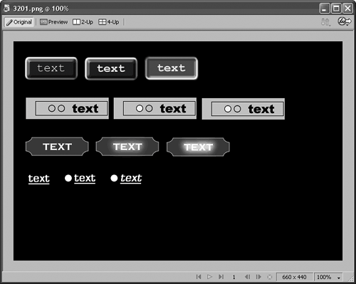
|
- Chapter VII Objective and Perceived Complexity and Their Impacts on Internet Communication
- Chapter X Converting Browsers to Buyers: Key Considerations in Designing Business-to-Consumer Web Sites
- Chapter XIV Product Catalog and Shopping Cart Effective Design
- Chapter XVII Internet Markets and E-Loyalty
- Chapter XVIII Web Systems Design, Litigation, and Online Consumer Behavior