Choosing Text and Background Colors
| People don't read text on a Web page. They don't have time for it. It slows them down too much. Instead, they like to skim and pick out the bits and pieces of information that interest them. Blame it on the collapse of Western civilization or too much TV and video games if you want, but browsing habits are what they are. As a designer, the best thing you can do for the text of your site is to make it easy to skim. Contrast is the most important tool in your toolbox in this regard. You want your text to stand out from the background easily, so that roving eyes can skim without having to squint or slow down and read the text word for word. If you don't have enough contrast, as in Figure 5.1, you make it harder for your visitors to skim your text, which makes it harder for them to find what they need. Figure 5.1. Your visitors are skimmers, and low-contrast text is hard to skim.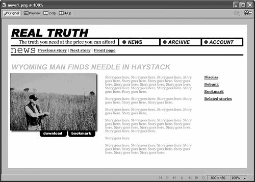 At the same time, the kind of contrast is important, too. Glaring or gaudy contrast like the kind in Figure 5.2 does two things: It draws too much attention to text, which ought to recede into the background when your visitors don't need it; and it forces your visitors' eyes to work harder than they should, which causes headaches and eyestrain. The ideal text/background contrast is clear in the sense that the text stands out, but it is quiet in the sense that it doesn't overpower the design. Figure 5.2. Glaring contrast may be easy to read, but notice how it draws too much attention to itself.
You can't go wrong with black text on a white background, as in Figure 5.3. The contrast is good, and it's easy on the eyes. If you can make this color scheme work in your design, then it's your best bet overall. Figure 5.3. When it comes to contrast, nothing beats black text on a white background.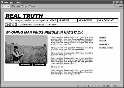 Don't feel locked into this scheme, though. There are plenty of good reasons to try different combinations of colors. Washed-out or desaturated tints of colors can be just as effective as white in the background, as in Figure 5.4. You can experiment with light text against a dark background, as in Figure 5.5, although it is generally harder on the eyes. If your site is on the text-heavy side, a scheme like this might not be the best choice. Figure 5.4. Light tints of background color can be effective, at the same time giving your site some character. Notice how well white works as a highlight color in this example. Figure 5.5. You can also try light text on a dark background, but it isn't as easy on the eyes. Even if you don't have much text on your site, take care in choosing the background color of the pages. The background should stay in the background as much as possible. You don't want it to siphon away attention from the main content of your pages. The background isn't the place for bright or unusual shades. Save those for highlightselements that you use specifically to draw attentionand let your content be the star of the show. |