Section 17.5. Making Clickable Images
17.5. Making Clickable ImagesClickable images aren't just about buttons in the nav bar. Resourceful web designers like to squeeze every bit of functionality from the elements on their pages, and an easy way to do this is to turn images into links. One very common practice is to link to the home page of the site from the logo image at the top of the layout. Happily, turning an image file into a link is simplicity itself. Select the image in the document window, and proceed as if you had just selected a string of text. Follow the steps for internal links, pop-up windows, named anchors, external links, or email links, depending upon what you want the link to do. By default in the browser, a visible border appears around the clickable image. The color of the border corresponds to the state of the link. However, Dreamweaver automatically turns off this border by setting the value of the Border field in the Property Inspector to 0, as Figure 17-17 shows. If you want to make the border visible, change this value. Generally, a value of 1 is sufficient, but the higher the number, the heavier the border. Figure 17-17. The default border of the linked image has a value of 0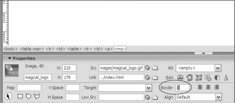 There are several other kinds of clickable images that you might want to add to your site. This section goes over the most common types. 17.5.1. Making Rollover ImagesRollover images can sit anywhere on your page, not just in the nav bar. To add a rollover image, create separate graphics for the up and over states, and save these files in the img or images folder of your site. Then choose an insertion point in the document window, open the menu of image objects in the Insert panel, and grab the Rollover Image object as shown in Figure 17-18. Figure 17-18. Selecting the Rollover Image object from the menu of image objects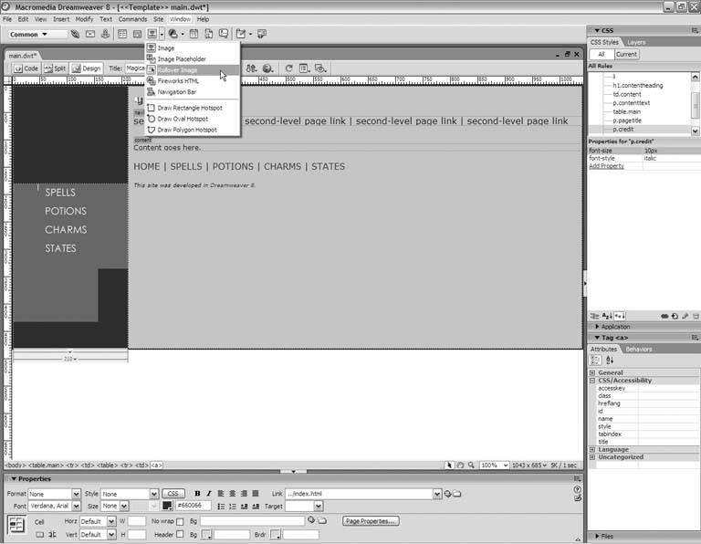
When you do, the Insert Rollover Image dialog box appears, as Figure 17-19 shows. In the Image Name field, type a brief but descriptive name for the image. Figure 17-19. Add the rollover image with the Insert Rollover Image dialog box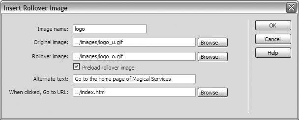 Click the Browse buttons next to the Original Image and Rollover Image fields, and navigate to the up- and over-state graphics files, respectively. Also, be sure to check the Preload Rollover Image option for smoother animation. In the Alternate Text field, supply the textual description of the image. Because this is a clickable image, you want to begin the description with a verb. Tell your visitors what to expect when they click. Finally, click the Browse button next to the When Clicked field, and navigate to the page to which you want to link. If you're linking to an external site, type the URL in the field instead. When you click OK, Dreamweaver adds the rollover to the page. 17.5.2. Making Image MapsAn image map is a graphic with one or more clickable regions or hotspots. Image maps come in handy when the banner for your site is a large, continuous image, of which the logo is a small part. Instead of making the entire banner image clickable, you can define an image map that makes just the logo portion clickable. Here's how:
Figure 17-21 shows an image map with a rectangular hotspot over the logo portion of the banner image. The hotspot links to the home page. Figure 17-21. A hotspot over the logo in the banner links to the home page
17.5.3. Making Control Buttons for a Flash MovieHere's a clever trick for the Flash fanatics among us. By way of Dreamweaver behaviors, you can insert buttons that control the playback of a Flash movie. Here's what you need:
Start by choosing an insertion point in the document window. Then go to the Insert panel, and click the Table object. What you want to do is create a table that holds the Flash movie and the control buttons, just to keep them together as a unit. If you're against using tables in this way, you don't need the table to make the buttons work, but your design may be less elegant. In the Table dialog box, specify a table with two rows and one column, as Figure 17-22 shows. The border, padding, and spacing values are up to you. Click OK to insert the table. Figure 17-22. Creating a table to house the Flash movie and its control buttons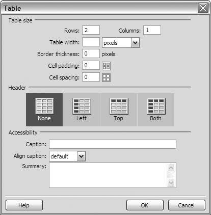
Click inside the top cell of the table, and insert the Flash movie. Go back to the Property Inspector to supply a brief but descriptive identifier for the movie and to uncheck the Loop and Autoplay options, as shown in Figure 17-23. Figure 17-23. Setting the properties of the Flash movie object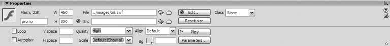 Now click in the bottom table cell and insert the button images, as Figure 17-24 shows. If you use a method that asks for a link destination, such as the Insert Rollover dialog box, supply the hash sign (#) to create a self-referential link. When you finish, position the buttons as you prefer and give them self-referential links (if they don't already have them). Select each button in turn, and type the hash sign in the Link field of the Property Inspector. Figure 17-24. Insert the button images in the bottom cell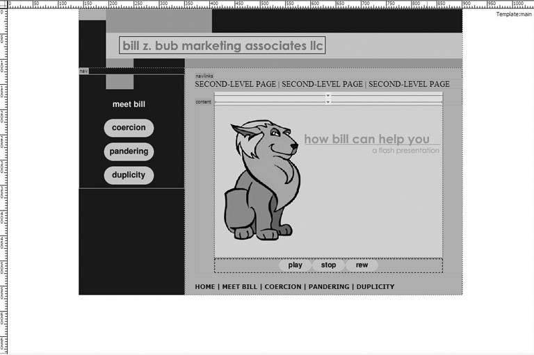
Select the first button in the document window. Then go to the Tag Selector, and click the <a> tag to select the button's link. Your next stop is the Behaviors panel. If you don't see the Behaviors panel on screen, choose Window Figure 17-25. Add the Control Shockwave Or Flash behavior to each button in turn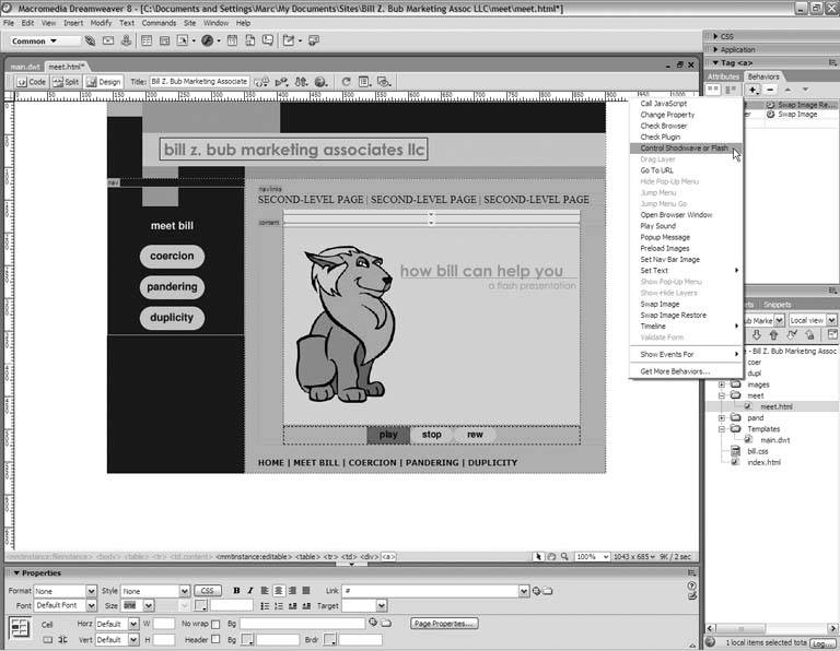 This gives you the Control Shockwave Or Flash dialog box shown in Figure 17-26. From the Movie menu, select the identifier of the movie. Then, do one of the following: Figure 17-26. The Action field sets the function of the button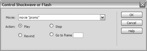
Click OK to add the behavior to the button. Repeat this process for the remaining buttons, and you've got your own movie control panel. Save your page, and preview it in a live browser to test the buttons, as in Figure 17-27. Figure 17-27. Testing the control buttons in a live browser window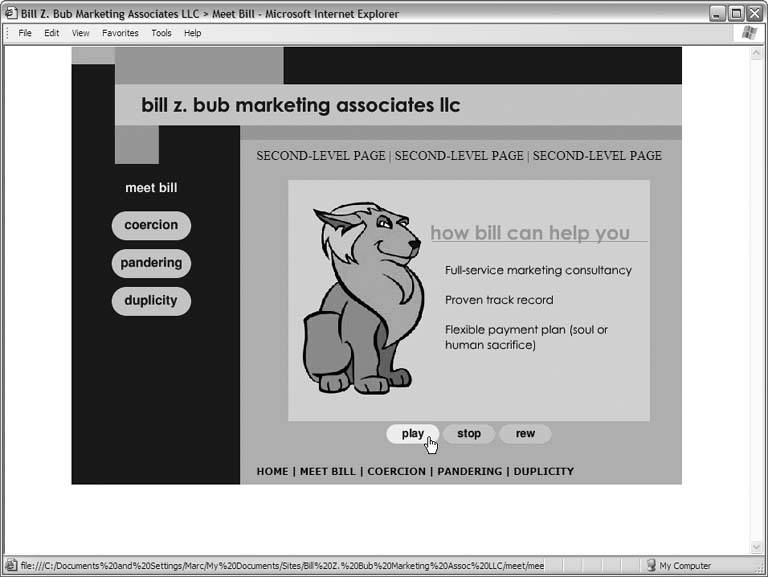 |
 Behaviors from the main menu. Click the plus button on the Behaviors panel, and choose the Control Shockwave Or Flash behavior from the menu that appears, as shown in Figure 17-25.
EAN: 2147483647
Pages: 154