Chapter 22: Analyzing Data with PivotTable Reports
A PivotTable report is a special kind of table that summarizes information from selected fields of a data source. The source can be a Microsoft Office Excel 2007 list, a relational database file, an Online Analytical Processing (OLAP) cube, or multiple consolidation ranges (multiple ranges containing similar data, which the PivotTable can assemble and summarize). When you create a PivotTable, you specify which fields you're interested in, how you want the table organized, and what kinds of calculations you want the table to perform. After you build the table, you can rearrange it to view your data from alternative perspectives. This ability to "pivot" the dimensions of your table-for example, to transpose column headings to row positions-gives the PivotTable its name and its analytical power.
Introducing PivotTables
PivotTables are linked to the data from which they're derived. If the PivotTable is based on external data (data stored outside Excel), you can choose to have it refreshed at regular time intervals, or you can refresh it whenever you want.
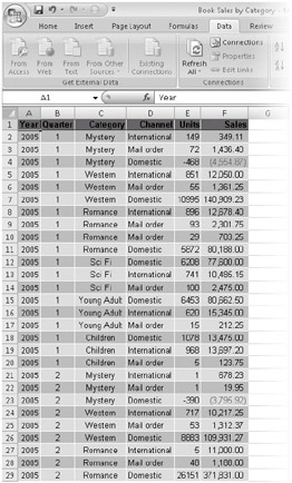
Figure 22-1 shows Books. xlsx, a list of sales figures for a small publishing firm. The list is organized by year, quarter, category, distribution channel, units sold, and sales receipts. The data spans a period of eight quarters (2005 and 2006). The firm publishes six categories of fiction (Mystery, Western, Romance, Sci Fi, Young Adult, and Children) and uses three distribution channels-domestic, international, and mail order. It's difficult to get useful summary information by looking at a list like this, even though the list itself is well organized.

Figure 22-1: It's difficult to see the bottom line in a flat list like this; turning the list into a PivotTable will help.
On the CD You'll find the Books. xlsx file in the Sample Files section of the companion CD.
Figures 22-2 through 22-4 show several ways you can transform this flat table into PivotTables that show summary information at a glance.
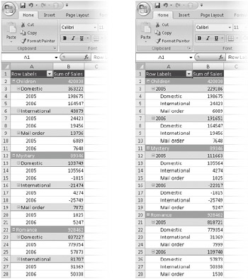
The example on the left in Figure 22-2 breaks the data down first by category, second by distribution channel, and finally by year, with the total sales at each level displayed in column B. Looking at this table, you can see (among many other details) that the Children category generated domestic sales of $363, 222, with more revenue in 2005 than in 2006.

Figure 22-2: These two PivotTables provide summary views of the information in Figure 22-1.
In the example on the right in Figure 22-2, the per-category data is broken out first by year and then by distribution channel. The data is the same; only the perspective is different.
Both the PivotTables shown in Figure 22-2 are single-axis tables. That is, we've generated a set of row labels (Children, Mystery, Romance, and so on) and set up outline entries below these labels. (And, by default, Office Excel 2007 displays outline controls beside all the headings, so we can collapse or expand the headings to suit our needs.)
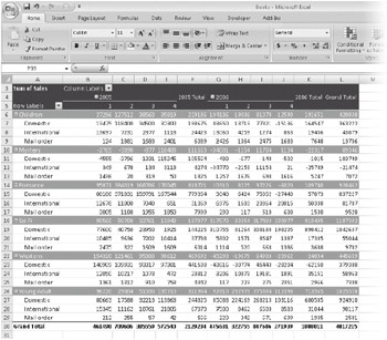
Figure 22-3 shows a more elaborate PivotTable that uses two axes. Along the row axis, we have categories broken out by distribution channel. Along the column axis, we have years (2005 and 2006). And we added the quarterly detail (not included in the Figure 22-2 examples) so we can see how each category in each channel did each quarter of each year. With four dimensions (category, distribution channel, year, and quarter) and two axes (row and column), we have a lot of choices about how to arrange the furniture. Figure 22-3 shows only one of many possible permutations.

Figure 22-3: In this PivotTable, we've rearranged the data along two axes-rows and columns.
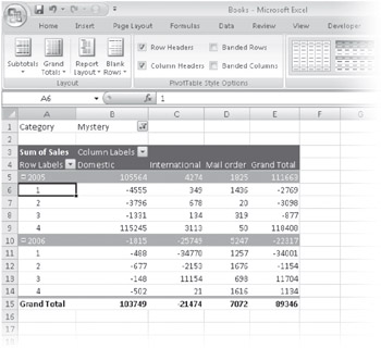
Figure 22-4 presents a different view. Now the distribution channels are arrayed by themselves along the column axis, while the row axis offers years broken out by quarters. The category, meanwhile, has been moved to what you might think of as a page axis. The data has been filtered to show the numbers for a single category, Mystery, but by using the filter control at the right edge of cell B2, we could switch the table to a different category (or combination of categories). Filtering the Category dimension by one category after another would be like flipping through a stack of index cards.

Figure 22-4: This PivotTable presents a "filtered" view, confining the report to a single category.
None of these tables required more than a few clicks to generate.
EAN: 2147483647
Pages: 260