Creating Reports in Design View
Creating Reports in Design View
Although this is a book about programming Access, let's review manual report design techniques for the same reasons we discussed report wizards. Access has an immensely powerful set of manual design techniques for reports. If you're a consultant building solutions for clients, many of your clients will expect you to deliver solutions that they can easily maintain and modify after your consulting engagement expires . Even if you manually design reports, there are many programmatic ways to make them dynamic after you create them. However, you will discover that crafting the basic layout of controls on a report is often best accomplished graphically.
This section explores three aspects of report functionality. First it examines techniques for expediting the manual layout of reports and their controls. Next , it moves on to discuss sorting and grouping techniques for the rows in a report's record source. Within this discussion, I'll cover the sorting and grouping of string data separately from the sorting and grouping of other kinds of data. The section concludes with a review of building reports that involve parent-child relationships. When I present this final topic, I'll drill down further into custom grouping and subreports. Here you'll learn how to use a chart just as you would a subreport.
Manually Laying Out a Customer Phone List Report
Although using the report wizards can expedite the preparation of specialized reports, you might find that they do not provide the flexibility you need for some custom reports. Even if you start with a wizard, it's probable that you will enter Design view to customize a report. Depending on your requirements, you might decide to build a report from scratch in Design view.
This section describes building the Customer Phone List report in Design view. The Design view for the finished report appears in Figure 6-8. You'll find the sample report, which is named rptManCustomers , in the sample database for this chapter. Notice that the report contains a Detail section sandwiched by the Page Header and Page Footer sections. The report populates all these sections with text box and label controls. A Report Header section contains a label control that displays the report's title. Since the Report Footer section has no controls, I dragged its bottom edge to make it flush with its top edge so that this section won't occupy any space on the report.
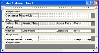
Figure 6.8: A Customer Phone List report prepared manually in Design view.
You can start to create a report similar to the one depicted in Figure 6-8 by using a blank report based on the default Report template. Unless you changed the Normal report template, the blank report will have a Detail section sandwiched between the Page Header and Page Footer sections. You create the blank report by double-clicking Design View in the New Report dialog box.
Immediately after opening the blank report, you should assign it a record source. Do this by opening the report's Properties dialog box. When you first open the report, it has the focus by default. However, if you've changed the focus to a particular section of the report, use the drop-down box at the top of the Properties dialog box to reselect the report. Then, select the Data tab on the Properties dialog box and click the drop-down arrow in the Record Source list. This opens a list of existing tables and queries in the current database. For this example, choose the Customers table as the report's record source. You can also enter a custom SQL string as the Record Source setting, or you can click the Build button to the right of the Record Source box. The Build button opens a graphical Query Designer that lets you create a custom record source for a report.
The next step is to add text box and label controls to the Detail and Page Header sections, respectively. If the Field List box isn't already open, open it by clicking the Field List button on the Report Design toolbar. When you initially drag a field from the list to the report's Detail section, that field appears with a label and a text box. Drag the CustomerID field from the Field List box to the report's Detail section. The label caption is the field name followed by a semicolon. To conform to our design goals, the caption needs to reside in the Page Header section. Therefore, you must select the label control, cut it from the Detail section, and paste it into the Page Header section. (To select a particular section, click the bar at the top of the section.) After you paste in the label control, it remains selected in the top-left corner of the Page Header section. Next, align the left edges of the label and text box controls. You can do this by holding down the Shift key and clicking the text box to select both the label and text box controls. Then, choose Format, Align, Left to align the left edges of the two controls. If you do not regularly design forms and reports manually, spend a moment exploring the Format menu, which offers commands in its Align and Size submenus for managing the arrangement and size of report controls ”in fact, go ahead and re- size the Label control so that it is the same width as the Text Box control. Click anywhere in the Detail section (except on the text box control) to remove the focus from both controls. Then, click the text box again. Hold down the Ctrl key and click the up arrow until the text box is nearly flush with the top of the Detail section (see Figure 6-8 for the layout position).
When you initially drag a control to a report, Access binds together its label and text box. By cutting and pasting the label from the Detail section to the Page Header section, you unbind them. With the text box still selected, choose Format, Set Control Defaults. This step enables you to drag subsequent fields from the Field List box without an accompanying label control.
Next, drag CompanyName from the Field List box to the Detail section. Properly arrange its text box next to the CustomerID text box. From the Properties dialog box for CompanyName , select the Format tab. Then, enter 2 to specify the Width property of the control (in inches). Recall that the CompanyName text box must exceed the default length. You can drag the ContactName and Phone fields to the report without making any size adjustments. After adding all four fields to the Detail section and arranging their text boxes, drag the lower boundary of the Detail section so that it rests just below the lower edge of the text boxes.
You can now shift your attention to the Page Header section. We need four label controls in this section to act as column headers in the report. Select the label with the Customer ID caption and choose Edit, Duplicate. Arrange the new label so that its top edge aligns with that of the original label control and its left edge aligns with the left edge of the CompanyName text box. Then, select both labels and duplicate them. Arrange the new labels so that their top edges align with those of the other labels and their left edges match the two far right text boxes in the Detail section. Although it is not necessary to size label controls to match their corresponding text boxes, you might find it convenient . The Format, Size menu can help you accomplish this. Change the Caption property for the label controls so that the labels properly describe the text box controls for which they serve as column headers. Complete your work on the label controls by selecting all of them and choosing a Font Weight property of Semi-bold from the Format tab of their Properties dialog box.
After completing the labels in the Page Header section, add and format a line that extends below the labels. To do so, click the Toolbox control on the Report Design toolbar if the Toolbox is not already open. Then, select the Line control and drag it below the bottom edge of the label controls. With the line still having the focus, select the Format tab of its Properties dialog box and select 2 pt as the line's Border Width setting. Finally, complete your work on the Page Header section by dragging its lower edge until it's close to the line.
Shift the focus to the Page Footer section, and add a 2-inch-wide text box that's flush with the section's left edge. In the Control Source setting for the text box, enter the expression ="Date published: " & Now() . This expression documents the date and time a report prints. Then, add a second text box to the Page Footer section, and align its right edge with that of the Phone text box. In the Control Source setting for the second text box, enter the expression ="Page " & [Page] & " of " & [Pages] . This expression shows the current page number and the total number of pages in a report. Select both text boxes in the Page Footer section. Make sure both text boxes align at their bottom edges by choosing Format-Align-Bottom from the menu. Assign a Semi-bold Font Weight property setting to the controls. Conclude your work with the Page Footer section by dragging the right edge of the report so that it's flush with the page number's text box.
Finish the report by adding a label that contains the report title. To do so, choose View, Report Header/Footer. Then, drag the bottom edge of the Report Footer section until it's flush with the top edge. Select the Report Header section and insert a label control from the Toolbox. Type Customer Phone List inside the label control. Click outside the label control, and then click the control again to give it the focus. Assign a Font Size property of 12 points and a Font Weight property of Bold. Make the label flush with the left edge of the report, and assign it a Width property of 2 inches and a Height property of 0.25 inches. Conclude setting the report's layout by making the bottom edge of Report Header section slightly lower than the bottom edge of the label (see Figure 6-8).
Figure 6-9 displays two excerpts from this report. The top panel shows the report's title above the column headers on the first page. It also shows the first several rows of customer phone numbers . The bottom panel shows the Page Footer contents along with the last several rows of data on the first page. If you change the height of the Detail section from that displayed in the example, different rows will appear at the bottom of the page.
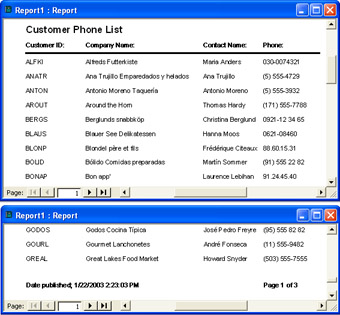
Figure 6.9: Two excerpts from a Customer Phone List report generated in Design view. The top panel shows the layout for the top of the first page; the bottom panel presents the layout for the bottom of the page.
Sorting and Grouping String Data
The report in Figure 6-9 sorts the customer phone list by the CustomerID field for the report's underlying record source. This is because CustomerID is the primary key for the Customers table. However, some uses for a customer phone list might be better served with rows sorted by the ContactName field. Using the View, Sorting And Grouping command on the Report Design menu, you can create custom sort orders that organize rows differently than a primary key for a table or an ORDER BY clause in a query statement.
The View, Sorting And Grouping command opens the Sorting And Grouping dialog box for a report. You can also open this dialog box by choosing the Sorting And Grouping button on the Report Design toolbar. The Field/Expression column in the dialog box allows you to select columns in the report's record source on which to sort rows. You can sort on multiple fields or expressions in the underlying record source. Access sorts at the highest level by the field or expression at the top of the column, and then it sorts by successive column entries in the dialog box. The dialog box's Sort Order column lets you choose to sort in ascending or descending order. The default order is ascending .
Figure 6-10 shows the Sorting And Grouping dialog box for the report design presented initially in Figure 6-8. The figure shows ContactName being selected as the sort column. For the moment, you can ignore the Group Properties settings in the lower portion of the dialog box.
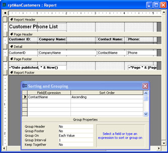
Figure 6.10: A setting in the Sorting And Grouping dialog box that alters the default order of the report.
Figure 6-11 shows the top of the first page from the sorted report. Not surprisingly, the records appear in ascending order based on the ContactName field. As you can see by comparing this figure with Figure 6-9, in which the rows are ordered by the customer ID, the sort settings in a report override any order settings in the underlying record source.
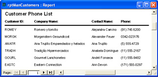
Figure 6.11: An excerpt from a report showing the customers phone list sorted in ascending order on the ContactName field for its record source.
As convenient as the preceding report is, it would be better if you could easily tell when a transition occurs from contacts whose first name begins with A , to contacts whose first name begins with B , and so on. Access reports offer two related features to accommodate this need. First, they allow you to group records on any field within the report's record source. When you group records on a field, Access automatically sorts them. However, your grouping and sorting criteria will often be different. Therefore, you'll need to set the sort criteria within the group criterion. Second, Access does not automatically separate or mark grouped records. However, you can specify places on a report that denote the beginning, the ending, or both the beginning and ending of a group.
Access calls the beginning and ending markers for groups Group Headers and Group Footers, respectively. These dividers introduce new sections within a report. Unlike the built-in report sections, you can elect to show just a Group Header or a Group Footer; you don't have to specify both.
Figure 6-12 shows a Sorting And Grouping dialog box for a modified Customer Phone List report that groups and sorts its records. The figure depicts the setting for grouping the records in the Group Properties area. The report groups records based on the first character in the ContactName field. By itself, this grouping criterion would not arrange a group's records in alphabetical order by ContactName field values. Instead, it would order the records within a group by their primary key value ( CustomerID ). However, because the Sorting And Grouping dialog box designates ContactName field values as a sort column in ascending order, the report shows the records in alphabetical order within each group. Since the Group Header setting is Yes, the report prints a divider at the start of each group. The report layout shown above the dialog box in Figure 6-12 shows an expression in the ContactName Header section. The expression retrieves the first letter of the ContactName field for the current record. Because this break occurs just once for each group, the expression causes the report to print the group's initial letter at the beginning of each group.
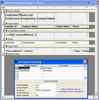
Figure 6.12: A report's Design view with its Sorting And Grouping dialog box that demonstrates how to group on the first letter of the ContactName field in the Customers table and sort the records within each group on the ContactName field values.
Figure 6-13 presents an excerpt from the report specified by the settings shown in Figure 6-12. Notice how easy it is to tell where a new group of contacts begins. Also, notice that the cost of improving the report was the time it took to add a single row in the Sorting And Grouping dialog box and an expression in the ContactName Header section. This ease of report formatting is one reason why Access is such a popular report generator for so many business applications.
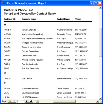
Figure 6.13: An excerpt from the report specified by the settings in
Figure 6-12.
Sorting and Grouping by Date
Although sorting and grouping techniques are similar across data types, different data types can require slightly different settings. While the previous sample used the first character in a string, the three samples we'll discuss next illustrate the use of date/time data types for sorting and grouping. I will not provide step-by-step descriptions of how to lay out these sample reports because I already described these steps earlier in the section and these reports are available in this chapter's sample database file.
The following SQL statement is a query saved as qryOrdersByMonth . This query serves as the data source for the three sample reports that follow. The SQL statement counts the number of order IDs by month. Notice that the statement nests the Year and Month functions and the value 1 as the day within a DateSerial function. By specifying the first day of the month regardless of the actual date contained in the underlying record, the DateSerial function generates a valid date that can be used to group records by month rather than by day.
SELECTDateSerial(Year([OrderDate]),Month([OrderDate]),1) AS[Date],Count(OrderID)ASOrders FROMOrders GROUPBYDateSerial(Year([OrderDate]),Month([OrderDate]),1)
The left window in Figure 6-14 presents an excerpt from the first report that demonstrates the sorting of dates. This sample report mostly echoes the values from its qryOrdersByMonth record source. By presenting the query results in a report, you make it harder for users to accidentally manipulate the query's design. You can also apply formatting options that are not available in a query's Datasheet view. The right window in Figure 6-14 highlights some of these formatting options. Both the Report Header and Page Footer sections use a gray background. This sample accentuates the report's title by using large, white letters against the gray background. You can control color properties by clicking the Build button next to the appropriate property name on the control's or section's Properties dialog box. The Build button opens a Color dialog box that lets you pick from a set of predetermined colors as well as create your own colors.
| Note | Not all date/time group functions work identically. Grouping by quarter aggregates all dates through the end of a quarter. This is true for all date/time serial values, right down to the days. However, grouping date/time serial values by hour lumps together all times extending through the middle of the hour. When the report's grouping feature does not aggregate the way you prefer, construct a new field that will lead to a more acceptable result for your application. For example, if you need times grouped through the end of the hour , add a new column to a report's record source that applies the Hour function to the date/time serial number values and group on the results from that function. |
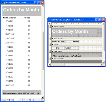
Figure 6.14: An excerpt from a report that displays the result set from the qryOrdersByMonth query.
The two text boxes in the report refer to the field names from the qryOrdersByMonth result set. No special processing of the result set occurs for this sample's report. Since the Orders field has numeric values, its column is right-justified automatically without any special formatting. The Orders column heading has its Text Align property set to Right so that its caption is flush with the right edge of the control. The Date column and the label control for its column heading each have the Text Align property set to Center so that the dates are displayed in the middle of the column.
Showing data grouped in multiple ways is one function that cannot be easily performed with just a query. For example, it is difficult to show monthly data in a query while also presenting the data grouped by quarter. If you display a query using a report, the built-in Sorting And Grouping command on the Report Design menu radically simplifies this task: it features an option for grouping by quarter. Other date/time grouping options include the year, month, week, day, hour, and minute.
Figure 6-15 shows a sample report that groups the monthly data from the qryOrdersByMonth query by quarter. In the figure, the window on the left shows the layout of the report's data, and the window on the right displays the Report Design view along with its Sorting And Grouping dialog box. Notice the gap in the left window between the data for months within each quarter. Choosing Qtr for Group On and Yes for Group Footer in the Sorting And Grouping dialog box causes these gaps. You can see the Date Footer section in the report layout above the Sorting And Grouping dialog box. When you group data by a time period such as a quarter, the detailed data within a group does not automatically sort in ascending or descending order. The report in the left window illustrates this. To remedy the situation, add Date as a sort field below the Date as a grouping field. Leave the Group On setting at its default value of Each Value. If you want to sort in descending order, change the default Sort Order setting in the second column from Ascending to Descending.
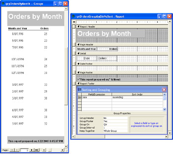
Figure 6.15: An excerpt from a report that groups the result set from the qryOrdersByMonth query by quarter.
Notice that the Keep Together property setting at the bottom of the Sorting And Grouping dialog box is Whole Group. This setting causes Access to keep together the three months of a quarter. If the group of months in a quarter would normally be split on the page, Access reformats the page so that the group of months in the quarter starts at the top of the next page.
Figure 6-16 presents the final example of a date-grouping report. This report does sort by month within a quarter. In addition, it calculates a subtotal of the monthly orders within a quarter. The expression in the Date Footer section shows that you can compute this result with a familiar aggregate function ”namely, the Sum function. To help make the quarterly aggregate values stand out from the monthly order totals, the report applies a Bold Font Weight setting to the text box for the quarterly sum of orders. This text box differs from the two text boxes in the Detail section in that it's not bound to any particular columns in the report's record source. Instead, this text box depends on the expression within it.
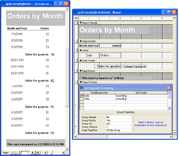
Figure 6.16: An excerpt from a report that groups and subtotals by quarter the result set from the qryOrdersByMonth query. Unlike the report shown in Figure 6-14, this report sorts the monthly totals by date within a quarter.
Hierarchical Reports with Groups, Subreports, and Charts
As a rule, subreports are less important to report design than subforms are to form design. This is because reports do not accommodate the input or updating of data ”they merely reflect the contents of a record source in a format suitable for a printer. Nevertheless, subreports do play a role in report design. One major reason for using subreports and subforms is so that you can easily display data with hierarchical relationships, such as products within a category. This need is particularly evident when you want to include a graph that updates for each group within a report. In this kind of application, the chart serves a role similar to that of a subreport within the group.
Representing Parent-Child Relationships with Groups
Whenever possible, you should look for ways to design reports that show hierarchical data relationships with groups created via the Sorting And Grouping dialog box. This style of representing hierarchical relationships with reports is simpler than developing a main/subreport combination because you do not have to maintain the relationship between the two reports. To make this approach work, you may need to create a specific query to support the report's grouping requirements.
Figure 6-17 displays an excerpt from a report with a hierarchical relationship between customers and product sales. The report contains a group for each customer. The Group Header section indicates the parent data (customer) to which the following set of child data (product sales) belongs. The report's design presents the child data, in this case the number of orders and total extended price for each product, in the report's Detail section. The report's Group Footer section presents the parent data, in this case the total orders and extended price for an individual customer. This section even compares the data about the current customer with the data for all customers in the report by displaying the current customer's percent of the total orders and extended price in the entire report.
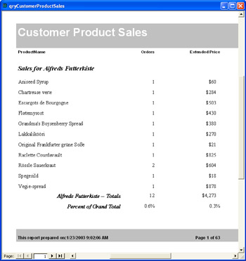
Figure 6.17: An excerpt from a single report that represents a hierarchical relationship between customers and product sales.
The main trick for representing parent-child relationships in a report is to specify the record source properly. The following SQL statement is the record source for the report just described. This statement appears in the sample database file for this chapter as qryCustomerProductSales . The three fields in the SELECT list are report fields. When you use an alias (such as Orders or ExtPrice ) in a query for a calculated or an aggregated field, your Access report should refer to the result via the alias name.
SELECTcus.CompanyName,prd.ProductName, Count(o.OrderID)ASOrders, Sum(od.UnitPrice*[Quantity]*(1-[Discount]))ASExtPrice FROMProductsASprdINNERJOIN((CustomersAScus INNERJOINOrdersASoONcus.CustomerID=o.CustomerID) INNERJOIN[OrderDetails]ASodONo.OrderID=od.OrderID) ONprd.ProductID=od.ProductID GROUPBYcus.CustomerID,cus.CompanyName,prd.ProductName
Figure 6-18 shows the report in Design view; this report is available as rptCustomerProductSales in the Chapter06.mdb file. Notice that the Detail section uses aliases to refer back to the order count for a product ( Orders ) and the sum of the extended price ( ExtPrice ). When a field name appears within a function, you must delimit it with square brackets, such as Sum([ExtPrice]) . Also, all expressions for the Control Source property of text boxes within a report must begin with an equal sign (=). If you forget this, Access will frequently insert a leading equal sign for you. The CompanyName Header section contains a text box with a string expression for labeling the sales of a customer.
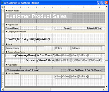
Figure 6.18: A report's Design view that displays a parent-child relationship between customers and their product sales rows based on the qryCustomerProductSales query.
The Sum function operates within the context of the section in which it resides. The CompanyName Footer section includes two Sum functions. These functions develop aggregates of product orders and the total extended price for that customer. The identical Sum functions in the Report Footer section generate the overall sum for all customers. The report names the two text boxes in the Report Footer section txtGrandOrders and txtGrandExtPrice . The corresponding two text boxes in the CompanyName Footer section are named txtCustOrders and txtCustExtPrice . The report uses these names to compute a customer's percentage of the grand total orders and extended price. Here are the Control Source expressions for the calculated percentages in the CompanyName Footer sections:
=[txtCustOrders]/[txtGrandOrders] =[txtCustExtPrice]/[txtGrandExtPrice]
Representing Parent-Child Relationships with Main/Subreports
The next sample report deals with a parent-child relationship between categories in the Northwind Categories table and the total extended price for the category's products. The aggregated sales for individual products within a category represent the category's children. I used a SQL statement (shown next) that accumulates sales by product for shipments during 1997. This same statement serves as the record source for both the main report and subreport. The query includes CategoryID . This field is the primary key for the parent Categories table. When working with main/subreports, include the primary key for the parent table in the SELECT list. This example uses the primary key, CategoryID , to link the subreport to the main report. When you do this, you don't need to include a text box with the primary key on either the main report or the subreport. The following SQL statement is available as qryProductSalesWithinCategory in the Chapter06.mdb file:
SELECTcat.CategoryID,cat.CategoryName,prd.ProductName, FormatCurrency(Sum(od.UnitPrice*[Quantity]*(1-[Discount])),2) ASProductSales FROM(CategoriesAScatINNERJOINProductsASprd ONcat.CategoryID=prd.CategoryID) INNERJOIN(OrdersASoINNERJOIN[OrderDetails]ASod ONo.OrderID=od.OrderID) ONprd.ProductID=od.ProductID WHEREo.ShippedDateBetween#1/1/1997#And#12/31/1997# GROUPBYcat.CategoryID,cat.CategoryName,prd.ProductName
Figure 6-19 displays an excerpt from the report for the first category, Beverages. The gray box below the statement about total sales within a category is the subreport. Everything else on the report is part of the main report. The individual rows within the subreport represent individual products within a category. As the main report enumerates different categories, it uses the subreport to show sales for just the products within that category. For example, all the products in the subreport shown in Figure 6-19 are beverages. In addition, the heading above the subreport includes the sum of sales for a category. This calculation changes for each category.
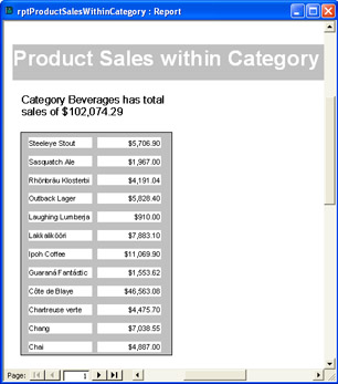
Figure 6.19: An excerpt from a main/subreport that represents a hierarchical relationship between categories and product sales.
Figure 6-20 shows the Design view for the main report ( rptProductSalesWithinCategory ) of the report we just discussed. Recall that the record source for the main report and subreport is qryProductSalesWithinCategory . The main report includes a CategoryName Header section. In fact, both of the main report's data-bound controls ”the text box and the subreport ”reside in the CategoryName Header section.
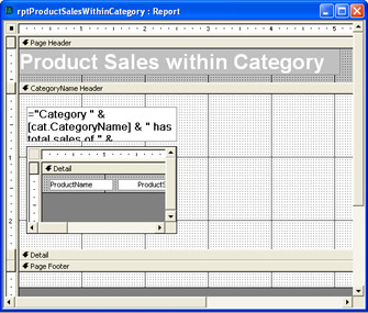
Figure 6.20: A report's Design view that displays a parent-child relationship between categories and their product sale rows based on the qryProductSalesWithinCategory query.
The subreport, rptSubTableProductSales , exists as a standalone report with just two fields in its Detail section. To construct the main/subreport, drag the subreport from the Database window into the Design view of the main report. Locate the control in the CategoryName Header section. You have the option to remove the label that the process assigns to the subreport control on the main report. If Access does not automatically prompt you to link fields between the main report and subreport, select the Data tab on the Properties dialog box for subreport control on the main report. Then, click the Build button to the right of either the Link Child Fields or Link Master Fields property setting box. This opens the Subreport Field Linker dialog box that lets you link fields from the record sources for the main report and subreport. The sample report uses the CategoryID field.
The control immediately above the subreport control on the main form is a text box. This text box contains an expression for its Control Source property setting. This expression references two fields from the report's record source:
="Category " &[cat.CategoryName]& "hastotalsalesof " & FormatCurrency(Sum([ProductSales]),2)
Notice that the expression references the CategoryName field with the same prefix that appears in the SQL string for the report's form. You must use this prefix. In addition, the expression taps the FormatCurrency function for displaying the sum of the ProductSales field in currency format with two places after the decimal.
Graphing Child Data in a Main/Subreport Design
When you add a graph to a report, you can make it function like a subreport. In order to synchronize a chart's contents with a main report, make assignments to the Link Child Fields and Link Master Fields settings for the control containing the chart. You will need to add a new chart to a report rather than drag an existing chart report from the Database window. Use the Insert, Chart command in a report's Design view to launch the Chart Wizard. This adds a new chart to the report. The Chart Wizard includes pages for specifying the chart's record source and chart type as well as the fields for linking the chart to the main report. Despite your selections, the wizard might construct a record source that differs from your needs. If the chart does not display the data the way you want, respecify the Record Source property setting for the Chart control. In the following example, I needed to respecify the Record Source property as the following:
SELECTProductName,ProductSalesFROMqryProductSalesWithinCategory
Figure 6-21 shows an excerpt from the report created by following the steps for adding a chart to the report shown in Figure 6-19. I had to edit the layout of the chart as well; in particular, I changed the font size for the horizontal and vertical axes to 7 point. In addition, I created more space for the chart on the report's pages by reducing the right margin setting in the File-Page Setup command to 0.25 inches. The other margins remained at their default setting of 1 inch.
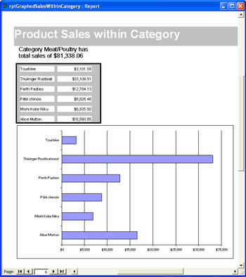
Figure 6.21: An excerpt from a main/subreport with a chart that depicts a hierarchical relationship between categories and product sales by plotting the product sales for each category immediately below the table showing product sales within a category.
EAN: 2147483647
Pages: 144