Tabbed Dialogs
Another user interface idiom that took the world of commercial software by storm is the tabbed dialog. In less than two years, tabbed dialogs, as shown in Figure 31-4, went from a virtually unknown idiom to a well-established standard, which has now found its way, in a somewhat degraded form, to almost every commercial Web site in existence. When an idiom has merit, it is widely copied, and the tab control has been such a blessing to dialog box designers that it has become a standard part of all GUIs.
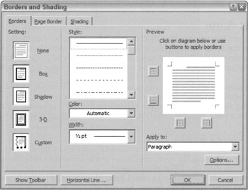
Figure 31-4: This is a tabbed dialog box from Microsoft Word. Combining borders and shading on one dialog box makes sense, if you have a convenient way to do it. Tabbing provides the way. Note that the designer correctly put the terminating controls outside the tabbed pane, in the lower-right. It would be best if the OK button were the right-most button (Apple has advocated this from the start, but Microsoft just has to be different).
Tabbed dialogs allow all or part of a dialog to be set aside in a series of fully overlapping panes, each one with a protruding, identifying tab. Clicking on a tab brings its associated pane to the foreground, hiding the others. The tabs can run horizontally across the top or the bottom of the panes or vertically down either side. Arguably, the most usable of these variations is the top-oriented tabs, because side-oriented tabs either require users to rotate their heads to read the labels or take up too much space with standard labels, and bottom-oriented tabs are too easy to overlook.
Many objects with numerous properties can now have correspondingly rich property dialog boxes without making those boxes excessively large and crowded with controls. Many function dialogs that were previously jam-packed with controls now make better use of their space. Before tabbed dialogs, the problem was clumsily solved with expanding and cascading dialogs, which we'll discuss shortly.
Every tabbed dialog box is divided into two parts, the stack of panes, the tabbed area, and the remainder of the dialog outside of the panes, the untabbed area. The terminating command buttons must be placed on the untabbed area. If the terminating buttons are placed directly on the tabbed area, even if they don't change position from pane to pane, their meaning is ambiguous. The user may well ask, "If I press the Cancel button, am I canceling just the changes made on this pane or all the changes made on all the panes?" By removing the buttons from the panes and placing them on the untabbed area, their scope becomes visually clear.
| DESIGN TIP | Put terminating buttons on the untabbed area of a tabbed dialog. |
Breadth versus depth
A tabbed dialog allows you to cram more controls onto a single dialog box, but more controls won't necessarily mean that the user will find your interface easier to use or more powerful. The contents of the various panes on the dialog must have a meaningful rationale for being together, otherwise this capability just degrades to what is good for the programmer, rather than what is good for the user.
The panes on a dialog can be organized to manage either increased depth or increased breadth on a topic. To organize for more breadth, each pane covers additional aspects of the main topic, the way borders and shading, shown in Figure 31-4, both address ways that text is enhanced. In the case of organizing for more depth, each pane probes the same aspect of one topic in greater depth.
Stacked tabs: Dialog abuse
Tabs had such success because the idiom follows the user's mental model of how things are normally stored: in a monocline grouping. The various controls are grouped in several parallel panes, one-level deep. But even this idiom can be (and often is) abused.
Because you can cram so many controls into a tabbed dialog, the temptation is great to add more and more panes to a dialog. The Options dialog in Microsoft Word, shown in Figure 31-5, is a clear example of this problem. The ten tabs are far too numerous to show in a single line, so they are stacked two deep. The problem with this idiom, called stacked tabs, is that, if you click on a tab in the back row, the entire row of tabs moves forward, shunting the other two rows to the back. Very few users seem to be happy with this because it is disconcerting to click on a tab and then have it move out from under the mouse. It works, true, but at what cost?
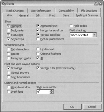
Figure 31-5: The Options dialog in Word is an extreme example of what can be done with tabs. There is certainly a lot crammed into this one dialog, which is good. The problem is that the tabs move around! The active tab must be on the bottom row, so if you click on Spelling and Grammar, for example, that row rolls down to the bottom and the other row rises to the top. Everybody hates it when the tabs move underneath the cursor. It's better just to break this up into smaller dialogs.
| AXIOM | All idioms have practical limits. |
Stacked tabs illustrate the following axiom of user interface design: All idioms, regardless of their merits, have practical limits. A group of five radio buttons may be excellent, but a group of fifty of them is ridiculous. Five or six tabs in a row are fine, but adding enough tabs to require stacking destroys the usefulness of the idiom.
A better alternative would be to use several separate dialogs with fewer tabs on each. In this example, Options is just too broad a category, and lumping all this functionality in one place isn't doing the user any favors. There is little connection between the twelve panes, so there is little need to move between them. This solution may lack a certain programming elegance, but it is much better for the user.
| DESIGN TIP | Don't stack tabs. |
|
|
 The Essentials of Interaction Design")
EAN: N/A
Pages: 263