Transient Posture
If dialog boxes were independent programs, they would be transient-posture programs. As you might expect, dialog boxes should then look and behave like transient programs, with bold, visual idioms, bright colors, and large buttons. On the other hand, dialogs borrow their pixels from sovereign applications, so they must never be wasteful of pixels. The imperative to be large is constantly at war with the imperative to be small. One solution is to make each of the individual controls slightly larger, but to make sure that the dialog itself wastes no additional space.
| DESIGN TIP | Dialogs should be as small as possible, but no smaller. |
Borland popularized a standard by creating extra-large butcons with bitmapped symbols on their faces: a large red X for Cancel, a large green checkmark for OK, and a big blue question mark for Help. They were cleverly designed and very attractive—at first. Most people, with good reason, now find them wasteful of space. The icons on the butcons worked well to visually identify themselves, well enough that the extra size wasn't necessary. Borland now uses the same bitmaps on buttons of a more conventional size, which is a much better solution. The visual images accomplish the job just fine without the need to waste precious pixels.
Obscuring the parent window with dialogs should be minimized. Dialog boxes should never take more room than they need. Pixels remain the most limited resource in modern desktop computers, and dialog boxes shouldn't sprawl across the screen. Compare the space efficiency of the CompuServe Navigator dialog in Figure 31-1 to the one from Word in Figure 31-2.
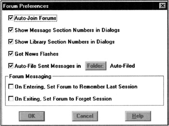
Figure 31-1: Here is a properties dialog box from CompuServe Navigator for Windows (v1.0). The sprawling check boxes consume a lot of space. At least it has a title bar, so you can move it out of the way. Also note the poor placement of the OK button at the far left rather than at the right.
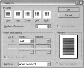
Figure 31-2: A typical function dialog box from Microsoft Word shows an excellent use of space. The controls are compact and very conservative of space. Compare this with the previous figure (Figure 31-1). Notice, also, Microsoft's willingness to use graphic objects instead of just canned, text-based controls like edit fields, check boxes, and push-buttons. Note the odd placement of the termination controls in the upper-right. In this case, the designer might have taken space efficiency a tiny bit too far.
Check boxes are a relatively space-inefficient control: the accompanying text requires a lot of dedicated space. Compared to the text of check boxes, butcons can be crammed together like sardines. But even check boxes don't need the kind of room they were given in the Navigator dialog.
|
|
 The Essentials of Interaction Design")
EAN: N/A
Pages: 263