Practical Techniques for Increasing Usability
We've looked at the user-centered approach that you need to build a useful intranet; now we'll look at some specific techniques to use in your intranet, and some pitfalls to avoid. Although it's very important to know your audience well, as we describe above, there are some aspects of usability that apply to everyone.
We'll focus here on the aspects of web usability that are specific to the intranet, or particularly important for intranets.
Creating Effective Site Navigation
An intranet can be full of useful information, but if a user cannot find any of it, then it might as well not be there. For this reason, it's just as important to put effort into a usable site navigation as it is into the content creation process.
There's more information on creating site navigation for intranet and Internet sites, including useful code examples, in the book Usable Web Menus (Andy Beaumont, et al., glasshaus ISBN 1-904151-02-7).
The Card-Sorting Approach to Designing Site Navigation
A common approach to finding an effective web site navigation is to use "card sorting".
Assemble a small group of users (maybe three or four), and give them a stack of cards with the name of a category on each. Ask them, as a group, to sort the cards into piles that make logical sense to them. Then ask them to label each pile - these labels will become the names of the top-level menu items.
Of course, you need to provide a set of cards for the users to work from. Fifty to a hundred is a reasonable number. This will take between half an hour and several hours, depending on the number of cards and the number of users involved. If you have an existing intranet, then you can take the card topics from that; if not, then write the cards based on what you've identified as important intranet items from speaking to users and content owners.
It's best to decide approximately how many piles (that is, top-level menu items) you want before the session. Although exactly how many piles are created is up to the users, it's useful to them if you can provide some guidance. With an intranet, it's better to err in the direction of a broad, shallow navigation hierarchy (a larger number of top-level categories with fewer items in each) than a narrower, deeper hierarchy. This makes it easier for the intranet to grow over time while keeping the top-level categories the same.
If you're designing the intranet for a large company, then it's worth repeating this process with users drawn from different internal audiences over several days.
"A well-liked intranet with a strong user interest and participation is more important than getting every navigation item in the "right" place"
This technique can tell you:
-
How the users think the intranet content should be organized
-
To what extent different user groups agree on the site navigation structure
-
Whether the names you've chosen for pages in the navigation are clear
It's also a good opportunity to get general feedback on what will be on the intranet - because the users can see an overview of what will be on the site, anything left out will be apparent.
It won't give you a final navigation design - particularly if different groups of users disagree on the organization. However, it gives a good base to work from.
One of the most valuable results of the card-sorting exercise can be an increased sense of user involvement in the intranet. Users who feel that they designed the intranet will like it more than if they weren't consulted. A well-liked intranet with a strong user interest and participation is more important than getting every navigation item in the "right" place!
| Note | Many intranets organize their content purely by company department. Although this is a simple approach, it's best to avoid it, It's not good for finding pages, since most employees won't know everything that all the departments do. It can also lead to unfortunate politics - in some companies every department will fight to have as big a share of the intranet as all the other departments, even though they might not have enough useful content to fill their section! |
Site Maps
An intranet site map is a web page that displays a list of links to the major intranet areas. Typically, these are grouped to represent the structure of the web site. A good, usable site map has three advantages:
-
It helps users find pages on the site quickly - particularly if they know more or less what they're looking for
-
It helps users see what is available on the site
-
It gives an overview that helps users understand the structure of the site - so subsequent navigation around the site should be easier
It's important that a site map is a simple HTML page, with as much visible at once as possible. Some sites use Flash, JavaScript, and Java applets to produce hierarchical, unfolding site maps - although these may be fine for the purpose of finding things, it makes it harder for the user to understand the site structure, and they can also present accessibility issues.
Exactly what appears on the site map is a question of the size of your intranet. On a small intranet, you might not need one at all - the front page of the intranet might be sufficient to display all the links you need. On a medium-size intranet, the site map will probably link to site pages or sections. On a large intranet, then the natural unit to appear on the site map is a subsite. As your intranet grows, you'll need to re-evaluate the site map every 6 months or so to see if you should change its scale.
As we suggested above for site navigation, it's not always a good idea to organize your site map by internal department. It's better to consider the tasks that a user might want to perform, and what types of information they are looking for when they come to the site map.
This is what the site map from CNET News looks like (http://news.cnet.com/);
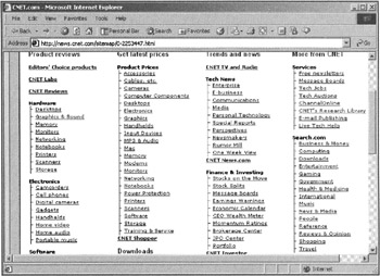
This is a good example of a site map. It's organized by task - for example "Get latest prices" or "View Product reviews". The structure is clear - there's very little space wasted. The whole site map fits on one page.
One way to improve it might be to add additional metadata - for example, the most commonly visited sections of the site could be highlighted with a "Most popular" icon. This increases usability by directing the user towards the site areas which others find useful.
We discussed the disadvantages of organizing your site navigation by department earlier. However, there are some times when it makes sense to an employee to locate a task by the department that is responsible for it. It often makes sense to have a separate departmental site map that presents an alternative view of the intranet's organization.
| Note | A simple improvement to the usability of a site map can be made by adding the HTML title attribute to the links in the site map. For example: <a href="desktops.html" title="Independent reviews of PC desktop computers">Desktops</a> In most common web browsers, the title information will appear when the mouse pointer hovers over the link. This adds useful information to the link, without wasting any of the screen space which is at a premium in a site map. If there is description metadata on the referenced pages, this can be kept up-to-date with minimal effort - in most CMS systems or web programming languages, it's a simple job to load each of the referenced pages, pull out the metadata, and add it to the link. |
Site A–Z
A Site A–Z (sometimes called a Site Index) provides an A–Z listing of the major areas of an intranet.
This is the A–Z index for the BBC web site (http://www.bbc.co.uk/). It is a good example of a highly usable site A–Z:
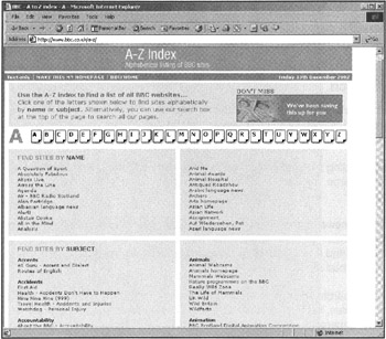
The display is split into two parts. In the Find Site by Name section there is an alphabetical list of BBC television programme names. In the Find Sites by Subject section, there is an alphabetical list of categories,
In the Find Site by Name section, each programme appears only once, but in the Find Sites by Subject a programme may appear in multiple categories. For example, the programme Home Front, a popular home and garden design programme, is listed in the Design, the Interior Design, and the Gardening categories.
Find Site by Name works well for the BBC because it has a large number of clearly identified TV programmes that can be unambiguously referenced by name. If your company is in a similar position (perhaps it produces a wide range of products, and each has a section on the intranet?), then this approach could be useful for your intranet.
More commonly, an approach similar to the Find Sites by Subject is useful for intranets. Important sections of the intranet need to be manually categorized (either by adding category metadata as the pages are created, or after the fact) and listed under an alphabetical list of categories. This does not mean that you have to catalog every page on the intranet - only the important sections. For a larger intranet, the A–Z page is likely to provide a list of microsites rather than a list of pages.
To decide on the list of categories, the card-sorting approach described earlier comes in useful. For an existing intranet, looking at the search terms recorded by the search engine can also give clues as to what users expect to be categories.
Improving the Usability of Searches
Search is perhaps the most important way of finding information on an intranet - but it also tends to be one of the most neglected. Unfortunately, because most search engines come with "out-of-the-box" functionality, it's rare for companies to tweak it extensively to their own needs.
Where to Search
Searches are particularly useful for the typical "overgrown" intranet described in Chapter 12. When information is spread across multiple, barely connected "silos", then often the only way of finding it effectively is with a search.
The problem with finding the useful information is transferred to the intranet maintainer - how do you efficiently index a large number of intranet silos spread across different servers, each using a different technology?
There is no simple answer to this. The best long-term solution is to bring all the information together in a single content management system, but this takes time, and has other disadvantages (for example, it's hard to find a single CMS that's appropriate for all types of content on a large intranet) that might make it a bad idea.
Most commercial search engines will search a variety of different data sources, such as SQL databases, Lotus Notes, flat files, and existing web sites. Alternatively, if each area of the intranet is currently indexed separately, then it's not too hard to write your own meta-search engine that submits a query to each separate search and displays the results together.
If you're starting an intranet from scratch, or your current intranet is small, then you have far fewer problems. You can use a CMS from the start and take advantage of its searching capabilities, but this can be expensive.
It's also important to have good content to index. A CMS can help here as well, by enforcing that metadata is added to pages as they are entered. It's also useful to ensure that outdated or inaccurate content is removed from the intranet - or it may appear in search results. We'll go into this more in Chapter 8 and Chapter 12.
For the moment, we'll assume that a search engine is set up and working well (some options are described later), and focus on how to make the search page and the results usable.
Making a Usable Search Page
For most searches, a search page shouldn't be used at all! The majority of search queries, both on the Internet and the intranet, are only one or two words. This kind of search is best served by having a "search" textbox in the corner of every intranet page.
This is an example of a good search box that appears on every Forrester Research (http://www.forrester.com/) web page:
| Note | Intranet developers writing a meta-search application to search numerous data silos often wonder how best to combine the results from the different searches. Is an item from a Lotus Domino search with a relevance score of 78% just as relevant as one from an AltaVista search with a score of 78%? What if the relevance isn't a percentage? Or if there's only a date and no relevance score? Often the most usable solution is to ignore the problem entirely! Display the search results from each source separately, with a title above each section giving the source of the results, and then it's easier for the user to tell whether they're relevant or not. |

It's clearly labeled as a search, has an additional link to an "advanced search" page, and there are no other textboxes nearby with which it could be confused. Although the Go button is an image, it also has the alt tag containing the text "Go" for the benefit of users who are visually impaired or those not using images. The search box appears at the top right of every page, where it is easy to find by a user scanning for it. Something like this is all that a typical intranet user will use most of the time.
"Simple search boxes tend to be used a lot more than links to a search page"
Simple search boxes like this tend to be used a lot more than links to a search page. In fact, a study by usability expert Jakob Nielsen reports "When I changed the useit.com homepage to include a search box instead of a link, search engine use increased by 91%" (http://www.useit.com/alertbox/20010513.html).
It's usually worthwhile to have an advanced search page, even though it won't be frequently used. Most search engines provide Boolean search logic, date ranges, and any number of other things for free - so it would be a shame not to make them available (but if you're writing your own search routines, then don't bother to write advanced searches unless you're sure you need to). You can increase the use of advanced searches by providing search training - at the very least, an online Help page that details the syntax used by your search engine, and examples of searches. There is searching advice targeted at users of Internet searches that might give benefits to your users at http://www.searchenginewatch.com/facts/index.html.
| Note | Just because the search page is simple doesn't mean that it can't be doing clever things behind the scenes. It's good to use a search engine that will correct misspelled search queries. It's also useful to use one that will search synonyms - if you are creating a site vocabulary (as described in the next section), then part of the compilation process should be to list the synonyms of each word so they can be fed into the search engine's configuration. For searching intranet address books, it's useful to support the "Soundex" algorithm developed for the US census. This encodes names by the way they sound, rather than just by the way they are spelled, and can make it easier to find the details of someone whose name you've only heard. Many search engines and databases can be made to implement Soundex, and there are implementations for most computer languages available freely on the Web. It is intended only for standard English pronunciation - so might not be useful if your company is global. There is documentation for using Soundex in PHP at http://php.benscom.com/manual/en/function.soundex.php, and an article about Soundex support in databases at http://databases.about.com/library/weekly/aa042901a.htm. |
Searching by Area
When the intranet content is divided naturally into different zones (for example, when it's on different intranet servers), some sites will provide a "Search only zone XXX" option. For example, the Microsoft site has a search page that looks like this:
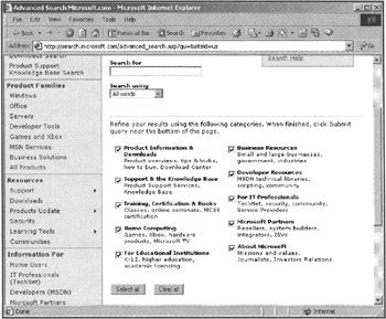
Only those areas of the site that are ticked will be searched.
Although this is appropriate and useful if you have very clearly distinguished and obvious zones, it can cause usability problems and needs careful consideration before being included. Users may be unsure which zone they should be looking in (I have a problem with programming JavaScript in Internet Explorer. Is that Support? Or Developer Resources? I'm an IT Professional, should I look there? Maybe it's in Product Information - that has tips and tricks?). They will require several searches to find an appropriate result, or just give up assuming the content isn't there. An alternative approach that is worth considering is to search all site areas, but to return the results grouped by the area that they came from.
It can also be appropriate to divide searches by zone if there are significant speed differences in the time that it takes for searching different zones. In this case, it would make sense to carry out the fast searches, and then provide a link at the top and bottom of the results page:
"This search only searches the most commonly used content. If you didn't find what you were looking for, you can repeat your search over the entire intranet which will take approximately thirty seconds"
Of course, speeding up the slowest search to the speed of the others is by far the best option if it's possible.
Increasing the Usability of Search Results
A search results page with good usability allows the user to make an accurate judgment of which pages are relevant to them just by scanning through it. A results page with bad usability requires that every result be loaded and read through before the user can tell whether each is useful or not. For example, compare the following two search results from a search for "web server":
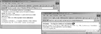
The first, on the left, is from Google (http://www.google.com/), the second from Ask Jeeves (http://www.ask.co.uk/). Both are search results for the same site, the home of the Apache web server (http://www.apache.org/). But the result from Google is much clearer and more usable than that from Ask Jeeves. The differences are summarized in the table overleaf:
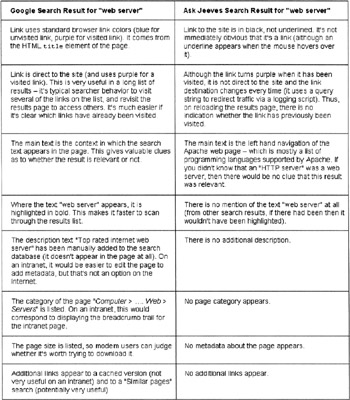
So, it should be clear that exactly the same search results can be made much more usable by carefully choosing what to display and how. In any search, there will inevitably be inappropriate results returned - but by ensuring that the search results are displayed in a usable way, you can help the user pick out the best ones.
Manually Improve the Search Results
Although it may seem to go against the point of having a search engine in the first place, most search engines will allow you to manually tune the results they provide. It's often worth checking the intranet logs to find out what the most common ten (or twenty, or thirty...) searches are, finding the most appropriate pages on the intranet for them yourself, and ensure that they are returned at the top of the search results. In particular, make sure that any intranet applications are easy to find with a search. It's best to separate off the manually chosen results into a section at the top - for example, Microsoft provides a "Best Bets" section at the top of their search results.
In some cases you may find that there's no appropriate content to be returned for a search result already on the intranet - this should be a cue to write some new content or to get in touch with the relevant content owner.
Where to Look for More Information
Making a very usable site search is a substantial amount of work, but definitely pays off. Microsoft, for example, estimates that a typical employee spends 2 1/2 hours every day using their intranet, and half of that time is spent looking for information. If that percentage can be reduced, then it benefits every employee.
It's not always necessary to buy an expensive search package from one of the big companies like Verity or Inktomi. There are several open source tools that may be more appropriate if your needs are simple - for example, Swish-E (http://www.swish-e.org/) is fast and free, and will index PDF and compressed files, and Lucene (http://jakarta.apache.org/lucene/) is a cross-platform Java-based search engine from the Apache Foundation. It's possible to get a more usable site search from a free package and some time working on HTML templates around the results, than you would from an expensive package to which you do no customization.
An excellent web site that gives more information on searching, including reviews of many site search tools, is http://www.searchtools.com/. It's also worth looking at the Usenet newsgroup comp.infosystems.search, although there can be a lot of spam to wade through.
Keep it Simple, and Keep it the Same
A common intranet problem, particularly in larger companies, is that every section of the site looks totally different. You need to re-learn how each section of the site works, and your time is wasted trying to work out where the search bar has moved to now, rather than being able to concentrate on finding the information you need.
"To be usable, an interface should be consistent."
To be usable, an interface should be consistent. This is as true of your intranet as it is of an Internet web site. The problems arise because in an intranet there are often a number of different content creators, each of whom works independently of the others. Each one makes their own decisions about how to structure their pages, and although these may be reasonable in isolation, it's much easier for the user if they only have to cope with one standard page design.
So, what can you do to increase usability in this situation, and how can you avoid this problem in the first place?
Creating Your Electronic Corporate Identity (ECI)
An Electronic Corporate Identity (ECI) is essentially a set of "look and feel" guidelines for the intranet. It's an intranet microsite itself, providing a set of resources to help content creators keep their own microsites consistent, and acts as a "support kit" for them. It's primarily useful for a large intranet with a number of different content creators in different areas
Since the ECI is available online, it's easy for content creators to find, and easy to keep up to date. It is also an example of best practices in itself.
Things that can go into an ECI include:
-
Standard page templates for whatever systems your authors use
-
CSS or XSLT stylesheets
-
Images, such as the company logo
-
Color palettes
-
Samples of code to produce page headers, navigation, breadcrumb trails, and so on.
-
Best practices and guidelines including a style guide, page weight recommendations, image sizes, and so on
-
Online discussion forums - it's not just a static data store, it should be more of a "Community of Practice" for content creators
and, most important of all:
-
Examples!
It's really important to get the templates and examples right - content creators tend to use an ECI by copying the examples rather than reading the best practice guidelines, so if there are any problems with the examples, the problems are likely to be copied along with the good parts.
Persuading Authors to Use the ECI
If you are creating a new intranet, then you can create the ECI at the start, train content creators in using it, and ensure a consistent look and feel for the intranet from the beginning. If there are already a number of existing intranet microsites, as in most large organizations, then you'll have to win over the existing site creators to using the new standard.
If content creators dislike the idea of the ECI, and see it as a restriction of their freedom, then they'll use it reluctantly if it all. Having enthusiastic content creators is very important to a vibrant, useful intranet. Some useful approaches to convince content creators that an ECI is useful include:
-
Consulting existing site authors and designers before drawing up the ECI. If site creators feel that they have had input to the ECI, and understand the compromises that went into it, then they are more likely to comply with it willingly.
-
Providing "goodies" for web sites that follow the ECI. For example, professionally designed graphics, Flash movies, and templates. This is not to say that you should police the use of these goodies - but a graphic will naturally look better in the context it was designed for.
-
Promoting sites that follow the ECI. For example, you might have a "microsite of the week" featured on the intranet homepage, selected from the sites that conform to the intranet ECI.
-
Providing flexibility within the ECI - not everything has to be exactly specified. Remember that the goal of the ECI is to promote usability, not to enforce the "One True Way". Keep it as minimal as possible while still fulfilling your goals.
-
Providing training along with the ECI. Even if a site creator is convinced that the ECI is a good thing, then she still won't use it unless she knows how to. Along with this, make sure that the ECI itself is easy to use - there's not much point trying to promote usability with a tool that is hard to use itself.
-
Selling the benefits of the ECI to the content creators. One of its purposes is to save them time, reduce the amount of maintenance they have to do and let them spend more time working on the content.
Increasing usability helps everyone! Site creators want their sites to be helpful and to be widely used, and an ECI helps towards this goal. As long as it's seen as a tool to increase usability, and not as a pointless corporate edict, then the ECI will be popular and useful.
Using a Content Management System (CMS)
A CMS can be the solution to the problem of consistent look and feel - but only if everyone is using it. There may be good reasons why it's not practical to migrate every microsite into a CMS immediately, and in the meantime, it's still useful to have guidelines and examples for authors to follow who aren't using the CMS.
We'll talk about CMS systems in more depth in Chapter 8.
| Note | A method I've used in the past to ensure a consistent behavior between a CMS and sites that haven't yet been migrated into the CMS is: Create individual pages in the CMS for site navigation elements, such as the header, footer, and navigation. Then include them in the non-migrated page via an HTTP connection (in ASP, this uses the Microsoft ServerXMLHTTP object, in JSP you read from a Socket object or use the Jakarta HttpClient, in PHP you can use fread, and similar functions exist in all other web languages). This is slightly risky - after all, it the server that you're pulling the navigation elements from is unavailable, then it will affect the availability of the site that's not running in the CMS. In addition, it will increase the latency of the request to the first server because it has to pull in elements from elsewhere. If either of these is a problem in practice, then you can set up a local cache on the first server to store the navigation elements, which is automatically updated. |
Building a Vocabulary
If in one area of the intranet, a spade is called a "spade", but in the next it's a "shovel", and in the third a "digging implement", then a user unfamiliar with what a spade is will be confused. A user searching for "spade" via the search engine may not find all the information that's on the site, and a user searching for "shovel" will find a different, also incomplete, set of information.
A solution to this problem is to build a "site vocabulary" (sometimes called a Thesaurus or taxonomy), and make it available in the ECI. A site vocabulary provides an authoring style guide, listing the terminology that should be used for key items. It's also helpful to have synonyms and common misspellings listed as part of the vocabulary.
As well as helping the content authors, the site vocabulary is also useful when creating the site navigation, and as keywords for the search engine (more on this later).
A useful article detailing Microsoft's work in creating a common vocabulary and taxonomy for their intranet is at http://www.boxesandarrows.com/archives/002931.php.
| Note | A standard way to provide a link to an HTML page providing the site glossary is by using the HTML "link" tag in each page header. For example:
<link rel = "glossary" href="/glossary.html" /> In browsers that support it, such as Netscape 6+ and Mozilla, this will display a link to the glossary in a browser links bar so users can have quick and consistent access to it. The other types that can be used in a link tag are listed in the HTML specification at http://www.w3.org/TR/html4/types.html#type-links. For example, you can use the link contents type to link to a table of contents for an intranet microsite. The only widely used link type is the stylesheet type to link in a CSS stylesheet. |
Vocabularies and Search Metadata
It is common to use the HTML meta tag keywords to list the synonyms and alternative spellings for the keywords in the page. This allows search engines to find the page more easily. For example, from Usability First (http://www.usabilityfirst.com):
<meta name="keywords" content="usability, usable, useability, useable, user, interface design, ...">
While this is useful on the Internet where there is no control over the search engine being used, it's less useful for an intranet search. The problem is that vocabularies change over time. For example, if a new synonym is used in a widely distributed internal publication, then users will begin to search for that synonym. If the keywords are fixed in the page, then this requires either a major search and replace task or a sophisticated CMS to add a new synonym to every occurrence.
Instead, it's preferable to store the "root word" taken from the site vocabulary in the page. Then the intranet search engine can be set to use the list of synonyms (and misspellings) taken from the vocabulary. This increases search usability, and it reduces the maintenance effort.
The Need for Speed
When you think about fast web pages, the first thought is of making them fast to download and display. While this is important, it's not the only kind of speed that matters. You need to worry about:
-
Download time
-
Perceived download time and responsiveness
-
Speed of use
Why Bandwidth Still Matters
Web developers used to working on the Internet tend to assume that developing intranet pages gives a license to use large images, AVI videos, and chunky Java applets, because "bandwidth doesn't matter on an intranet". While there is some truth to this when the intranet is for a single site, what about company branch offices with slow connections? What about employees working from home via modem? What about salespeople on the road with mobile devices?
"There's no need to pare everything to the bone. Just make sure that the intranet homepage and navigation are fast and small"
The truth is that nowadays, bandwidth is important, and will remain so until we're living in the promised paradise of universal broadband and ultra-fast 3G mobile communications (don't hold your breath).
There's no need to pare everything to the bone. Just make sure that the intranet homepage and navigation are fast and small, and so is all the information that a remote user might want to use. And most importantly, make sure to test the intranet using the access methods that will actually be used, rather than just testing it over a fast internal network. For an intranet, you will have a good idea of what every user's connection speed will be, which makes testing simpler.
A good Content Management System (CMS) can help by providing a low-bandwidth version of web pages from the same content (see Chapter 8 for more information).
Which Pages Should be Fast?
As a rule of thumb, the amount of effort you put into speeding up an intranet application should be proportional to the amount of time that users will spend using it. This may seem obvious - but it's all too easy for a developer to get carried away tweaking a rarely used application when it might be better to add a progress indicator, or a simple warning "This will take approximately three minutes to run".
By making the intranet faster, you can make it more widely used. If it's faster to use an offline alternative, then people often will, even if it doesn't have all the same advantages as the intranet.
There's not enough space in this chapter, or even in this whole book, to give advice on exactly how to speed up applications. Instead, consult the appropriate manuals and web sites for your CMS or programming language.
| Note | At one company at which I worked, it took nearly ten seconds to search the company address book from the intranet. Employees tended to jot down phone numbers on Post-It notes and scraps of paper rather than use the intranet. By optimizing the code in the page and the database query, I managed to reduce the time for the page to display to less than a second. The address book became more widely used and the Post-It notes began to disappear. People will work around inconvenient technology - often without complaining about it. So, track what users are actually doing with server access logs and by talking to them, and you can fix the speed problems that they haven't told you about. |
Increasing Perceived Speed
The time taken for all the elements of a page to download is not necessarily the same as the time taken for the page to be useful. On a well-designed page, you can start making use of the page before it has all downloaded. Some tips you can use to help design pages that appear quickly are:
-
If an HTML <img> tag has width and height specified, then the browser can place that image on the page and reserve space for it even before the image has downloaded.
-
Internet Explorer loads images in alphabetical order of their filename. If there are images that are more important on a page, then you can provide them with names that are nearer the beginning of the alphabet to prioritize their loading.
-
If all of the content in your page is within one large table for layout, then none of it can appear until the whole table has been downloaded. If you split up the table, and use <div> elements and CSS for layout, then you can cause the page to be displayed considerably sooner.
-
Web browsers are usually capable of opening several connections to the web server simultaneously. If files such as JavaScript and stylesheets are linked to from the page, rather than included within the page, then they can be loaded concurrently with the page (and should be cached for future pages).
| Note | The perceived speed of your intranet may have very little to do with its actual speed. Usability expert Jared Spool has conducted research showing that people rate the download speed of a web site by how successfully they can perform tasks on it! So, when users complain about slow web sites, they may be complaining that it is slow or difficult to complete the tasks they need to, rather than that the pages are actually slow themselves. Jared Spool talks about this research, and other interesting usability topics, in an interview at http://webword.com/interviews/spool2.html |
You can find more advice along these lines on sites such as Evolt (http://www.evolt.org).
Providing Feedback to the User
On an intranet, it's quite common to have "applications" that perform some lengthy task such as a query or a database update, or sending a number of e-mails. This is much more common on intranets than it is on the Internet.
If there is no feedback from the task, then the user will often be unsure whether the task is in progress, or whether it's failed. It's very common for users to hit Back in their browser, and resubmit the page that runs the task. This may cause the task to restart, to occur twice, or even to corrupt the data on which it acts.7
The first attempt at a solution should always be to speed up the application sufficiently that no feedback is needed. Unfortunately, this isn't always possible.
The easiest solution to implement, and probably the most widely used, is to add a warning (often popping up when the link to launch the task is selected):
"This task will take a long time to execute. Do not interrupt the browser until the task completes."
This example is poor for two reasons. Firstly, it doesn't give an estimate of the amount of time needed - how long is "a long time"? You should always be able to give at least an approximate estimate of the time. Secondly, it's an ingrained reflex for many computer users to click OK on pop-up warning dialogs without reading them. For a warning to be effective, the message needs to be visible while the user is waiting for results.
A fallback can be to put a time-based check in the application, to display a page that says something like:
"This application was last run less than 2 minutes ago. Are you sure that you want to run it again?"
A better solution is to provide a progress bar. This is a common idiom in desktop applications that users will be accustomed to. It's relatively easy to provide a progress bar with an ActiveX object, a Java applet, or a Flash movie.
An alternative for a multi-threaded environment is to start the task in one thread, and to have a process that monitors it in a separate thread. The web page can point at the monitoring thread, and with a meta-refresh tag update the display of task status until it is complete.
Some applications may not require a visible progress indicator, for example a task that takes five or ten minutes to execute might be better dealt with by having a "Task began successfully" message on the Web, and then an e-mail sent to the user to explain whether it succeeded or failed.
| Note | If you're using an ActiveX object, Java applet, or Flash movie, then it's not too hard to add a progress indicator -- if you search on Google for "ActiveX progress bar" you'll find hundreds of examples. If you want to produce feedback from an ASP, PHP, or Java web page, then one of the simplest ways is just to output a dot "." from the script every time it completes a step, or the name of the file that it's just processed. However, many web servers will cache script output and only send it when there's a decent sized chunk. You should be able to turn off this caching for specific pages, but if you can't, then there's a hack I've used in the past. You can send a "." and then "<! --(several KB more dots) -->". The dots sent inside HTML comment tags won't display, but they will fool the cache and make your progress indicator display immediately. . This isn't a great solution, but it is better than leaving the user hanging. |
| Note | Adding a progress indicator often slows the operation down slightly (especially if you use the "comment" hack above). Don't worry about this too much; studies have shown that responsiveness and feedback contribute at least as much to perceived speed as the actual performance does! |
Don't Waste the User's Time in Repetitive Tasks
A user experienced with a desktop application such as Word can use all sorts of shortcuts to help him use it much faster than a new user. For example, they will know keyboard shortcuts such as CtrlS to embolden text, and Ctrl-B to save. Although shortcuts like these are available for the web browser (such as pressing backspace rather than using the back button) it's also possible to set up similar keyboard shortcuts for the specific elements of a web site - for example, pressing "Alt-1" to go to the front page. However, timesaving shortcuts like these aren't common on Internet web pages, because Internet sites have few repeat visitors who would benefit from taking the time to learn them.
On an intranet site things are different. A receptionist might use an intranet phone book application several hundred times a day, and will benefit from whatever shortcuts can be provided. Likewise, a software tester might fill in bug reports via an intranet form many times in a day. There are a few simple ways of making the intranet more usable for these people, and it will increase the accessibility of your intranet as well.
Keyboard Shortcuts and Tab Ordering
A little known part of standard HTML is the accesskey attribute. This attribute can be applied to form inputs, links, buttons, and a few other elements. It looks like this:
<form> <u>N</u>ame: <input type="text" name="name" accesskey="n" /><br /> <u>A</u>ddress: <input type="text" name="address" accesskey="a" /> </form>
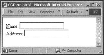
When you press Alt-N (or Control-N on the Macintosh) then the focus will be set to the Name text field. The convention used in Windows is to underline the access key for an item, like this: File (as above).
However, you have to be careful with the keys you choose for the accesskey - if you set an accesskey of "f", then Alt-F will no longer display the File menu in the browser. It's even worse if you have a multinational intranet because different countries have different menu shortcuts; for example "Tiedosto" is Finnish for "File" and so Alt-T normally opens the File menu.
accesskey is supported by Internet Explorer 4+ and Netscape 6+, but not Netscape 4.
In most browsers, it's also possible to use the Tab key to step between form elements. By default, form elements are stepped through in the order that they appear in the HTML source. It's possible to use the tabindex attribute to force the ordering to be different, which can be useful if you're displaying the form elements in a table. It looks like this:
<form> Name: <input type="text" name="name" tabindex="1"/> Address: <input type="text" name="address" tabindex="2" /> </form>
Internet Explorer and Netscape also support using Enter to submit a form - you can make this most useful by making sure that each form has only one submit button.
| Note | Its no good having keyboard shortcuts if no one knows what they are or how to use them. But if you have a separate set of instructions for a simple web application, very few people will read them, because they will assume that they already know how to use the application. Some applications deal with this by providing a pop-up "Tip of the Day" to gently introduce features, but this Is rarely appropriate for a web application unless it is very complex. Instead, you can help the user by providing a brief overview of how to use the shortcuts, perhaps in a sidebar or at the bottom of the application page. It's also important to use shortcuts consistently, so a user's knowledge of one web application will generalize to all the others on the intranet. Google uses this technique. If you use your mouse to click on the Google Search button, Google will give you a message "Tip: In most browsers you can just hit the return key instead of clicking on the search button". To avoid annoyance, it uses a cookie to only send this message once. Note that search engines like Google are one of the few types of Internet application that have as many repeat users as an intranet application does. |
Default Form Values
In most web applications, many of the fields entered each time will be the same. For example, a software tester will only rarely switch between operating systems and product build versions.
On an Internet form, usually the best that can be done is to set sensible defaults for the form elements. On an intranet, because the same users will keep coming back to the application, it's possible to help them more. Setting a cookie that automatically saves form entries and re-fills in the form when the user comes back to it can save them considerable amounts of time.
This technique is particularly useful when combined with the accesskey keyboard shortcut described above. The whole form can be filled out with values to begin with, and the user can jump quickly to the one or two fields that need to be altered before submitting the form.
EAN: 2147483647
Pages: 124